
Bar Chart vs Histogram: Key Differences Explained
Learn the real difference between bar charts and histograms with clear examples. Covers when to use each, common mistakes, and how to create both quickly.
Bar charts and histograms look similar at first glance — both use rectangular bars to represent data. But they serve fundamentally different purposes, and confusing them is one of the most common mistakes in data visualization. Using the wrong one can misrepresent your data and lead to incorrect conclusions.
This guide breaks down exactly how bar charts and histograms differ, when to use each, and how to avoid the mistakes that trip up beginners and experienced analysts alike.
AI Chart Generator
Describe your data and get a professional bar chart or histogram in seconds — no design skills needed.
Create a chart free →What is a Bar Chart?
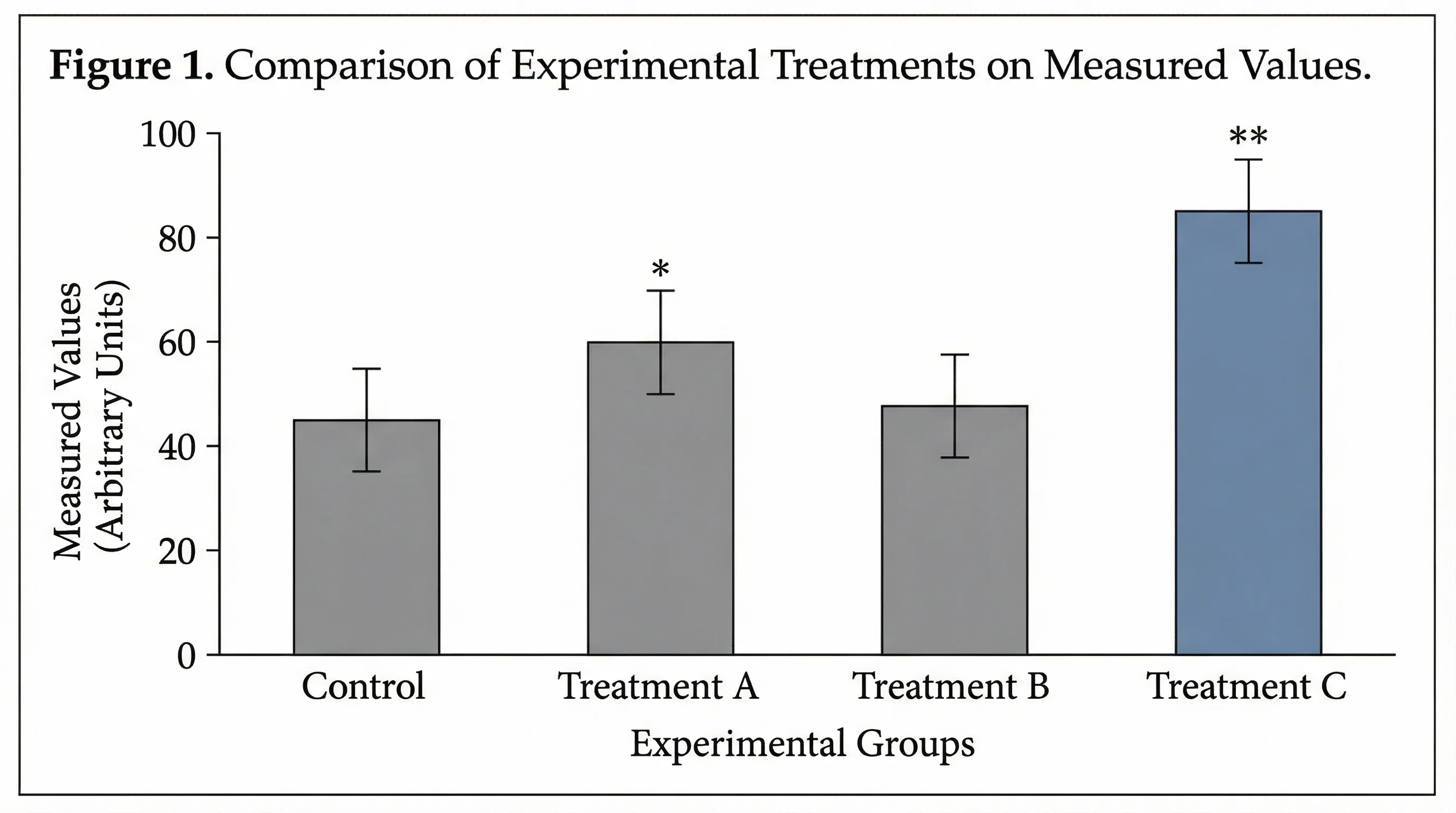
A bar chart displays categorical data using rectangular bars. Each bar represents a distinct category, and the length or height of the bar corresponds to the value for that category.
The key characteristic of a bar chart is that the categories are discrete and separate. There is no inherent order or continuity between them. A bar chart answering "How many units did each product sell?" treats each product as its own independent group.
Bar Chart Characteristics
- Data type: Categorical (discrete groups)
- Bar spacing: Gaps between bars (emphasizing separation)
- Axis labels: Category names on one axis, values on the other
- Bar order: Can be rearranged freely (alphabetical, by value, etc.)
- Orientation: Can be vertical (column chart) or horizontal
- Comparison focus: Comparing values across distinct groups
Bar Chart Example
Imagine you surveyed 500 people about their favorite programming language. Your bar chart might show:
| Language | Respondents |
|---|---|
| Python | 168 |
| JavaScript | 142 |
| TypeScript | 87 |
| Go | 55 |
| Rust | 48 |
Each language is a separate category with no meaningful relationship between adjacent bars. You could reorder them alphabetically, by popularity, or any other way — the data would still be valid. The gaps between bars visually reinforce that these are independent categories.
What is a Histogram?
A histogram displays the distribution of continuous numerical data by dividing the data into intervals (called bins) and showing the frequency of values in each bin.
Unlike a bar chart, a histogram's bins represent ranges on a continuous scale. The bars touch each other because the data flows continuously from one bin to the next — there are no gaps in the underlying data.
Histogram Characteristics
- Data type: Continuous numerical (quantitative)
- Bar spacing: No gaps between bars (showing continuity)
- Axis labels: Numerical ranges (bins) on the x-axis, frequency on the y-axis
- Bar order: Fixed — bins must follow numerical order
- Bin width: Can vary; wider bins smooth the distribution, narrower bins show more detail
- Distribution focus: Understanding how data is spread across a range
Histogram Example
Suppose you measured the heights of 500 students. Your histogram would group the measurements into bins:
| Height Range (cm) | Number of Students |
|---|---|
| 150–155 | 28 |
| 155–160 | 67 |
| 160–165 | 124 |
| 165–170 | 148 |
| 170–175 | 89 |
| 175–180 | 34 |
| 180–185 | 10 |
The bars touch because height is continuous — a student who is 164.9 cm belongs to one bin while 165.0 cm belongs to the next. Reordering these bins would destroy the meaning of the chart. The shape of the histogram reveals the distribution pattern (in this case, approximately normal/bell-shaped).
Bar Chart vs Histogram: Side-by-Side Comparison
Understanding the core differences helps you choose correctly every time.
| Feature | Bar Chart | Histogram |
|---|---|---|
| Data type | Categorical (discrete) | Continuous (numerical) |
| Bars | Separated by gaps | Touching, no gaps |
| X-axis | Category labels | Numerical ranges (bins) |
| Bar order | Flexible, can be rearranged | Fixed numerical order |
| Purpose | Compare values across groups | Show data distribution |
| Bar width | Equal, arbitrary | Equal or variable, represents bin range |
| What bars represent | A count or value per category | Frequency of values in a range |
| Reordering | Does not change meaning | Destroys meaning |
| Typical question answered | "Which category has the highest value?" | "How is the data distributed?" |
The Fundamental Distinction
The single most important difference: bar charts compare categories, histograms show distributions.
If you are asking "how does group A compare to group B?", you need a bar chart. If you are asking "what does the shape of this data look like?", you need a histogram.
When to Use a Bar Chart
Bar charts are the right choice when your data fits these scenarios:
Comparing Categories
Use bar charts when you want to compare values across distinct groups. Examples include:
- Revenue by product line
- Survey responses by demographic group
- Employee count by department
- Website traffic by source (organic, paid, social, direct)
- Student grades by subject
Showing Rankings
Bar charts naturally show which categories rank highest or lowest. Sorting bars by value creates an immediate visual hierarchy.
Tracking Discrete Changes
Use bar charts to show values at specific, separate time points — such as annual revenue or quarterly sales — where the emphasis is on comparing individual periods rather than showing a continuous trend.
Displaying Nominal or Ordinal Data
When categories have no inherent numerical relationship (nominal data like countries or colors) or a ranked but non-continuous relationship (ordinal data like satisfaction ratings), bar charts are appropriate.
Multi-Group Comparisons
Grouped bar charts (also called clustered bar charts) and stacked bar charts let you compare multiple variables across categories simultaneously — for example, comparing sales of three products across five regions.
When to Use a Histogram
Histograms are the right choice for these data scenarios:
Understanding Data Distribution
When you need to see the overall shape of your data — whether it is symmetric, skewed left, skewed right, bimodal, or uniform — a histogram is essential.
Identifying Outliers and Gaps
Histograms reveal unusual gaps in data, unexpected clusters, or extreme outliers that summary statistics might miss. A histogram of customer purchase amounts might reveal a surprising gap between casual buyers and wholesale purchasers.
Analyzing Frequency Patterns
Use histograms when you want to know how often values fall within specific ranges:
- Distribution of test scores in a class
- Age distribution of customers
- Response times for a web application
- Distribution of daily temperatures over a year
- Income distribution in a population
Checking Normality
Before running statistical tests that assume normal distribution, researchers use histograms to visually assess whether their data approximates a bell curve.
Binning Continuous Data
When you have continuous measurements (time, distance, weight, temperature, price) and want to understand their frequency patterns, histograms transform raw numbers into visual insight.
Common Mistakes (and How to Avoid Them)
Even experienced analysts make these errors when choosing between bar charts and histograms.
Mistake 1: Using a Bar Chart for Continuous Data
The problem: Plotting age groups (18-25, 26-35, 36-45) as a bar chart with gaps between bars. This incorrectly implies the age ranges are unrelated categories rather than segments of a continuous variable.
The fix: Use a histogram with touching bars. Age is continuous, and the bins represent contiguous ranges on the same scale.
Mistake 2: Using a Histogram for Categorical Data
The problem: Plotting favorite ice cream flavors as a histogram with touching bars. This incorrectly implies that "chocolate" flows continuously into "vanilla."
The fix: Use a bar chart with gaps between bars. Flavor preference is categorical — there is no continuity between flavors.
Mistake 3: Choosing Inappropriate Bin Sizes
The problem: Using too few bins makes the histogram overly smooth and hides important patterns. Using too many bins creates noise and makes the distribution hard to read.
The fix: Start with the square root of your sample size as the number of bins, then adjust. For 100 data points, start with 10 bins. Use statistical methods like Sturges' rule or the Freedman-Diaconis rule for more precise guidance.
Mistake 4: Misinterpreting Histogram Bar Height
The problem: Assuming taller bars mean "better" or "more important" in a histogram. A tall bar in a histogram simply means more data points fall in that range — it is a frequency measure, not a value judgment.
The fix: Remember that histogram bars represent frequency or density, not a comparative value. The shape of the entire distribution matters more than any individual bar.
Mistake 5: Ignoring the Y-Axis Scale
The problem: Comparing two histograms or bar charts that use different y-axis scales, leading to visual misinterpretation.
The fix: When comparing charts, ensure they use the same scale, or clearly label the axes so viewers understand the difference.
Mistake 6: Adding Gaps to Histograms (or Removing Them from Bar Charts)
The problem: Some charting tools default to gaps between all bars, even for histograms. Others remove gaps for bar charts. Both misrepresent the data type.
The fix: Manually adjust spacing. Histograms must have touching bars. Bar charts should have visible gaps. This is not just aesthetics — it communicates the nature of the data.
How to Create Bar Charts and Histograms
Creating Charts with ConceptViz
The fastest way to create professional bar charts and histograms is with an AI-powered tool. With ConceptViz's AI Chart Generator, you can describe your data in plain text and get a polished chart in seconds.
For a bar chart, describe your data like this:
"Create a bar chart comparing quarterly revenue: Q1 $2.4M, Q2 $3.1M, Q3 $2.8M, Q4 $4.2M"
For a histogram, describe your distribution:
"Create a histogram showing the distribution of customer ages: most customers are between 25-45, with a peak around 30-35"
ConceptViz automatically applies the correct formatting — gaps for bar charts, touching bars for histograms — so you do not need to worry about getting the visual conventions wrong.
AI Chart Generator
Generate professional bar charts and histograms from text descriptions instantly.
Creating Charts in Spreadsheet Tools
Google Sheets / Excel:
- For a bar chart: Select your category and value columns, then insert a "Bar Chart" or "Column Chart"
- For a histogram: Select your numerical data column, then insert a "Histogram" chart type (available under statistical charts)
- Adjust bin sizes in histogram settings to find the right level of detail
Important: Spreadsheet tools sometimes default to the wrong chart type. Always verify that your histogram has touching bars and your bar chart has gaps.
Creating Charts with Code
Python (Matplotlib):
For bar charts, use plt.bar() with categorical x-values. For histograms, use plt.hist() with raw numerical data — Matplotlib handles the binning automatically.
R (ggplot2):
Use geom_bar() for bar charts and geom_histogram() for histograms. The ggplot2 library applies the correct spacing conventions by default.
JavaScript (D3.js / Chart.js):
Both libraries support bar charts and histograms, though you may need to pre-bin your data for histograms in D3.js. Chart.js has a built-in histogram mode in its bar chart configuration.
Real-World Examples
Example 1: E-Commerce Dashboard
Bar chart use: Comparing total sales by product category (Electronics, Clothing, Home & Garden, Books, Sports). Each category is discrete — a bar chart with gaps is correct.
Histogram use: Showing the distribution of order values. Most orders cluster between $20-$80, with a long tail extending to $500+. A histogram reveals this purchasing pattern that averages alone would obscure.
Example 2: HR Analytics
Bar chart use: Showing employee count by department. Engineering has 120, Sales has 85, Marketing has 45, and so on. Departments are separate groups.
Histogram use: Showing the salary distribution across the company. A histogram might reveal a bimodal distribution — one peak around $65K for junior roles and another around $110K for senior roles — indicating a gap in mid-level compensation.
Example 3: Education Research
Bar chart use: Comparing average test scores across five schools. Each school is a distinct entity.
Histogram use: Showing the distribution of individual student scores within one school. This reveals whether scores cluster tightly around the mean or spread widely, whether there are outliers, and whether the distribution is symmetric.
Example 4: Healthcare Data
Bar chart use: Comparing patient counts by diagnosis category (respiratory, cardiovascular, orthopedic, neurological).
Histogram use: Showing the distribution of patient wait times in an emergency room. This reveals whether most patients are seen quickly with a few extreme waits, or whether wait times are uniformly spread.
Advanced Considerations
When the Line Gets Blurry
Some data sits in a gray area. Consider age groups in a survey: if your survey collected exact ages (28, 34, 41...), a histogram is correct. But if respondents selected predefined brackets ("18-25", "26-35", "36-45"), you are now working with ordinal categories, and a bar chart may be more appropriate — though a histogram-style presentation is also defensible since the brackets represent a continuous underlying variable.
The rule of thumb: Think about the underlying data, not just how it was collected. If the underlying variable is continuous, lean toward a histogram. If the groups are genuinely separate entities, use a bar chart.
Density Plots vs Histograms
For continuous data with large sample sizes, consider density plots (kernel density estimation) as a smooth alternative to histograms. Density plots eliminate the bin-size problem entirely and can overlay multiple distributions more cleanly than overlapping histograms.
Combining Bar Charts and Histograms in Dashboards
A well-designed dashboard often uses both chart types. Use bar charts for KPI comparisons across business segments and histograms for understanding the distribution behind those KPIs. For instance, pair a bar chart of average customer satisfaction by region with a histogram showing the full distribution of scores — the average might be the same across regions while the distributions differ dramatically.
Frequently Asked Questions
What is the main difference between a bar chart and a histogram?
A bar chart displays categorical data with gaps between bars to show comparisons across distinct groups. A histogram displays the distribution of continuous numerical data with touching bars to show how frequently values fall within specific ranges. The fundamental difference is categorical vs continuous data.
Why do histogram bars touch but bar chart bars have gaps?
Histogram bars touch because they represent contiguous ranges on a continuous scale — there is no gap between where one bin ends and the next begins. Bar chart bars have gaps because the categories they represent are discrete and independent, with no continuity between them. The spacing is a visual convention that communicates the nature of the data.
Can you rearrange the bars in a histogram?
No. Histogram bars must remain in numerical order because they represent sequential ranges on a continuous scale. Rearranging them would destroy the distribution pattern, which is the entire purpose of the chart. Bar chart bars, on the other hand, can be freely rearranged — by value, alphabetically, or any other order — without losing meaning.
When should I use a bar chart instead of a histogram?
Use a bar chart when your data represents distinct categories — such as product names, countries, departments, survey options, or any groups that are separate entities. Bar charts are best for answering 'which category has the highest or lowest value?' If your data is categorical or you want to compare specific groups, a bar chart is the correct choice.
What is a bin in a histogram?
A bin (also called a bucket or interval) is a range of values that a histogram groups together. For example, if you are plotting test scores, your bins might be 0-10, 10-20, 20-30, and so on. The height of each bar shows how many data points fall within that bin's range. Choosing the right bin size is important — too few bins oversimplify the data, while too many bins create noise.
Can a bar chart be horizontal?
Yes. Horizontal bar charts are common and often preferred when category labels are long, when you have many categories, or when you want to emphasize ranking. Histograms, however, are almost always displayed vertically with the numerical scale on the x-axis and frequency on the y-axis, following the mathematical convention for distribution plots.
Conclusion
The bar chart vs histogram distinction comes down to one question: is your data categorical or continuous?
Bar charts compare values across separate categories — products, regions, departments, survey responses. The gaps between bars signal independence. You can reorder them freely.
Histograms reveal the distribution shape of continuous numerical data — ages, prices, temperatures, test scores. The touching bars signal continuity. Their order is fixed.
Getting this right matters. The wrong chart type does not just look unprofessional — it can genuinely mislead your audience about the nature of your data. When in doubt, ask yourself: "Am I comparing groups, or exploring a distribution?" The answer tells you which chart to use.
Ready to create a chart? Try the AI Chart Generator to build professional bar charts and histograms from a simple text description — no spreadsheet formatting required.
Related Articles:
カテゴリー
もっと読む
")
Canva Venn Diagram Maker: Complete Guide + Free Alternatives (2026)
Learn how to make a Venn diagram in Canva step by step, discover its limitations, and explore the best free alternatives including AI-powered tools for faster diagram creation.
")
How to Design Scientific Infographics: 8-Step Guide for Researchers (2026)
Create credible, publication-ready infographics that scientists trust. Step-by-step process covering data accuracy, visual hierarchy, and source citations - with free templates.

Science Journal Cover Design: Complete Guide to Getting Your Research Featured
Learn how to design compelling journal cover art that gets your research noticed. Includes technical specs for Nature, Cell, ACS journals, design principles, and step-by-step creation process.