
Scientific Infographic Design: Complete Guide for Researchers and Scientists
Master the art of creating effective scientific infographics. Learn design principles, data visualization techniques, and best practices for communicating research visually.
Scientific infographics have become essential tools for researchers to communicate complex findings to diverse audiences. Whether you're presenting at conferences, publishing in journals, or engaging with the public, well-designed infographics can transform dense data into accessible visual narratives that capture attention and enhance understanding.
What is a Scientific Infographic?
A scientific infographic is a visual representation that combines data, illustrations, text, and design elements to communicate research findings, concepts, or processes in an engaging and easily digestible format. Unlike traditional figures or charts, infographics tell a complete story through integrated visual and textual elements.
Scientific infographics serve multiple purposes in research communication:
- Simplify complexity: Break down intricate concepts into understandable components
- Enhance retention: Visual information is processed faster and remembered longer
- Increase engagement: Attractive visuals capture and maintain audience attention
- Broaden reach: Make research accessible to non-specialist audiences
- Support dissemination: Shareable formats extend research impact beyond traditional publications
Why Scientists Need Infographics
The research landscape increasingly demands effective science communication beyond traditional academic papers. Infographics address several critical needs:
Communicating with Non-Specialists
Funding agencies, policymakers, and the public need to understand research implications without technical expertise. Infographics bridge this gap by translating specialized knowledge into accessible visuals.
Standing Out in Information Overload
With thousands of papers published daily, infographics help your research stand out on social media, conference posters, and journal websites, increasing visibility and citations.
Meeting Journal Requirements
Many journals now request graphical abstracts or visual summaries alongside manuscripts. Well-designed infographics fulfill these requirements while enhancing your paper's appeal.
Enhancing Teaching and Presentations
Infographics make excellent teaching tools and presentation slides, helping students and colleagues grasp complex concepts quickly.
Building Your Research Profile
Sharing infographics on platforms like Twitter, ResearchGate, and LinkedIn establishes your expertise and expands your professional network.
Core Principles of Scientific Infographic Design
Effective scientific infographics balance aesthetic appeal with scientific accuracy and clarity. These fundamental principles guide successful design:
Well-designed infographics transform complex data into accessible visual narratives
Clarity Over Complexity
Every element should serve a clear purpose. Avoid decorative additions that don't enhance understanding. Your audience should grasp the main message within seconds.
Accuracy and Integrity
Never distort data or misrepresent findings for visual appeal. Maintain scientific rigor in all visual representations, including proper scales, labels, and statistical information.
Visual Hierarchy
Guide viewers through your infographic using size, color, and placement to emphasize important information. The most critical elements should be most prominent.
Consistency
Use consistent colors, fonts, icons, and styles throughout your infographic. This creates professional appearance and reduces cognitive load for viewers.
Accessibility
Design for diverse audiences, including those with color vision deficiencies. Use sufficient contrast, clear fonts, and alternative text descriptions.
Simplicity
Include only essential information. Each additional element increases cognitive burden. When in doubt, remove rather than add.
Types of Scientific Infographics
Different research communication needs call for different infographic formats:
Statistical Infographics
Present numerical data, research findings, and survey results using charts, graphs, and data visualizations. Ideal for quantitative research summaries.
Process Infographics
Illustrate workflows, experimental procedures, or sequential steps in research methods. Perfect for explaining methodologies or biological processes.
Timeline Infographics
Show chronological developments, research history, or project phases. Useful for longitudinal studies or historical context.
Comparison Infographics
Highlight differences and similarities between conditions, treatments, or theories. Effective for presenting experimental results or literature reviews.
Hierarchical Infographics
Organize information by levels, categories, or relationships. Suitable for taxonomies, organizational structures, or conceptual frameworks.
Geographic Infographics
Display spatial data, study locations, or distribution patterns using maps. Essential for ecological, epidemiological, or geographical research.
The Scientific Infographic Design Process
Creating effective infographics follows a systematic approach:
Step 1: Define Your Objective
Clarify what you want to communicate and to whom. Ask yourself:
- What is the single most important message?
- Who is my target audience?
- What action or understanding do I want to inspire?
- Where will this infographic be used?
Step 2: Gather and Organize Content
Collect all relevant data, findings, and supporting information. Organize content logically:
- Identify key findings or concepts
- Select supporting data and evidence
- Determine the narrative flow
- Eliminate non-essential information
Step 3: Choose the Right Format
Select an infographic type that matches your content and purpose. Consider:
- Nature of your data (quantitative, qualitative, spatial)
- Complexity of relationships to show
- Platform constraints (print, digital, social media)
- Audience preferences and expectations
Step 4: Sketch Your Layout
Create rough sketches before digital design. Plan:
- Overall structure and flow
- Placement of major elements
- Visual hierarchy
- White space distribution
Step 5: Select Visual Elements
Choose appropriate charts, icons, illustrations, and images:
- Use standard chart types for familiar data patterns
- Select icons that clearly represent concepts
- Ensure illustrations are scientifically accurate
- Maintain consistent visual style
Step 6: Design and Refine
Create your infographic using design software or tools:
- Apply your color scheme consistently
- Use readable fonts at appropriate sizes
- Align elements for professional appearance
- Balance visual weight across the design
Step 7: Review and Test
Before finalizing, evaluate your infographic:
- Show it to colleagues unfamiliar with your research
- Check for scientific accuracy and clarity
- Verify accessibility (color contrast, font size)
- Test at intended display size
- Proofread all text carefully
Color in Scientific Infographics
Color choices significantly impact effectiveness and accessibility:
Color Psychology
Different colors evoke different responses:
- Blue: Trust, stability, professionalism (ideal for scientific content)
- Green: Growth, health, nature (suitable for environmental or biological topics)
- Red: Urgency, importance, warning (use sparingly for emphasis)
- Yellow: Attention, optimism (effective for highlights but avoid as background)
- Gray: Neutrality, sophistication (excellent for supporting elements)
Color Schemes
Choose harmonious color combinations:
- Monochromatic: Variations of a single hue (simple, elegant)
- Analogous: Adjacent colors on the color wheel (harmonious, natural)
- Complementary: Opposite colors (high contrast, dynamic)
- Triadic: Three evenly spaced colors (balanced, vibrant)
Accessibility Considerations
Ensure your infographic is readable for everyone:
- Use colorblind-safe palettes (avoid red-green combinations alone)
- Maintain sufficient contrast ratios (at least 4.5:1 for text)
- Don't rely solely on color to convey information
- Test with colorblind simulation tools
For research-appropriate color schemes, explore our guide on scientific color palettes.
Typography for Scientific Infographics
Font choices affect readability and professionalism:
Font Selection
Choose appropriate typefaces:
- Sans-serif fonts (Arial, Helvetica, Calibri): Clean, modern, excellent for digital display
- Serif fonts (Times New Roman, Georgia): Traditional, formal, good for body text in print
- Display fonts: Use sparingly for titles only, never for data or body text
Font Hierarchy
Establish clear typographic hierarchy:
- Title: Largest, boldest (24-36pt for print, 48-72pt for posters)
- Headings: Medium size, bold or semi-bold (18-24pt)
- Body text: Readable size (12-14pt for print, 18-24pt for posters)
- Captions: Smaller but still legible (10-12pt)
Readability Guidelines
Maximize text legibility:
- Limit to 2-3 font families maximum
- Use adequate line spacing (1.2-1.5x font size)
- Keep line length reasonable (50-75 characters)
- Align text consistently (left-aligned usually best)
- Avoid all caps except for short headings
Learn more about appropriate fonts in our article on best fonts for scientific posters and figures.
Data Visualization in Infographics
Presenting data effectively is central to scientific infographics:
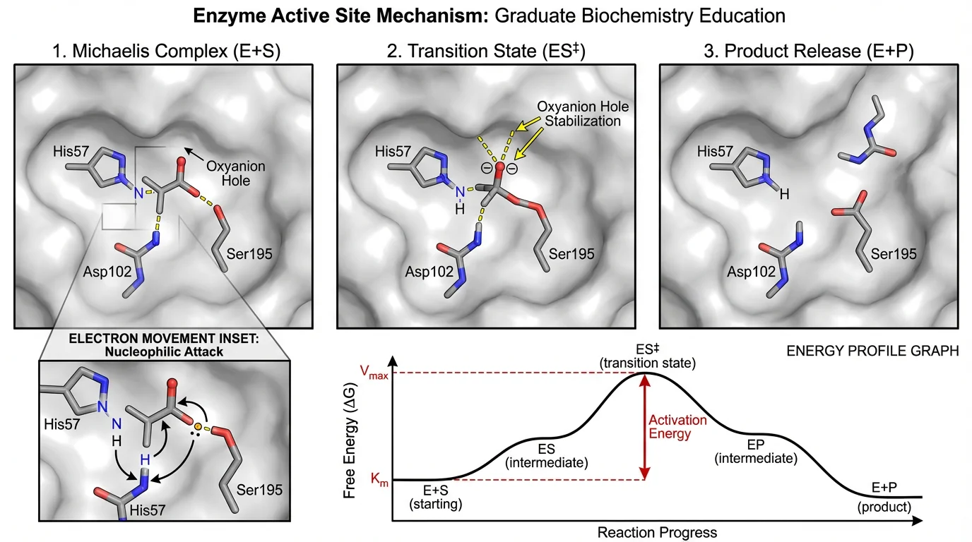
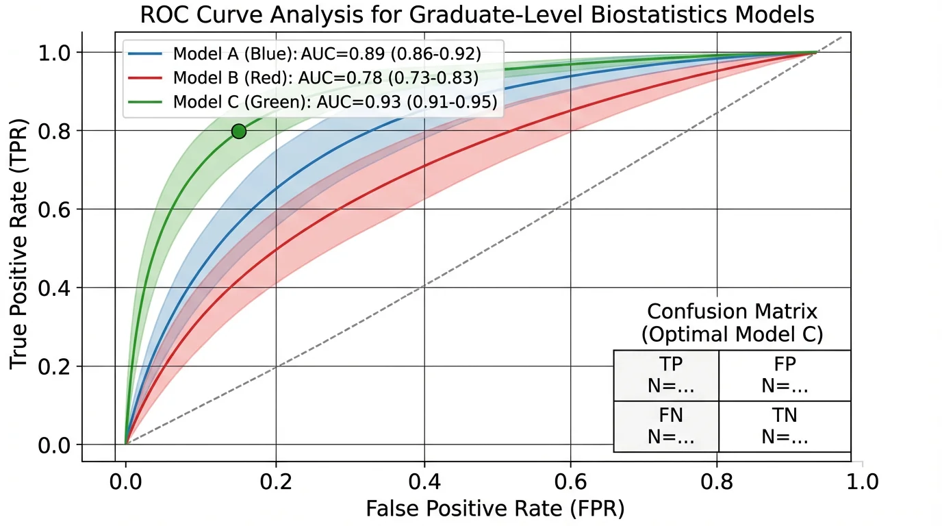
Effective data visualization makes complex biological mechanisms understandable at a glance
Choosing the Right Chart Type
Match visualization to data type:
- Bar charts: Comparing categories or groups
- Line graphs: Showing trends over time
- Scatter plots: Displaying correlations or relationships
- Pie charts: Showing parts of a whole (use sparingly)
- Heat maps: Representing matrix data or intensity
- Box plots: Displaying distribution and variability
Data Visualization Best Practices
Follow these guidelines for clear data presentation:
- Start y-axes at zero unless there's compelling reason not to
- Label axes clearly with units
- Include error bars or confidence intervals where appropriate
- Use consistent scales across comparable charts
- Avoid 3D effects that distort perception
- Limit data series to avoid clutter
Simplifying Complex Data
Make intricate data accessible:
- Focus on key findings rather than showing everything
- Round numbers to appropriate precision
- Use visual cues (arrows, highlights) to direct attention
- Provide context through comparisons or benchmarks
- Consider showing data subsets rather than complete datasets
For comprehensive guidance, see our research data visualization best practices guide.
Icons and Illustrations
Visual symbols enhance understanding and engagement:
Using Icons Effectively
Icons should clarify, not decorate:
- Choose universally recognizable symbols
- Maintain consistent style (outline, filled, flat)
- Size icons appropriately for their importance
- Use icons to replace or supplement text
- Ensure icons are culturally appropriate
Scientific Illustrations
Accurate illustrations are crucial for scientific content:
- Use established conventions for your discipline
- Maintain proper proportions and relationships
- Label components clearly
- Cite sources for adapted illustrations
- Consider using AI scientific image generators for custom visuals
Finding Quality Graphics
Source appropriate visual elements:
- Free resources: Noun Project, Flaticon, BioRender (for biology)
- Paid resources: iStock, Shutterstock, Science Slides
- Custom creation: Adobe Illustrator, Inkscape, ConceptViz tools
- Citation requirements: Always credit sources appropriately
Layout and Composition
Effective layout guides viewers through your infographic:
Grid Systems
Use grids to organize elements:
- Establish consistent margins and gutters
- Align elements to grid lines
- Create visual rhythm through repetition
- Balance symmetry and asymmetry
White Space
Empty space is as important as filled space:
- Prevent overcrowding by leaving breathing room
- Use white space to separate sections
- Create focus by surrounding key elements with space
- Don't feel compelled to fill every area
Visual Flow
Guide viewers through your narrative:
- Use F-pattern or Z-pattern for natural reading flow
- Employ arrows or lines to show connections
- Number steps in sequential processes
- Place most important information in prime viewing areas
Balance and Proportion
Create visually pleasing compositions:
- Distribute visual weight evenly
- Use the rule of thirds for focal points
- Vary element sizes to create interest
- Maintain consistent spacing between similar elements
Tools for Creating Scientific Infographics
Various tools suit different skill levels and needs:
Beginner-Friendly Tools
Start with these accessible options:
- Canva: Templates and drag-and-drop interface
- Piktochart: Infographic-specific templates
- Venngage: Science-focused templates
- Google Slides: Simple and collaborative
Professional Design Software
For advanced control:
- Adobe Illustrator: Industry standard for vector graphics
- Inkscape: Free, open-source vector editor
- Affinity Designer: Affordable Illustrator alternative
- CorelDRAW: Comprehensive design suite
Specialized Scientific Tools
Purpose-built for research visualization:
- BioRender: Biological and medical illustrations
- ChemDraw: Chemical structures and reactions
- R/ggplot2: Statistical graphics and data visualization
- Python/Matplotlib: Programmatic data visualization
- ConceptViz tools: AI-powered scientific diagram generation
Data Visualization Tools
For chart creation:
- Tableau: Interactive data dashboards
- Plotly: Web-based interactive charts
- GraphPad Prism: Statistical graphing for scientists
- Excel/Google Sheets: Basic charts and graphs
Common Mistakes to Avoid
Steer clear of these frequent pitfalls:
Design Mistakes
- Overcrowding: Trying to include too much information
- Inconsistent styling: Mixing fonts, colors, or icon styles
- Poor contrast: Text that's hard to read against backgrounds
- Decorative clutter: Non-functional design elements
- Ignoring hierarchy: All elements given equal visual weight
Content Mistakes
- Unclear message: No obvious main point or takeaway
- Too technical: Language inappropriate for target audience
- Missing context: Data without explanation or interpretation
- Inaccurate information: Errors in data or scientific content
- Plagiarism: Using others' graphics without permission
Data Visualization Mistakes
- Misleading scales: Truncated axes that exaggerate differences
- Inappropriate chart types: Wrong visualization for data type
- Cherry-picking data: Showing only favorable results
- Missing error bars: No indication of uncertainty
- 3D distortion: Unnecessary dimensions that obscure data
Infographics for Different Platforms
Optimize your design for intended use:
Social Media
Platform-specific considerations:
- Twitter: 1200x675px, landscape orientation, bold text
- Instagram: 1080x1080px, square format, mobile-optimized
- LinkedIn: 1200x627px, professional tone, clear branding
- Facebook: 1200x630px, attention-grabbing visuals
Conference Posters
Poster-specific guidelines:
- Large format (typically 36"x48" or 42"x42")
- Readable from 3-6 feet away
- Clear sections with visual hierarchy
- Contact information and QR codes
- See our scientific poster examples for inspiration
Journal Graphical Abstracts
Publication requirements:
- Follow journal specifications exactly
- Typically square or landscape format
- High resolution (300 dpi minimum)
- Standalone comprehensibility
- File size within limits
Presentations
Slide-specific considerations:
- 16:9 aspect ratio for modern displays
- Minimal text per slide
- High contrast for projection
- Consistent template across slides
- Animations used purposefully
Measuring Infographic Effectiveness
Evaluate your infographic's impact:
Engagement Metrics
Track these indicators:
- Social media shares, likes, and comments
- Download or view counts
- Time spent viewing
- Click-through rates to related content
Comprehension Testing
Assess understanding:
- Ask viewers to summarize the main message
- Test recall of key facts after viewing
- Compare comprehension with text-only versions
- Gather feedback on clarity and usefulness
Citation and Impact
Monitor research impact:
- Track citations of papers with infographics
- Monitor Altmetric scores
- Measure website traffic from infographic shares
- Note media coverage or public engagement
Best Practices for Scientific Accuracy
Maintain research integrity in visual form:
Data Representation
- Show complete datasets or clearly indicate subsets
- Include sample sizes and statistical significance
- Represent uncertainty appropriately
- Use proper scales and units
- Avoid visual distortions
Source Attribution
- Cite all data sources
- Credit image and icon sources
- Acknowledge collaborators and funding
- Include institutional affiliations
- Provide references for key claims
Peer Review
- Have colleagues review for accuracy
- Check with subject matter experts
- Verify all numbers and statistics
- Confirm proper terminology
- Test with target audience members
Conclusion
Scientific infographics are powerful tools for communicating research in our visually-oriented world. By combining design principles with scientific rigor, you can create infographics that make complex research accessible, engaging, and memorable.
Remember that effective infographic design is a skill that improves with practice. Start simple, focus on clarity and accuracy, and gradually develop your visual communication abilities. Your research deserves to be understood and appreciated—well-designed infographics help ensure it reaches and resonates with diverse audiences.
Ready to create your own scientific infographics? Explore our AI infographic generator to transform your research data into compelling visual stories that enhance understanding and extend your research impact.
Related Articles:
分類
更多文章
")
How to Create Scatter Plots in Excel: Step-by-Step Guide (2026)
Learn how to make scatter plots in Excel with trend lines, labels, and formatting. Complete guide with screenshots and tips for research data visualization.
")
How to Draw a Volcano: Step-by-Step (Easy Labeled Diagram)
Learn how to draw a volcano step by step — an easy labeled cross-section for science class. Simple shapes for the cone, magma chamber, conduit, vent, and erupting ash cloud, plus a free instant generator.

Best AI Scientific Illustration Tools in 2026: Complete Guide
Compare the best AI-powered scientific illustration tools for researchers in 2026. From BioRender to ConceptViz, find the right tool for publication-quality scientific figures.