Scientific Color Palette Generator
Pick colorblind-friendly color palettes for scientific figures and copy the hex codes. Okabe-Ito for categorical data, Viridis for heatmaps, plus diverging and Nature-style journal colors — preview on charts and export, free.
Pick A Palette Family, Then Copy What You Need
This page now behaves like a real palette utility, not a generic image prompt box. Choose a family, inspect a figure preview, and copy ready-to-use hex, Python, R, or CSS snippets immediately.
Okabe-Ito
Widely recommended in academic publishing because every category stays distinct, even under common forms of color blindness.
#E69F00, #56B4E9, #009E73, #F0E442, #0072B2, #D55E00, #CC79A7, #000000
You need distinct colors for separate groups or treatments.
Your figure will be read on slides, in print, and by mixed audiences.
You can pair color with direct labels or line styles for extra clarity.
This sends you into the main creation flow with a prefilled prompt based on Okabe-Ito.
Color Palette Examples
Scientific palettes and chart examples with hex codes you can copy
Okabe-Ito Categorical Palette
The go-to colorblind-safe palette for categorical data — eight colors that stay distinct under deuteranopia and protanopia.
Viridis Sequential Palette
A perceptually uniform colormap for sequential data and heatmaps — equal steps in value look like equal steps in color.
Nature Journal Style
A restrained, publication-ready scheme inspired by figures in high-impact journals like Nature and Science.
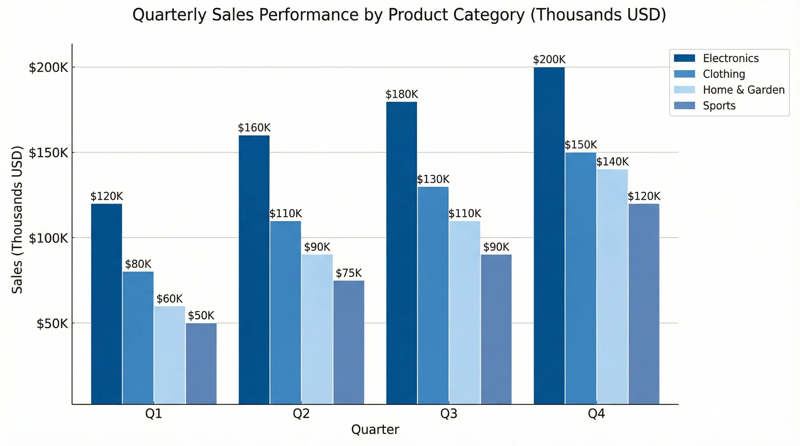
Bar Chart Color Scheme
How a categorical palette looks applied to grouped bars — every group stays readable for colorblind viewers.
Line Graph Colors
Accessible line colors paired with distinct line styles — a redundant cue so the figure works even in grayscale.
Heatmap Color Scale
A correlation matrix on a perceptually uniform scale, so the color bar maps cleanly onto the underlying values.
What makes a color palette "scientific"?
A scientific color palette is a set of colors chosen for how accurately they communicate data, not for decoration. Three properties matter: it should be colorblind-friendly so every reader can tell the categories apart; it should be perceptually uniform for continuous data, meaning equal steps in value look like equal steps in color; and it should reproduce reliably from screen to print. This generator gives you ready-made palettes that meet those criteria — Okabe-Ito and other qualitative sets for categories, Viridis and friends for gradients, plus diverging and journal-style schemes — with the hex codes laid out so you can copy them straight into your chart.
Sequential, diverging, or qualitative — pick by data type
- Qualitative (categorical) palettes use unrelated hues for unordered groups — species, treatments, conditions. Okabe-Ito is the default here because its colors stay distinct for the most common types of color blindness.
- Sequential palettes run light-to-dark in a single hue family for data that goes low-to-high, such as counts, density, or intensity. Viridis is the safe choice because it is perceptually uniform and prints well in grayscale.
- Diverging palettes have two contrasting hues meeting at a neutral midpoint, for data with a meaningful center — correlations around zero, change from a baseline, or anomalies above and below an average.
- Matching the palette type to your data is the single most important decision: a rainbow on sequential data exaggerates some ranges and flattens others, and a sequential ramp on categories implies an order that is not there.
Colorblind-friendly palettes (deuteranopia, protanopia, tritanopia)
Roughly 1 in 12 men and 1 in 200 women have some color vision deficiency, so a figure that relies on red-versus-green alone will be unreadable for a meaningful slice of your audience. The most common deficiencies are deuteranopia and protanopia (both affect red-green perception); tritanopia (blue-yellow) is rarer. Palettes like Okabe-Ito and the Viridis family are engineered to stay distinguishable across these conditions. For categorical data, a good rule is to add a second, non-color cue — line style, marker shape, direct labels, or hatching — so the figure still works if printed in grayscale or viewed by someone who cannot separate the hues at all.
Perceptually uniform colormaps: why Viridis beats the rainbow
The old jet/rainbow colormap looks vivid but distorts data: it has sharp luminance jumps that create false boundaries and dull stretches that hide real variation, and it falls apart in grayscale. Perceptually uniform colormaps — Viridis, Cividis, Magma, Inferno, Plasma — fix this by making perceived color change track the data linearly. The result is a heatmap or surface plot where what your eye sees matches what the numbers do, with no phantom features and no lost detail. Cividis is worth knowing specifically because it is optimized to look the same to colorblind and non-colorblind viewers.
How to use the palette generator
- Choose a palette family — categorical, sequential, diverging, or journal-style — based on the kind of data you are plotting.
- Preview the colors on a sample bar chart, line graph, or heatmap to see how they read together before you commit.
- Copy the hex codes, or grab a ready-made snippet for Python (Matplotlib/Seaborn), R (ggplot2), or CSS to drop straight into your code.
- Paste the colors into your plotting library, spreadsheet, or design tool — the values are exact, so your figure matches the preview.
Choosing colors for journals and publication
Many journals now ask for accessible color schemes, and most still print or distribute figures that may be viewed in grayscale, so a palette that survives both is the safe bet. Practical guidance: keep categorical palettes to a handful of colors (beyond about seven, swatches start to blur together — split the data or use facets instead); always pair color with a redundant cue in line and scatter plots; use a perceptually uniform colormap for any heatmap or continuous surface; and keep the same palette across every panel in a figure so a color means the same thing throughout. The hex codes here are fixed values, which also makes your figures reproducible — collaborators and reviewers get exactly the colors you specified.
Frequently Asked Questions
Related Research Tools
 Research
AI Chart Generator
Turn your data into clean bar, line, and pie charts ready for reports and slides.
 Research
Scientific Poster Generator
Lay out a research poster with sections, figures, and a clean academic style.
 Research
Graphical Abstract Maker
Build a polished graphical abstract that summarizes your paper at a glance.