Line Chart Maker from Your Data
Make a line chart online from your own data. Paste a few rows, get an exact, labeled line graph with axes, gridlines, and multiple series — or describe one for an AI illustration. Then download a free SVG.
Paste your data (one row per category, with one or more value columns) — renders an exact line chart as SVG, free
Chart data
Exact line chart, rendered as SVG.
First column is the x-axis label; each column after it is a series. An optional header row names the series.
Straight segments. Download an editable SVG for slides, reports, and worksheets.
Line Chart Maker
Free to try ·
Your line chart will appear here
Describe the line chart you want
Line Chart Examples
Single-line trends, multi-series comparisons, and smooth curves over time
Single Trend Line
The simplest case: one series over time, with a clear upward trend and labeled data points.
Multiple Series Comparison
Plot several lines on one chart to compare trends — each series gets its own color and a legend.
Price Over Time
A time-series price chart — ideal for tracking a value as it moves up and down over a period.
Smooth Seasonal Curve
A smoothed line turns monthly readings into a flowing seasonal curve instead of jagged segments.
Research Line Chart
Two condition lines across several time points — a clean way to show how groups diverge.
Trends Over Years
Track several categories year over year to see how their relative trends shift over time.
What is a line chart?
A line chart connects individual data points with straight or curved segments to show how a value changes across an ordered axis — usually time. Because the eye follows the slope of the line, it is the clearest way to read a trend: whether something is rising, falling, leveling off, or swinging up and down. That is exactly what this maker draws — paste your numbers and it builds a labeled line graph with proper axes, gridlines, and a line for every series, so you do not have to position anything by hand.
Two ways to make a line chart here
- Precise mode: paste your data — one row per category, with one or more value columns — and the tool scales the axes, adds labeled ticks and gridlines, and draws an exact line per series. Use this when the numbers must be correct, such as homework, reports, or a chart from real data.
- AI illustration mode: describe the line chart you want in plain English and the tool generates a polished, presentation-ready illustration with themed colors, annotations, and styling.
- Reach for precise mode when accuracy matters and AI mode when you want an eye-catching graphic for slides or social — both are free and export-ready.
Line chart vs bar chart: which should you use?
Use a line chart when the x-axis is continuous or ordered — months, years, weeks, time points — and you want to emphasize the trend between values. The connecting line implies "what happened in between" and makes direction easy to see. Use a bar chart instead when you are comparing separate, unordered categories (for example, sales by region) where there is no trend to follow. As a rule of thumb: if it makes sense to ask "is it going up or down over time?", a line chart is the right call.
Plotting multiple lines and trends over time
To compare several things at once, add more value columns to your data: the first column is the x-axis label and each column after it becomes its own line. The tool gives every series a distinct color, draws a small dot at each point, and adds a legend so readers can tell the lines apart. This is how you put revenue against cost, compare two products quarter by quarter, or track a control group against a treatment group on a single, readable chart.
Smoothing, points, and reading the line
By default the chart connects points with straight segments, which is the honest way to show measured data — every kink is a real reading. Turning on smoothing replaces those segments with a gentle curve, which looks cleaner for continuous quantities like temperature or growth, though it implies values between points rather than showing them exactly. You can also toggle the point markers on or off: keep them on when each reading matters, hide them when you only care about the overall shape of the trend.
Free line chart maker with SVG download
The precise line chart renderer runs entirely in your browser — your data never leaves the page, there is nothing to install, and there is no sign-up to draw or download a chart. When you are happy with it, download a clean SVG that stays crisp at any size and stays editable in vector tools, ready to drop into a document, slide deck, worksheet, or website.
Frequently Asked Questions
Related Chart Tools
 Research
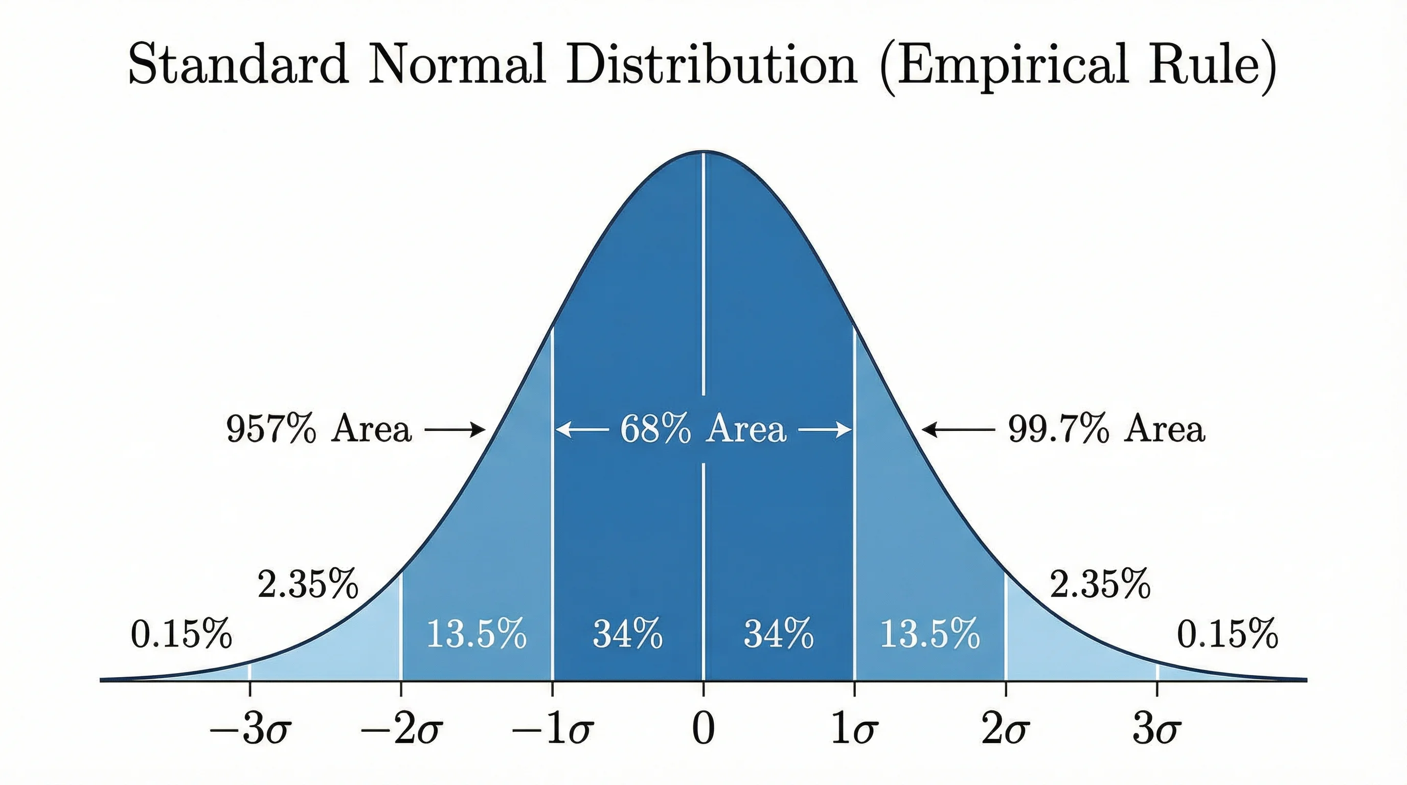
Bell Curve Generator
Render an exact normal distribution curve from a mean and standard deviation, or from your data.
 Research
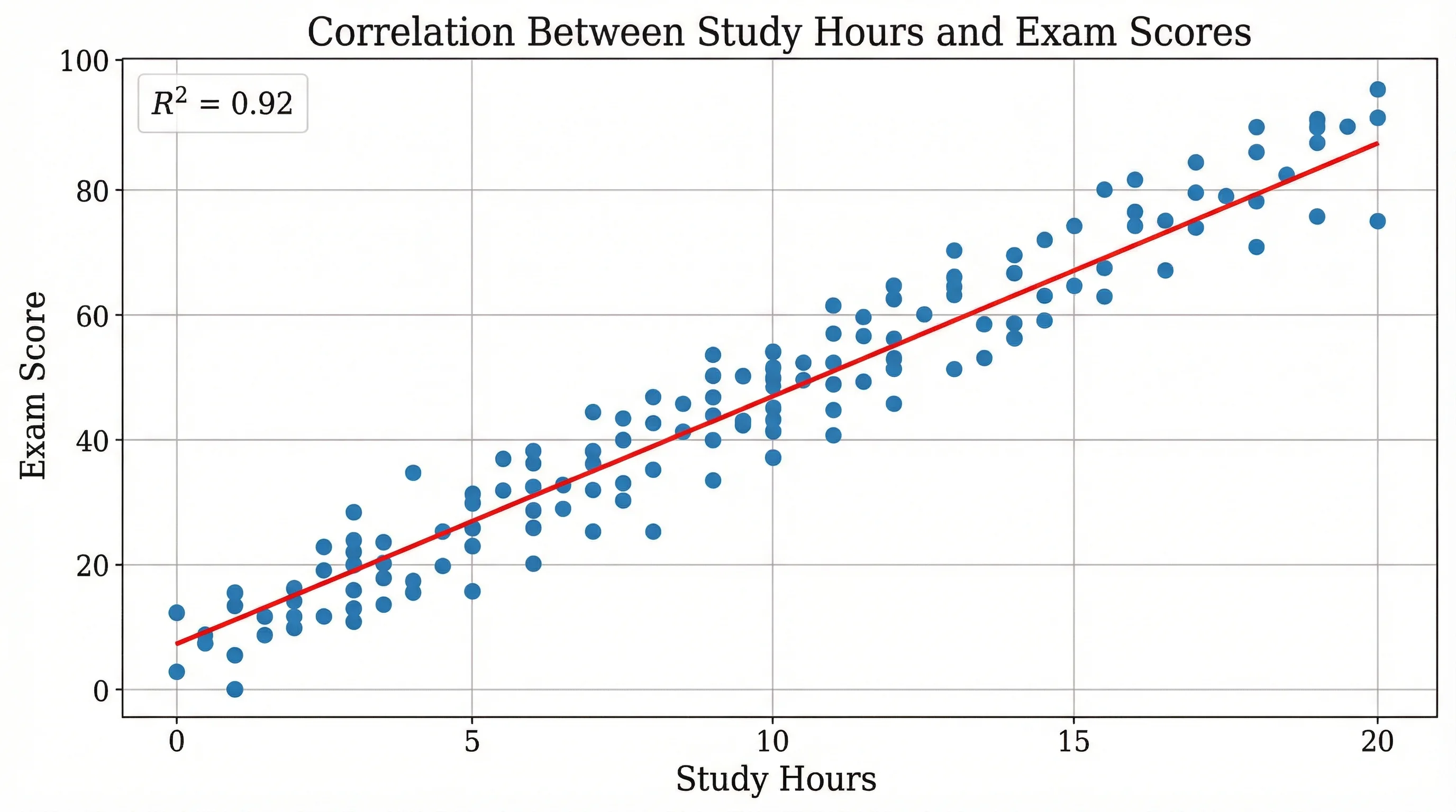
Scatter Plot Maker
Plot x-y points to reveal correlation and clusters, then export a clean chart.
 Research
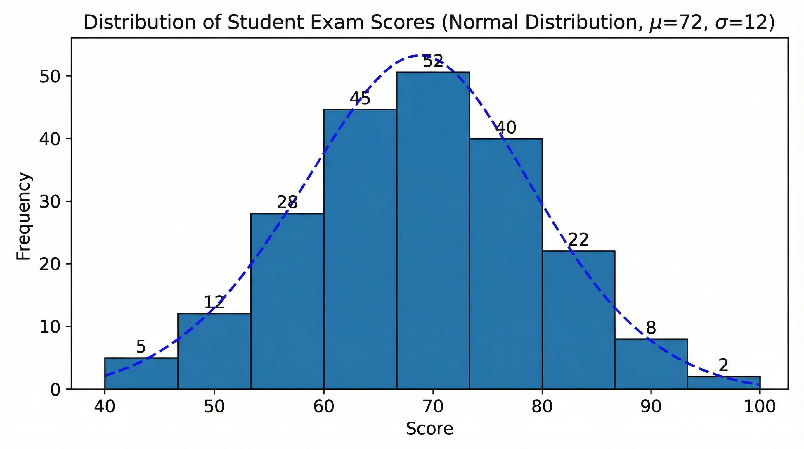
Histogram Maker
Turn raw numbers into a binned frequency histogram with labeled axes, then export it.