Hertzsprung-Russell Diagram Generator to Plot Stars by Temperature & Luminosity
Plot a Hertzsprung–Russell (HR) diagram: stars charted by surface temperature and luminosity with the main sequence, giants, supergiants, and white dwarf regions labeled. The precise mode places each star exactly on a reversed logarithmic temperature axis (hot on the left, cool on the right) and a logarithmic luminosity axis, with the Sun and named stars marked — then export SVG or PNG. Deterministic precise mode plus an AI sketch mode.
Stars (12)
Add a star
HR Diagram Examples
Common ways to plot and label a Hertzsprung–Russell diagram
Labeled HR Diagram
A full HR diagram with the main sequence and giant, supergiant, and white dwarf regions labeled.
Main Sequence Highlighted
The diagonal main sequence running from hot, luminous stars to cool, dim ones.
HR Diagram Regions
The four classic HR regions shaded and labeled: main sequence, giants, supergiants, white dwarfs.
Spectral Classes
The spectral sequence O B A F G K M running hot to cool across the top of the chart.
Named Stars Plotted
Well-known stars plotted by temperature and luminosity, with the Sun on the main sequence.
Blank HR Diagram
An empty HR diagram with labeled axes, ready for students to plot their own stars.
What is a Hertzsprung–Russell diagram?
A Hertzsprung–Russell (HR) diagram is a scatter plot of stars that reveals the relationship between two of their most important properties: surface temperature and luminosity (how much energy they radiate). It is named after Ejnar Hertzsprung and Henry Norris Russell, who independently created it in the early 1910s. When you plot thousands of stars this way, they do not scatter randomly — they fall into distinct groups: a long diagonal strip called the main sequence, cool but bright giants and supergiants in the upper right and top, and hot but faint white dwarfs in the lower left. The HR diagram is one of the most powerful tools in astronomy because a star’s position on it encodes its temperature, luminosity, radius, mass, and stage of life all at once.
The reversed temperature axis and spectral classes
- The defining quirk of an HR diagram is its x-axis: surface temperature runs backwards. Hot stars (around 40,000 K) sit on the left and cool stars (around 2,500 K) sit on the right, the opposite of most graphs. This convention is historical — the axis was originally spectral class, which had been ordered before temperatures were known — and it has stuck ever since. The temperature scale is also logarithmic, so each step spans a factor of ten.
- Across the top, astronomers often label the spectral classes O, B, A, F, G, K, and M, running from hottest to coolest. O and B stars are blue-white, A and F stars white, G stars (like the Sun) yellow, K stars orange, and M stars red. The classic mnemonic "Oh Be A Fine Guy/Girl, Kiss Me" keeps the order straight. Each class corresponds to a temperature band: O above 30,000 K, B from 10,000–30,000 K, A 7,500–10,000 K, F 6,000–7,500 K, G 5,200–6,000 K, K 3,700–5,200 K, and M below 3,700 K.
The logarithmic luminosity axis
- The vertical axis shows luminosity — the total power a star radiates — measured relative to the Sun (L/L☉), where the Sun is defined as 1. Stellar luminosities cover an enormous range, from faint red dwarfs at about 0.0001 L☉ to brilliant supergiants at over 1,000,000 L☉, so the axis must be logarithmic to fit them all. Each gridline up the y-axis multiplies luminosity by a hundred: 0.0001, 0.01, 1, 100, 10,000, 1,000,000.
- Luminosity is not the same as apparent brightness in the night sky. A dim-looking star may actually be intensely luminous but very far away, while a bright-looking one may be modest but nearby. The HR diagram uses intrinsic luminosity so that stars can be compared on equal footing regardless of distance.
The main sequence, giants, supergiants, and white dwarfs
- About 90% of stars, including the Sun, live on the main sequence — the diagonal band running from hot, luminous stars in the upper left to cool, dim stars in the lower right. A star sits on the main sequence for most of its life while it fuses hydrogen into helium in its core; where it falls along the band is set mainly by its mass, with the most massive stars at the top.
- When a star exhausts its core hydrogen it swells and cools, moving off the main sequence into the giant region (upper right) or, for the most massive stars, the supergiant region across the top. These stars are cool yet very luminous because they are enormous — Betelgeuse and Rigel are supergiants hundreds of times the Sun’s diameter.
- In the lower left sit the white dwarfs: the hot, dense, Earth-sized remnants left when a Sun-like star sheds its outer layers. They are hot but tiny, so despite high temperatures they are very faint. Together these four regions map the full life cycle of stars.
How to read a star’s position
- To place a star, read its temperature along the bottom (remembering hot is on the left) and its luminosity up the side. The Sun, for example, has a surface temperature of about 5,800 K and a luminosity of 1 by definition, so it plots squarely on the main sequence near the middle — a yellow G-type star. Sirius A, hotter and brighter, sits above and to the left of the Sun; Proxima Centauri, cool and faint, sits below and to the right.
- Because temperature also sets colour, a star’s horizontal position tells you its colour at a glance: blue-white on the left, yellow in the middle, red on the right. Its vertical position tells you its power output. Two stars at the same temperature but different luminosities must differ in size — the more luminous one is larger — which is exactly how giants and supergiants are distinguished from main-sequence stars of the same colour.
Frequently Asked Questions
Related Science Tools
 Education
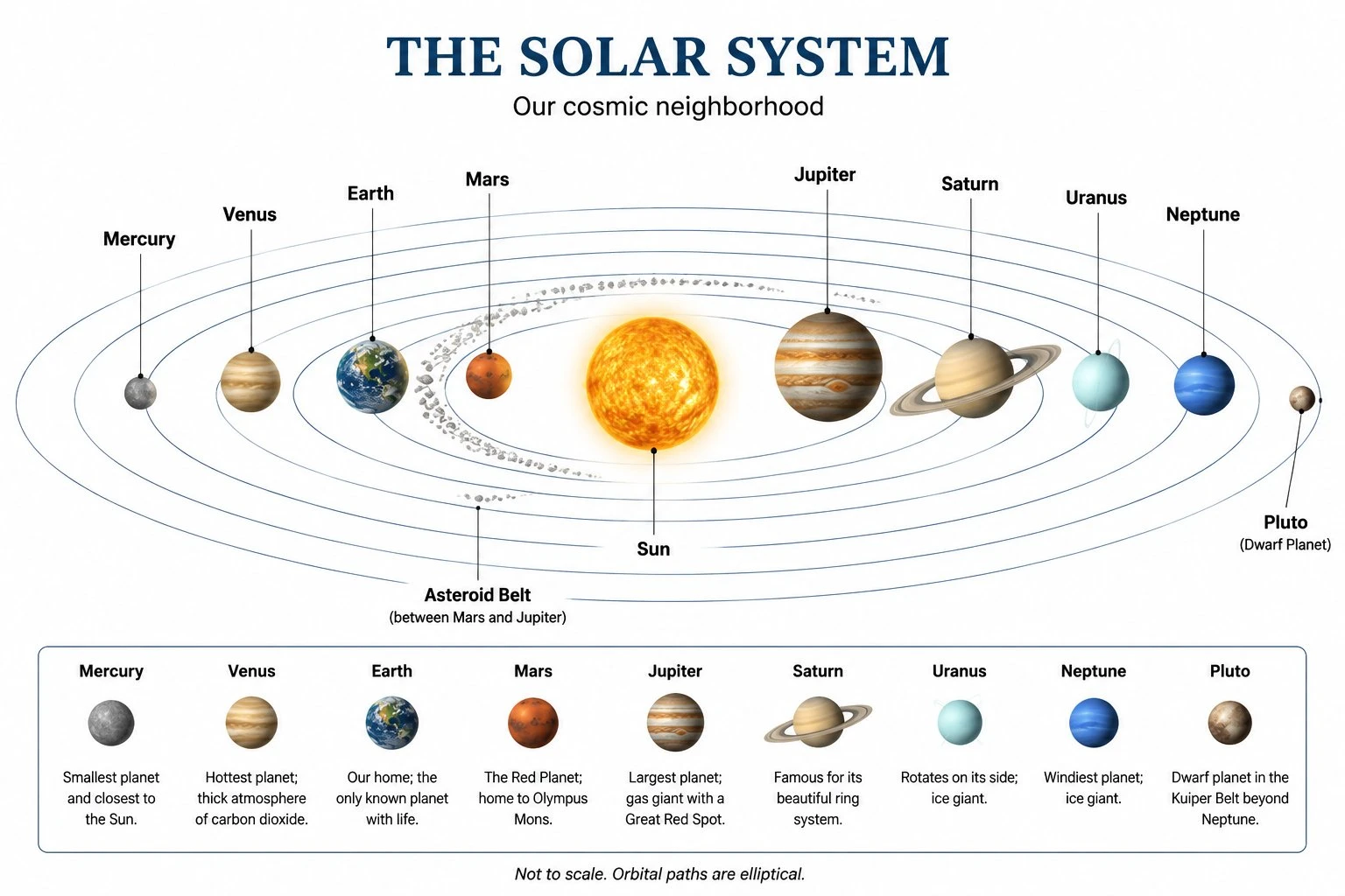
Solar System Diagram Generator
Create labeled solar system diagrams with the Sun and planets in order, sized and spaced for astronomy lessons.
 Education
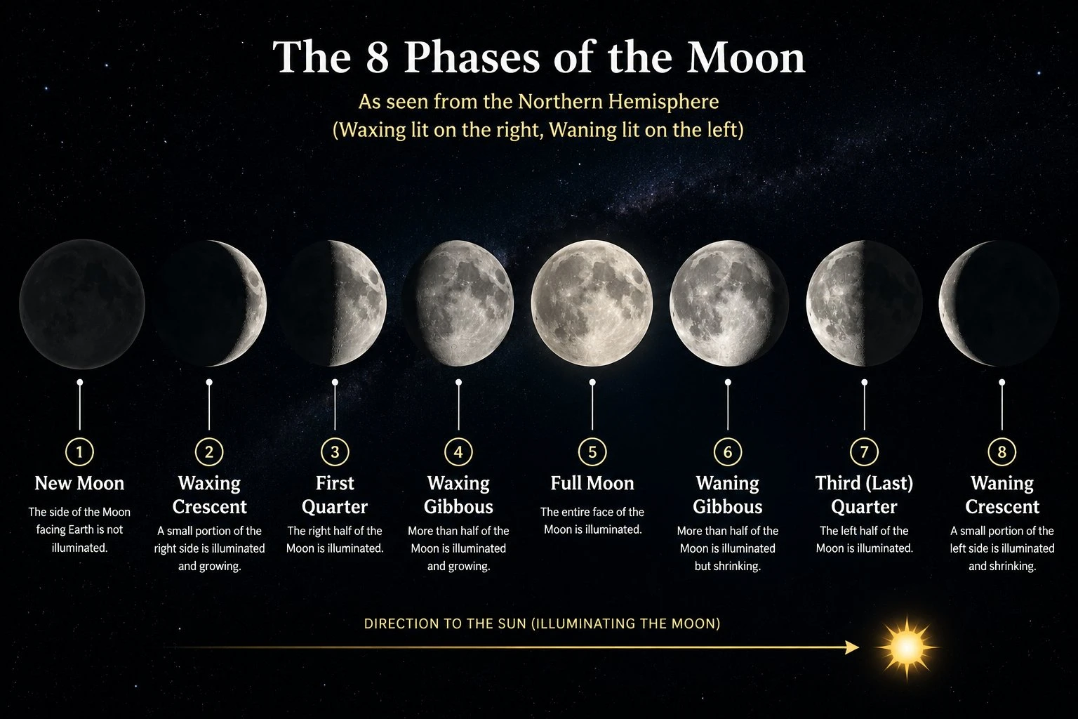
Moon Phases Diagram Generator
Draw the eight phases of the Moon in order, labeled and arranged around the Earth for clear astronomy handouts.
 Education
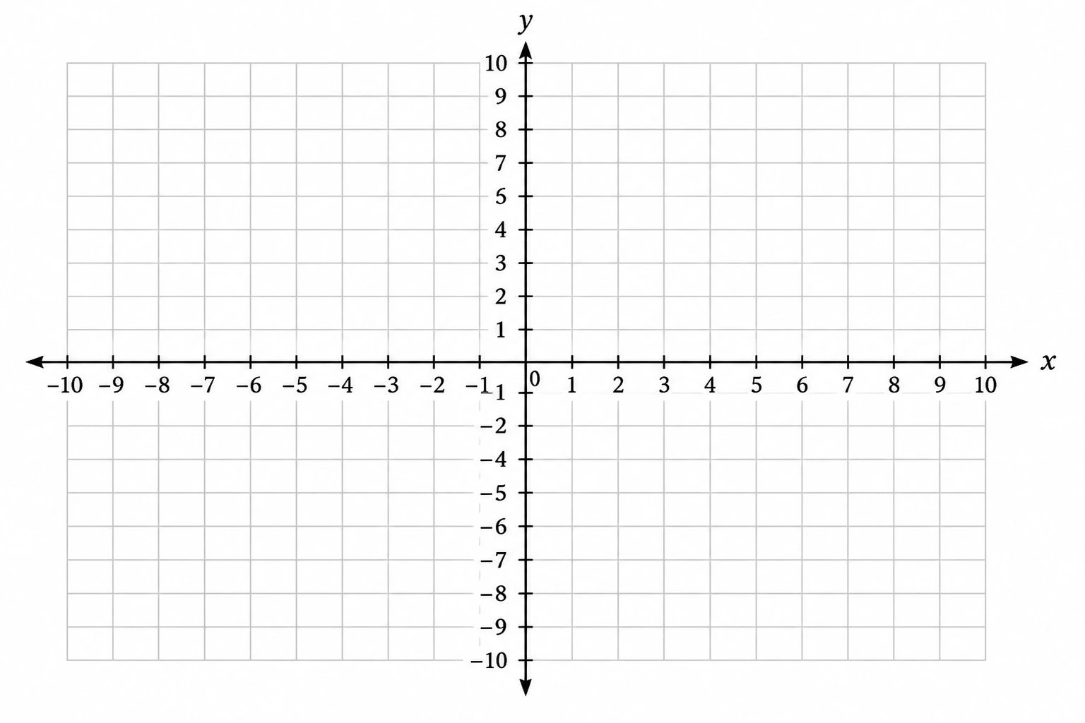
Coordinate Plane Generator
Create clean, printable Cartesian planes: plot ordered pairs, graph lines, and label the four quadrants.