Timeline Generator from a list of events
Make a timeline online from a simple list of events. Type one event per line as "Label, date" for a precise, proportionally spaced timeline, or describe one for an AI illustration — then export a free SVG.
Type one event per line as "Label, date" — renders an exact, proportionally spaced timeline as SVG, free
Timeline settings
Proportional, dated timeline as SVG.
One event per line as Label, date (or Label, date, description). Dates can be a year (1969), ISO (1969-07-20), or a plain number. Invalid lines are skipped.
Markers are placed in proportion to each date, so uneven gaps between events are preserved. Download an editable SVG for slides, reports, and lesson handouts.
Timeline Generator
Free to try ·
Your timeline will appear here
Describe the timeline you want
Timeline Examples
Project, history, biography, and science timelines built from a list of events
Project Milestone Timeline
Lay out a project from kickoff to launch — each milestone placed in date order on a single axis.
Science & Research Timeline
Map research phases and key dates so collaborators can see the whole study at a glance.
Deadline & Roadmap Timeline
Turn a list of deadlines into a clean roadmap where the spacing reflects the real dates.
Product Roadmap Timeline
Show a product roadmap with phases and release dates for stakeholders and slides.
History & Biography Timeline
Plot historical events or a biography so the order — and the gaps between dates — is clear.
Team Project Timeline
Coordinate a team project by sequencing every phase along a shared, dated timeline.
What is a timeline generator?
A timeline generator turns a list of dated events into a clear visual where each event sits on an axis in the order it happened. Instead of dragging boxes around or fighting with a drawing app, you type your events as plain text and the tool places, dates, and labels every milestone for you. It is the fastest way to picture history, a project plan, a biography, or a sequence of scientific discoveries — chronology made visible in seconds.
Two ways to make a timeline here
- Precise mode: type one event per line as "Label, date" and the tool sorts your events and positions each marker in proportion to its date — so a ten-year gap looks bigger than a one-year gap. Accurate every time, and free to download as SVG.
- AI illustration mode: describe the timeline you want in plain English and the tool generates a polished, presentation-ready illustration with themed colors, icons, and styling.
- Use precise mode when the dates and order have to be exactly right (history, project plans, reports); use AI mode when you want an on-brand graphic for slides or social.
Text to timeline: how the input works
You write one event per line. The simplest form is "Label, date" — for example, "Moon landing, 1969". You can add an optional short note as a third field: "Moon landing, 1969-07-20, Apollo 11". Dates can be a four-digit year (1969), an ISO date (1969-07-20), or a plain number used as an ordinal position. The tool reads the date only for placement and keeps your original text on the label, so the timeline always shows the dates exactly as you typed them. Lines it cannot read are simply skipped, so a stray heading will not break the chart.
How to make a timeline from your events
- Give the timeline a title, such as "Company History" or "Roman Empire Key Dates".
- Type your events, one per line, as "Label, date" — paste a list straight from your notes if you have one.
- The tool sorts the events by date and places each marker in proportion to when it happened, alternating labels above and below the axis so they stay readable.
- Switch to a vertical layout if it reads better, then download a clean SVG to drop into a slide, document, or worksheet.
Timelines for history, projects, biography, and science
The same tool covers very different jobs. For history and biography, plot events by year and let the proportional spacing show long quiet stretches and bursts of change. For projects and product roadmaps, lay out phases and deadlines so a team can see the whole plan on one axis. For science and research, sequence discoveries, study phases, or experiment milestones with exact dates. Because the spacing reflects real dates rather than even steps, the picture tells the truth about pace — not just order.
When to use the AI illustration mode
Reach for AI illustration mode when you want a styled, eye-catching graphic rather than a strict dated layout — a themed history timeline for a presentation, a colorful product roadmap, or a social graphic. For anything where the order and spacing must be exactly correct, such as a graded assignment, a project schedule, or a research report, use precise mode so each event is placed from its actual date and exported as an editable SVG.
Frequently Asked Questions
Related Visualization Tools
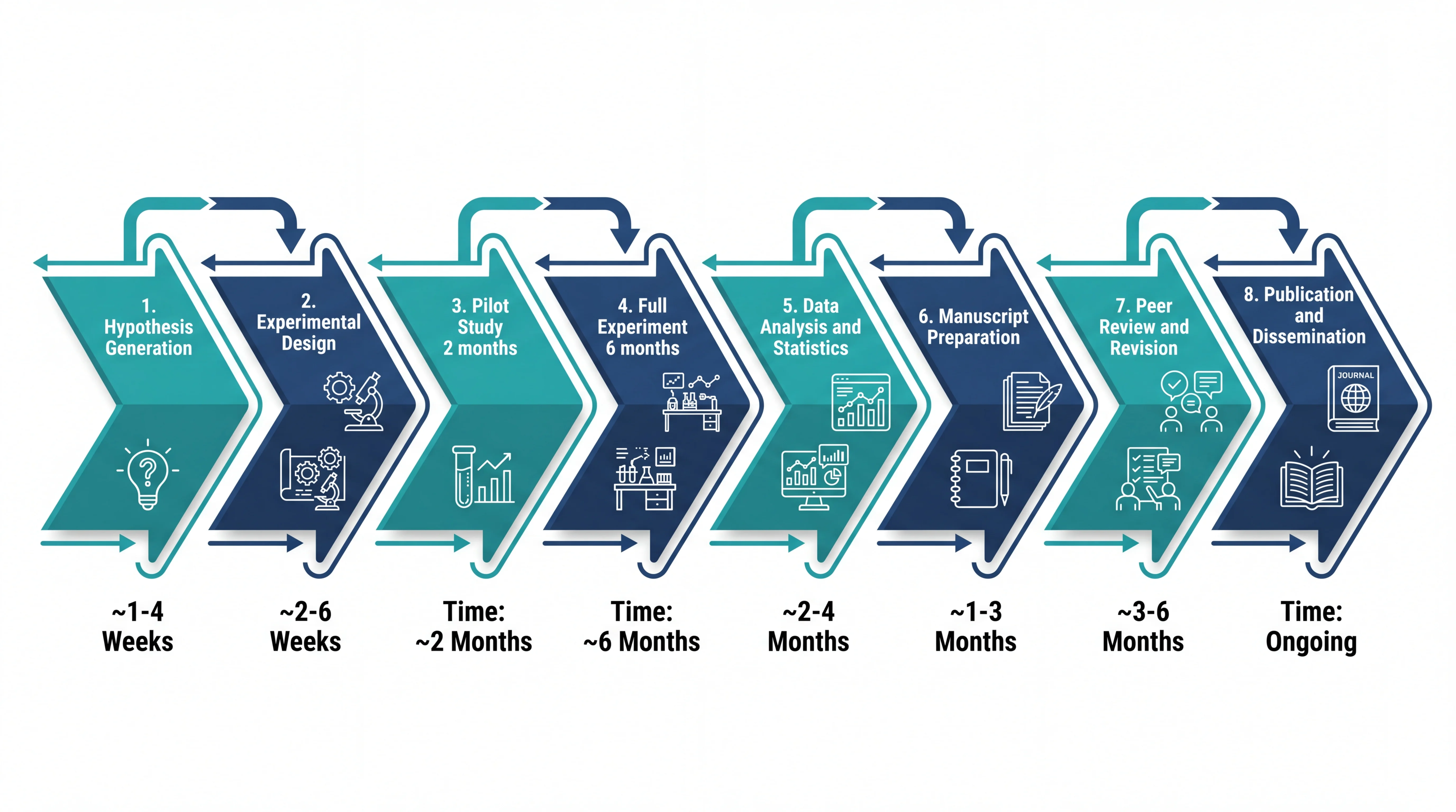 Research
Research Roadmap Maker
Plan a research project as a phased roadmap with milestones and dates.
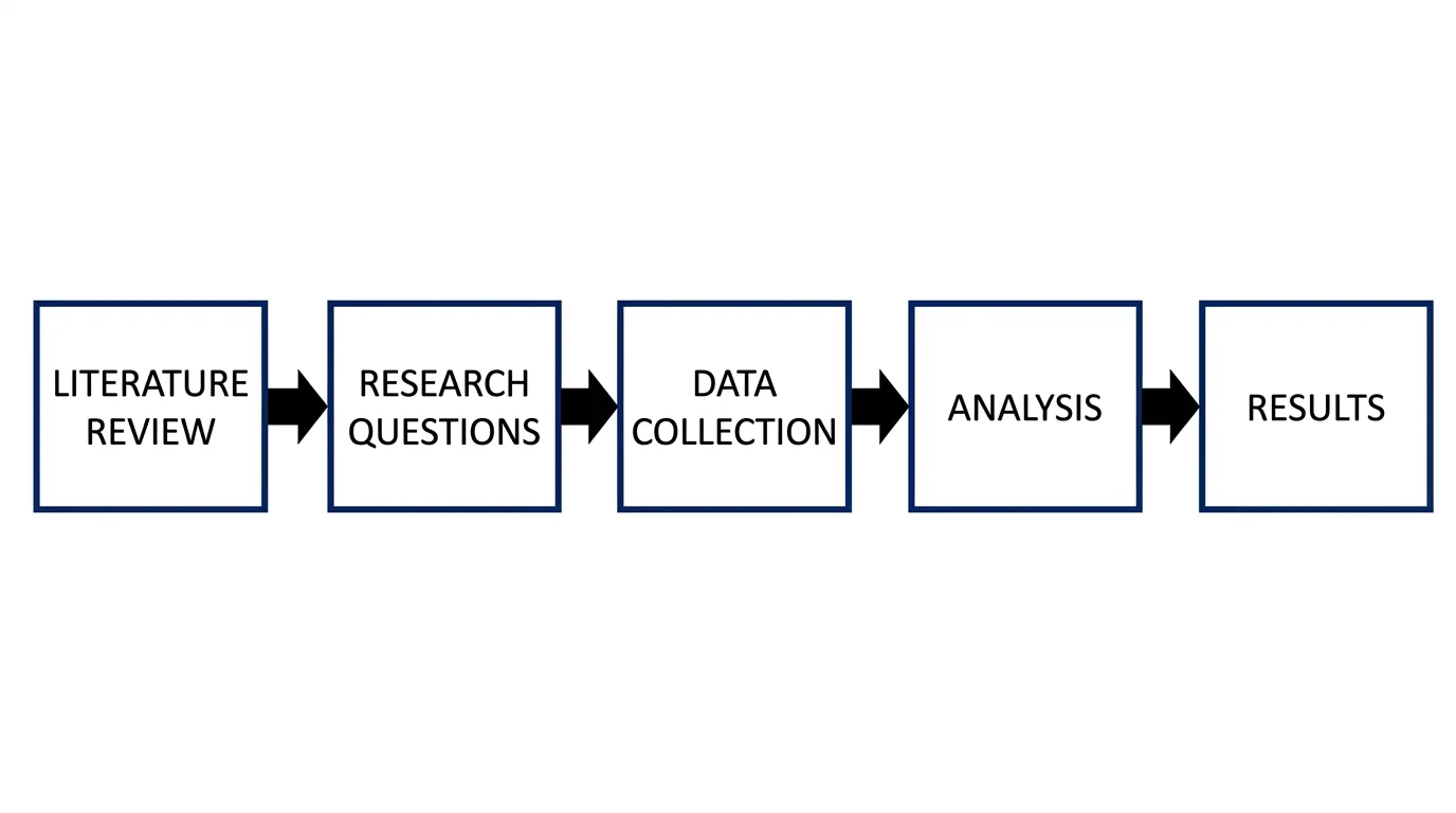 Visualization
Workflow Diagram Generator
Map a process or pipeline into a clear, step-by-step workflow diagram.
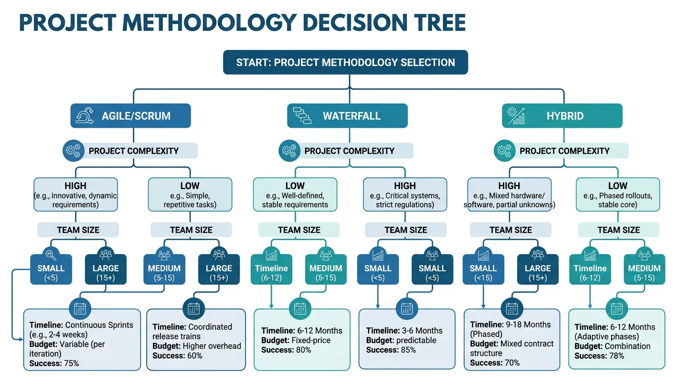 Visualization
Decision Tree Generator
Turn choices and outcomes into a structured, easy-to-read decision tree.