Pie Chart Maker with Percentages, Free
Make a pie chart online from your data, free. Type one slice per line as "Label, value" and the tool draws an exact pie or donut chart with percentages, then exports an editable SVG — or describe one for an AI illustration.
Type your slices as "Label, value" — renders an exact pie or donut chart as SVG, free
Chart data
Exact pie or donut, rendered as SVG.
5 slices · values converted to percentages automatically
Legend
- Organic Search42%
- Direct22%
- Social Media18%
- Referral11%
- Email7%
Each slice is sized by its share of the total and labeled with a percentage. Download an editable SVG for slides, reports, and worksheets.
Pie Chart Maker
Free to try ·
Your pie chart will appear here
Describe the pie chart you want
Pie Chart Examples
Market share, budgets, surveys, and donut-style breakdowns
Market Share Pie Chart
A classic market-share breakdown — each brand is a slice sized to its share, labeled with a percentage.
Budget Allocation Chart
Budgets map perfectly to a pie: every category becomes a slice that sums to 100% of the total.
Energy Sources Pie Chart
Distinct colors and a legend make a category comparison readable at a glance.
Donut Chart
Toggle on the donut hole when you want a cleaner, modern look or room for a total in the center.
Demographics Pie Chart
Proportions like age bands or survey responses turn into clear, labeled slices.
Survey Results Chart
Survey and research breakdowns sum to 100%, which is exactly what a pie chart shows best.
What is a pie chart?
A pie chart is a circle split into slices, where each slice represents a category and its size is proportional to that category’s share of the whole. The full circle is 100%, so a slice that takes up a quarter of the pie is 25% of the total. Pie charts are the clearest way to show how a single total breaks down into parts — market share, a budget, survey answers, or any data where the categories add up to one whole. This maker computes every slice angle from your numbers and labels each one with its percentage, so the chart is accurate, not eyeballed.
Make a pie chart from your data
- Type one slice per line as "Label, value" — for example, "Organic Search, 42". Paste a list straight from a spreadsheet and it works the same way.
- You enter raw values, not percentages: the tool sums them and converts each to a share of the total automatically.
- Each slice is sized by value ÷ total × 360° and labeled with its rounded percentage, so the proportions are always exact.
- Invalid or blank lines are skipped, so a stray header row or note will not break the chart.
Pie chart vs donut chart
A donut chart is a pie chart with the center removed, leaving a ring of slices around a hollow middle. The data and proportions are identical — only the look changes. Donut charts read as cleaner and more modern, and the empty center gives you space to place a total, a label, or an icon. Flip the Donut toggle in this tool to switch between the two styles instantly without re-entering your data; both export the same way.
When a pie chart is the right choice
Pie charts work best when you are showing parts of a single whole and you have a small number of categories — roughly six or fewer. The categories should add up to 100%, like a budget split, market share, or the breakdown of survey responses. When you have many small categories, a long ranked list, or you need to compare values across groups or over time, a bar chart is usually easier to read. Reach for a pie when the story is "how this one total divides up."
Reading percentages and proportions
The size of each slice is its share of the total, and the percentage label removes any guesswork — readers do not have to estimate angles by eye. Because the slices must sum to 100%, a pie chart instantly shows which category dominates and which are minor. Rounding each label to a whole percent keeps the chart clean; if you need exact figures, the underlying values stay in your input. This is why pie charts are a staple in reports, presentations, and dashboards.
Download and reuse your pie chart
When the chart looks right, download it as an SVG. SVG is a vector format, so the pie stays perfectly sharp at any size — from a slide thumbnail to a printed poster — and the colors, labels, and slices remain editable in design tools like Figma, Illustrator, or Inkscape. The whole tool runs in your browser, so generating and downloading the precise chart is free, instant, and needs no account. For a styled, artistic version instead, switch to the AI illustration mode.
Frequently Asked Questions
Related Chart Tools
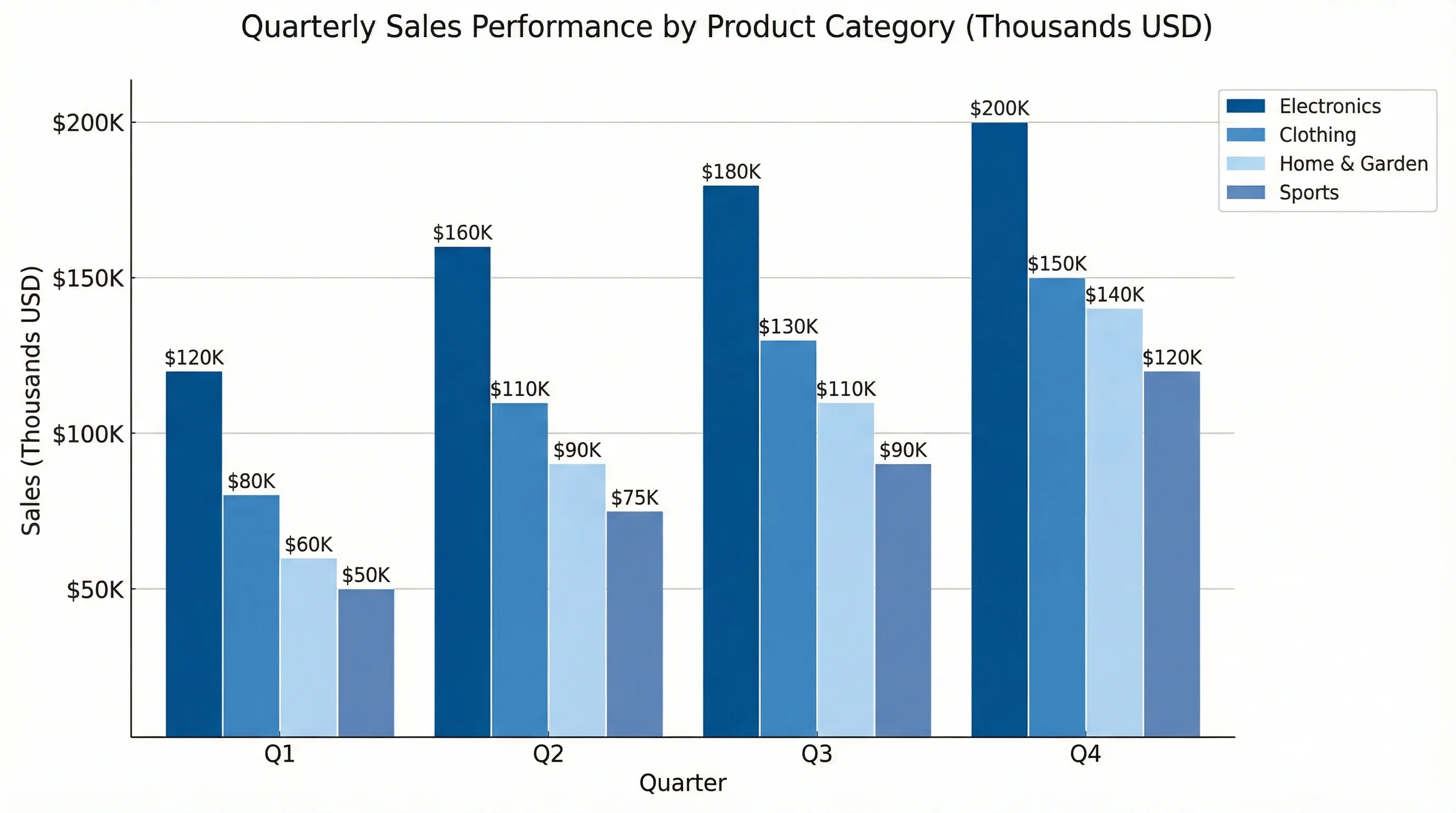 Visualization
AI Chart Generator
Turn data into bar, line, and other charts with clean labels and styling.
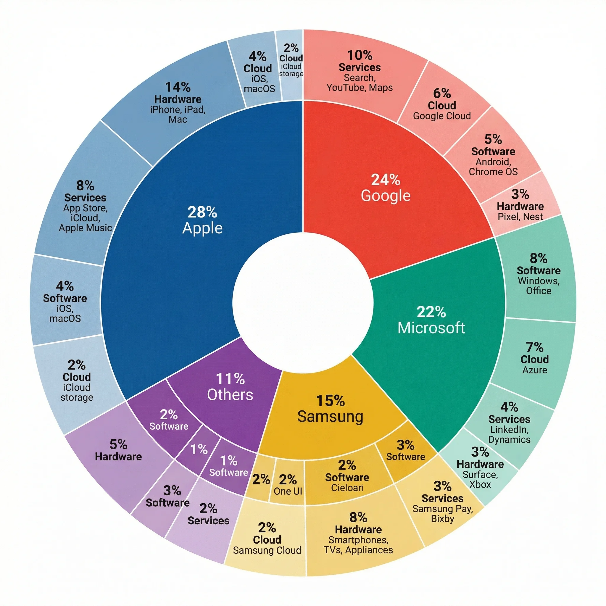 Visualization
Multi-Layer Pie Chart Maker
Build nested, multi-level pie and donut charts for detailed category breakdowns.
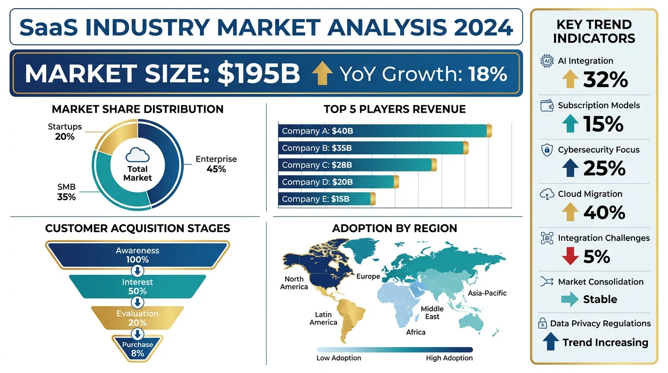 Visualization
AI Infographic Generator
Create clean, shareable infographics from your data and key points.