")
How to Make a Bar Chart in Excel: Step-by-Step Guide (2026)
Learn how to create a bar chart in Excel, sort categories, adjust gap width, add labels, and choose between bar and column charts. Includes Microsoft and ExcelJet references.
Bar charts remain one of the best chart types in Excel because they solve a very common communication problem: comparing categories clearly. If you need to show sales by product, responses by question, tickets by team, or revenue by region, a well-formatted bar chart is usually easier to read than a pie chart and faster to interpret than a table.
Excel makes bar charts easy to insert, but the default result is often only halfway useful. To get something presentation-ready, you still need to think about category order, axis labels, bar spacing, and whether a horizontal bar chart is actually a better choice than a vertical column chart.
This guide walks through how to make a bar chart in Excel, how to format it well, and how to avoid the most common mistakes that turn simple comparison charts into clutter.
AI Chart Generator
Generate polished bar charts from text or raw values without spending time on manual Excel cleanup.
Create bar charts in seconds ->What a Bar Chart Is Best For
A bar chart compares values across separate categories.
Good bar chart use cases:
- revenue by product
- student count by department
- support tickets by priority
- survey responses by option
- costs by budget category
Bar charts are most useful when:
- categories are discrete, not continuous
- labels may be long
- exact comparisons matter
- ranking is part of the story
If your x-axis represents continuous bins rather than separate labels, you probably want a histogram instead. For that case, see how to make a histogram in Excel.
Bar Chart vs Column Chart in Excel
Excel groups bar and column charts together because they solve the same basic problem. The main difference is orientation.
Use a horizontal bar chart when:
- category names are long
- you want a ranked list feeling
- you are comparing many items
- the chart will appear in a narrow layout
Use a column chart when:
- labels are short
- the chart needs to fit a wider dashboard
- the categories have a left-to-right reading expectation
Microsoft's general charting guide, Create a chart from start to finish in Excel, covers the core ribbon flow used for both chart families.
In practice, the biggest decision is often not whether Excel can build the chart, but whether a horizontal bar chart or a vertical column chart will let people read the labels more comfortably. For long category names, horizontal bars usually win.
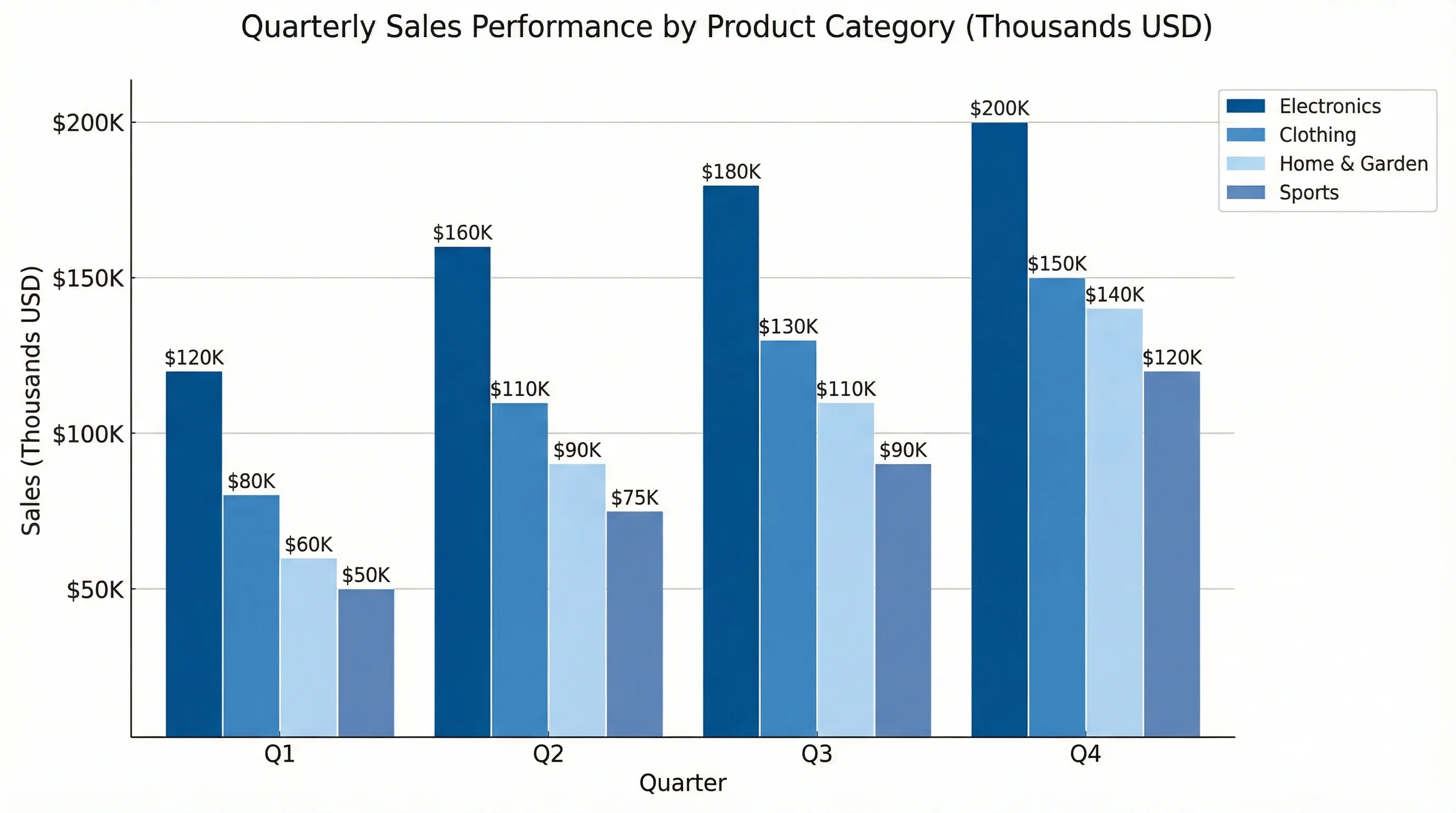
Step 1: Prepare the Data
Excel bar charts work best with one category column and one value column.
| Product | Revenue ($) |
|---|---|
| Alpha | 125000 |
| Beta | 98000 |
| Gamma | 153000 |
| Delta | 86000 |
Data prep rules
- Put category labels in one column
- Put values in the adjacent column
- Include headers
- Remove blank rows inside the range
- Keep units consistent
If you are comparing percentages, use percentages all the way through. If you are comparing dollars, use one currency and one unit system.
Step 2: Decide What the Reader Should Notice First
Before you format anything, decide what the chart needs to emphasize:
- the top category
- the ranking across all categories
- the difference between two leading categories
- whether results pass a threshold
That decision affects color, labels, and even whether you should sort the data before charting.
Step 2: Insert the Bar Chart
- Select the table, including headers.
- Go to
Insert > Charts. - Choose
Bar Chart. - Start with
Clustered Barunless you have a reason to use stacked bars.
Excel will build a chart automatically, but the first version is rarely the final version.
If you want a quick visual walkthrough of the exact ribbon clicks, ExcelJet's tutorial on how to create a bar chart in Excel is a useful practical companion.
Step 3: Sort the Data Before You Style It
One of the easiest upgrades to a bar chart is sorting the data before final styling.
For example, this:
- Alpha
- Beta
- Gamma
- Delta
is often less useful than this:
- Gamma
- Alpha
- Beta
- Delta
Sorting by value makes the ranking obvious immediately.
In Excel, you can usually do this before inserting the chart by sorting the worksheet range. If Excel has interpreted your rows and columns incorrectly, use Chart Design > Switch Row/Column.
Step 4: Clean Up the Axis and Bar Spacing
Start the value axis at zero
For most standard bar charts, the baseline should begin at zero. Starting above zero exaggerates visual differences.
Adjust gap width
Right-click a bar and choose Format Data Series. Then adjust Gap Width.
- lower gap width = denser bars
- higher gap width = more breathing room
For business reporting, moderate spacing usually works best. If the bars are too thin, the chart feels weak. If they are too thick, categories blur together.
Use clear unit labels
The value axis should tell the reader what is being measured:
Revenue ($)StudentsSupport TicketsCompletion Rate (%)
Highlight one category without making the chart noisy
If one category matters most, use a single accent color and keep the rest of the bars in a restrained palette. This is much more effective than giving every bar its own unrelated color.
Good pattern:
- gray-blue for the full series
- teal for the key bar
- optional thin target line for context
Step 5: Add Labels That Help, Not Clutter
Bar charts are often clearer than pie charts because readers can compare lengths more easily, but labels still matter.
Good label practices
- add data labels if exact values matter
- keep the title descriptive
- keep category names readable
- use abbreviated units when appropriate
Examples of good titles:
Revenue by Product, FY2026Support Tickets by SeverityStudent Enrollment by Department
Examples of weak titles:
Bar ChartResultsSheet1 Chart
Step 6: Choose the Right Bar Chart Variant
Excel offers several bar-based chart variants. Pick deliberately.
Clustered bar
Best when comparing one measure across categories, or several series side by side.
Stacked bar
Best when you need to show both total size and composition at the same time.
100% stacked bar
Best when the total for each category differs, but your real goal is to compare proportion rather than absolute magnitude.
If you are only telling one story, do not reach for stacked bars automatically. They make internal segments harder to compare than standard clustered bars.
When a Bar Chart Is Better Than a Pie Chart
Use a bar chart when:
- exact comparison matters
- ranking matters
- labels are long
- there are many categories
Use a pie chart when:
- the main story is part-to-whole
- the slice count is small
This distinction is why so many dashboards default to bars even when the underlying data could technically be shown as percentages in a pie chart.
Example: Survey Response Comparison
Suppose you are summarizing survey results across four answer options:
| Response | Count |
|---|---|
| Strongly Agree | 84 |
| Agree | 126 |
| Neutral | 33 |
| Disagree | 19 |
This is a great bar chart dataset because:
- the categories are discrete
- the labels are readable
- the ranking matters
- the comparison is more important than part-to-whole
It would be a poor pie chart candidate if the category names were long and the audience needed precise comparisons.
A polished final version would probably:
- sort the responses highest to lowest
- use direct labels
- remove the legend if there is only one series
- keep the axis starting at zero
- highlight only the most important category if emphasis is needed
Common Bar Chart Mistakes in Excel
Mistake 1: Using a bar chart for continuous data
If the x-axis should represent ranges like 50-59, 60-69, and 70-79, that is histogram territory, not bar-chart territory.
Mistake 2: Overformatting the bars
Gradients, bevels, shadows, and 3-D effects make charts look dated and often less readable.
Mistake 3: Not sorting when ranking is the point
If the story is "which category is largest?", sort the data and make that obvious.
Mistake 4: Using too many colors
If every bar has a different random color, the chart looks noisy. Use one main color and one accent if you need to highlight something.
Mistake 5: Truncating long labels badly
This is one reason horizontal bars are so useful. If the category names are long, switch to a bar layout instead of forcing a cramped column chart.
Mistake 6: Overusing stacked bars
Stacked bars are useful when composition matters, but they are weaker when readers need precise comparisons between internal segments. If the audience needs exact comparison, clustered bars are usually better.
When Excel Is Enough and When It Is Not
Excel is enough when:
- the data already lives in a workbook
- you need a fast report chart
- you want straightforward comparisons
- your design needs are moderate
Excel becomes slower when:
- you need many style variations
- you want publication-ready polish
- you need a text-to-chart workflow
- you are building many charts from rough descriptions
That is where ConceptViz AI Chart Generator can help. Instead of tweaking axis labels, spacing, and color rules manually, you can go from description to draft much faster.
AI Chart Generator
Generate polished bar charts, column charts, and grouped comparisons from a text description.
Frequently Asked Questions
How do I make a bar chart in Excel with percentages?
Set up the categories in one column and percentage values in the next, insert the bar chart, and format the value axis as percentage. Keep the baseline at zero unless you have a very specific analytical reason not to.
How do I swap rows and columns in an Excel bar chart?
Use Chart Design > Switch Row/Column. Excel will reinterpret the orientation of the selected data range.
When should I use a column chart instead of a bar chart?
Use a column chart when labels are short and the layout benefits from vertical orientation. Use a bar chart when category labels are long or when ranking is the main story.
How do I make Excel bar charts easier to read?
Sort the data, start the axis at zero, reduce visual clutter, use clear titles, and keep the color palette restrained.
Is a bar chart better than a pie chart?
Often, yes. If exact comparison and ranking matter, bar charts are usually clearer. Pie charts are better only when part-to-whole is the main message and the number of slices is small.
Conclusion
Making a bar chart in Excel is straightforward, but making a good bar chart requires a few deliberate choices:
- structure the data cleanly
- choose the right orientation
- sort when ranking matters
- keep the axis honest
- format for readability, not decoration
If you do those five things, a basic Excel bar chart will outperform a much flashier but less disciplined visual.
If you want the same comparison story with less manual cleanup, try ConceptViz AI Chart Generator for faster, cleaner chart drafts.
Additional Resources
分类
更多文章
")
Canva Venn Diagram Maker: Complete Guide + Free Alternatives (2026)
Learn how to make a Venn diagram in Canva step by step, discover its limitations, and explore the best free alternatives including AI-powered tools for faster diagram creation.

How to Make a Schematic Diagram: Step-by-Step Guide for Scientists and Students
Learn how to make a schematic diagram for science, lab experiments, and research. Step-by-step guide covering rules, symbols, software tools, and examples for biology, chemistry, and physics.
")
How to Create a Scatter Plot Diagram: Complete Guide for Researchers & Students (2026)
Learn how to draw a scatter diagram in Excel, Python, R, and with AI tools. Step-by-step scatter plot guide with best practices, examples, and common mistakes to avoid.