Two-Way Table Generator Two-Way
Build a two-way (contingency) table from two categorical variables with row and column totals, computed exactly, then export SVG or PNG.
| Soccer | Basketball | Tennis | |
|---|---|---|---|
| Grade 6 | |||
| Grade 7 |
2 × 3 table · grand total 31
Two-Way Table Examples
Common ways to build a two-way table
Sport Preference by Grade Two-Way Table
A two-way table cross-tabulating grade (rows) against favorite sport (columns), with an exact row-totals column, column-totals row, and grand total in the corner.
Pet Ownership by Gender Two-Way Table
A two-way table showing pet ownership (Dog, Cat, None) broken down by gender, demonstrating how the exact engine handles a 2×3 grid of counts.
Movie Genre Preference by Age Group
A survey-style two-way table comparing favorite movie genre across age groups, a common data-handling classroom example.
Lunch Choice by Classroom
A worksheet-style two-way table cross-tabulating lunch choice against classroom, with full row and column totals.
Transportation Mode by Neighborhood
A contingency table comparing how students travel to school across different neighborhoods, a classic categorical-data example.
Exam Pass Rate by Study Group
A two-way table comparing pass/fail outcomes between two study groups, useful for teaching relative frequency and association.
What is a two-way table?
A two-way table (also called a contingency table) organizes data from two categorical variables at once. One variable runs down the rows, the other runs across the columns, and each interior cell holds the count of observations that share that row's category and that column's category. A row-totals column on the right, a column-totals row along the bottom, and a grand total in the corner summarize the whole data set. This generator computes every total exactly from the counts you enter — no estimating, no rounding.
Reading row totals, column totals, and the grand total
- Each row total is the sum of every count across that row — it tells you how many observations fall into that row's category overall, regardless of column. Each column total works the same way down a column.
- The grand total, in the bottom-right corner, is the sum of all the counts in the table — and it should equal both the sum of all row totals and the sum of all column totals. Checking that those three sums agree is a quick way to catch a data-entry mistake.
- This generator computes row totals, column totals, and the grand total automatically as plain integer sums the moment you change a count, so the totals always match what you entered.
Two-way table vs. one-way frequency table
- A one-way (or single-variable) frequency table — like a tally chart — tracks just one categorical variable: how many times each category occurred. A two-way table tracks two variables simultaneously, which is what lets you ask questions about the relationship between them.
- For example, a one-way table can tell you how many students prefer each sport overall. A two-way table can tell you whether that preference differs by grade level — comparing rows (grades) against columns (sports) at the same time.
- That's why two-way tables are the standard tool for introducing association between two categorical variables before moving on to relative frequency and conditional probability.
Relative frequency and reading proportions
- Once a two-way table is built, dividing any cell by its row total, column total, or the grand total turns raw counts into a relative frequency — a proportion. Dividing by the row total answers 'of this row's category, what share fell into each column?' Dividing by the grand total answers 'what share of everyone fell into this exact combination?'
- This generator focuses on the counts and totals themselves — the numbers you divide to compute those relative frequencies — so the underlying data is always exact and easy to check by hand.
Free tool, printable and exportable
- Set your own row categories, column categories, and a full grid of counts, or start from a preset like sport preference by grade and edit it from there.
- Add optional row and column variable names, a title, and a border color to match a worksheet or lesson.
- Everything renders in your browser and exports as a crisp SVG or a high-resolution PNG, so the table prints sharply at any size and drops cleanly into worksheets, slides, or handouts.
Frequently Asked Questions
Related Math Tools
 Education
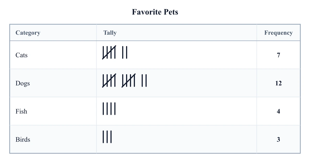
Tally Chart Generator
Make a tally chart from your own counts: draw tally marks grouped in fives plus a frequency column for any categories, then export SVG or PNG.
 Research
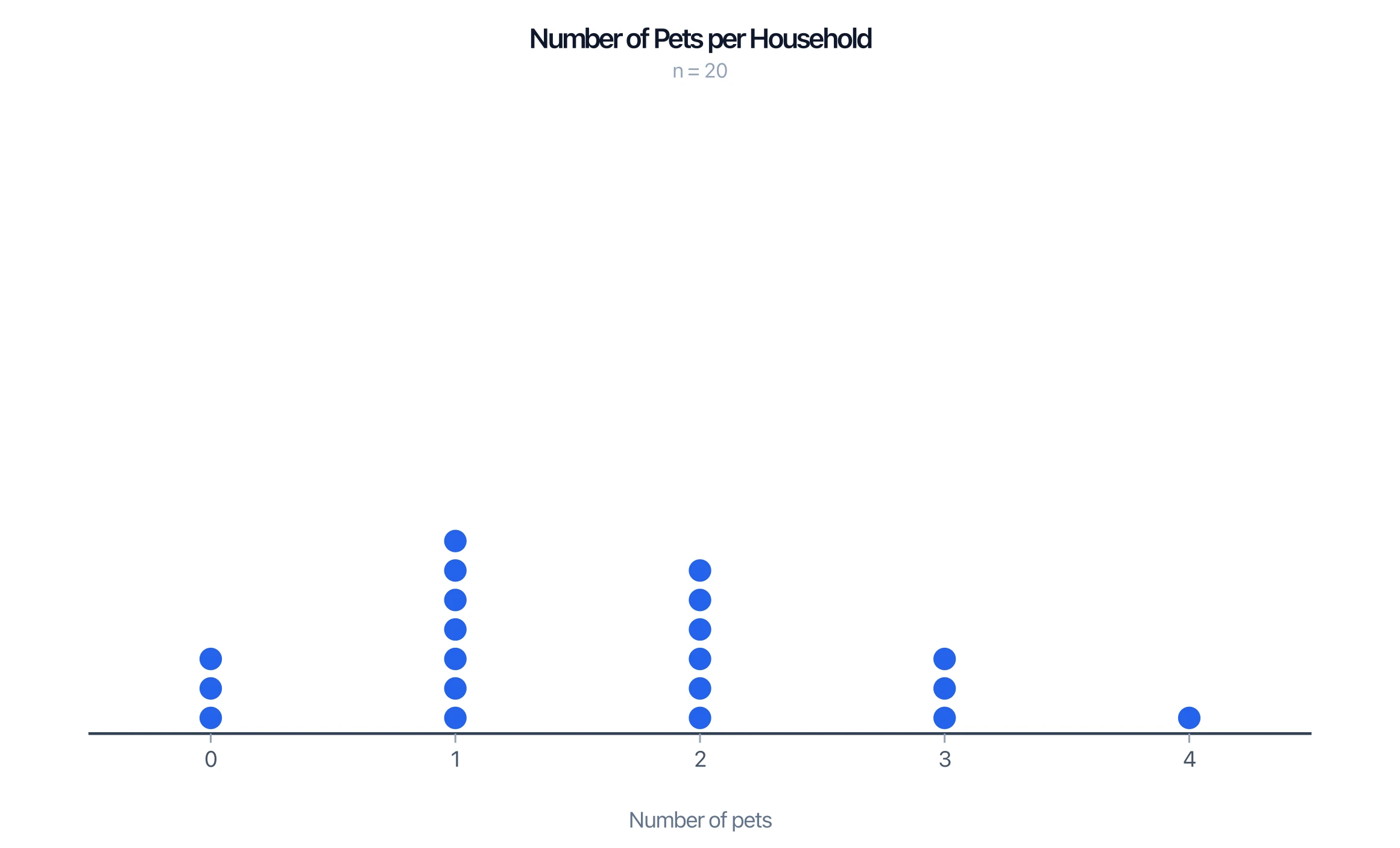
Dot Plot Generator
Make a dot plot or line plot from your own data. Stack frequencies on a number line, show mean and median, and export PNG or SVG — free.
 Research
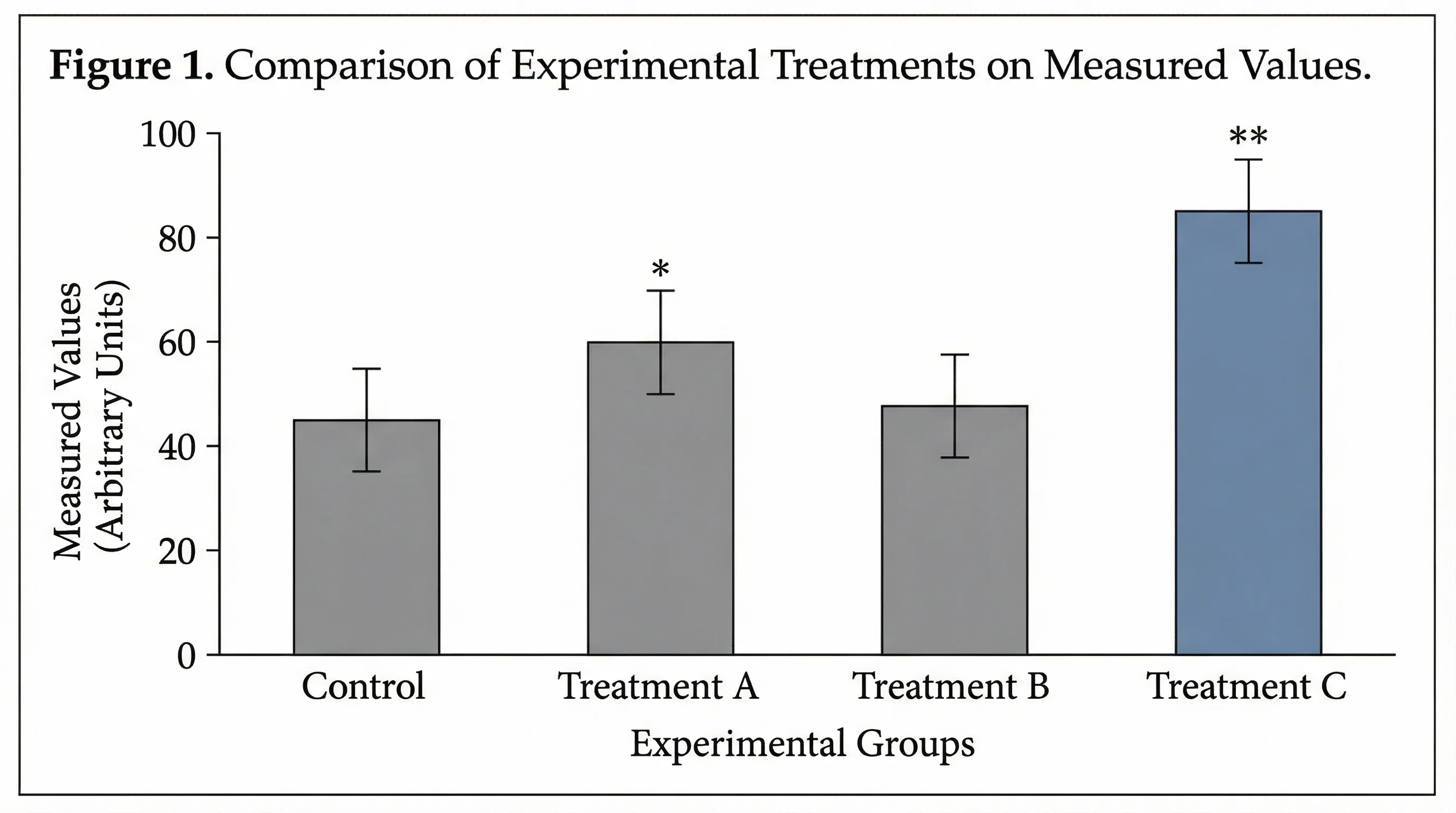
Bar Chart Maker
Create horizontal, grouped, and stacked bar charts for rankings, comparisons, and classroom data visualization.