Tally Chart Generator Tally
Make a tally chart from your own counts: draw tally marks grouped in fives plus a frequency column for any categories, then export SVG or PNG.
4 categories · total 26
Tally Chart Examples
Common ways to build a tally chart
Favorite Pets Tally Chart
A survey of favorite pets — Cats, Dogs, Fish, and Birds — with tally marks grouped in fives and an exact frequency count for each.
Weather Days Tally Chart
A month of weather observations recorded as tally marks, showing how the exact engine handles four categories at once.
Class Election Tally Chart
A worksheet-style tally chart counting votes for a class election, a classic use case for tally marks in the classroom.
Favorite Fruit Tally Chart
A survey of favorite fruits with tally marks grouped in fives and an exact frequency column.
Tally Chart to Bar Graph
A tally chart paired with its matching bar graph — useful for teaching how raw tally counts become a graphed frequency.
Dice Roll Tally Chart
A six-category tally chart counting dice rolls — a common probability and data-handling classroom activity.
What is a tally chart?
A tally chart is one of the first tools students meet for organizing data by hand: as each item, vote, or observation comes in, you make one tally mark next to its category. Once counting is done, the marks in each row are added up into a frequency — the total number of times that category occurred. Tally charts are quick to build on the fly (no calculator needed) and make it easy to see, at a glance, which categories have the most and fewest observations. This generator builds an exact tally chart from any list of categories and counts, drawing real tally marks and a frequency column automatically.
How tally marks work in groups of five
- Tally marks are almost always grouped in fives: four single vertical strokes, then a fifth stroke drawn diagonally across the first four. That diagonal "gate" makes each group instantly countable at a glance — five, ten, fifteen — without having to count individual strokes one by one.
- This generator works out that grouping automatically for any count: a value of 12, for example, becomes two complete groups of five (drawn as two gates) plus two leftover single strokes, for 2 × 5 + 2 = 12. A value of 7 becomes one gate plus two singles, and a value under 5 is drawn as plain single strokes.
- Because the breakdown is exact integer division and remainder, the picture always matches the number precisely — there is no rounding or approximation in how many strokes are drawn.
Tally chart vs. frequency table
- A tally chart and a frequency table describe the same data, just at two different stages. The tally chart is the "counting" stage — marks are added one at a time as data comes in, which is why tally charts are so useful for live counting (like a quick class survey or a die-rolling experiment).
- The frequency table is the "result" stage: once counting is finished, each tally group is converted into its final number. This generator shows both at once — the tally marks and the frequency column side by side — so students can see exactly how the marks add up to the total.
- That combined view is also what most worksheets and textbooks expect: a three-column layout of Category, Tally, and Frequency.
Common classroom uses
- Tally charts show up across elementary and middle-school math: recording favorite colors, pets, or fruits in a class survey; tracking dice or spinner results in a probability activity; counting votes in a class election; or logging daily weather over a month.
- They are also the natural first step before building a bar graph or pictograph from the same data — many lessons ask students to tally first, then graph, then compare the two representations.
- Because tally charts read left to right — category, tally, frequency — they translate directly into a bar graph's categories and heights, which is why they are taught together so often.
Free tool, printable and exportable
- Add as many categories as you need, edit each label and count directly, or paste rows of "Category, count" text and the generator parses it instantly.
- Toggle the header row on or off, pick a mark color, and add an optional title to match a worksheet or lesson.
- Everything renders in your browser and exports as a crisp SVG or a high-resolution PNG, so the tally chart prints sharply at any size and drops cleanly into worksheets, slides, or handouts.
Frequently Asked Questions
Related Math Tools
 Research
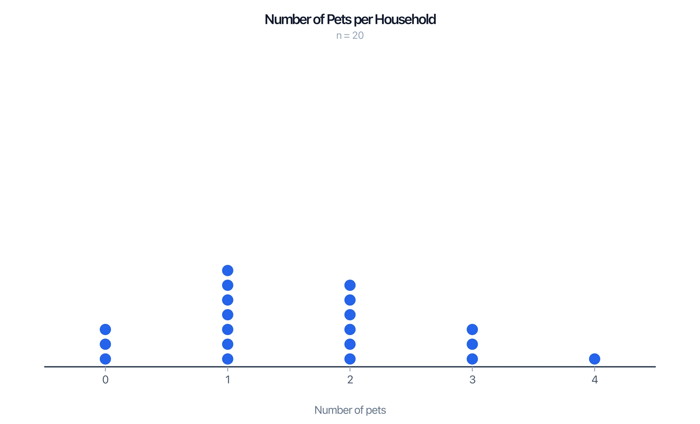
Dot Plot Generator
Make a dot plot or line plot from your own data. Stack frequencies on a number line, show mean and median, and export PNG or SVG — free.
 Education
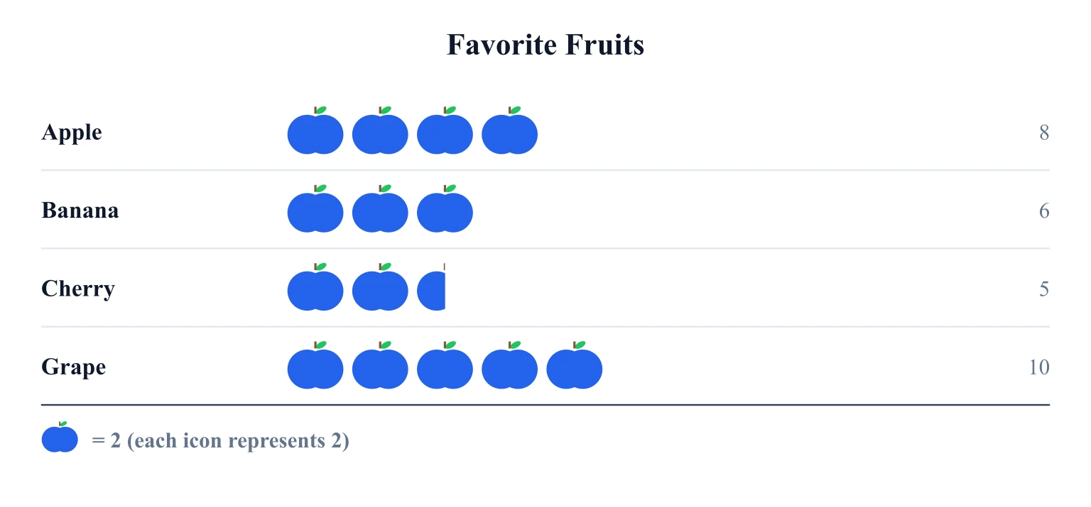
Pictograph Generator
Make a pictograph (picture graph) online — pick an icon, set the key value, enter categories, and export a clean SVG or PNG.
 Research
Bar Chart Maker
Create horizontal, grouped, and stacked bar charts for rankings, comparisons, and classroom data visualization.