
Bode Plot Generator Guide: Make Magnitude and Phase Plots from a Transfer Function
Learn how to use a Bode plot generator, enter transfer functions correctly, read magnitude and phase plots, and avoid common frequency-response mistakes.
A Bode plot generator turns a transfer function into two frequency-response charts: a magnitude plot and a phase plot. That sounds simple, but most mistakes happen before the graph appears. Users enter coefficients in the wrong order, mix hertz and radians per second, forget a gain factor, or read the phase plot without checking the gain crossover.
This guide explains the practical workflow: what a Bode plot shows, how to prepare a transfer function, what to enter in an online generator, how to read magnitude and phase, and how to spot results that do not make physical sense.

Bode Plot Generator
Enter numerator and denominator coefficients, generate magnitude and phase plots, and export SVG, PNG, or CSV.
Generate a Bode plot ->Quick Answer: How Do You Use a Bode Plot Generator?
To use a Bode plot generator:
- Write the system as a transfer function, such as
H(s) = 10 / (s^2 + 2s + 10). - Check whether the tool expects a full expression or numerator and denominator coefficients.
- If it uses coefficients, enter them in descending powers of
s. - Set the frequency range if the default range does not include your corner frequencies.
- Generate the magnitude plot in decibels and the phase plot in degrees.
- Look for corner frequencies, slope changes, gain crossover, phase crossover, gain margin, and phase margin.
- Compare the shape against the poles, zeros, and gain in your transfer function.
If you only need a quick graph for a homework check, an online generator is usually enough. If you need exact control-design decisions, validate the result in MATLAB, Python Control Systems Library, Wolfram Language, or another trusted engineering tool.
A Bode plot is also a chart-reading problem: clean axes, labels, and scale choices matter as much as the calculation.
What a Bode Plot Shows
A Bode plot describes how a linear time-invariant system responds to sine-wave inputs at different frequencies. It is usually shown as two stacked graphs with the same logarithmic frequency axis:
| Plot | What it shows | Common unit |
|---|---|---|
| Magnitude plot | Output-to-input gain versus frequency | dB |
| Phase plot | Phase shift between input and output versus frequency | degrees |
Wikipedia's Bode plot overview describes the standard pair as a magnitude plot and a phase plot for the frequency response of a system. Rohde & Schwarz's Bode plot explanation emphasizes why this matters in real systems: Bode plots help analyze magnitude and phase changes and are often used to assess feedback stability.
In plain terms, the magnitude plot answers:
- Does the system amplify or attenuate this frequency?
- Where does the response start dropping?
- How steep is the roll-off?
- Is the system still above or below 0 dB at a key frequency?
The phase plot answers:
- How much timing lag does the system add?
- Is the output close to inverted at this frequency?
- How much phase margin remains before feedback becomes risky?
- Does a pole, zero, delay, or filter stage explain the shift?
For filters, amplifiers, power electronics, sensors, and control loops, those two plots often reveal more than a time-domain graph alone.
Generator vs Calculator vs Plotter
Search results use several names for the same workflow:
| Search term | Usually means |
|---|---|
| Bode plot generator | Enter a transfer function and generate plots |
| Bode plot calculator | Calculate magnitude, phase, and sometimes margins |
| Bode plotter | Interactive plotting tool, often with zoom/export |
| Frequency response plotter | Broader tool that may include Bode, Nyquist, Nichols, and step response |
For example, GetZenQuery's Bode Plot Generator asks for numerator and denominator coefficients and plots magnitude and phase. CtrlSolve accepts a transfer function and also provides Nyquist, Nichols, pole-zero, root-locus, and time-domain response plots.
The naming is less important than the input format. A good generator should make it clear whether it wants:
- A symbolic transfer function, such as
10/(s^2 + 2s + 10) - Numerator coefficients, such as
10 - Denominator coefficients, such as
1, 2, 10 - Pole-zero-gain form
- Frequency-response data measured from a real system
Most mistakes come from using the right tool with the wrong input format.
Step 1: Prepare the Transfer Function
A transfer function describes the ratio of output to input in the Laplace domain:
H(s) = output(s) / input(s)For Bode plotting, the tool evaluates the function on the imaginary axis by substituting s = j*omega, where omega is angular frequency. That is why Bode plots use a frequency axis rather than a time axis.
Common examples:
| System | Transfer function | Expected Bode shape |
|---|---|---|
| First-order low-pass filter | 1 / (s + 1) | Flat at low frequency, then rolls off |
| First-order high-pass filter | s / (s + 1) | Low at low frequency, flat at high frequency |
| Integrator | 1 / s | Magnitude decreases at -20 dB/decade |
| Second-order system | omega_n^2 / (s^2 + 2*zeta*omega_n*s + omega_n^2) | Possible resonance peak |
| Lead compensator | (s + z) / (s + p) with z < p | Phase lead over a frequency band |
Before entering anything into a generator, simplify the transfer function enough that you know the poles, zeros, and gain. You do not need to hand-plot every line, but you should know what broad shape to expect.
For control systems, the Bode plot is often created from the open-loop transfer function before closing the feedback loop.
Step 2: Enter Numerator and Denominator Coefficients Correctly
Many online generators ask for coefficients rather than a full expression. In that case, coefficient order matters.
For this transfer function:
H(s) = 10 / (s^2 + 2s + 10)Use:
| Field | Correct input |
|---|---|
| Numerator | 10 |
| Denominator | 1, 2, 10 |
The denominator coefficients are in descending powers of s:
1*s^2 + 2*s + 10For this transfer function:
H(s) = (2s + 5) / (s^2 + 3s + 2)Use:
| Field | Correct input |
|---|---|
| Numerator | 2, 5 |
| Denominator | 1, 3, 2 |
Common coefficient errors:
- Entering denominator coefficients in reverse order.
- Leaving out zero coefficients, such as entering
1, 1fors^2 + 1instead of1, 0, 1. - Putting gain in both the numerator and a separate gain field.
- Typing
s+1into a field that expects numbers only. - Using commas in one field and spaces in another when the tool only supports one separator.
Wolfram's BodePlot documentation is useful if you are working in symbolic or programmatic form because it treats Bode plotting as a frequency-response visualization of a system model rather than only a coefficient form.
Step 3: Choose the Frequency Range
If the plot looks flat, empty, or strangely compressed, the frequency range is often wrong.
A useful range should include the important corner frequencies from the poles and zeros. If your first-order system has a pole near omega = 10 rad/s, a range from 0.1 to 1000 rad/s usually gives enough context. If the range is 1000 to 100000, you may miss the interesting transition.
Use this rule of thumb:
| Situation | Frequency range suggestion |
|---|---|
| One known corner frequency | Plot two decades below and two decades above |
| Several poles and zeros | Cover below the smallest and above the largest |
| Unknown system | Start wide, then zoom into slope and phase changes |
| Measured data | Use the actual measurement range and do not extrapolate too far |
Also check the unit:
omegausually means radians per second.fusually means hertz.omega = 2*pi*f.
Mixing hertz and radians per second shifts the plot horizontally. The curve shape may look correct, but the cutoff or crossover frequency will be wrong.
Step 4: Read the Magnitude Plot
Magnitude is usually shown in decibels:
magnitude in dB = 20 * log10(|H(j*omega)|)That conversion is why a gain of 1 becomes 0 dB, a gain of 10 becomes 20 dB, and a gain of 0.1 becomes -20 dB.
Key things to read:
Low-frequency gain
Look at the left side of the plot. Does the system pass slow changes, block them, or amplify them?
- Low-pass filters often start flat.
- High-pass filters often start very low.
- Integrators can trend upward as frequency approaches zero.
Corner frequency
Corner frequencies are where the slope changes. In a simple first-order low-pass filter, the corner frequency is also near the -3 dB point.
Slope
Poles and zeros change the slope. A simple pole usually adds about -20 dB/decade. A simple zero usually adds about +20 dB/decade. Multiple poles or zeros stack.
Gain crossover
The gain crossover frequency is where the magnitude crosses 0 dB. In feedback analysis, you read phase margin at this frequency.
MathWorks' Bode plot overview is a helpful reference for connecting Bode plots with control-system workflows, including frequency response and design analysis.
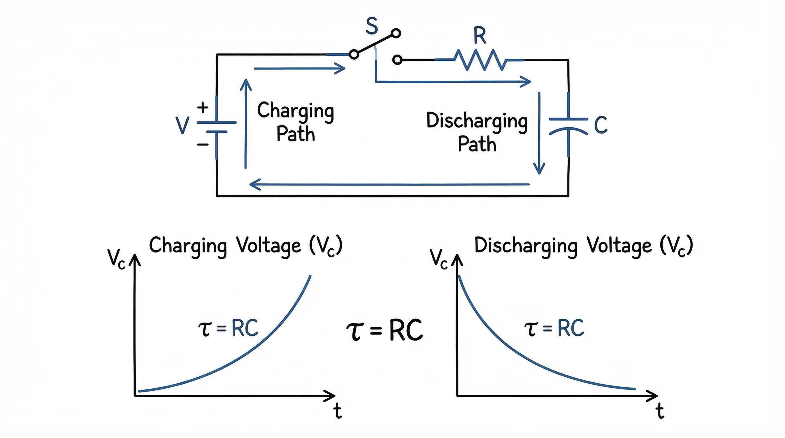
A first-order RC circuit is one of the simplest physical systems where a Bode plot makes the cutoff behavior visible.
Step 5: Read the Phase Plot
The phase plot shows how much the output is shifted relative to the input. A phase of 0 degrees means no phase shift. A phase near -90 degrees means the output lags by a quarter cycle. A phase near -180 degrees means the output is nearly inverted.
Important phase questions:
- What is the phase at low frequency?
- What is the phase at the gain crossover frequency?
- Does the phase keep decreasing because of additional poles or delay?
- Does a zero add phase lead in the expected range?
For feedback systems, the phase plot is not optional. A system can look acceptable in magnitude but still have poor phase margin. That is why Bode plots are usually read as a pair, not as two unrelated charts.
Gain Margin and Phase Margin
Many Bode plot generators show gain margin and phase margin automatically. If they do not, you can read them from the plots.
| Metric | How to read it | Why it matters |
|---|---|---|
| Phase margin | Phase distance from -180 degrees at gain crossover | Indicates how close feedback is to oscillation |
| Gain margin | Gain distance from 0 dB at phase crossover | Indicates how much gain can increase before instability |
| Gain crossover | Frequency where magnitude crosses 0 dB | Used to read phase margin |
| Phase crossover | Frequency where phase crosses -180 degrees | Used to read gain margin |
A larger margin generally means more robustness, but "larger" is not always "better." A very conservative control loop may be stable but slow. A very aggressive loop may respond quickly but have poor robustness. The Bode plot helps you see that tradeoff.
Exact Plot vs Hand-Sketched Asymptotes
Engineering courses often teach hand-sketched Bode plots using straight-line asymptotes. Online generators usually draw the exact curve. Both are useful:
| Method | Best for |
|---|---|
| Hand sketch | Understanding poles, zeros, slopes, and approximations |
| Online generator | Fast exact plot for homework checks or design iteration |
| MATLAB/Python/Wolfram | Reproducible engineering analysis |
| Oscilloscope/network analyzer | Measured physical system response |
LAPLACE Calculator's Bode plot guide discusses corner frequencies and asymptotic approximations. That matters even when you use software, because it gives you a mental check against obviously wrong output.
Generated plots should still be checked against the expected pattern. A smooth curve can still be wrong if the input model was wrong.
Common Bode Plot Generator Mistakes
Reversing coefficient order
If a denominator is s^2 + 3s + 2, enter 1, 3, 2, not 2, 3, 1.
Forgetting zero coefficients
For s^2 + 1, enter 1, 0, 1. The missing s term still needs a coefficient.
Mixing Hz and rad/s
If your expected cutoff is 100 Hz, the angular frequency is approximately 628 rad/s. A rad/s plot will not place that cutoff at 100.
Plotting the closed-loop function when you meant open-loop
For stability margins, courses often ask for the open-loop transfer function. The closed-loop function answers a different question.
Ignoring phase wrap
Some tools wrap phase into a limited range, while others unwrap phase continuously. A jump from -180 to +180 degrees may be display convention rather than a physical discontinuity.
Trusting the graph without checking poles and zeros
If the plot shape contradicts the transfer function, check the input first. A generator cannot infer the system you meant to type.
Which Tool Should You Use?
Choose based on the task:
| Task | Recommended option |
|---|---|
| Quick homework check | Online Bode plot generator |
| Learning by hand | Tutorial plus asymptotic sketch |
| Control design | MATLAB, Python Control Systems Library, Wolfram, or a validated engineering package |
| Circuit measurement | Oscilloscope, frequency response analyzer, or simulation tool |
| Report or presentation visual | Export a clean chart and label axes carefully |
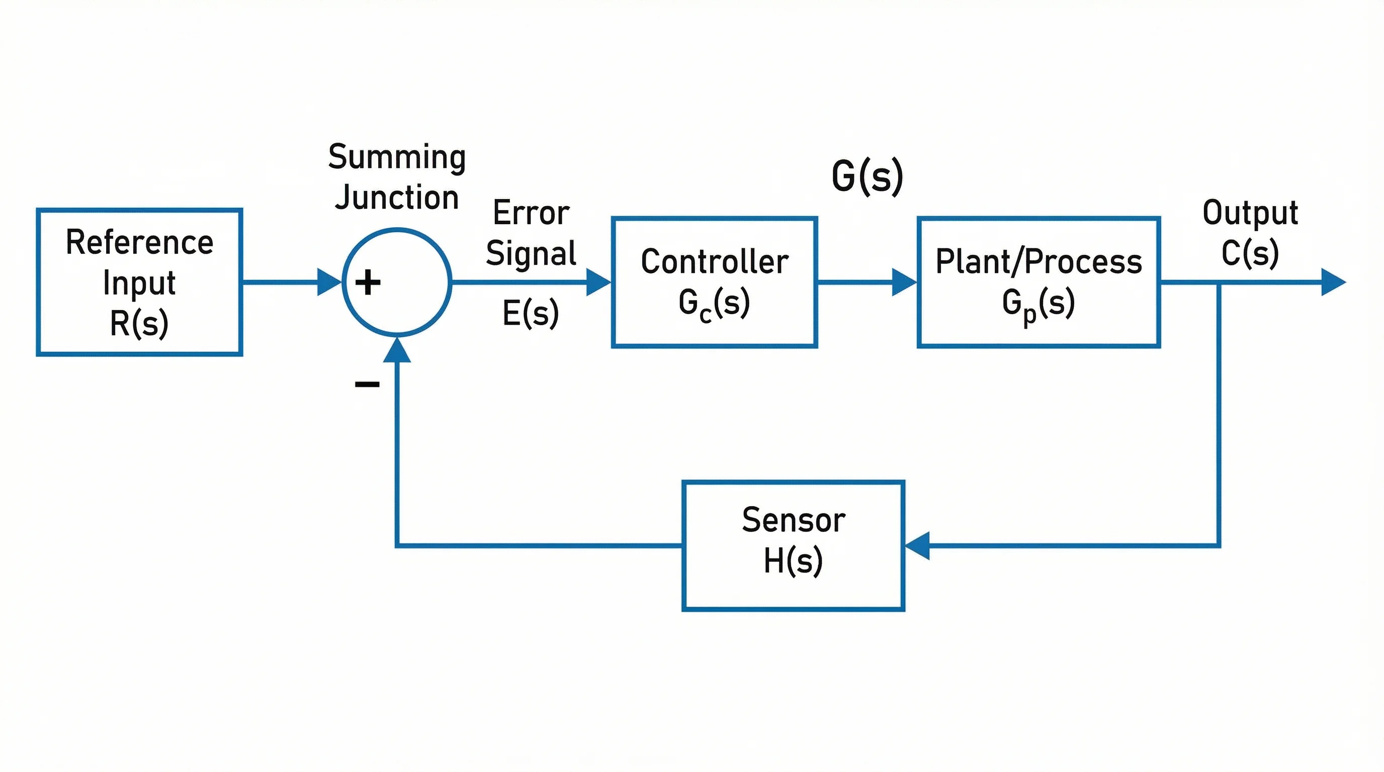
If you need diagrams around the Bode plot, such as a feedback control block diagram or circuit setup, use a dedicated diagram tool. For example, ConceptViz has a block diagram generator, circuit diagram maker, and schematic diagram maker for the surrounding visual context.
Block Diagram Generator
Create feedback loops, signal paths, and control-system architecture diagrams for engineering notes and presentations.
Circuit Diagram Maker
Generate clean circuit diagrams for filters, amplifiers, and electronics teaching materials.
A Practical Example
Suppose your system is:
H(s) = 10 / (s^2 + 2s + 10)Before using a generator, reason through the expected behavior:
- The numerator gain is
10. - The denominator is second order.
- At low frequency, substituting
s = 0givesH(0) = 1, or0 dB. - At high frequency, the
s^2term dominates, so the magnitude should roll off. - Because it is second order, the high-frequency slope should approach
-40 dB/decade. - Depending on damping, the phase should move toward about
-180 degrees.
Then enter:
Numerator: 10
Denominator: 1, 2, 10
If the generated magnitude starts far away from 0 dB, the gain may be entered incorrectly. If the slope is not close to -40 dB/decade at high frequency, the denominator may be wrong. If the plot never shows the transition, expand the frequency range.
This mental check is fast, and it catches many input mistakes before they become misleading conclusions.
How to Use a Bode Plot in a Report
For homework, lab reports, and engineering documentation, do not paste an unlabeled screenshot. Include enough context for the reader to interpret the plot:
- State the transfer function or measured system.
- Label frequency units clearly.
- Label magnitude in dB.
- Label phase in degrees.
- Show the frequency range.
- Mark gain crossover or phase margin if those are part of the analysis.
- Mention whether the plot is exact, asymptotic, simulated, or measured.
- Include a caption that explains the main takeaway.
Example caption:
Bode plot of H(s) = 10 / (s^2 + 2s + 10). The magnitude is approximately flat at low frequency and rolls off at high frequency, while phase approaches -180 degrees as the second-order dynamics dominate.For broader figure formatting, see our research data visualization best practices and scientific color palette guide.
Frequently Asked Questions
What is a Bode plot generator?
A Bode plot generator is an online or software tool that evaluates a transfer function over a frequency range and draws the magnitude and phase response. Most generators either accept a symbolic transfer function or separate numerator and denominator coefficients.
What should I enter for numerator and denominator coefficients?
Enter coefficients in descending powers of s. For H(s) = 10 / (s^2 + 2s + 10), the numerator is 10 and the denominator is 1, 2, 10. If a term is missing, include a zero coefficient, such as 1, 0, 1 for s^2 + 1.
Why does my Bode plot look flat?
The frequency range may not include the important corner frequencies, or the transfer function may have been entered incorrectly. Try plotting several decades below and above the expected poles and zeros, then check coefficient order and gain.
Is a Bode plot frequency in hertz or radians per second?
Many engineering tools use angular frequency in radians per second, but some interfaces allow hertz. Check the axis label or settings. The conversion is omega = 2*pi*f, so mixing the units shifts the plot horizontally.
What is the difference between magnitude and phase in a Bode plot?
Magnitude shows how strongly the system amplifies or attenuates each input frequency, usually in dB. Phase shows how much the output is shifted in time relative to the input, usually in degrees. Both are needed to understand frequency response.
Can I use a Bode plot generator for control-system stability?
Yes, if the generator reports or lets you read gain margin and phase margin from the open-loop transfer function. For real design decisions, verify the result in a trusted control-systems package and confirm that you entered the correct open-loop model.
Why does the phase jump from -180 degrees to 180 degrees?
That jump is usually phase wrapping. Some tools keep phase inside a fixed range, while others unwrap the phase curve continuously. The underlying response may be smooth even when the displayed phase appears to jump.
Should I use an online Bode plot generator or MATLAB?
Use an online generator for quick checks, learning, and simple homework examples. Use MATLAB, Python Control Systems Library, Wolfram Language, or another validated engineering environment when the analysis needs to be reproducible, documented, or used for design decisions.
Conclusion
A Bode plot generator is useful when it speeds up the calculation without hiding the engineering logic. The safest workflow is simple: understand the transfer function, enter numerator and denominator terms correctly, choose a frequency range that includes the important dynamics, and read magnitude and phase together.
If the plot does not match the poles, zeros, gain, and expected slope, do not assume the system is strange. Check the input first. Most bad Bode plots come from a coefficient, unit, or model-selection mistake rather than from the plotting tool itself.
For a complete engineering visual, pair the Bode plot with a block diagram, circuit diagram, or schematic that shows what system the frequency response belongs to. That gives readers both the math and the physical context.
Catégories
Plus d'articles
")
How to Make a Bar Chart in Excel: Step-by-Step Guide (2026)
Learn how to create a bar chart in Excel, sort categories, adjust gap width, add labels, and choose between bar and column charts. Includes Microsoft and ExcelJet references.
")
7 Best Free Prezi Alternatives in 2026 (Ranked)
Looking for a free Prezi alternative? Compare 7 best options with zoom effects & animations—Google Slides, Canva, Genially & more. No $59/month needed.
")
Lucidspark Alternatives: 8 Best Free Tools (2026)
Compare the 8 best free Lucidspark alternatives for 2026. FigJam, Miro, Excalidraw, Canva Whiteboard & more — unlimited brainstorming without the paywall.