")
Research Data Visualization: Best Practices & Tools for Scientists (2026 Guide)
Master scientific data visualization with proven best practices. Learn to choose the right charts, use color effectively, and discover free tools for creating publication-ready figures.
A poorly designed chart can bury your findings. A well-designed one can make them unforgettable.
As Knowable Magazine notes, "The scientific literature is riddled with bad charts and graphs, leading to misunderstanding and worse." Yet data visualization remains one of the most undertaught skills in graduate programs.
This guide covers everything researchers need to create effective, publication-ready visualizations—from fundamental principles to specific tools and techniques.
Why Data Visualization Matters in Research
Before diving into techniques, let's understand what's at stake:
| Impact Area | Poor Visualization | Effective Visualization |
|---|---|---|
| Comprehension | Readers struggle to understand findings | Key insights are immediately clear |
| Credibility | Appears unprofessional or misleading | Builds trust in your methodology |
| Citations | Findings get overlooked | Work gets shared and cited |
| Review Process | Reviewers request major revisions | Smooth path to acceptance |
| Public Impact | Research stays in academic silos | Findings reach broader audiences |
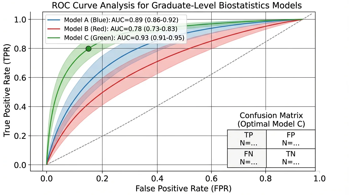
A well-designed ROC curve clearly communicates model performance, making complex statistical concepts accessible to readers
The Foundation: Define Your Purpose First
According to Simplified Science Publishing, every visualization should start with a clear purpose. The four main purposes for scientific data visualization are:
- Explain a process or method
- Compare or contrast
- Show change over time
- Establish relationships
Your purpose determines your chart type. Getting this wrong is the most common visualization mistake.
The Data Purpose Framework
| Purpose | Best Chart Types | Example Use Case |
|---|---|---|
| Explain process | Flowcharts, diagrams, Sankey diagrams, timelines | Showing experimental methodology |
| Compare/contrast | Bar charts, box plots, grouped charts, bullet charts | Treatment vs. control groups |
| Show change | Line charts, area charts, slope graphs | Longitudinal study results |
| Establish relationships | Scatter plots, heat maps, network diagrams, chord diagrams | Correlation between variables |
Choosing the Right Chart Type
For Categorical Comparisons
Bar Charts remain the workhorse of scientific visualization, but they're often overused. According to the Johns Hopkins Data Visualization Guide, many alternatives provide more information:
- Box plots — Show variability and distribution
- Scatter plots — Reveal sample size, outliers, and clusters
- Violin plots — Combine box plot information with density distribution
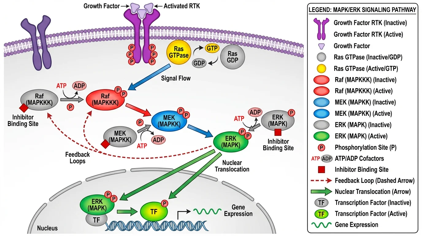
Complex relationships like this signaling pathway require thoughtful visualization choices to communicate multiple variables and interactions
For Time Series Data
| Chart Type | Best For | Avoid When |
|---|---|---|
| Line chart | Continuous trends, few series | More than 5-7 lines |
| Area chart | Part-to-whole over time | Overlapping makes comparison difficult |
| Slope graph | Two time points, many categories | More than 2 time points |
| Sparklines | Inline trends in tables | Precise values matter |
For Distributions
- Histogram — Single variable distribution
- Density plot — Smoother distribution visualization
- Box plot — Compare distributions across groups
- Violin plot — Distribution shape with statistical summary
For Relationships
- Scatter plot — Two continuous variables
- Bubble chart — Three variables (x, y, size)
- Heat map — Matrix of values across categories
- Network diagram — Connections between entities
The Seven Principles of Effective Visualization
The Michigan State University Library Guide identifies seven criteria for judging visualization effectiveness:
1. Usefulness
Does the visualization meet your audience's needs? A figure for journal reviewers differs from one for a conference poster or public presentation.
Ask yourself:
- Who will view this?
- What decision or understanding should it enable?
- What's their technical background?
2. Completeness
Include all necessary information—and nothing more. Every element should serve a purpose.
Must include:
- Clear title describing the finding
- Axis labels with units
- Legend (if multiple series)
- Sample size indicators
- Statistical significance markers
Often unnecessary:
- Gridlines (use sparingly)
- Decorative elements
- 3D effects
- Excessive decimal places
3. Perceptibility
Can viewers understand the visualization with minimal effort? The George Washington University Guide distinguishes between:
- Exploratory visualizations — For your own data analysis
- Explanatory visualizations — For communicating to others
Publication figures should be explanatory—immediately clear to someone seeing them for the first time.
4. Truthfulness
Never distort data to make findings appear more significant. Common distortions to avoid:
| Distortion | Problem | Solution |
|---|---|---|
| Truncated y-axis | Exaggerates differences | Start at zero for bar charts |
| Cherry-picked time range | Hides context | Show relevant full range |
| Misleading scales | Incomparable panels | Use consistent scales |
| 3D effects | Distorts perception | Stick to 2D |
5. Intuitiveness
Use familiar conventions. Readers shouldn't need to learn a new visual language to understand your figure.
- Time flows left to right
- Larger = more
- Red = negative/danger, Green = positive (but consider colorblindness)
- Up = increase
6. Aesthetics
Visual appeal matters for engagement. Clean, professional figures signal careful research.
Design tips:
- Consistent color palette throughout paper
- Adequate white space
- Aligned elements
- Professional fonts (see our font guide)
7. Engagement
The best visualizations tell a story. Guide the viewer's eye to your key finding.
Using Color Effectively
Color is powerful but frequently misused. The University at Buffalo Data Visualization Guide emphasizes strategic color use.
Color Best Practices
1. Use color to encode meaning, not decoration
Every color should represent something. Random colors confuse readers.
2. Design for colorblindness
Approximately 1 in 12 men and 1 in 200 women have some form of color vision deficiency. Tools for creating accessible palettes:
- ColorBrewer — Colorblind-safe palettes
- Viz Palette — Test palettes for accessibility
- Color Safe — WCAG-compliant combinations
3. Ensure print compatibility
Many journals still print in grayscale. Test your figures in black and white.
4. Limit your palette
3-5 colors maximum. More creates visual noise.
For detailed guidance, see our scientific color palette guide.
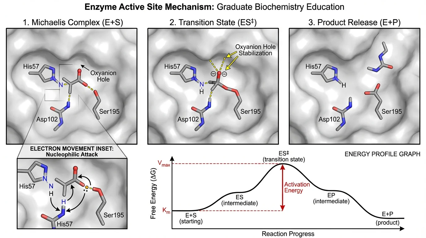
This enzyme mechanism uses color strategically—different colors distinguish substrate, enzyme, and products while maintaining accessibility
Eliminating Chartjunk
Edward Tufte coined the term "chartjunk" for visual elements that don't contribute to understanding. Ruthlessly eliminate:
| Chartjunk | Why It's Harmful | Alternative |
|---|---|---|
| 3D effects | Distorts proportions | Use 2D |
| Excessive gridlines | Visual noise | Light or no gridlines |
| Decorative images | Distracts from data | Let data speak |
| Gradient fills | Harder to read values | Solid colors |
| Heavy borders | Clutters appearance | Subtle or no borders |
| Redundant labels | Information overload | Label once |
The Data-Ink Ratio
Tufte advocates maximizing the "data-ink ratio"—the proportion of ink devoted to displaying data versus non-data elements. Higher is better.
Before: Heavy gridlines, 3D bars, gradient fills, decorative border After: Clean bars, minimal gridlines, clear labels, white space
Journal Requirements and Specifications
Before creating figures, check your target journal's requirements. Common specifications:
Figure Dimensions
| Journal | Single Column | Double Column |
|---|---|---|
| Nature | 89 mm | 183 mm |
| Science | 55 mm | 230 mm |
| Cell | 85 mm | 174 mm |
| PLOS ONE | 83 mm | 173 mm |
Resolution Requirements
- Line art: 1000-1200 DPI
- Halftones (photos): 300 DPI minimum
- Combination: 500-600 DPI
File Formats
Most journals accept:
- TIFF — Preferred for final submission
- EPS — Vector graphics
- PDF — Some journals
- PNG — Web versions
For comprehensive journal figure guidelines, see our guide on making figures for Nature, Science, and Cell.
Free Tools for Research Data Visualization
General-Purpose Tools
| Tool | Best For | Learning Curve | Link |
|---|---|---|---|
| RAWGraphs | Unconventional chart types | Low | rawgraphs.io |
| Flourish | Interactive, narrative visualizations | Low | flourish.studio |
| Datawrapper | Quick charts, maps, tables | Low | datawrapper.de |
| Tableau Public | Complex dashboards | Medium | public.tableau.com |
| Google Charts | Web-embedded charts | Medium | developers.google.com/chart |
Statistical & Scientific Tools
| Tool | Best For | Learning Curve | Link |
|---|---|---|---|
| GraphPad Prism | Life sciences, statistics | Medium | graphpad.com |
| R + ggplot2 | Custom, publication-quality | High | ggplot2.tidyverse.org |
| Python + Matplotlib/Seaborn | Reproducible visualizations | High | matplotlib.org |
| JASP | Statistical visualization | Low | jasp-stats.org |
Network & Specialized Tools
| Tool | Best For | Learning Curve | Link |
|---|---|---|---|
| Gephi | Network analysis | Medium | gephi.org |
| VOSviewer | Bibliometric networks | Low | vosviewer.com |
| Cytoscape | Biological networks | Medium | cytoscape.org |
| ConceptViz | AI-generated diagrams | Low | conceptviz.app |
Data Preparation
| Tool | Purpose | Link |
|---|---|---|
| OpenRefine | Data cleaning | openrefine.org |
| Trifacta Wrangler | Data transformation | trifacta.com |
Step-by-Step: Creating Publication-Ready Figures
Step 1: Plan Your Figure
Before opening any software:
- Define the message — What should readers take away?
- Choose chart type — Based on data purpose
- Sketch layout — Rough paper sketch helps
- Check journal specs — Dimensions, format, color
Step 2: Prepare Your Data
- Clean and organize data
- Calculate summary statistics
- Identify outliers
- Format for your chosen tool
Step 3: Create Initial Visualization
- Start with defaults
- Focus on accuracy first
- Get the data displayed correctly
Step 4: Refine Design
Apply best practices:
- Remove chartjunk
- Add clear labels
- Apply accessible colors
- Ensure adequate contrast
Step 5: Add Context
- Descriptive title
- Axis labels with units
- Legend if needed
- Statistical annotations
Step 6: Export and Test
- Export at required resolution
- Test at actual print size
- Check grayscale version
- Verify on different screens
Multi-Panel Figures
Complex research often requires multi-panel figures. Best practices:
Layout Principles
- Consistent sizing — Panels should be comparable
- Clear labeling — A, B, C labels in consistent position
- Logical flow — Left-to-right, top-to-bottom
- Shared legends — Avoid redundancy
Panel Labels
| Style | Example | Best For |
|---|---|---|
| Bold capital | A, B, C | Most journals |
| Lowercase | a, b, c | Some biology journals |
| Parenthetical | (A), (B), (C) | Alternative style |
Alignment
- Align axes across panels when possible
- Use consistent scales for comparison
- Match color coding across panels
Common Mistakes and How to Fix Them
Mistake 1: Wrong Chart Type
Problem: Using a pie chart to show changes over time Fix: Match chart type to data purpose (use line chart for trends)
Mistake 2: Overcrowded Figures
Problem: Too much information in one figure Fix: Split into multiple panels or separate figures
Mistake 3: Missing Error Bars
Problem: No indication of variability Fix: Always show standard deviation, standard error, or confidence intervals
Mistake 4: Inconsistent Styling
Problem: Different fonts, colors, styles across figures Fix: Create a style template and apply consistently
Mistake 5: Low Resolution
Problem: Pixelated figures in final publication Fix: Work at publication resolution from the start
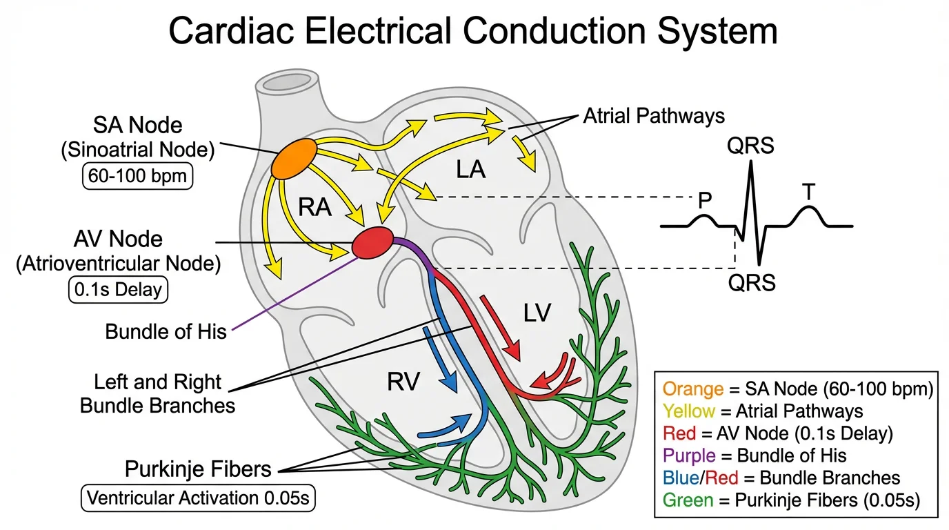
Medical diagrams require particular attention to accuracy and clarity—each element must be precisely positioned and labeled
Frequently Asked Questions
What is the best free tool for creating scientific figures?
It depends on your needs. For quick, professional charts, Datawrapper and Flourish are excellent browser-based options. For statistical plots in life sciences, GraphPad Prism offers a free trial. For maximum flexibility, R with ggplot2 or Python with Matplotlib are free and produce publication-quality figures, though they require coding skills. For AI-assisted diagram creation, ConceptViz generates scientific visuals from text descriptions.
What resolution should scientific figures be?
Most journals require 300 DPI minimum for photographs and halftones, 500-600 DPI for combination figures, and 1000-1200 DPI for line art. Always check your target journal's specific requirements. Work at final resolution from the start—upscaling low-resolution images produces poor results.
How do I make my figures colorblind-accessible?
Use colorblind-safe palettes from tools like ColorBrewer or Viz Palette. Avoid red-green combinations, which are problematic for the most common form of colorblindness. Use patterns, shapes, or labels in addition to color to distinguish elements. Always test your figures in grayscale to ensure they remain interpretable.
Should I use bar charts or scatter plots?
Scatter plots are generally preferred for continuous data as they show individual data points, revealing sample size, distribution, and outliers. Bar charts work well for categorical comparisons and when showing summary statistics. Many journals now require showing individual data points rather than just bar heights with error bars.
How many figures should a research paper have?
This varies by journal and field. Most journals allow 6-8 figures for full articles. Focus on quality over quantity—each figure should convey a distinct, important finding. Use multi-panel figures to combine related data. Additional figures can often go in supplementary materials.
What's the difference between exploratory and explanatory visualizations?
Exploratory visualizations are for your own data analysis—they help you understand patterns and generate hypotheses. They can be rough and quick. Explanatory visualizations communicate findings to others—they should be polished, clear, and guide readers to your key conclusions. Publication figures should always be explanatory.
How do I choose colors for my figures?
Start with a limited palette of 3-5 colors. Use established tools like ColorBrewer for scientifically-tested palettes. Ensure sufficient contrast between colors. Use color meaningfully—to encode data or highlight findings, not for decoration. Consider colorblind accessibility and grayscale printing.
Can I use Excel for publication figures?
Excel can create basic figures, but has limitations for publication-quality work. It lacks fine control over styling, produces lower resolution exports, and defaults to poor design choices. For quick drafts, Excel is fine, but consider tools like R, Python, GraphPad Prism, or dedicated visualization tools for final figures.
Conclusion
Effective data visualization is a skill that distinguishes impactful research from overlooked findings. The principles are straightforward:
- Define your purpose before choosing a chart type
- Choose the right visualization for your data and message
- Apply design best practices — eliminate chartjunk, use color strategically
- Ensure accessibility — colorblind-safe palettes, grayscale compatibility
- Meet technical requirements — resolution, dimensions, file formats
- Tell a story — guide readers to your key findings
Remember: your visualizations should make complex findings clear, not showcase technical complexity. The best figure is one that readers understand immediately.
Additional Resources
- Johns Hopkins Data Visualization Guide
- George Washington University DataViz Best Practices
- PLOS Computational Biology: Ten Simple Rules for Better Figures
- How to Make Figures for Nature, Science, Cell
- Scientific Color Palette Guide
- Best Fonts for Scientific Figures
- How to Create a Graphical Abstract
Ready to create stunning research visualizations? Try ConceptViz to generate professional scientific diagrams from simple text descriptions.
分類
更多文章
")
How to Create a Scatter Plot Diagram: Complete Guide for Researchers & Students (2026)
Learn how to draw a scatter diagram in Excel, Python, R, and with AI tools. Step-by-step scatter plot guide with best practices, examples, and common mistakes to avoid.
")
How to Make Figures for Nature, Science & Cell Journals (2026)
Step-by-step guide to submission-ready figures for Nature, Science & Cell. Exact dimensions, 300 DPI requirements, accepted formats, and font rules included.
")
Mapping Diagrams Explained: Complete Guide with Examples (2026)
Learn what mapping diagrams are, how to create them, and when to use them in mathematics and research. Complete guide with function mapping examples and free tools.