Production Possibilities Curve Generator
Make a PPC or PPF graph with two goods, increasing or constant opportunity cost, and capacity shifts. Edit labels and download exact SVG or PNG for free.
Maxima: 1 to 1,000,000 units in the same time period
Change productive capacity
Compare a new frontier with the original. Use a negative value for a contraction.
Each axis: -50% to +100%
Swipe the graph sideways to read the full axes
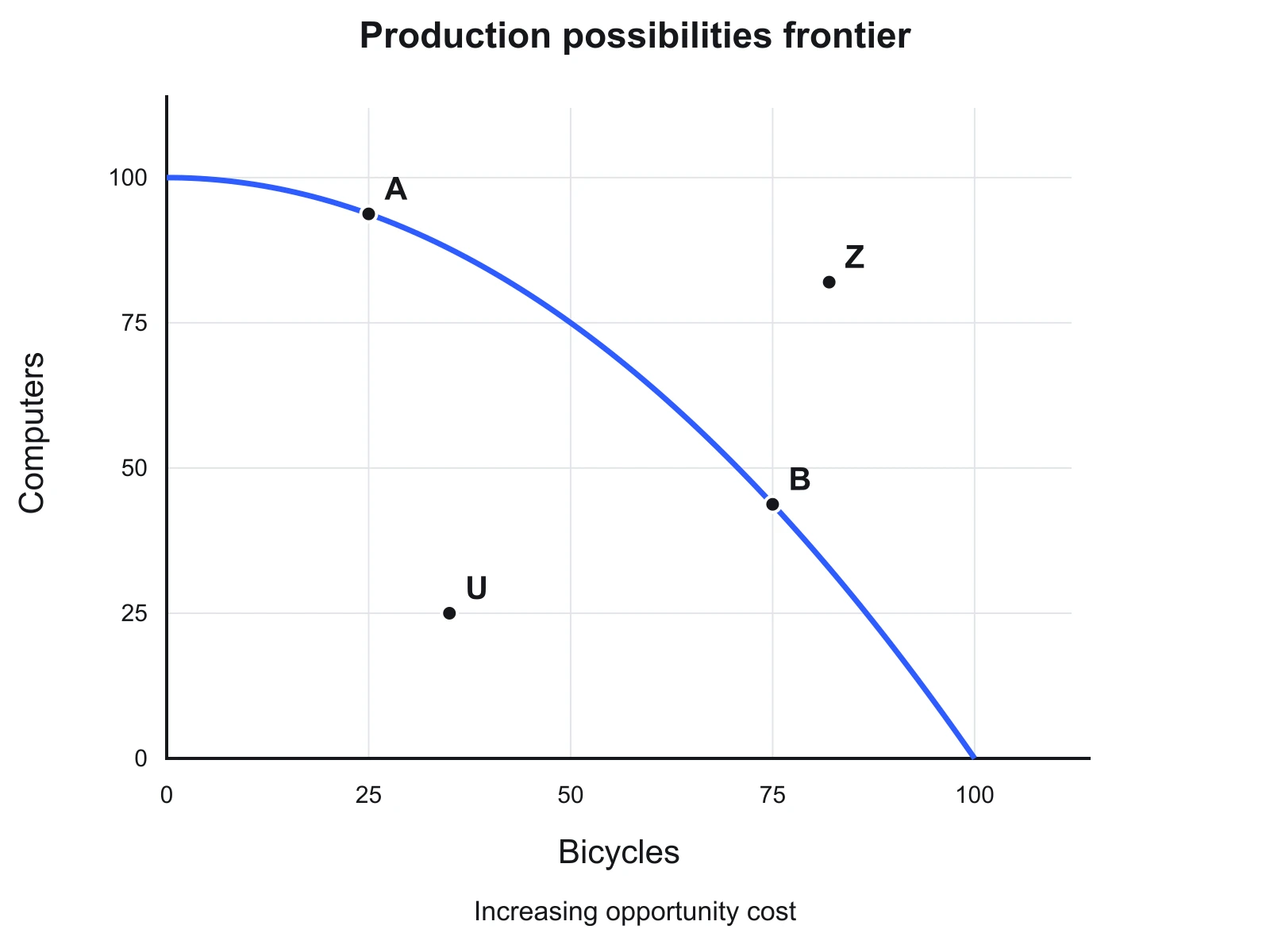
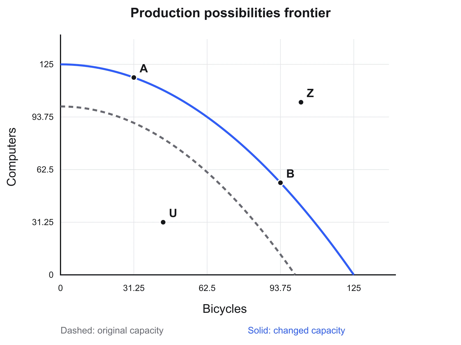
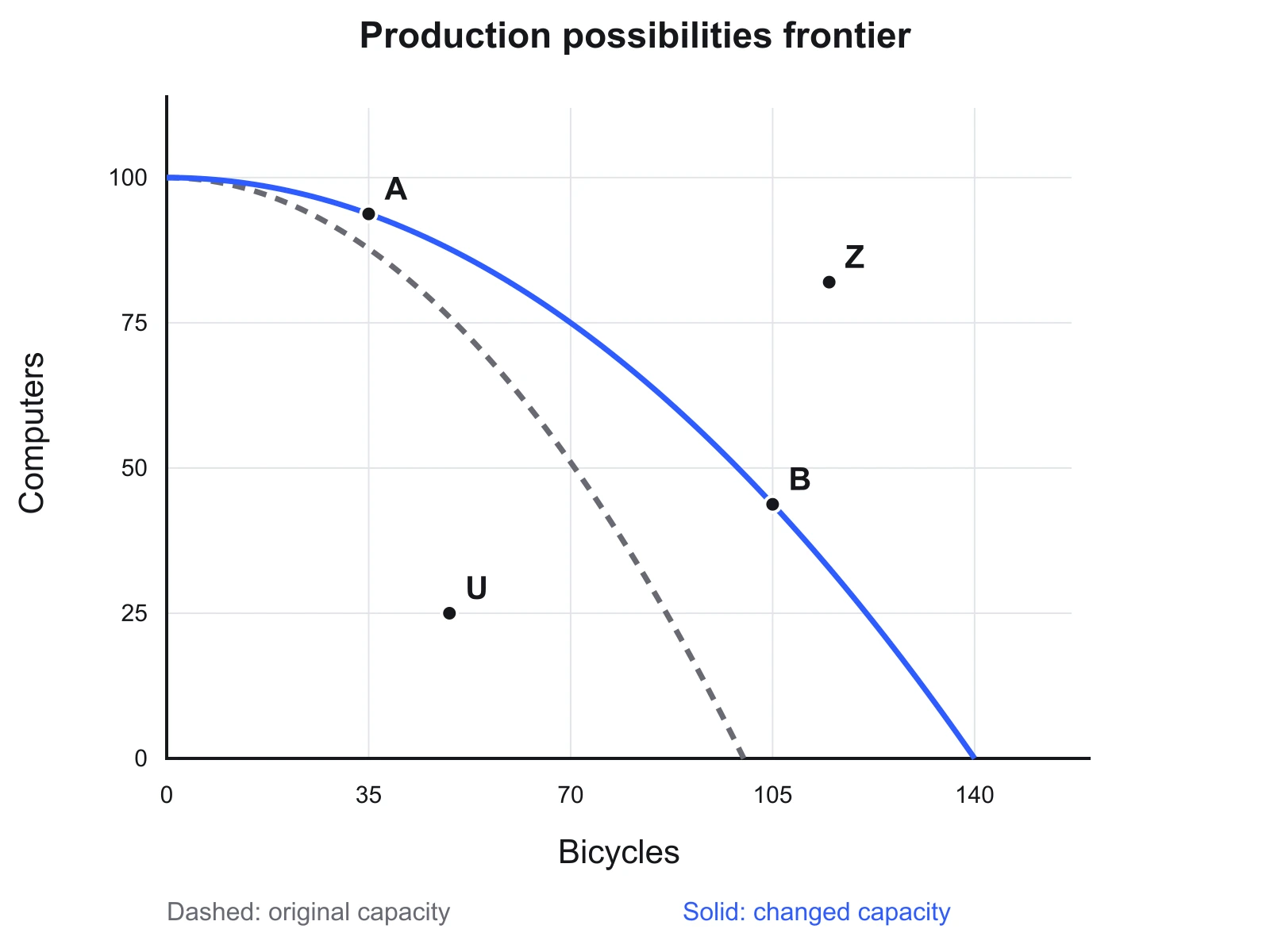
A and B: productively efficient. U: attainable but inefficient. Z: unattainable with current capacity. Efficiency alone does not tell us which mix society prefers.
| Bicycles | Computers | Y forgone per extra X* |
|---|---|---|
| 0 | 100 | Not applicable |
| 25 | 93.75 | 0.25 |
| 50 | 75 | 0.75 |
| 75 | 43.75 | 1.25 |
| 100 | 0 | 1.75 |
*Average cost from the previous row, not the tangent slope. Values rounded to 2 decimals; very small values use scientific notation.
Read the frontier, not just the shape
Choose two goods and the maximum output of each if all available resources were devoted to that good. Use the same time period for both, such as bicycles per week and computers per week. The curve connects feasible, efficient combinations under the selected model. It is a production possibilities curve, not a forecast of demand or a recommendation about what to produce.
Start with increasing opportunity cost to see a bowed-out curve. For the default 100-by-100 model, moving from 25 to 50 bicycles reduces computers from 93.75 to 75. That interval gives up 18.75 computers for 25 bicycles, or 0.75 computers per extra bicycle. The next 25 bicycles cost 31.25 computers, an average of 1.25 each. The table makes this increase visible.
The equation is deliberately explicit: the bowed model uses Y = Ymax × [1 − (X/Xmax)²]; the linear model removes the square. Real frontiers may be uneven or estimated from data. This editor illustrates the concept without fitting an economy, assigning utility, or choosing an optimal production mix.
Four graphs you can recreate
These exact exports use the same presets and renderer as the editor. Load the matching example above to change it.
Increasing opportunity cost
Equal increases in bicycles give up progressively more computers. A and B lie on the frontier; U is inside it and Z is outside.
Constant opportunity cost
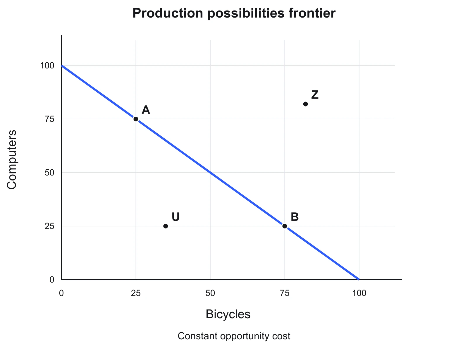
A straight line keeps the same tradeoff everywhere. With both maxima at 100, each extra bicycle costs one computer.
Growth in both goods
Both maximum outputs rise by 25%. The solid frontier expands beyond the dashed original frontier.
Improvement in one sector
The horizontal maximum rises by 40%; the vertical intercept stays fixed. This is a stylized sector-specific improvement.
Shifts, unused resources, and trade
Open “Change productive capacity” to compare a solid new frontier with the dashed original. Positive changes can illustrate more resources or better technology; negative changes illustrate lost capacity. A change in just one maximum holds the other intercept fixed. These percentages describe a scenario, not a measured growth rate.
An inefficient point inside the curve is still attainable. Reducing unemployment or waste can move production toward the same frontier. A point outside it is unattainable for production under the represented resources and technology. Consumption opportunities with trade are a separate question; this tool does not draw a trade line.
For prices and quantities rather than two outputs, use the Supply and Demand Graph Maker or read the supply and demand guide. For the flow of income between households and firms, use the circular-flow diagram tool.
Concepts and sources
The interpretation of feasibility, productive efficiency, increasing opportunity cost and growth follows OpenStax, Principles of Economics 3e, section 2.2. Reviewed October 2026. The numerical equation and examples on this page are our own simplified teaching model.