")
How to Create a Scatter Plot Diagram: Complete Guide for Researchers & Students (2026)
Learn how to draw a scatter diagram in Excel, Python, R, and with AI tools. Step-by-step scatter plot guide with best practices, examples, and common mistakes to avoid.
Whether you are analyzing experimental results for a thesis or exploring trends in a dataset, the scatter plot diagram is one of the most powerful tools in your visualization toolkit.
Yet many researchers and students struggle with creating scatter plots that are clear, accurate, and publication-ready. A scatter diagram that is poorly designed can obscure relationships, mislead readers, or simply look unprofessional.
This guide walks you through everything you need to know about scatter diagrams: what they are, when to use them, how to create them in Excel, Python, R, and AI-powered tools, plus the best practices that separate amateur charts from publication-quality figures.
AI Chart Generator
Create professional scatter plots and charts instantly with AI. No coding or design skills required.
Try it free →What Is a Scatter Plot Diagram?
A scatter plot (also called a scatter diagram, scattergraph, or scatter chart) is a type of data visualization that uses dots plotted on a two-dimensional plane to show the relationship between two numerical variables. Each dot represents a single observation, with its horizontal position determined by one variable (x-axis) and its vertical position determined by the other (y-axis).
Scatter plots are one of the seven basic quality tools identified by the American Society for Quality (ASQ) and are widely used across science, engineering, business, and social sciences.
Key Components of a Scatter Diagram
| Component | Description | Example |
|---|---|---|
| X-axis | Horizontal axis, typically the independent variable | Temperature (°C) |
| Y-axis | Vertical axis, typically the dependent variable | Ice cream sales ($) |
| Data points | Individual dots representing observations | Each day's temperature and sales |
| Trend line | Optional line showing the overall pattern | Linear regression line |
| Labels | Axis titles, units, and chart title | Descriptive and clear |
| Legend | Explains groupings or color coding | Treatment A vs. Treatment B |
Scatter plots and similar point-based visualizations are essential for communicating relationships in research data effectively
When Should You Use a Scatter Plot?
Scatter plots are not the right choice for every dataset. Understanding when to use them is just as important as knowing how to create them.
Use a Scatter Plot When You Want To:
- Identify correlations — Determine whether two variables have a positive, negative, or no relationship
- Detect outliers — Spot data points that deviate significantly from the overall pattern
- Reveal clusters — Find natural groupings in your data
- Assess linearity — Check whether a linear model is appropriate before running regression
- Compare groups — Overlay multiple datasets to compare distributions
Do NOT Use a Scatter Plot When:
- You have categorical data on both axes (use a bar chart or heat map instead)
- You want to show change over time with a single variable (use a line chart)
- You have very few data points (fewer than 10 makes patterns unreliable)
- You need to show part-to-whole relationships (use a pie or stacked bar chart)
Scatter Plot vs. Other Chart Types
| Chart Type | Best For | Data Requirement |
|---|---|---|
| Scatter plot | Relationships between two continuous variables | Two numeric columns |
| Line chart | Trends over time | Time series data |
| Bar chart | Categorical comparisons | Categories + values |
| Bubble chart | Three-variable relationships | Three numeric columns |
| Heat map | Dense correlation matrices | Matrix of values |
Understanding Scatter Plot Correlations
Before creating your scatter diagram, it helps to understand what patterns you might observe:
Positive Correlation
When one variable increases, the other also increases. The dots form an upward slope from left to right.
Example: Study hours vs. exam scores — more studying generally leads to higher scores.
Negative Correlation
When one variable increases, the other decreases. The dots form a downward slope.
Example: Vehicle age vs. resale value — older cars typically sell for less.
No Correlation
The dots are scattered randomly with no discernible pattern.
Example: Shoe size vs. intelligence — no meaningful relationship exists.
Non-Linear Relationships
The data shows a pattern, but it is curved rather than straight. This is common in biological dose-response data and diminishing returns scenarios.
Important: As the saying goes in statistics, correlation does not imply causation. A scatter plot can reveal associations, but additional analysis is needed to establish causal relationships.
How to Draw a Scatter Diagram in Excel
Microsoft Excel remains the most widely used tool for creating basic scatter plots. Here is a step-by-step guide.
Step 1: Organize Your Data
Arrange your data in two columns. Place the independent variable (x) in the left column and the dependent variable (y) in the right column.
| Temperature (°C) | Ice Cream Sales ($) |
|---|---|
| 15 | 200 |
| 20 | 350 |
| 25 | 480 |
| 30 | 620 |
| 35 | 780 |
Step 2: Select Your Data
Highlight both columns of data, including the headers.
Step 3: Insert the Chart
- Go to the Insert tab on the ribbon
- In the Charts group, click the Scatter (X, Y) icon
- Select Scatter with only Markers (the first option)
Step 4: Customize Your Chart
- Add a title: Click the chart title and type a descriptive name (e.g., "Temperature vs. Ice Cream Sales")
- Label axes: Click Chart Elements (+) and check Axis Titles. Add labels with units
- Add a trendline: Right-click any data point, select Add Trendline, and choose Linear
- Display R-squared: In the trendline options, check Display R-squared value on chart
- Adjust axis ranges: Right-click an axis, select Format Axis, and set minimum/maximum values
Step 5: Format for Publication
- Remove gridlines or make them light gray
- Use a consistent font (Arial or Helvetica, 10-12pt)
- Ensure adequate contrast for printing
- Export as PNG (300+ DPI) or SVG for publications
For more guidance on creating publication-quality figures, see our guide to making figures for Nature, Science, and Cell journals.
How to Create a Scatter Plot in Python
Python with Matplotlib and Seaborn provides far more customization than Excel. Here is how to create a publication-ready scatter plot.
Basic Scatter Plot with Matplotlib
import matplotlib.pyplot as plt
import numpy as np

# Sample data
x = np.array([15, 20, 25, 30, 35, 22, 28, 33, 18, 26])
y = np.array([200, 350, 480, 620, 780, 400, 550, 700, 280, 500])

# Create scatter plot
fig, ax = plt.subplots(figsize=(8, 6))
ax.scatter(x, y, c='#2563EB', s=60, alpha=0.8, edgecolors='white', linewidth=0.5)

# Add trend line
z = np.polyfit(x, y, 1)
p = np.poly1d(z)
ax.plot(x, p(x), '--', color='#DC2626', alpha=0.7, label=f'Linear fit (R²={np.corrcoef(x,y)[0,1]**2:.3f})')

# Labels and formatting
ax.set_xlabel('Temperature (°C)', fontsize=12)
ax.set_ylabel('Ice Cream Sales ($)', fontsize=12)
ax.set_title('Temperature vs. Ice Cream Sales', fontsize=14, fontweight='bold')
ax.legend()
ax.spines['top'].set_visible(False)
ax.spines['right'].set_visible(False)

plt.tight_layout()
plt.savefig('scatter_plot.png', dpi=300, bbox_inches='tight')
plt.show()
Enhanced Scatter Plot with Seaborn
import seaborn as sns
import pandas as pd

# Create DataFrame
data = pd.DataFrame({
    'Temperature': [15, 20, 25, 30, 35, 22, 28, 33, 18, 26],
    'Sales': [200, 350, 480, 620, 780, 400, 550, 700, 280, 500],
    'Season': ['Spring', 'Spring', 'Summer', 'Summer', 'Summer',
               'Spring', 'Summer', 'Summer', 'Spring', 'Summer']
})

# Seaborn scatter with regression line
fig, ax = plt.subplots(figsize=(8, 6))
sns.scatterplot(data=data, x='Temperature', y='Sales', hue='Season',
                palette='Set2', s=80, ax=ax)
sns.regplot(data=data, x='Temperature', y='Sales',
            scatter=False, color='gray', ax=ax)

ax.set_title('Temperature vs. Sales by Season', fontsize=14, fontweight='bold')
plt.tight_layout()
plt.savefig('scatter_seaborn.png', dpi=300)
Pro tip: Seaborn makes it easy to add grouping by color (hue), size, and style in a single function call. This is invaluable for multi-variable research datasets.
How to Create a Scatter Plot in R
R with ggplot2 is the gold standard for statistical visualization in academic research.
Basic ggplot2 Scatter Plot
library(ggplot2)

# Sample data
data <- data.frame(
  temperature = c(15, 20, 25, 30, 35, 22, 28, 33, 18, 26),
  sales = c(200, 350, 480, 620, 780, 400, 550, 700, 280, 500)
)

# Create scatter plot
ggplot(data, aes(x = temperature, y = sales)) +
  geom_point(color = "#2563EB", size = 3, alpha = 0.8) +
  geom_smooth(method = "lm", se = TRUE, color = "#DC2626", linetype = "dashed") +
  labs(
    title = "Temperature vs. Ice Cream Sales",
    x = "Temperature (°C)",
    y = "Sales ($)"
  ) +
  theme_minimal() +
  theme(
    plot.title = element_text(face = "bold", size = 14),
    axis.title = element_text(size = 12)
  )

ggsave("scatter_plot.png", width = 8, height = 6, dpi = 300)
Grouped Scatter Plot with Confidence Intervals
# With grouping and faceting
ggplot(data, aes(x = temperature, y = sales, color = season)) +
  geom_point(size = 3) +
  geom_smooth(method = "lm", se = TRUE) +
  scale_color_brewer(palette = "Set2") +
  facet_wrap(~season) +
  theme_minimal()
For guidance on choosing the right color palettes for your scatter plots, see our scientific color palette guide.
How to Create a Scatter Plot with AI Tools
If you want to skip the coding entirely, AI-powered chart generators can create scatter plots from text descriptions or raw data in seconds.
Using ConceptViz AI Chart Generator
- Navigate to the AI Chart Generator
- Describe your chart in plain text, for example: "Create a scatter plot showing the relationship between study hours (x-axis, 0-40 hours) and exam scores (y-axis, 0-100%), with a positive correlation and a linear trendline"
- The AI generates a professional scatter plot
- Download in high-resolution format for your paper or presentation
Advantages of AI-Generated Scatter Plots
| Feature | Traditional Tools | AI Chart Generator |
|---|---|---|
| Time to create | 15-60 minutes | Under 1 minute |
| Coding required | Yes (Python/R) or manual setup (Excel) | No |
| Design quality | Depends on skill level | Consistently professional |
| Customization | Full control | Text-based adjustments |
| Learning curve | Hours to weeks | None |
AI Chart Generator
Create scatter plots in seconds
Scatter Plot Best Practices for Publication
Following these best practices will ensure your scatter diagrams are clear, accurate, and professional.
1. Always Label Both Axes with Units
Every axis must have a descriptive label and the unit of measurement. "Temperature (°C)" is correct; "Temp" is not.
2. Use Appropriate Axis Scales
- Start axes at zero when possible, or clearly indicate a broken axis
- Use consistent scales when comparing multiple scatter plots
- Avoid logarithmic scales unless scientifically justified (and clearly label them)
3. Handle Overplotting
When you have hundreds or thousands of data points, dots overlap and obscure the true data density. Solutions include:
- Transparency (alpha): Make points semi-transparent so overlapping areas appear darker
- Jittering: Add small random offsets to prevent exact overlaps
- 2D density plots: Replace dots with contours or heat maps for very large datasets
- Hexbin plots: Aggregate points into hexagonal bins
4. Add Statistical Context
- Include a trend line (linear, polynomial, or LOESS) when appropriate
- Display the R-squared value to quantify the strength of the relationship
- Show confidence intervals around the trend line
- Note the sample size (n) in the figure caption
5. Use Color Meaningfully
- Use color to encode a third variable (e.g., group membership)
- Limit to 5-7 colors maximum for readability
- Choose colorblind-accessible palettes (see ColorBrewer)
- Ensure colors work in grayscale for print journals
6. Write Informative Captions
Your figure caption should describe:
- What the figure shows
- The number of observations
- Any statistical tests applied
- How to interpret groupings or symbols
Complex research data often requires multiple visualization approaches. Scatter plots work best for showing relationships between two continuous variables within larger datasets
Common Scatter Plot Mistakes (and How to Fix Them)
Mistake 1: Using a Scatter Plot for Categorical Data
Problem: Plotting categories like "Treatment A" and "Treatment B" on the x-axis as a scatter plot.
Fix: Use a box plot, violin plot, or grouped bar chart for categorical comparisons. Scatter plots require continuous numerical data on both axes.
Mistake 2: Ignoring Outliers
Problem: Outliers skew the trend line and give a false impression of the relationship.
Fix: Identify outliers visually and investigate them. Report analyses both with and without outliers. Never silently remove data points.
Mistake 3: Implying Causation
Problem: Writing "X causes Y" based solely on a scatter plot correlation.
Fix: Use careful language: "X is associated with Y" or "X correlates with Y." Causation requires controlled experiments or rigorous statistical methods.
Mistake 4: Overcrowding the Plot
Problem: Hundreds of overlapping points create an unreadable blob.
Fix: Use transparency, jittering, density contours, or hexbin plots. Consider subsampling if the dataset is extremely large.
Mistake 5: Poor Aspect Ratio
Problem: A stretched or squished chart distorts the perceived relationship.
Fix: Use a roughly 4:3 or 16:9 aspect ratio. The trend should appear at approximately a 45-degree angle when the correlation is strong.
Mistake 6: Missing Trend Line When Needed
Problem: Showing raw dots without any visual guide makes it hard for readers to assess the relationship.
Fix: Add a trend line with a confidence band when your goal is to demonstrate a correlation. Skip the trend line only when showing raw distributions.
For broader guidance on avoiding visualization mistakes, see our data visualization best practices guide.
Advanced Scatter Plot Techniques
Adding a Third Variable
You can encode additional variables using visual properties:
| Visual Property | Variable Type | Example |
|---|---|---|
| Color | Categorical | Different treatment groups |
| Size | Continuous | Population size (bubble chart) |
| Shape | Categorical | Male vs. female participants |
| Opacity | Continuous | Confidence level |
| Faceting | Categorical | Separate panels per condition |
Marginal Distributions
Add histograms or density plots along the axes to show the distribution of each variable individually. In Python, use seaborn.jointplot(). In R, use the ggExtra package.
Regression Diagnostics
After fitting a trend line, create a residuals vs. fitted values scatter plot to check whether your linear model is appropriate. Patterns in the residuals suggest a non-linear relationship.
Animated Scatter Plots
For presentations (not publications), animated scatter plots can show how relationships change over time. Tools like Flourish, Plotly, and D3.js support scatter plot animations.
Scatter Diagram Checklist
Before submitting your scatter plot for publication or a presentation, run through this checklist:
- Both axes have descriptive labels with units
- Chart title clearly describes the relationship shown
- Data points are visible and not excessively overlapping
- Trend line is included (if relevant) with R-squared value
- Colors are accessible to colorblind readers
- Legend explains all groupings or encodings
- Figure caption includes sample size and statistical details
- Resolution is 300+ DPI for publication
- Fonts are consistent with the rest of the manuscript (see our font guide)
- Aspect ratio is not distorted
Frequently Asked Questions
What is a scatter diagram used for?
A scatter diagram (scatter plot) is used to visualize the relationship between two numerical variables. It helps identify correlations (positive, negative, or none), detect outliers, reveal clusters in data, and assess whether a linear model is appropriate. Scatter plots are widely used in scientific research, quality control, business analytics, and education.
How do I draw a scatter diagram in Excel?
To draw a scatter diagram in Excel: (1) Organize your data in two columns with the independent variable on the left. (2) Select both columns. (3) Go to Insert > Charts > Scatter and choose 'Scatter with only Markers.' (4) Add axis labels, a chart title, and optionally a trendline by right-clicking a data point and selecting 'Add Trendline.' (5) Format for publication by adjusting fonts, removing gridlines, and exporting at 300+ DPI.
What is the difference between a scatter plot and a line chart?
A scatter plot shows individual data points as dots to reveal relationships between two variables, while a line chart connects data points in sequence to show trends over time. Use scatter plots when your x-axis is a continuous variable and you want to examine correlations. Use line charts when your x-axis represents time and you want to track changes.
How many data points do I need for a scatter plot?
While there is no strict minimum, most statisticians recommend at least 20-30 data points for a meaningful scatter plot. Fewer than 10 points makes it difficult to identify reliable patterns. For research publications, larger sample sizes (50+) provide more convincing evidence of correlations. If you have thousands of points, use transparency or density plots to handle overplotting.
Can I create a scatter plot without coding?
Yes. Excel, Google Sheets, and online tools like Datawrapper, Flourish, and ConceptViz's AI Chart Generator all create scatter plots without any coding. ConceptViz lets you describe your chart in plain text and generates a professional scatter plot automatically, which is ideal for researchers who want quick, publication-quality results.
How do I add a trendline to a scatter plot?
In Excel, right-click any data point and select 'Add Trendline,' then choose linear, polynomial, or logarithmic. In Python (Matplotlib), use numpy.polyfit() to calculate coefficients and plot the line. In R (ggplot2), add geom_smooth(method='lm') for a linear trendline with confidence intervals. Always display the R-squared value to show how well the trendline fits the data.
What does R-squared mean on a scatter plot?
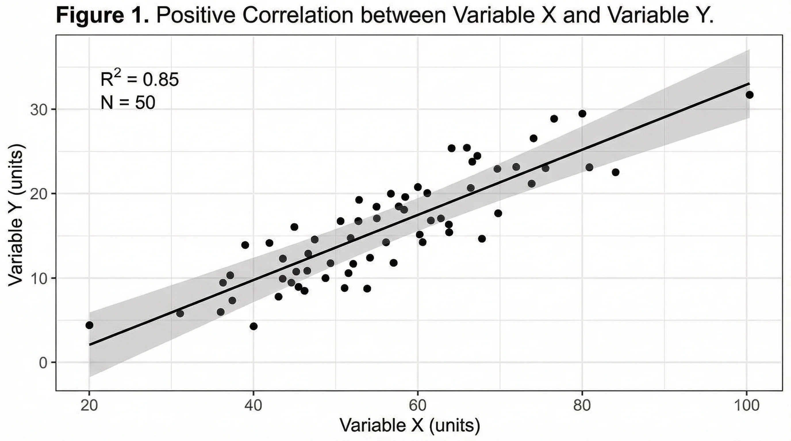
R-squared (R²) is a statistical measure that indicates what proportion of the variance in the dependent variable (y) is explained by the independent variable (x). An R² of 0.85 means 85% of the variation in y can be explained by x. Values closer to 1.0 indicate a stronger linear relationship. However, a high R² does not prove causation, and non-linear relationships may show a low R² even when a strong pattern exists.
How do I handle overlapping points in a scatter plot?
Overlapping points (overplotting) is common with large datasets. Solutions include: (1) reducing point opacity (alpha transparency) so overlapping areas appear darker, (2) adding small random jitter to separate nearby points, (3) using hexbin plots that aggregate points into hexagonal bins with color-coded density, (4) switching to 2D density contour plots, or (5) subsampling your data while preserving the overall distribution.
Conclusion
The scatter plot diagram is an indispensable tool for anyone working with data. Whether you are a student exploring your first dataset or a researcher preparing figures for a journal submission, mastering scatter plots will strengthen your ability to communicate findings clearly and accurately.
To summarize the key takeaways:
- Choose scatter plots when you need to show relationships between two continuous variables
- Prepare your data carefully and understand the correlation type before plotting
- Use the right tool for your skill level: Excel for quick plots, Python or R for full customization, or AI tools for instant results
- Follow best practices: label axes, handle overplotting, use accessible colors, and include statistical context
- Avoid common mistakes like implying causation, ignoring outliers, or overcrowding the plot
Ready to create your own scatter plot diagram? Try ConceptViz's AI Chart Generator to produce publication-quality scatter plots in seconds, or explore our data visualization best practices guide for more tips on presenting research data effectively.
Additional Resources
- ASQ: What Is a Scatter Diagram?
- Atlassian: Mastering Scatter Plots
- Statistics By Jim: Scatterplots
- Data Visualization Best Practices for Researchers
- Scientific Color Palette Guide
- How to Make Figures for Nature, Science, Cell
- How to Design Infographics for Scientists
- Supply and Demand Graph: Equilibrium & Shifts
Категории
Ещё публикации

Motion Diagram Physics Guide: How to Draw and Read Motion Diagrams
Learn how to draw motion diagrams in physics, read dot spacing, velocity arrows, acceleration direction, and connect diagrams to graphs.
")
How to Make a Pie Chart in Excel: Step-by-Step Guide (2026)
Learn how to create a pie chart in Excel, format labels, choose better colors, and avoid misleading slices. Includes Excel 365, 2024, 2021, and 2019 workflows.
")
How to Design Scientific Infographics: 8-Step Guide for Researchers (2026)
Create credible, publication-ready infographics that scientists trust. Step-by-step process covering data accuracy, visual hierarchy, and source citations - with free templates.