
What Is a Dot Plot? Statistics Examples and How to Make One
A dot plot shows the frequency of data with stacked dots over a number line. Learn how to make and read dot plots, find mean, median, mode, and range, with examples.
A dot plot is one of the simplest ways to show data — yet it packs in a lot of information. By stacking a dot for every data point over a number line, it reveals how often each value occurs and what the overall distribution looks like, all in one glance.
This guide explains what a dot plot is, how to make one, how to read the mean, median, mode, and range from it, and how it compares to a line plot and a histogram.
Quick Answer: What Is a Dot Plot?
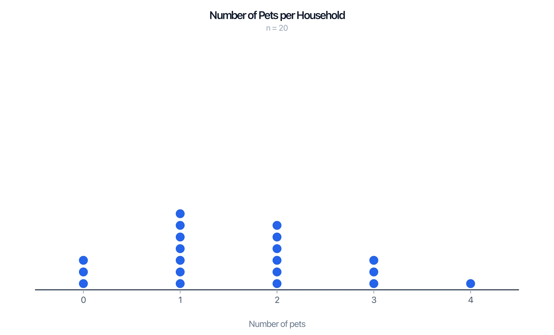
A dot plot is a statistical graph that shows the frequency of data values using dots placed above a number line. Each dot represents one data point, and when a value repeats, the dots stack vertically — so taller stacks mean more frequent values.
In elementary grades the same graph is often called a line plot. Dot plots work best for small to moderate data sets.
How to Make a Dot Plot
- Draw a number line that spans the range of your data, with evenly spaced, consecutive values.
- Title and label the plot so it is clear what the numbers represent.
- Plot a dot for each data point above its value.
- Stack repeated values — each additional dot goes on top of the previous one for that value.
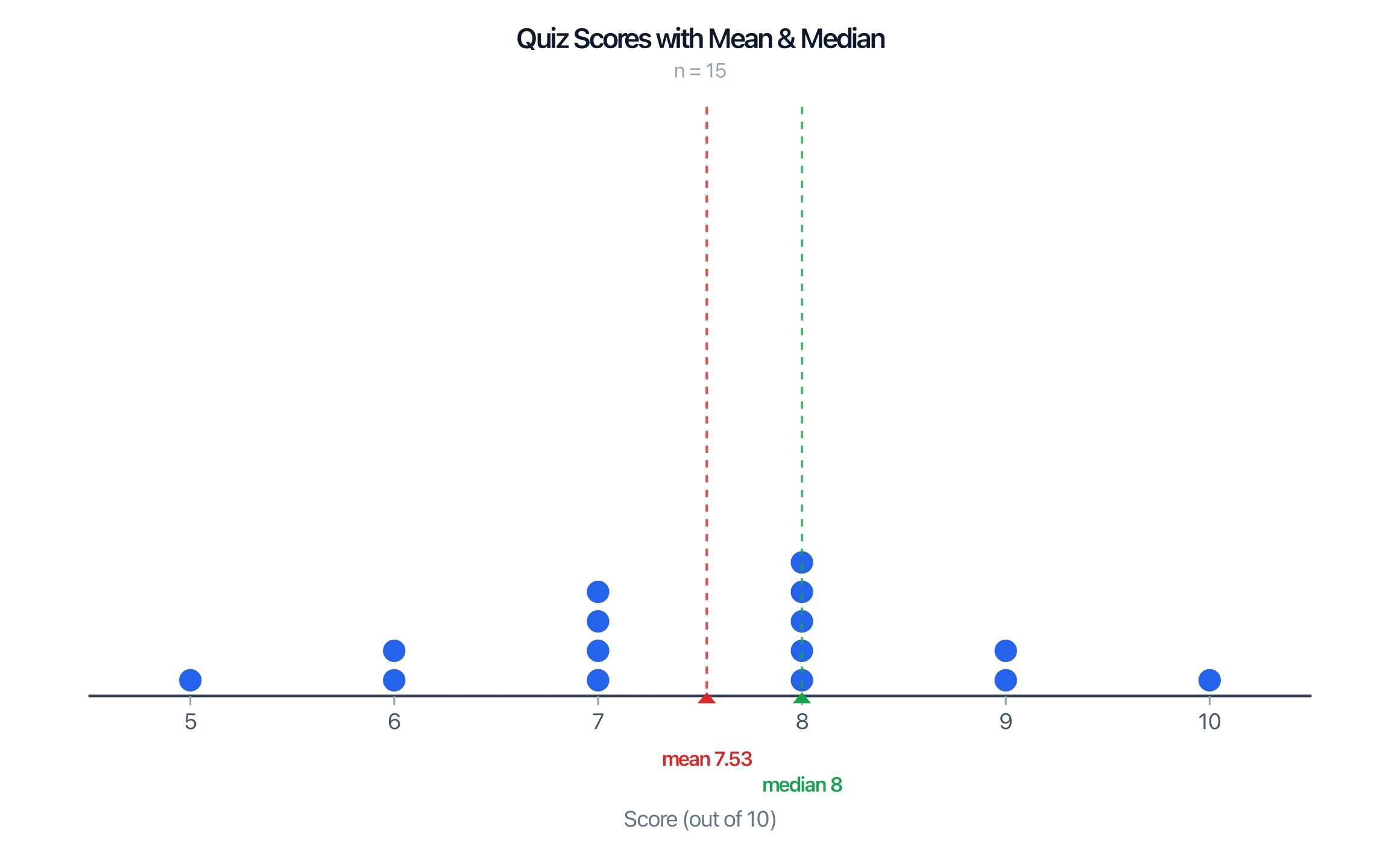
For example, if quiz scores out of 10 are recorded for a class, you place one dot above each score and stack them where scores repeat. The result shows the whole distribution at a glance.
Dot Plot Generator
Create dot plots and line plots from your data, with mean, median, and frequency, and download them free as SVG or PNG.
Make a dot plot ->How to Read a Dot Plot
A dot plot makes the key features of a data set easy to see:
- Frequency: the height of each stack is how often that value occurs.
- Mode: the value with the tallest stack.
- Range: the distance from the smallest to the largest value.
- Median: the middle data point when you count dots from one end.
- Mean: the balance point of the dots (add all values and divide by the number of dots).
- Shape: clusters, gaps, symmetry, and outliers all stand out visually.
Dot Plot vs Line Plot vs Histogram
- Dot plot vs line plot: these are the same graph. "Line plot" is the term used in many elementary curricula; "dot plot" is the more general statistical name. (A "line plot" should not be confused with a line graph, which connects points with a line.)
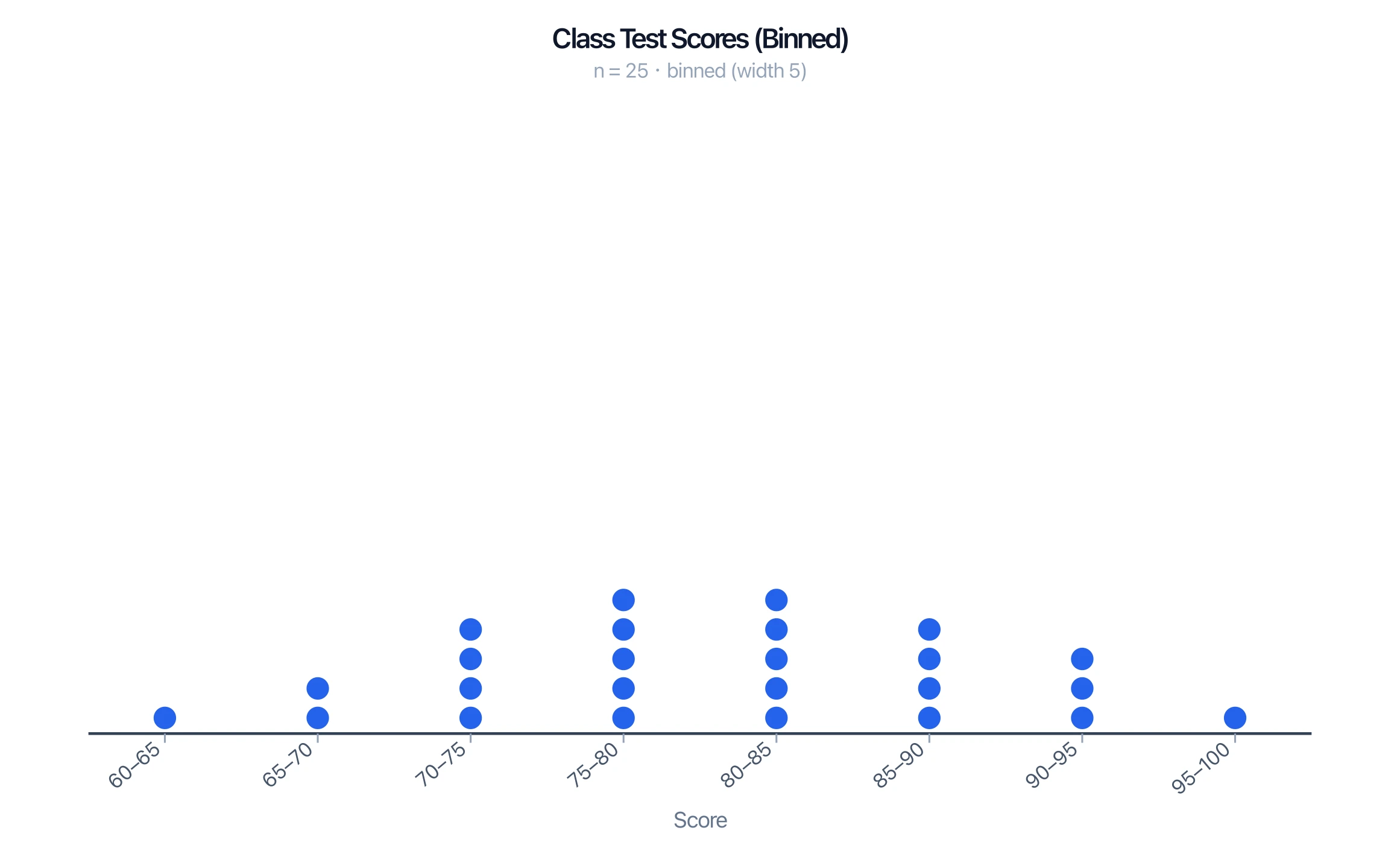
- Dot plot vs histogram: a dot plot shows every individual data point as a dot, while a histogram groups values into bins and shows bars. Dot plots keep the raw data visible; histograms summarize larger data sets more compactly.
When to Use a Dot Plot
Dot plots are ideal for small to moderate data sets (roughly under 30 points) where you want to see the actual values and their frequencies. For larger data sets the dots become cluttered, and a histogram, stem-and-leaf plot, or box plot is usually clearer.
Common Mistakes
- Uneven number line. The values must be evenly spaced and consecutive, even where a value has zero dots.
- Skipping empty values. Leave a gap (no dots) rather than removing the value — the gap is information.
- Confusing a line plot with a line graph. A line plot is a dot plot; a line graph connects points to show change over time.
- Using a dot plot for big data sets. Past ~30 points, switch to a histogram.
FAQ
What is a dot plot in statistics?
A dot plot is a graph that shows the frequency of data values using dots stacked above a number line. Each dot is one data point, and taller stacks mean more frequent values.
Is a dot plot the same as a line plot?
Yes. "Line plot" is the term common in elementary math; "dot plot" is the general statistical name for the same graph. Note it is different from a line graph, which connects points with a line.
How do you find the mean and median from a dot plot?
For the mean, add the value of every dot and divide by the number of dots. For the median, count dots in from each end until you reach the middle one (or the average of the two middle ones).
What is the difference between a dot plot and a histogram?
A dot plot shows each individual data point as a dot, so the raw values stay visible. A histogram groups values into bins and shows bars, which summarizes larger data sets more compactly.
When should you use a dot plot?
Use a dot plot for small to moderate data sets (under about 30 points) when you want to see individual values and their frequencies. For larger sets, a histogram or box plot is clearer.
Related Guides
- What Is a Tape Diagram? — another elementary-math visual, used to model word problems and part-whole relationships.
Further Reading
Categories
More Posts

5 Best Free Canva Alternatives for Diagrams in 2026
Best free Canva alternatives for diagrams: BioRender, draw.io, ConceptViz & more. Compare specialized tools that create professional diagrams faster than Canva.

AI Worksheet Generator Guide: Create Printable Worksheets and Answer Keys
Learn how to use an AI worksheet generator for printable classroom worksheets, answer keys, differentiation, diagrams, and teacher review workflows.

Eye Anatomy: The Parts of the Human Eye Explained
A clear guide to eye anatomy: the cornea, iris, pupil, lens, retina, and optic nerve, what each part does, how vision works, and how to read an eye diagram.