科學配色調色盤 產生器
為科學圖表和研究視覺化生成色盲友善的配色方案。取得 Okabe-Ito、Viridis 及 Nature 期刊推薦顏色的十六進制色碼。
Pick A Palette Family, Then Copy What You Need
This page now behaves like a real palette utility, not a generic image prompt box. Choose a family, inspect a figure preview, and copy ready-to-use hex, Python, R, or CSS snippets immediately.
Okabe-Ito
Widely recommended in academic publishing because every category stays distinct, even under common forms of color blindness.
#E69F00, #56B4E9, #009E73, #F0E442, #0072B2, #D55E00, #CC79A7, #000000
You need distinct colors for separate groups or treatments.
Your figure will be read on slides, in print, and by mixed audiences.
You can pair color with direct labels or line styles for extra clarity.
This sends you into the main creation flow with a prefilled prompt based on Okabe-Ito.
配色方案範例
瀏覽科學配色調色盤及圖表範例,並複製十六進制色碼
Okabe-Ito 類別配色
類別資料的黃金標準色盲友善調色盤,包含 8 種獨特顏色。
Viridis 連續配色
感知均勻色彩映射,適合連續資料和熱力圖。
Nature 期刊風格
受頂尖科學期刊啟發的專業配色方案。
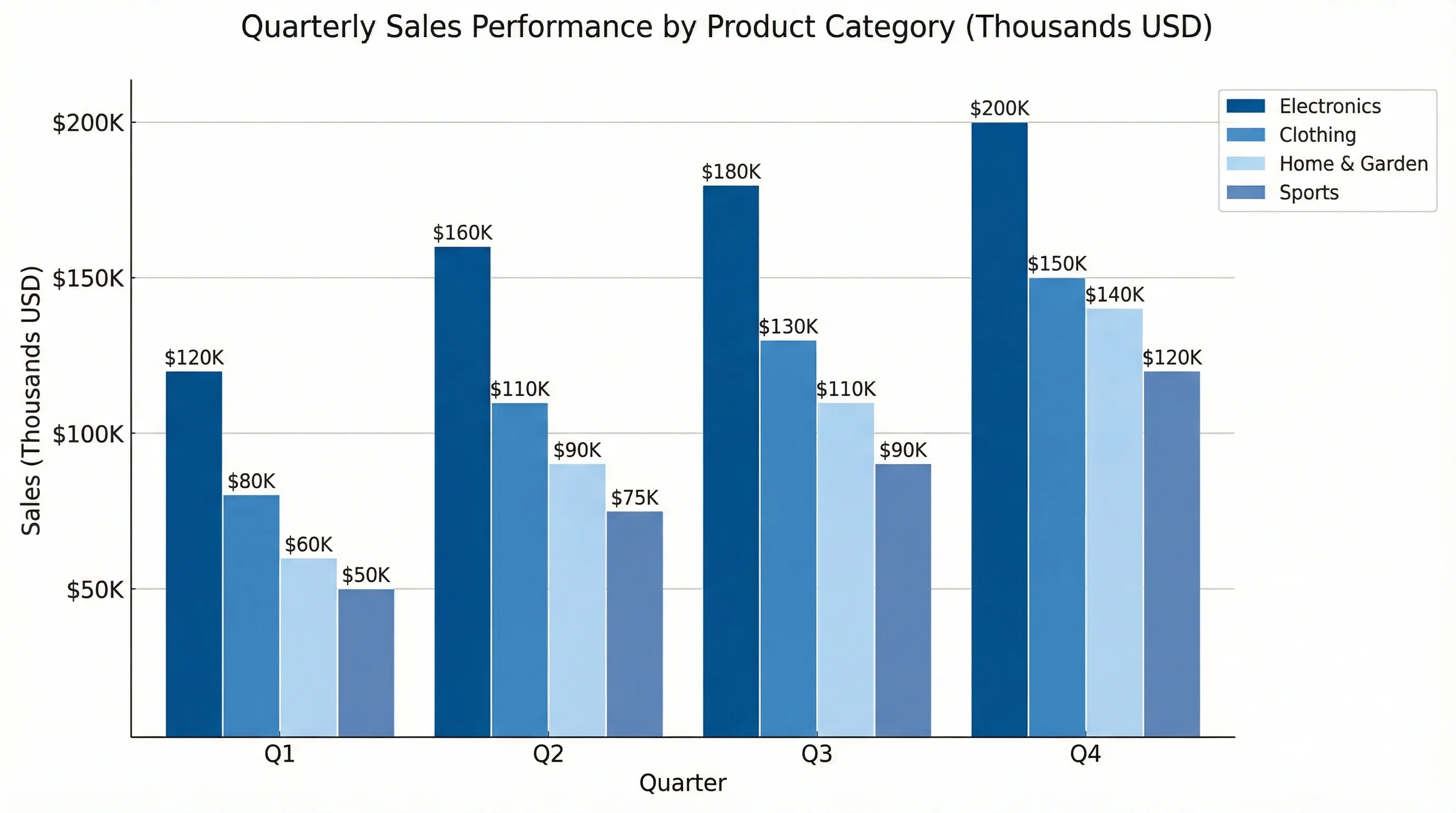
長條圖配色方案
示範如何將無障礙顏色應用於長條圖的範例。
折線圖顏色
採用無障礙顏色和線型的時間序列視覺化。
熱力圖色階
附感知均勻色階和標記的熱力圖範例。
什麼是科學配色調色盤?
科學配色調色盤是一組精心挑選的顏色,專為研究出版物的資料視覺化而最佳化。與裝飾性調色盤不同,科學配色調色盤的設計兼顧無障礙性(色盲友善)、感知均勻性(視覺權重相等),以及在不同顯示器和印刷媒體上的重現性。最廣泛使用的調色盤包括:適用於類別資料的 Okabe-Ito、適用於連續資料的 Viridis,以及 Nature、Science 和 Cell 等期刊的專屬配色方案。
為何使用色盲友善配色?
- 約 8% 的男性和 0.5% 的女性患有某種形式的色覺缺陷
- 許多期刊現在要求或建議使用無障礙配色方案
- 色盲友善調色盤對所有讀者都美觀,不只適用於有色覺問題的人
- 使用 Okabe-Ito 等標準調色盤能讓您的作品立即呈現出專業感
- 無障礙圖表獲得更多引用,因為更多人能理解它們
- 您的圖表在灰階列印時也能正確重現
熱門科學配色調色盤
- Okabe-Ito:8 種顏色,針對所有類型色盲最佳化,適合長條圖和類別資料
- Viridis:感知均勻的紫色到黃色漸層,適用於熱力圖和連續資料
- Plasma:類似 Viridis,但採用洋紅-橙-黃範圍
- Cividis:專為二色盲和紅色盲最佳化
- ColorBrewer:針對定性、連續和發散資料的多組調色盤
- Nature/Science 風格:符合頂尖期刊美學的精緻配色
如何使用這些十六進制色碼
直接從我們的調色盤範例複製十六進制色碼,貼入您偏好的軟體。在 Excel 中:格式 > 圖案填滿 > 其他色彩 > 自訂 > 輸入十六進制色碼。在 PowerPoint 中:設定圖案格式 > 填滿 > 色彩 > 其他色彩 > 自訂。在 R 中:在 ggplot2 的 scale_color_manual() 中直接使用十六進制色碼。在 Python matplotlib 中:將十六進制色碼傳入 color 參數。