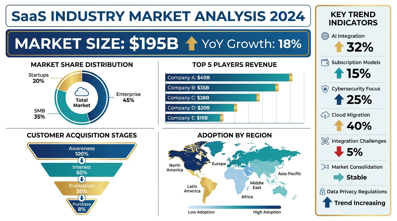
Sankey Diagram Generator AI-Powered
Describe your data flows and our AI will create a professional Sankey diagram with proportional band widths. Perfect for energy audits, material flow analysis, research papers, and presentations.
Sankey Diagram Generator
Free to try ·
Your Sankey diagram will appear here
Describe your data flows and click Generate
Sankey Diagram Examples
Browse scientific and engineering examples or generate your own above
Energy Flow in Ecosystem
Ecosystem energy flow Sankey diagram illustrating how energy transfers and diminishes across trophic levels, from primary producers to apex predators.
Research Funding Allocation
Research funding Sankey diagram showing the allocation of grants from funding bodies through universities to individual research departments and projects.
Material Flow Analysis
Industrial material flow analysis Sankey diagram tracking raw materials through manufacturing processes to finished products, byproducts, and waste.
Patient Flow in Clinical Study
Clinical trial patient flow Sankey diagram visualizing participant progression from screening through randomization, treatment arms, and study endpoints.
Carbon Emissions Flow
Carbon cycle Sankey diagram mapping greenhouse gas emissions from source sectors through atmospheric processes to carbon sinks and accumulation.
Supply Chain Resource Flow
Supply chain Sankey diagram tracking resources from raw material suppliers through processing, distribution, and retail to final consumers.
4 more examples available
Sign in for free to unlock all example diagrams and generate your own 4k custom diagrams.
What is a Sankey Diagram?
A Sankey diagram is a flow visualization where the width of each arrow or band is proportional to the quantity it represents. Originally developed by Captain Matthew Sankey in 1898 to visualize energy efficiency in steam engines, these diagrams have become essential tools in science, engineering, and data analysis. Sankey diagrams excel at showing how quantities split, merge, and flow between stages in a process, making them ideal for energy audits, material flow analysis, budget allocation, and any scenario where tracking the magnitude of flows between nodes is critical.
Why Use Sankey Diagrams in Research?
- Visualize energy transfers and losses across system components with proportional flow widths
- Track material flows through industrial processes to identify waste and inefficiency
- Map patient progression through clinical trial phases from enrollment to outcomes
- Illustrate carbon emissions pathways from source sectors to atmospheric accumulation
- Communicate complex multi-stage processes to reviewers and non-specialist audiences
- Reveal hidden patterns in resource allocation that tables and bar charts cannot show
Types of Sankey Diagrams
Sankey diagrams serve different analytical purposes depending on the domain. Energy Sankey diagrams map energy inputs, conversions, and losses across systems such as power plants or buildings. Material Flow Analysis (MFA) Sankey diagrams track the mass of substances through production, use, and disposal stages. Cost and budget Sankey diagrams visualize how financial resources are allocated from revenue sources to expenditure categories. Process Sankey diagrams show how items (patients, users, products) move through sequential stages with branching outcomes. Each type shares the core principle that band width equals quantity, but styling and labeling conventions differ by field.
How to Create Effective Sankey Diagrams
Start by defining your source nodes (inputs) and target nodes (outputs), then quantify the flow between each pair. Limit visible paths to 7-8 key flows to avoid visual clutter. Use color purposefully: gradient coloring can show flow direction, while categorical colors distinguish different resource types. Always label nodes clearly and include units so readers understand the scale. Ensure flows are ordered logically, typically left-to-right or top-to-bottom, and group related nodes together. Our AI-powered generator handles these design decisions automatically, producing publication-ready Sankey diagrams from a simple text description.
Applications in Science and Engineering
- Ecology: mapping energy flow through trophic levels and nutrient cycling in ecosystems
- Chemical engineering: tracking mass and energy balances in reactor systems and refineries
- Environmental science: visualizing water usage, carbon footprints, and waste management flows
- Healthcare: illustrating patient pathways, treatment outcomes, and hospital resource utilization
- Urban planning: analyzing transportation flows, electricity distribution, and city metabolism
- Economics: depicting trade flows, supply chains, and national resource consumption patterns
Frequently Asked Questions
More Data Visualization Tools
VisualizationAI Infographic Generator
Create professional infographics to summarize complex data and research findings visually.
Data VisualizationAI Chart Generator
Generate charts and graphs from data descriptions for research papers and presentations.
DiagramsText to Diagram Generator
Convert text descriptions into structured diagrams including flowcharts, architecture diagrams, and more.