人人適用
比較圖表製作工具 比較圖表
即刻建立專業比較圖表。用AI生成視覺化圖表,並排對比產品、功能、服務或任何選項。
並排版面功能矩陣優缺點圖表簡報即用
比較圖表製作工具
描述你的比較內容
0 / 50,000 characters
By using ConceptViz, you agree not to generate or edit adult, sexual, explicit, unsafe, or policy-violating content. See Content Policy.
免費試用 ·
預覽
你的比較圖表將顯示於此
描述你的比較內容並點擊生成
比較圖表範例
瀏覽比較圖表範例,或在上方生成專屬圖表
檢視:
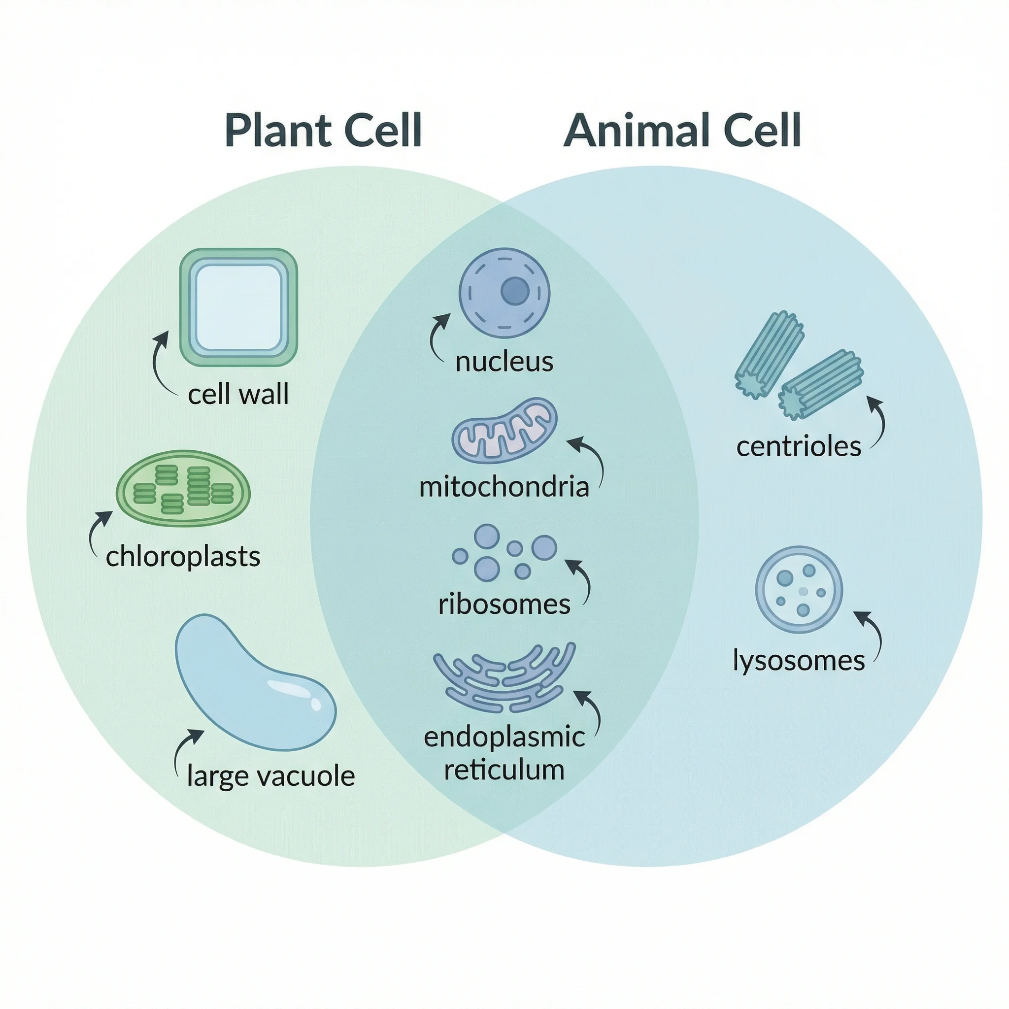
再生能源比較
太陽能、風能、水力和地熱能源的多維度比較,涵蓋關鍵指標。
energycomparisonenvironment
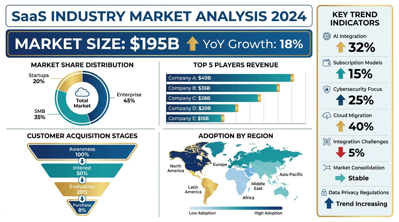
SaaS平台比較
為企業決策比較主要SaaS平台的詳細功能矩陣。
SaaSfeature-matrixbusiness
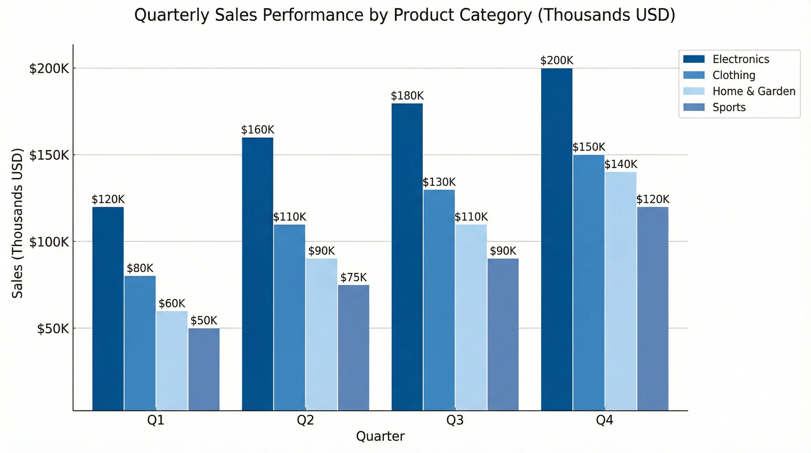
產品優缺點
評估兩種競爭產品或服務的清晰優缺點版面。
pros-consproductevaluation
雲端供應商比較
AWS、Azure和Google Cloud在基礎架構能力方面的技術比較。
cloudtechnicalinfrastructure
前後對比
顯示可量測結果轉變的前後對比圖。
before-aftertransformationresults
定價方案比較
SaaS產品和訂閱服務常用的定價層級比較圖。
pricingtierssubscription
什麼是比較圖表?
比較圖表是一種視覺化工具,並排呈現兩個或多個項目,以突顯其相似點和差異點。比較圖表使用表格、矩陣、圖示和顏色編碼,讓複雜資訊易於掃視和一目瞭然。它被廣泛應用於商業的產品評估、行銷的競爭分析、教育的概念比較,以及日常決策中的選項比較。
比較圖表的類型
- 功能矩陣——以勾選和叉號的格子顯示每個選項支援哪些功能
- 優缺點圖表——兩欄版面,列出每個選項的優點和缺點
- 並排比較——平行欄位或面板,以相同分類直接比較
- 前後對比圖——顯示變更前後的指標或流程狀態
- 定價比較表——在關鍵維度上比較訂閱層級、方案或供應商報價
- 規格比較——針對硬體、軟體或服務列出詳細技術規格
何時使用比較圖表
當你需要根據相同標準評估多個選項時,就應使用比較圖表。它對於購買決策、供應商選擇、競爭分析、比較理論或方法的學術研究,以及評測替代方案的部落格文章都不可或缺。設計良好的比較圖表可降低認知負擔、消除偏見,並幫助讀者比閱讀文字段落更快做出明智結論。
比較圖表最佳實踐
- 將比較項目限制在2-5個,避免讓讀者不知所措
- 對所有選項使用一致的標準,確保比較公平
- 以顏色或標誌突顯關鍵差異點或推薦選項
- 使用圖示、勾選符號和顏色編碼,而非冗長的文字描述
- 按重要性排列行次——將最具決定性的標準置於頂部
- 添加摘要行或結論,幫助快速瀏覽的讀者