箱形圖生成器 箱形圖
描述您的資料,AI 將即時生成專業的箱形圖,非常適合比較分布、識別離群值及呈現研究結果。
Upload your CSV/Excel data — generates precise box plots with real statistical calculations
Box Plot Generator
By using ConceptViz, you agree not to generate or edit adult, sexual, explicit, unsafe, or policy-violating content. See Content Policy.
免費試用 ·
Your box plot will appear here
Describe the box plot you want
Box Plot Generator
Paste data, upload a file, or use sample data to continue.
By using ConceptViz, you agree not to generate or edit adult, sexual, explicit, unsafe, or policy-violating content. See Content Policy.
免費試用 ·
Your box plot will appear here
Upload data to generate precise box plots
箱形圖範例
瀏覽箱形圖範例或在上方生成您自己的圖表
單一箱形圖
標準盒鬚圖,顯示五數概括:最小值、Q1、中位數、Q3 與最大值,標注清晰。
多組比較
多個並排箱形圖,用於比較不同群體或類別的分布。
含離群值的箱形圖
盒鬚圖,以個別資料點顯示超出鬚線邊界的離群值。
水平箱形圖
水平排列的箱形圖,適合顯示標籤較長的類別或比較多個群組。
小提琴圖混合
結合小提琴圖密度曲線與傳統箱形圖統計量的混合視覺化,提供更豐富的資料呈現。
學術出版風格
期刊品質的箱形圖,含顯著性標記、p 值與格式化軸標籤,適合學術論文使用。
什麼是箱形圖?
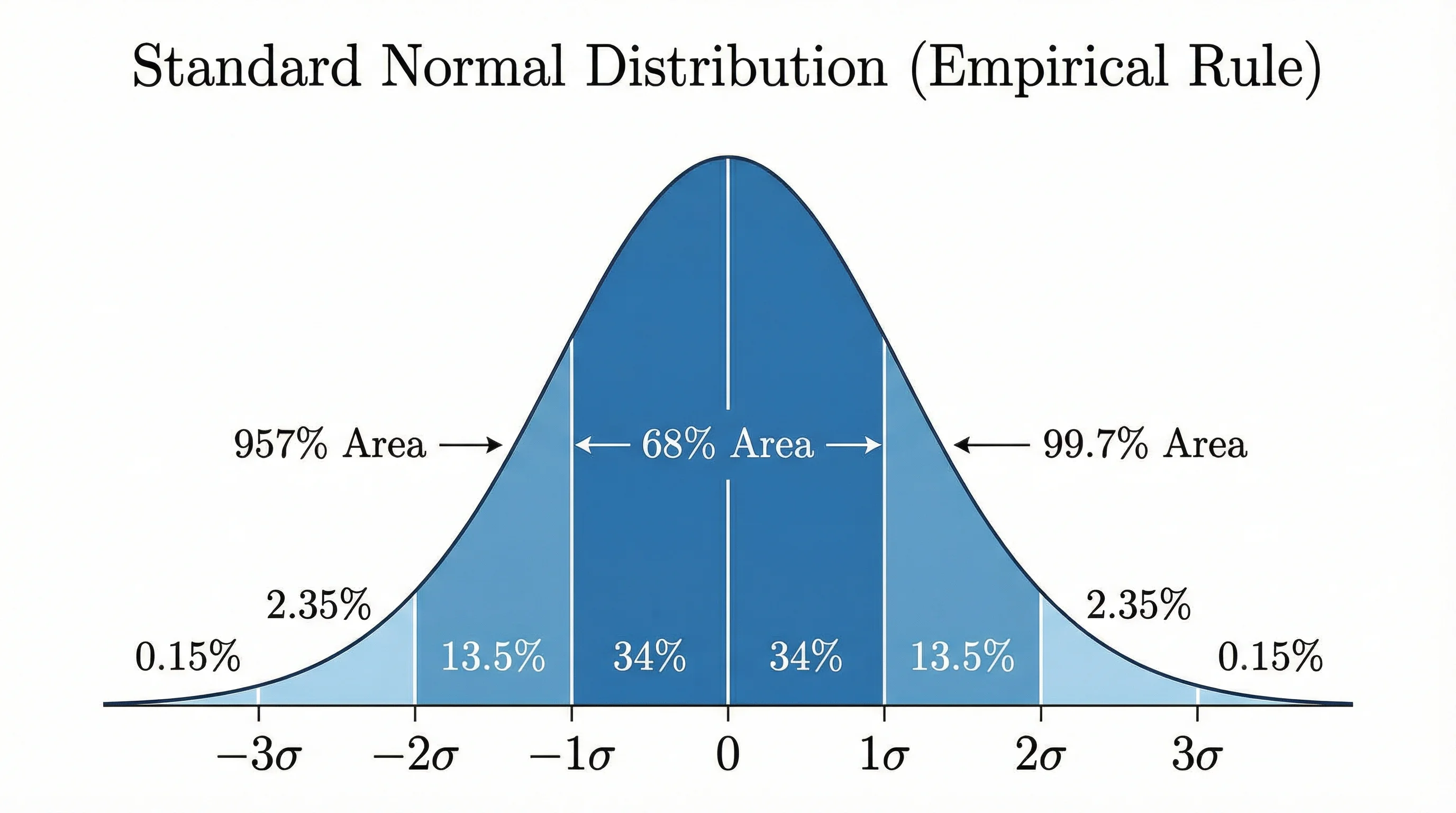
箱形圖(又稱盒鬚圖)是根據五數概括顯示資料分布的標準化方式:最小值、第一四分位數(Q1)、中位數(Q2)、第三四分位數(Q3)與最大值。「箱」從 Q1 延伸到 Q3(四分位距,即 IQR),箱內有一條線標示中位數。「鬚線」從箱子延伸到 1.5 倍 IQR 範圍內的最小值與最大值,超出鬚線的資料點則單獨繪製為離群值。箱形圖特別適合比較多個群組的分布,並一眼識別偏斜度、離散程度與異常觀測值。
理解四分位數與 IQR
- Q1(第一四分位數):25% 的資料低於此值——下半部資料的中位數
- Q2(中位數):50% 的資料低於此值——資料集的中間點
- Q3(第三四分位數):75% 的資料低於此值——上半部資料的中位數
- IQR(四分位距):Q3 − Q1,表示中間 50% 資料的離散程度
- 鬚線延伸到箱子邊緣 1.5 × IQR 範圍內的最極端點
- 離群值是超出鬚線邊界的個別資料點,表示異常觀測值
如何解讀箱形圖
解讀箱形圖需要檢視幾個關鍵特徵。箱內中位數線的位置顯示偏斜度:若中位數靠近 Q1,資料呈右偏;若靠近 Q3,則呈左偏。箱子長度(IQR)顯示中間 50% 資料的離散程度——箱子越寬表示變異性越大。鬚線長度表示主要資料體的範圍,鬚線外的個別點為離群值。比較多個箱形圖時,注意各組中位數位置(集中趨勢)、箱子大小(變異性)及離群值數量的差異。
箱形圖與直方圖的比較
箱形圖與直方圖都顯示資料分布,但服務不同目的。直方圖以長條表示頻率計數,呈現分布的完整形狀,適合理解單一變數的詳細分布規律。箱形圖將分布濃縮為簡潔的五數概括,使其在並排比較多個群組時更具優勢。直方圖能揭示箱形圖無法顯示的多峰性(多個峰值),而箱形圖在突顯離群值及比較各類別的中位數與離散程度方面更勝一籌。實務上,研究人員常同時使用兩種視覺化方式以獲得完整的資料全貌。
在研究與資料分析中的應用
箱形圖廣泛應用於各科學領域。在臨床試驗中,比較各患者群組的治療結果;在教育中,顯示不同班級或學校的測驗分數分布;在品質管制中,監控隨時間變化的製程變異;在環境科學中,比較不同地點的污染程度;在金融中,視覺化報酬分布與風險概況;在心理學中,比較不同實驗條件下的反應時間或問卷分數。其緊湊格式使其成為版面有限且需要清晰呈現多項比較的出版品的理想選擇。
如何建立箱形圖
- 描述您的資料——提供數值、群組標籤或分布參數
- 選擇方向——根據標籤與情境選擇垂直(預設)或水平
- 選擇比較類型——單一變數、多組或前後對比設計
- 指定離群值處理——顯示個別點、使用 1.5×IQR 規則或自訂閾值
- 新增標注——中位數值、樣本大小、顯著性標記或 p 值
- 我們的 AI 產生器處理版面配置,即時生成出版級箱形圖