常態分布曲線生成器 鐘形曲線
描述您的分布參數,我們的AI將立即建立專業的常態分布曲線。適用於統計學課程、研究論文和數據分析簡報。
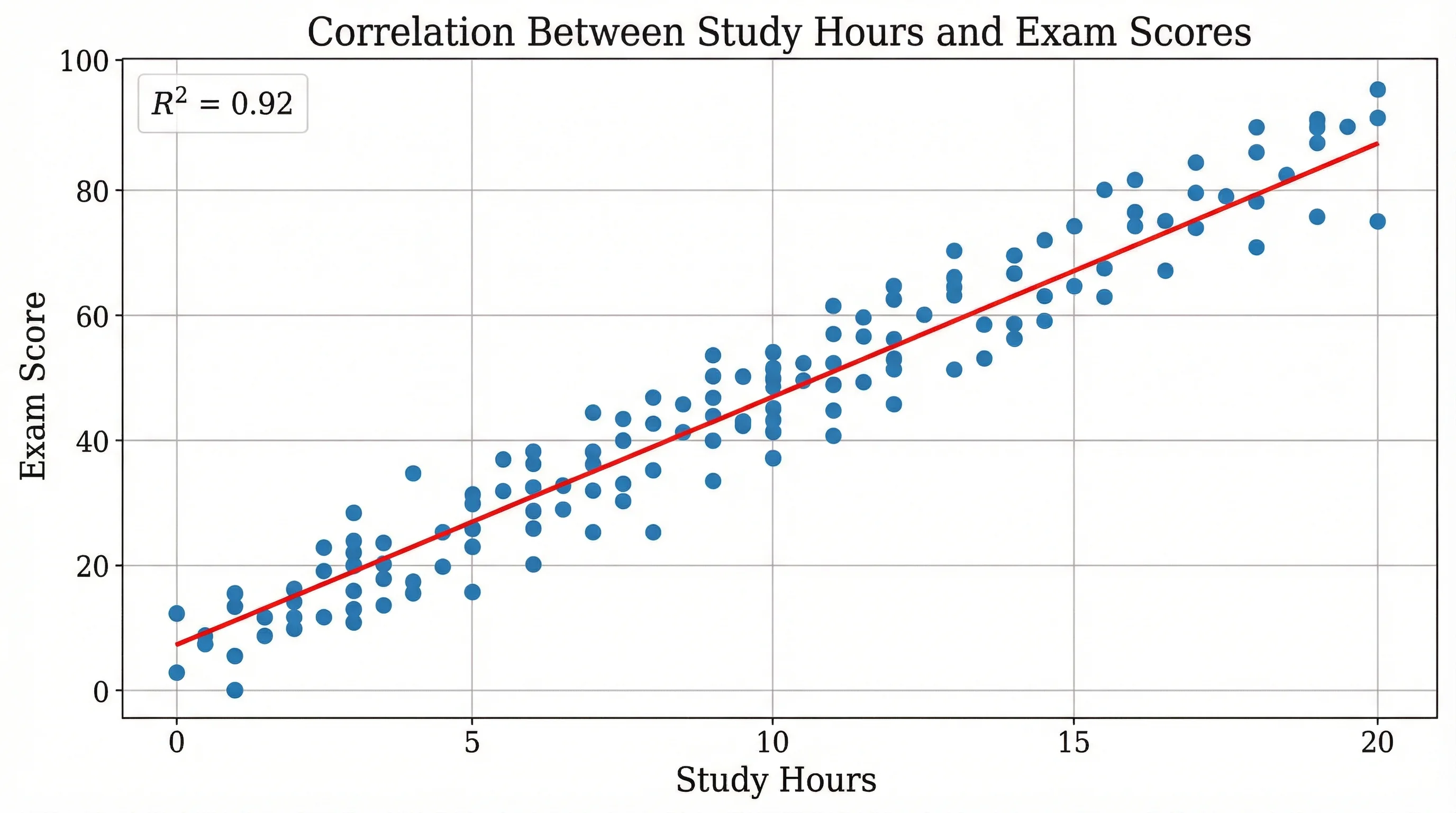
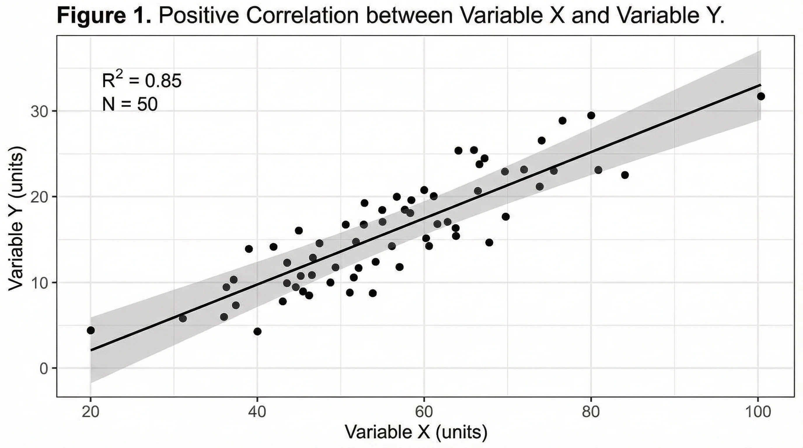
Upload your data — generates a precise normal distribution fit with real statistical calculations
Bell Curve Generator
By using ConceptViz, you agree not to generate or edit adult, sexual, explicit, unsafe, or policy-violating content. See Content Policy.
免費試用 ·
Your bell curve will appear here
Describe the bell curve you want
Bell Curve Generator
Paste data, upload a file, or use sample data to continue.
By using ConceptViz, you agree not to generate or edit adult, sexual, explicit, unsafe, or policy-violating content. See Content Policy.
免費試用 ·
Your bell curve will appear here
Upload data to fit and visualize a normal distribution
鐘形曲線範例
瀏覽常態分布範例或在上方生成您自己的圖表
標準常態分布
經典的標準常態分布(Z分布),均值=0,σ=1,展示68-95-99.7法則及百分比標籤。
考試成績分布
考試成績的常態分布,包含字母成績等級邊界和百分位標記,用於教育評量。
兩個分布的比較
重疊的常態分布,比較對照組和實驗組,常用於假設檢定。
信賴區間視覺化
顯示信賴區間的常態分布,包含用於假設檢定的臨界值和拒絕域。
智商分數分布
智商分數的常態分布,包含認知分類範圍和人口百分比。
品質管制圖
六標準差品質管制鐘形曲線,顯示製程能力及規格限和缺陷率。
什麼是鐘形曲線?
鐘形曲線,也稱為常態分布或高斯分布,是一種對稱的機率分布,在繪製圖表時形成特徵性的鐘形。曲線的最高點代表均值(平均值),數據在兩側對稱分布。鐘形曲線是統計學的基礎,自然地出現在許多現實世界的現象中,從考試成績和身高分布到量測誤差和品質管制流程。其形狀由兩個參數定義:決定中心位置的均值(μ)和決定分散程度的標準差(σ)。
68-95-99.7法則(經驗法則)
- 68%的數據落在均值的1個標準差範圍內(μ ± 1σ)
- 95%的數據落在均值的2個標準差範圍內(μ ± 2σ)
- 99.7%的數據落在均值的3個標準差範圍內(μ ± 3σ)
- 該法則有助於快速估算常態分布數據的機率並識別異常值
- 超過3σ的值被認為在統計上是罕見的(僅占觀測值的0.3%)
- 該法則廣泛用於品質管制、成績曲線和假設檢定
鐘形曲線在研究中的應用
鐘形曲線幾乎在所有科學學科中都有應用。在心理學中,智商分數和人格特質遵循常態分布。在教育中,標準化考試成績通常呈常態分布,從而可以進行百分位排名和成績分配。在製造業中,鐘形曲線支撐著六標準差品質管制,其中製程旨在將缺陷保持在嚴格的標準差限制內。在金融中,股票報酬和風險模型經常假設常態分布。在醫學研究中,鐘形曲線有助於分析藥物反應、血壓讀數和其他跨族群的生物量測值。
如何建立鐘形曲線
- 定義均值(μ)— 分布的中心點
- 指定標準差(σ)— 數據的分散程度
- 選擇要突顯的內容:信賴區間、成績等級邊界或比較組
- 選擇標註樣式:百分比、Z分數或x軸上的原始值
- 為特定感興趣的區域新增著色(尾部、中心區域或自訂範圍)
- 我們的AI生成器處理所有數學運算,即時生成出版級圖表
鐘形曲線與其他分布的比較
雖然鐘形曲線(常態分布)最為常見,但並非所有數據都遵循這種模式。偏態分布在一側有更長的尾部,常見於收入數據或反應時間。雙峰分布有兩個峰值,見於混合族群。均勻分布在所有值上具有相等的機率。理解數據何時真正服從常態分布至關重要——對非常態數據使用鐘形曲線假設會導致錯誤的統計結論。我們的工具專注於為已驗證符合常態分布模式的數據生成準確的常態分布視覺化。