
Infographic Design Styles & Trends: Flat, Isometric, Hand-Drawn and Minimalist
Compare infographic design styles and trends: flat, isometric, hand-drawn, minimalist, 3D and editorial layouts, with examples and selection rules.
Infographic design styles are not just decoration. The style you choose changes how quickly a reader understands the message, how credible the information feels, and whether the final graphic looks like a data summary, a classroom handout, a research explainer, or a social media post.
The current search intent around infographic styles is very specific: people want to compare flat design, isometric design, hand-drawn visuals, minimalist layouts, 3D elements, sketch aesthetics, and current visual trends. This guide focuses on that decision: which infographic style should you use, when should you avoid it, and how do you keep the design clear rather than trendy for its own sake?
AI Infographic Generator
Create infographic drafts, visual summaries, and research explainers from text prompts.
Try it free →Quick Answer: Which Infographic Style Should You Use?
If you need a fast choice, match the style to the communication job:
| Infographic goal | Best style | Why it works |
|---|---|---|
| Explain a process | Flat design or line art | Simple shapes keep steps easy to follow |
| Show a system, pipeline, or environment | Isometric design | Adds depth without the cost and clutter of full 3D |
| Make a complex topic feel approachable | Hand-drawn or sketch style | Signals humanity, exploration, and teaching |
| Present research data | Minimalist editorial style | Keeps attention on the data and conclusion |
| Promote a technology or product idea | 3D or dimensional style | Creates polish and visual depth |
| Compare methods, categories, or tradeoffs | Modular card or matrix layout | Supports scanning and side-by-side decisions |
| Teach students | Flat, labeled, high-contrast illustration | Works well for worksheets and classroom projection |
The best infographic style is usually the least distracting style that still makes the idea memorable. A public-facing environmental explainer can be warmer and more illustrative. A research methods infographic should be quieter, more structured, and more precise.
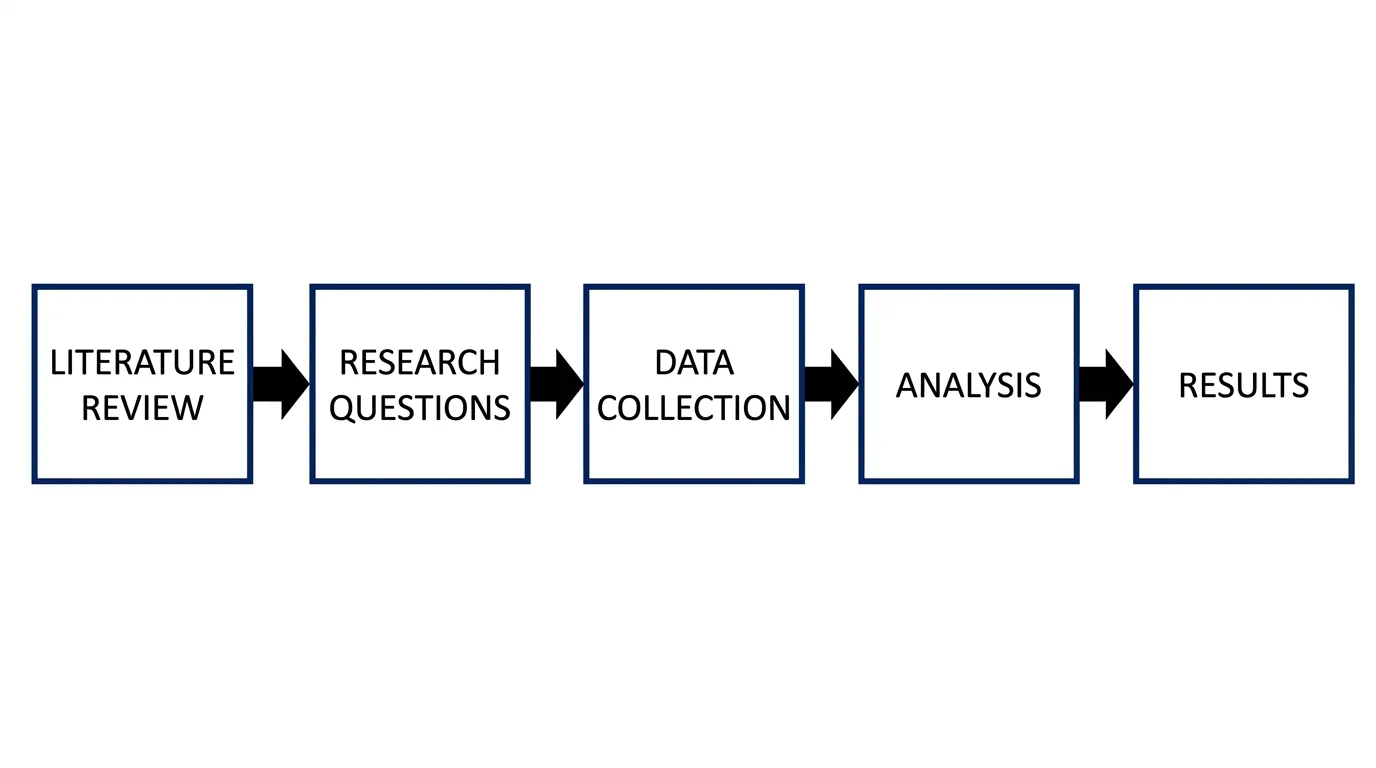
A process-style infographic works best when the reader needs to follow a sequence or method.
What Counts as an Infographic Design Style?
An infographic style is the visual language used to present information. It includes:
- Illustration type: flat, isometric, sketch, 3D, line art
- Layout structure: timeline, flowchart, comparison matrix, dashboard, cards
- Typography: editorial, technical, playful, academic, poster-like
- Color strategy: muted, high contrast, colorblind-safe, gradient-heavy
- Texture: clean vector, grain, hand-drawn marks, paper-like surfaces
- Data treatment: charts, icons, callouts, labels, annotations
This matters because an infographic is not one thing. A public health poster, a scientific graphical abstract, a startup market map, and a classroom worksheet are all “infographics,” but they need different visual styles.
CLIPS science communication guidance describes infographics as a genre that combines icons, illustration, minimal text, data visualization, and narrative structure. That is a useful definition because it reminds us that style must serve the story, not replace it.
1. Flat Infographic Design
Flat design uses clean shapes, simple icons, solid color areas, and minimal texture. It is still one of the safest infographic styles because it scales well, exports cleanly, and does not fight the content.
Best for:
- Process explainers
- Classroom diagrams
- Social media summaries
- Basic comparison infographics
- Icons and section headers
Use flat design when the reader needs speed. If the infographic explains a five-step workflow, a scientific process, or a simple framework, flat shapes help the eye move through the sequence.
Avoid flat design when:
- The topic depends on depth, spatial structure, or anatomy
- The design needs a premium editorial look
- The subject already has too many icons and flat graphics in the SERP
Flat design can also become generic. The fix is not to add more decoration. Instead, use a stronger grid, a better title, sharper labels, and one distinctive color accent.

Flat illustration is useful for clear, scalable infographic elements and simple visual summaries.
2. Isometric Infographic Design
Isometric design creates a 3D-like view using consistent angles and parallel lines. It shows depth while staying organized. For infographics, this makes it useful for systems, environments, dashboards, and technical concepts.
Design trend research from SVG Genie notes that isometric SVG graphics add dimensional depth while retaining the scalability and efficiency of vector graphics. That is exactly why isometric visuals are common in technology explainers and product diagrams.
Best for:
- System maps
- Research pipelines
- Lab workflows
- Software architecture
- Facilities, campuses, or environments
- Multi-step processes with spatial relationships
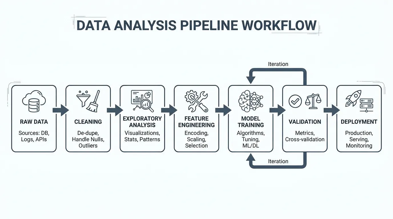
Use isometric design when the concept has structure. If you are explaining a lab setup, an AI pipeline, a supply chain, or a network, isometric style lets you show parts in relation to one another without turning the graphic into a technical drawing.
Avoid isometric design when:
- The message is mostly text or statistics
- Accessibility is a concern and labels must stay large
- You need a fast mobile-first social post
Isometric illustrations can look impressive but become unreadable if labels are too small. Keep the number of objects low and use callout labels outside the drawing.
3. Hand-Drawn and Sketch Infographic Style
Hand-drawn infographic style uses imperfect lines, sketch marks, loose icons, notebook textures, and a more human feel. It is useful when the subject is complex or intimidating and the goal is to make it approachable.
Creative Bloq’s 2026 illustration trend reporting highlights a wider move toward imperfect, human-made visuals in response to overly polished AI aesthetics. For infographic design, that trend matters because hand-drawn marks can make a topic feel less corporate and more teachable.
Best for:
- Early-stage ideas
- Classroom explanations
- Brainstorming frameworks
- Public science communication
- Workshop handouts
- Friendly social posts
Use hand-drawn style when the audience needs permission to explore. A sketch-like diagram can reduce the feeling that a concept is final or rigid. That is useful for explaining frameworks, design thinking, research planning, or introductory science topics.
Avoid hand-drawn style when:
- You need regulatory, medical, or technical precision
- The graphic includes exact data
- The audience expects formal academic presentation
The best hand-drawn infographics still use structure. The lines can be imperfect, but the hierarchy must be clear.
4. Minimalist Editorial Infographic Style
Minimalist editorial style uses whitespace, restrained color, strong typography, simple charts, and careful alignment. It is one of the best styles for research, policy, education, and professional reports.
For quantitative science communication, the rule is simple: the reader should see the purpose, the data, and the message quickly. A tutorial on effective visual communication for quantitative scientists argues for clear purpose, clear data, and an obvious message. Minimalist editorial style supports those three goals better than most decorative trends.
Best for:
- Research summaries
- Data-heavy visuals
- Journal club materials
- Executive briefings
- Policy explainers
- Scientific posters
Use minimalist style when credibility matters. A restrained layout tells the reader that the information is the main event. It also gives charts, captions, and uncertainty notes enough space.
Avoid minimalist style when:
- The infographic needs emotional warmth
- The audience is very young
- The topic is abstract and needs visual metaphor
Minimal does not mean empty. It means every visual element has a job.
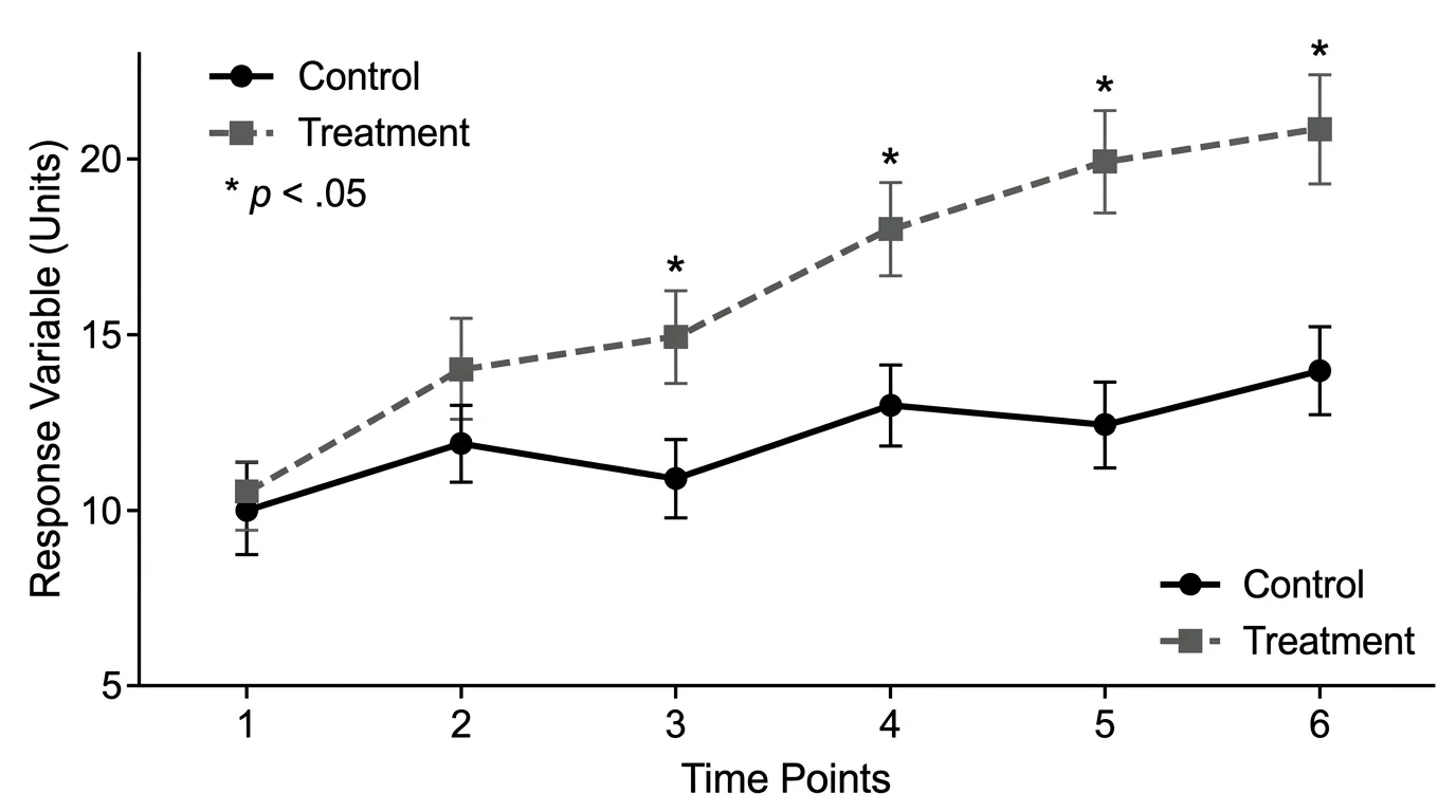
Minimalist research infographics work best when charts, labels, and conclusions are easy to inspect.
5. 3D and Dimensional Infographic Style
3D-style infographic design uses depth, soft shadows, rendered objects, dimensional typography, and layered surfaces. In 2026 design trend coverage, 3D and dimensional SVG graphics appear repeatedly because they add depth and visual polish to otherwise flat interfaces.
Best for:
- Technology explainers
- Product features
- Abstract concepts
- Hero visuals
- Marketing infographics
- High-level system overviews
Use 3D style when the infographic needs to attract attention first. A dimensional visual can make a report, landing page, or social card feel more current.
Avoid 3D style when:
- The subject requires exact interpretation
- The visual includes many labels
- The infographic must print clearly in black and white
- The style makes the content look like advertising
For scientific or educational content, 3D works best as a supporting element. Let it introduce the topic, then use flat charts, labels, and tables for the actual explanation.
6. Technical Line Art and Diagram Style
Technical line art uses outlines, arrows, labels, dimension marks, and schematic structure. It is less decorative than other infographic styles but extremely effective for teaching systems and methods.
Best for:
- Scientific methods
- Engineering diagrams
- Lab equipment
- Anatomy and biology labels
- Software architecture
- Step-by-step procedures
Use line art when precision matters. The viewer should be able to trace relationships, identify parts, and follow labels without guessing what the decoration means.
Avoid line art when:
- The audience needs emotional engagement
- The infographic competes in a highly visual social feed
- There are too many small details for mobile viewing
Line art pairs well with flat color blocks. Use color to group sections, not to decorate every line.
7. Modular Card and Bento Infographic Layouts
Not every style is an illustration style. Sometimes the most important choice is the layout. Modular card layouts, comparison matrices, and bento-style grids are useful when the infographic has many small ideas rather than one continuous story.
Best for:
- Lists of trends
- Tool comparisons
- Pros and cons
- Step summaries
- Before/after examples
- Feature breakdowns
Use a modular layout when the reader will scan. Many people looking for infographic style ideas do not read from top to bottom. They compare options. A matrix or card grid lets them jump to the style that fits their project.
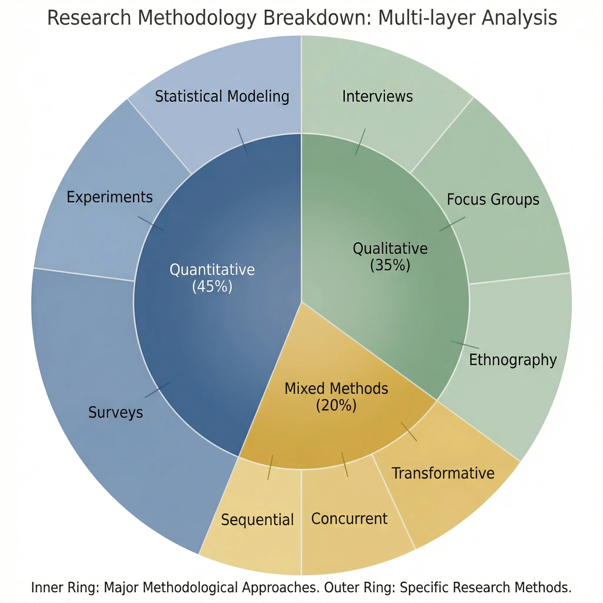
Modular and chart-based layouts help readers compare components without following a strict narrative path.
Current Infographic Design Trends to Watch
Search results around current infographic visual styles show several recurring trends. The useful question is not “what is fashionable?” but “which trend improves comprehension?”
Human-made texture after AI polish
Designers are adding grain, rough lines, paper texture, and hand-made marks to avoid the generic look of AI-generated visuals. This works well for education and public communication, but less well for formal data graphics.
Isometric and soft 3D systems
Isometric and dimensional styles remain useful for systems, dashboards, software, and technology topics. They help readers understand relationships between components.
Minimal editorial layouts
For research and professional audiences, minimalist editorial layouts remain strong because they make the argument look credible. They also support citations, chart labels, and caveats.
Hybrid flat-plus-sketch visuals
A practical 2026 approach is to combine flat structure with hand-drawn accents. The grid stays clean, but the marks feel human. This is useful for course materials, explainer posts, and workshop visuals.
Fewer colors, stronger hierarchy
Many modern infographics use fewer colors, larger type, stronger spacing, and more deliberate contrast. The result is easier to read on mobile and easier to translate into slides.
Style Selection Framework
Use this framework before opening a design tool:
| Question | If yes | Recommended style |
|---|---|---|
| Does the reader need to follow steps? | Yes | Flat process or line-art flowchart |
| Does the topic involve spatial relationships? | Yes | Isometric or schematic style |
| Is the audience scientific or professional? | Yes | Minimalist editorial style |
| Is the goal classroom engagement? | Yes | Flat, labeled, or light sketch style |
| Is the graphic for social discovery? | Yes | Strong title, bolder color, maybe 3D or hand-drawn texture |
| Are exact numbers central? | Yes | Data-first minimalist chart layout |
| Is the idea early-stage or conceptual? | Yes | Sketch or whiteboard style |
When in doubt, choose the style that removes the most friction. A beautiful infographic that hides the message is a failed infographic.
Common Mistakes When Choosing an Infographic Style
Mistake 1: Choosing a style before defining the message
Start with the one-sentence takeaway. If you cannot write it in one sentence, the infographic style will not fix the problem.
Mistake 2: Using 3D for exact data
3D effects can distort perception. Use them for scene-setting, not for precise comparisons.
Mistake 3: Making hand-drawn mean messy
Hand-drawn style should feel human, not careless. Keep alignment, spacing, and reading order controlled.
Mistake 4: Confusing trendiness with credibility
A trend can earn attention, but credibility comes from clear labels, real sources, and honest visual hierarchy.
Mistake 5: Designing only for desktop
Many infographics are first seen on mobile. Test whether the title, key number, and main visual still work at small size.
Best Style Choices by Use Case
Scientific infographic
Use minimalist editorial structure, clear charts, restrained color, and source notes. Add illustration only where it clarifies the mechanism.
Related guide: How to Design Infographics for Scientists
Classroom infographic
Use flat, labeled visuals with high contrast. Avoid tiny captions. If the infographic is a worksheet, include both labeled and unlabeled versions.
Related tools: Plant Cell Diagram Generator, Animal Cell Diagram Generator
Social media infographic
Use a strong headline, one idea, large text, and a style with personality. Hand-drawn, bold flat, or dimensional styles can work if the message stays simple.
Research workflow infographic
Use a flat or isometric process style. Keep steps numbered and use arrows only where they show real sequence or causality.
Workflow Diagram Generator
Create process visuals, research workflows, and methodology diagrams from text.
Data infographic
Use minimalist charts and clear annotation. Do not hide uncertainty. Include the source, date, and sample size when relevant.
Related guide: Research Data Visualization Best Practices
Practical Workflow: From Topic to Style
- Write the main takeaway in one sentence.
- Decide the reader's task: understand, compare, remember, decide, or act.
- Choose the layout: timeline, process, comparison, dashboard, map, or matrix.
- Choose the illustration style: flat, isometric, sketch, minimal, 3D, or line art.
- Limit the palette to 2-4 main colors.
- Build the hierarchy: title, key visual, supporting details, source notes.
- Test the graphic at mobile size.
- Remove anything that does not support the takeaway.
If you use AI to draft the infographic, treat the first output as a layout sketch. Edit the hierarchy, verify every claim, and replace generic icons with subject-specific visuals.
FAQ
What are the main infographic design styles?
The main infographic design styles include flat design, isometric design, hand-drawn or sketch style, minimalist editorial style, 3D or dimensional style, technical line art, and modular card layouts. The best choice depends on whether you need to explain steps, compare information, present data, or make a topic feel approachable.
Which infographic style is best for scientific communication?
For scientific communication, minimalist editorial style usually works best because it keeps attention on the evidence, labels, and conclusion. Flat diagrams and technical line art also work well when explaining methods, workflows, or biological processes.
Are flat infographics still modern?
Yes. Flat infographics are still useful because they are clear, scalable, and easy to read. The modern version uses stronger hierarchy, better spacing, fewer colors, and more deliberate icons instead of generic decoration.
When should I use isometric infographic design?
Use isometric design when you need to show systems, environments, pipelines, dashboards, or spatial relationships. It adds depth while staying more organized than full 3D rendering.
Is hand-drawn infographic style professional?
It can be professional when used intentionally. Hand-drawn style is best for education, workshops, early concepts, and public communication. It is less suitable for exact data graphics, formal medical content, or regulatory documents.
What infographic styles are trending in 2026?
Current trends include human-made texture, hand-drawn accents, isometric systems, soft 3D elements, minimalist editorial layouts, and hybrid flat-plus-sketch visuals. The strongest trend is using style to improve clarity rather than adding decoration.
How do I choose an infographic style for a data-heavy topic?
Use a data-first minimalist layout. Start with the chart type, labels, source notes, and conclusion. Add illustration only if it helps readers understand the context or mechanism behind the data.
Can AI help create infographic styles?
Yes. AI tools can quickly draft multiple infographic style directions, but you should still edit the hierarchy, verify facts, check accessibility, and refine the visual language so the final infographic does not look generic.
Sources and Further Reading
分類
更多文章
")
8 Best Free ChemDraw Alternatives in 2026 (For Drawing Chemical Structures)
Compare the best free ChemDraw alternatives: ChemSketch, MarvinSketch, MolView, ChemDoodle & more. Draw chemical structures without expensive subscriptions.

How to Create Science Animations for PowerPoint: Complete Guide for Researchers
Learn to create engaging scientific animations in PowerPoint with zero budget. Includes step-by-step tutorials, free tools comparison, and best practices for molecular biology, chemistry, and physics presentations.

Best AI Diagram Generators in 2026 Compared
Compare the top AI diagram generators for UML, ER, Venn, electrical, and architecture diagrams. Turn text into professional visuals in seconds.