
Column Chart Maker Guide: When to Use Column Charts and How to Make One
Learn when to use a column chart, how it differs from a bar chart, and how to make clean grouped, stacked, and spreadsheet-ready column charts.
A column chart is one of the quickest ways to compare values across categories or show changes across a small number of time periods. It looks simple: categories on the horizontal axis, numeric values on the vertical axis, and vertical bars rising from a baseline. But that simplicity is exactly why column charts are so easy to misuse.
This guide explains when a column chart is the right choice, when a horizontal bar chart is clearer, how to prepare data for a column chart maker, and how to build clean grouped, stacked, and spreadsheet-ready column charts without making the chart harder to read than the table it replaces.

Column Chart Maker
Paste CSV data and create simple, grouped, stacked, or 100% stacked column charts with SVG, PNG, and CSV export.
Make a column chart ->Quick Answer: What Is a Column Chart?
A column chart compares values with vertical bars. The categories sit on the x-axis, the numbers sit on the y-axis, and the height of each column represents the value.
Use a column chart when:
- you have discrete categories, such as products, months, departments, survey choices, or grade levels
- category labels are short enough to fit along the horizontal axis
- the viewer should compare magnitudes quickly
- the left-to-right order matters, such as months, quarters, age groups, or process steps
- you need a familiar chart for a report, dashboard, worksheet, or presentation
Do not use a column chart when category names are long, there are too many categories, or the main question is about a continuous distribution. In those cases, a horizontal bar chart, line chart, histogram, or table may communicate the data more clearly.
A good column chart starts with a simple question: what should the reader compare first?
Column Chart vs Bar Chart
Column charts and bar charts belong to the same family. Both use rectangular bars to compare values. The practical difference is orientation:
| Chart type | Orientation | Best for |
|---|---|---|
| Column chart | Vertical bars | Short labels, time periods, small category sets, dashboards |
| Bar chart | Horizontal bars | Long labels, rankings, many categories, narrow layouts |
Microsoft's column chart guidance describes column charts as useful for comparing items or showing data changes over time. Google Sheets help gives a similar framing: compare categories or show changes over time, with labels in the first column and numeric values in the remaining columns.
That means the decision is not "which chart is more professional?" The decision is "which orientation makes the data easiest to read?"
Use a column chart when labels are short
Column charts work well when labels can sit comfortably under the bars:
| Month | Revenue |
|---|---|
| Jan | 42000 |
| Feb | 51000 |
| Mar | 48000 |
| Apr | 63000 |
The viewer expects time to move left to right, so monthly or quarterly data often feels natural as a column chart.
Use a bar chart when labels are long
If your categories are long, a horizontal bar chart is usually better:
- Customer onboarding documentation
- Billing and subscription support
- Enterprise implementation consulting
- Product education and training
Rotating labels under a column chart makes the chart harder to scan. A horizontal bar chart lets the labels read normally.
For a focused horizontal version, use the Bar Chart Maker. For vertical grouped or stacked charts, use the Column Chart Maker.
Bar Chart Maker
Create horizontal, grouped, and stacked bar charts when labels are long or ranking is the main story.
When a Column Chart Is the Right Choice
Column charts are strongest when the reader needs a fast visual comparison across a modest number of categories.
1. Comparing categories
Example: support tickets by priority.
| Priority | Tickets |
|---|---|
| Critical | 18 |
| High | 42 |
| Medium | 96 |
| Low | 54 |
The chart answers one clear question: which category has the largest value?
2. Showing values over discrete time periods
Example: revenue by quarter.
| Quarter | Revenue |
|---|---|
| Q1 | 210000 |
| Q2 | 260000 |
| Q3 | 245000 |
| Q4 | 310000 |
A line chart is better for a continuous trend or many time points. A column chart is better when the individual periods are important and the viewer should compare each period as a separate item.
3. Comparing a few series side by side
Example: revenue and expenses by month.
| Month | Revenue | Expenses |
|---|---|---|
| Jan | 20000 | 14000 |
| Feb | 35000 | 18000 |
| Mar | 32000 | 15500 |
This is a grouped column chart. It is useful when the reader needs to compare both across months and within each month.
4. Showing part-to-whole changes over time
Example: sales by channel across quarters.
| Quarter | Organic | Paid | Referral |
|---|---|---|---|
| Q1 | 52 | 31 | 17 |
| Q2 | 49 | 36 | 15 |
| Q3 | 57 | 28 | 15 |
This can become a stacked column chart. Use stacked columns when the total matters and the breakdown matters. Use 100% stacked columns only when proportions matter more than totals.
When more than one series appears, the chart needs a clear legend, consistent colors, and a focused comparison goal.
How to Format Data for a Column Chart Maker
Most online chart makers, spreadsheets, and BI tools expect a similar table shape:
| Category | Series 1 | Series 2 |
|---|---|---|
| A | 10 | 8 |
| B | 14 | 11 |
| C | 9 | 13 |
The first column contains labels. The remaining columns contain numbers. The first row usually contains headers.
Follow these rules before you paste data into a column chart maker:
| Data rule | Why it matters |
|---|---|
| One row per category | Keeps each x-axis item clean |
| Numeric values only in value columns | Prevents parsing errors |
| Consistent units | Avoids misleading comparisons |
| Short category labels | Prevents crowded x-axis text |
| No blank rows inside the range | Reduces chart import mistakes |
| Headers included | Gives the chart a title, legend, or series names |
If your source data is raw transactions, summarize it first. For example, convert order-level data into revenue by month before making the chart.
How to Make a Column Chart in Google Sheets
Google Sheets is a common place to make column charts because the data is already in a table. The basic workflow is:
- Put category labels in the first column.
- Put numeric values in one or more adjacent columns.
- Select the table, including headers.
- Choose
Insert > Chart. - In the Chart editor, choose a column chart if Sheets does not select it automatically.
- Use the Customize tab to edit chart title, axis titles, labels, colors, and gridlines.
For stacked versions, use multiple numeric columns and choose a stacked or 100% stacked column chart. Google Sheets notes that stacked column charts need at least two data series and are useful for part-to-whole relationships over time.
Good Google Sheets table
| Month | Revenue | Expenses |
|---|---|---|
| January | 20000 | 14000 |
| February | 35000 | 18000 |
| March | 32000 | 15500 |
Weak Google Sheets table
| Month | Revenue |
|---|---|
| January | $20k |
| February | about 35k |
| March | 32,000 dollars |
The second table looks readable to a human but is less reliable for charting because the values are not consistently numeric.
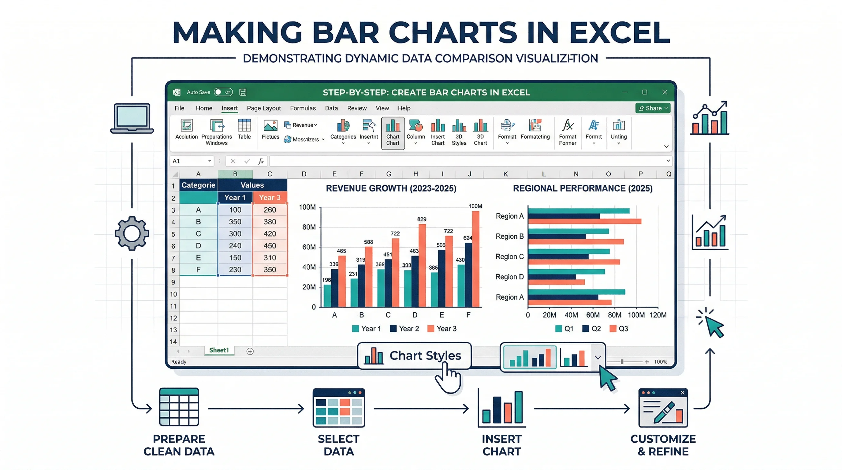
How to Make a Column Chart in Excel
Excel's column chart flow is similar:
- Enter a clean table with labels and numeric values.
- Select the range.
- Go to
Insert. - Choose
Insert Column or Bar Chart. - Pick a column chart variant.
- Format the chart title, axis labels, data labels, colors, and legend.
Microsoft's support page for column charts follows the same core flow: enter data, select it, then choose a column chart from the Insert tab.
The hard part is not inserting the chart. The hard part is choosing the right variant and cleaning up the default formatting.
Choosing the Right Column Chart Type
Column chart makers often offer several options. Pick the smallest chart type that answers the question.
| Column chart type | Use when | Avoid when |
|---|---|---|
| Simple column | One value per category | You need to compare multiple series |
| Grouped column | Compare two or more series within each category | There are too many categories or series |
| Stacked column | Show total plus composition | Exact segment comparison matters |
| 100% stacked column | Compare proportions across categories | Absolute totals are important |
| Combo chart | Pair columns with a line for target or rate | The two axes could confuse readers |
Simple column chart
Use this for one clean comparison: sales by month, students by grade, defects by product, or responses by option.
Grouped column chart
Use this when each category has multiple comparable series, such as 2025 vs 2026 revenue by quarter. Keep it small. Once you have more than three or four series, the chart becomes visually busy.
Stacked column chart
Use this when the total height matters and the composition is meaningful. For example, total website traffic by quarter split into organic, paid, and referral.
100% stacked column chart
Use this when the question is about share, not volume. For example, the percentage of support tickets by channel across quarters.
Column Chart Best Practices
Start the value axis at zero
For standard column charts, the baseline should usually start at zero. Since readers compare bar heights, truncating the y-axis exaggerates differences. The same caution applies to most bar and column charts.
Sort categories when order does not matter
If categories have no natural order, sort by value. Ranking makes comparison faster.
Keep natural order when the x-axis represents:
- months
- quarters
- age groups
- grade levels
- process stages
- rating scales
Keep colors purposeful
Do not give every column a random color. Use one main color for a single series. Use an accent color only when highlighting a specific category.
For grouped columns, assign one consistent color to each series. For stacked columns, use related colors that remain distinguishable.
Use labels only when they help
Data labels are useful when exact values matter. They are distracting when every label repeats information already clear from the axis.
Good label use:
- label the final value in a small chart
- label highlighted categories
- label stacked totals
- label percentages in a 100% stacked chart
Weak label use:
- labels on every tiny segment
- labels that overlap
- labels with too many decimals
- labels that use inconsistent units
Give the chart a sentence-like title
Bad title: Column Chart
Better title: Q4 revenue increased after the October campaign
A good title tells the reader what to notice. Axis labels and subtitles can carry details such as currency, date range, or sample size.

Even when the chart type changes, the same design rules apply: readable labels, honest scale, and enough context for the audience.
Common Column Chart Mistakes
Mistake 1: Too many categories
If the chart has 20 or 30 columns, readers stop comparing and start scanning. Use a horizontal bar chart, filter to the top items, or group smaller categories into "Other."
Mistake 2: Long labels under vertical bars
Rotated x-axis labels are a warning sign. If labels need to rotate 45 or 90 degrees, try a horizontal bar chart.
Mistake 3: Using columns for continuous data
A column chart compares discrete categories. If you are showing a distribution of continuous numeric data, use a histogram. If you are showing many time points, use a line chart.
Mistake 4: Comparing stacked segments too precisely
Stacked columns are good for totals and broad composition. They are weak for comparing middle segments because those segments do not share a common baseline.
Mistake 5: Using 3D effects
3D columns look decorative but make values harder to judge. Use flat columns with clean labels.
Mistake 6: Mixing units
Do not put revenue, conversion rate, and customer count into the same column chart unless you are using a carefully labeled combo chart. Different units need different visual treatment.
Column Chart Examples
Business report
| Quarter | Revenue |
|---|---|
| Q1 | 210000 |
| Q2 | 260000 |
| Q3 | 245000 |
| Q4 | 310000 |
Best chart: simple column chart.
Why: four short labels, one metric, clear quarterly comparison.
Classroom worksheet
| Plant Type | Average Height (cm) |
|---|---|
| Control | 12 |
| Fertilizer A | 18 |
| Fertilizer B | 15 |
| Fertilizer C | 21 |
Best chart: simple column chart with y-axis starting at zero.
Why: students can compare categories and write a conclusion from the visual.
Marketing dashboard
| Month | Organic | Paid | Referral |
|---|---|---|---|
| Jan | 5200 | 3100 | 1700 |
| Feb | 6100 | 3400 | 1900 |
| Mar | 6800 | 3900 | 2100 |
Best chart: grouped column if comparing channels month by month; stacked column if total traffic and channel mix matter.
Product ranking
| Product Feature | Requests |
|---|---|
| Collaboration workspace | 412 |
| Advanced permissions | 287 |
| Custom export formatting | 244 |
| White-label dashboards | 198 |
Best chart: horizontal bar chart.
Why: the labels are long and the ranking is the story.
Column Chart Maker Checklist
Before exporting your chart, run this quick check:
| Check | Question |
|---|---|
| Chart choice | Does a column chart answer the question better than a bar, line, or histogram? |
| Data shape | Is the first column labels and the remaining columns numeric values? |
| Axis baseline | Does the value axis start at zero for a standard comparison? |
| Labels | Are labels readable without rotation or overlap? |
| Units | Are units clear in the title, axis, or labels? |
| Colors | Does color explain series or highlight a point? |
| Variant | Is simple, grouped, stacked, or 100% stacked the right version? |
| Export | Will the chart remain readable in the final slide, report, or worksheet? |

Column Chart Maker
Create accurate grouped, stacked, and percent-stacked column charts from pasted CSV or spreadsheet data.
Prompt Examples for an AI Column Chart Maker
If you are using an AI chart maker, give it the data and the design intent.
Simple column chart prompt
Create a clean column chart comparing quarterly revenue:
Q1 $210k, Q2 $260k, Q3 $245k, Q4 $310k.
Use a zero baseline, blue columns, data labels above each column,
and the title "Quarterly revenue increased in Q4".
Grouped column chart prompt
Create a grouped column chart comparing revenue and expenses by month:
January revenue 20000, expenses 14000;
February revenue 35000, expenses 18000;
March revenue 32000, expenses 15500.
Use two consistent colors, a clear legend, and currency formatting.
Stacked column chart prompt
Create a stacked column chart showing website traffic by quarter.
Q1: organic 52, paid 31, referral 17.
Q2: organic 49, paid 36, referral 15.
Q3: organic 57, paid 28, referral 15.
Show totals above each column and use a clean dashboard style.
The more specific the prompt, the less time you spend correcting legends, labels, and chart variants.
Quarterly data often suits vertical charts because the time periods read naturally from left to right.
FAQ
What is a column chart?
A column chart is a chart that compares values with vertical bars. Categories usually appear on the horizontal axis, and numeric values appear on the vertical axis. The height of each column represents the value for that category.
What is the difference between a column chart and a bar chart?
The main difference is orientation. A column chart uses vertical bars, while a bar chart uses horizontal bars. Use column charts for short labels and left-to-right categories such as months or quarters. Use horizontal bar charts for long labels, rankings, and many categories.
When should I use a column chart?
Use a column chart when you want to compare values across a small number of discrete categories or show changes across a few time periods. It works well for monthly sales, survey counts, classroom data, department metrics, and dashboard comparisons.
When should I avoid a column chart?
Avoid a column chart when you have long category labels, too many categories, continuous distribution data, or many time points. A horizontal bar chart, histogram, line chart, or table may be clearer.
What data format does a column chart maker need?
Most column chart makers work best with one label column and one or more numeric value columns. The first row should contain headers, the first column should contain category labels, and the other columns should contain numbers.
Should a column chart start at zero?
For standard column charts, yes. Because viewers compare the height of columns, starting the value axis above zero can exaggerate differences. Use a zero baseline unless you have a specialized reason and clearly label the chart.
What is a grouped column chart?
A grouped column chart places multiple series side by side within each category. It is useful for comparing related values, such as revenue vs expenses by month or 2025 vs 2026 results by quarter.
What is a stacked column chart?
A stacked column chart stacks multiple series into one vertical column for each category. It is useful when the total and the composition both matter, such as total traffic split by channel across quarters.
Final Takeaway
A column chart is best when the data is simple, categorical, and easy to read left to right. Keep the table clean, choose the right column variant, start the axis at zero, and avoid forcing long labels into a vertical layout.
If you need a quick vertical comparison chart, try the Column Chart Maker. If your labels are long or the chart is mainly a ranking, use the Bar Chart Maker instead.
分類
更多文章
")
How to Design Scientific Infographics: 8-Step Guide for Researchers (2026)
Create credible, publication-ready infographics that scientists trust. Step-by-step process covering data accuracy, visual hierarchy, and source citations - with free templates.

Best Free Adobe Illustrator Alternatives 2026
Compare the best free Adobe Illustrator alternatives in 2026: Inkscape, Affinity by Canva, Canva, Vectr, Gravit and ConceptViz for vector graphics and diagrams.

AI Worksheet Generator Guide: Create Printable Worksheets and Answer Keys
Learn how to use an AI worksheet generator for printable classroom worksheets, answer keys, differentiation, diagrams, and teacher review workflows.