Créateur de Diagramme Camembert Multicouches Camemberts Imbriqués
Décrivez vos données hiérarchiques et notre IA créera instantanément un diagramme camembert multicouches professionnel. Générez des graphiques sunburst, des graphiques en anneau imbriqués et des graphiques en anneaux concentriques pour la recherche, l'analyse commerciale et les présentations.
Upload your data — generates precise pie/donut/sunburst charts with real proportions
Pie Chart Maker
By using ConceptViz, you agree not to generate or edit adult, sexual, explicit, unsafe, or policy-violating content. See Content Policy.
Gratuit à essayer ·
Your pie chart will appear here
Describe the pie chart you want
Pie Chart Maker
Paste data, upload a file, or use sample data to continue.
By using ConceptViz, you agree not to generate or edit adult, sexual, explicit, unsafe, or policy-violating content. See Content Policy.
Gratuit à essayer ·
Your pie chart will appear here
Upload data to generate a precise pie chart
Exemples de Diagrammes Camembert Multicouches
Parcourez des exemples de graphiques sunburst, en anneau imbriqué et en anneaux concentriques ou générez le vôtre ci-dessus
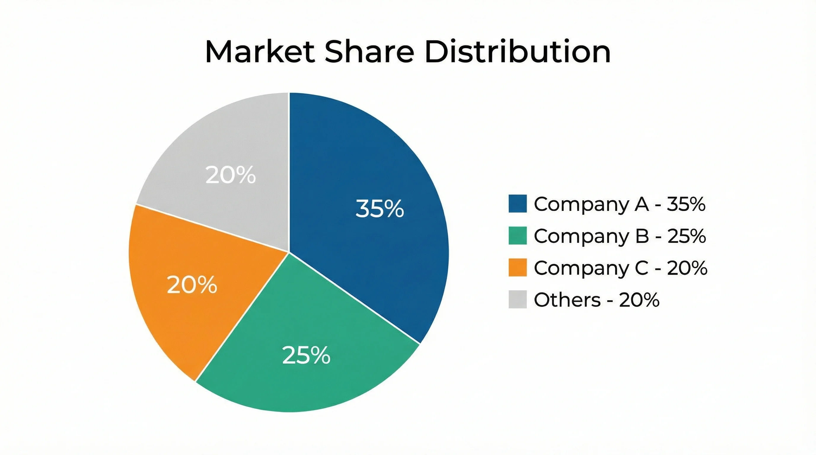
Répartition des Parts de Marché
Graphique sunburst visualisant les parts de marché technologique mondial par entreprise dans l'anneau intérieur et les catégories de produits dans l'anneau extérieur.
Graphique de Répartition du Budget
Graphique en anneau imbriqué montrant la répartition du budget universitaire par département et sous-catégories pour la planification financière.
Démographie de la Population
Graphique multi-anneaux visualisant la démographie de la population avec les groupes d'âge et la distribution ethnique sur des couches concentriques.
Répartition des Sources d'Énergie
Graphique sunburst cartographiant la consommation mondiale d'énergie des sources primaires aux méthodes de production spécifiques sur plusieurs couches.
Hiérarchie Organisationnelle
Diagramme camembert multicouches représentant la hiérarchie organisationnelle des divisions exécutives jusqu'aux allocations des équipes individuelles.
Décomposition de la Méthodologie de Recherche
Graphique sunburst académique décomposant la méthodologie de recherche des approches générales aux techniques spécifiques de collecte de données.
Qu'est-ce qu'un Diagramme Camembert Multicouches ?
Un diagramme camembert multicouches est une visualisation de données circulaire qui utilise des anneaux concentriques pour représenter des données hiérarchiques ou catégorielles à plusieurs niveaux simultanément. Contrairement à un diagramme camembert standard qui n'affiche qu'un seul niveau de catégories, les diagrammes camembert multicouches ajoutent de la profondeur en imbriquant les sous-catégories connexes dans des anneaux extérieurs autour d'un camembert central. Cette famille de graphiques comprend les graphiques sunburst, les graphiques en anneau imbriqués et les graphiques en anneaux concentriques. Ils sont particulièrement précieux en recherche et en analyse commerciale pour révéler comment les catégories larges se décomposent en sous-groupes plus fins, rendant les ensembles de données hiérarchiques complexes immédiatement compréhensibles.
Types de Diagrammes Camembert Multicouches
- Graphique Sunburst - Un graphique de hiérarchie radiale où chaque anneau représente un niveau dans l'arborescence des données, s'étendant vers l'extérieur depuis une catégorie racine centrale jusqu'aux nœuds feuilles
- Graphique en Anneau Imbriqué - Des anneaux concentriques où chaque anneau montre une dimension catégorielle différente, avec des segments alignés pour montrer les relations partie-tout
- Graphique en Anneaux Concentriques - Plusieurs couches d'anneaux indépendantes empilées concentriquement, chacune affichant une variable ou une période distincte pour la comparaison
- Camembert Hiérarchique - Un diagramme camembert standard avec des couches de décomposition révélant les sous-catégories dans chaque tranche du graphique parent
- Anneau Multi-couches - Un graphique en anneau avec deux anneaux ou plus partageant le même trou central, souvent utilisé pour comparer les proportions entre différents groupes ou périodes
- Treemap Radial - Une variante circulaire d'un treemap qui arrange les données hiérarchiques en arcs imbriqués plutôt qu'en rectangles
Quand Utiliser les Diagrammes Camembert Multicouches
Les diagrammes camembert multicouches sont idéaux lorsque vos données ont une hiérarchie naturelle et que vous souhaitez montrer comment les sous-catégories contribuent aux catégories parentes. Utilisez-les pour les décompositions budgétaires où les départements se subdivisent en centres de coûts, l'analyse de marché où les secteurs se décomposent en segments, les études démographiques avec des couches imbriquées et les organigrammes montrant les divisions jusqu'aux équipes. Ils fonctionnent mieux avec 2 à 3 niveaux de hiérarchie et moins de 20 segments au total. Évitez-les lorsque la comparaison numérique précise est plus importante que la structure hiérarchique, car les segments courbes peuvent rendre difficile l'estimation exacte des valeurs.
Comment Lire un Diagramme Camembert Multicouches
Commencez à lire un diagramme camembert multicouches du centre vers l'extérieur. L'anneau le plus intérieur montre les catégories de premier niveau et leurs proportions. Chaque anneau extérieur suivant décompose ces catégories en sous-catégories plus fines. La largeur angulaire de chaque segment est proportionnelle à sa valeur par rapport à son segment parent. Le codage couleur relie les segments connexes entre les anneaux, de sorte que les segments de la même famille de couleurs appartiennent à la même catégorie parente. Pour comprendre un point de données spécifique, retracez son arc vers l'intérieur pour identifier les catégories parentes auxquelles il appartient. L'arc total de tous les segments enfants est toujours égal à l'arc de leur segment parent, maintenant la relation partie-tout à chaque niveau.
Meilleures Pratiques pour la Conception de Diagrammes Camembert Multicouches
- Limitez la hiérarchie à 2 ou 3 anneaux pour maintenir la lisibilité et éviter la surcharge visuelle
- Utilisez des familles de couleurs cohérentes où les sous-catégories partagent des teintes plus claires ou plus foncées de la couleur de leur catégorie parente
- Étiquetez les segments directement quand l'espace le permet, et utilisez une légende pour les tranches plus petites
- Incluez des valeurs en pourcentage sur chaque segment afin que les lecteurs puissent estimer précisément les proportions
- Ordonnez les segments par taille dans chaque anneau, en plaçant la plus grande tranche à la position 12 heures
- Ajoutez une étiquette ou un titre au centre du trou de l'anneau pour décrire le total ou le nom de l'ensemble de données
- Assurez un contraste adéquat entre les segments adjacents, notamment dans les anneaux extérieurs où les tranches sont plus étroites
Questions Fréquentes
Plus d'Outils de Visualisation de Données
 Visualisation
Générateur de Graphiques IA
Créez des histogrammes, graphiques linéaires, diagrammes camembert et nuages de points professionnels à partir de descriptions textuelles.
 Recherche
Créateur de Nuage de Points
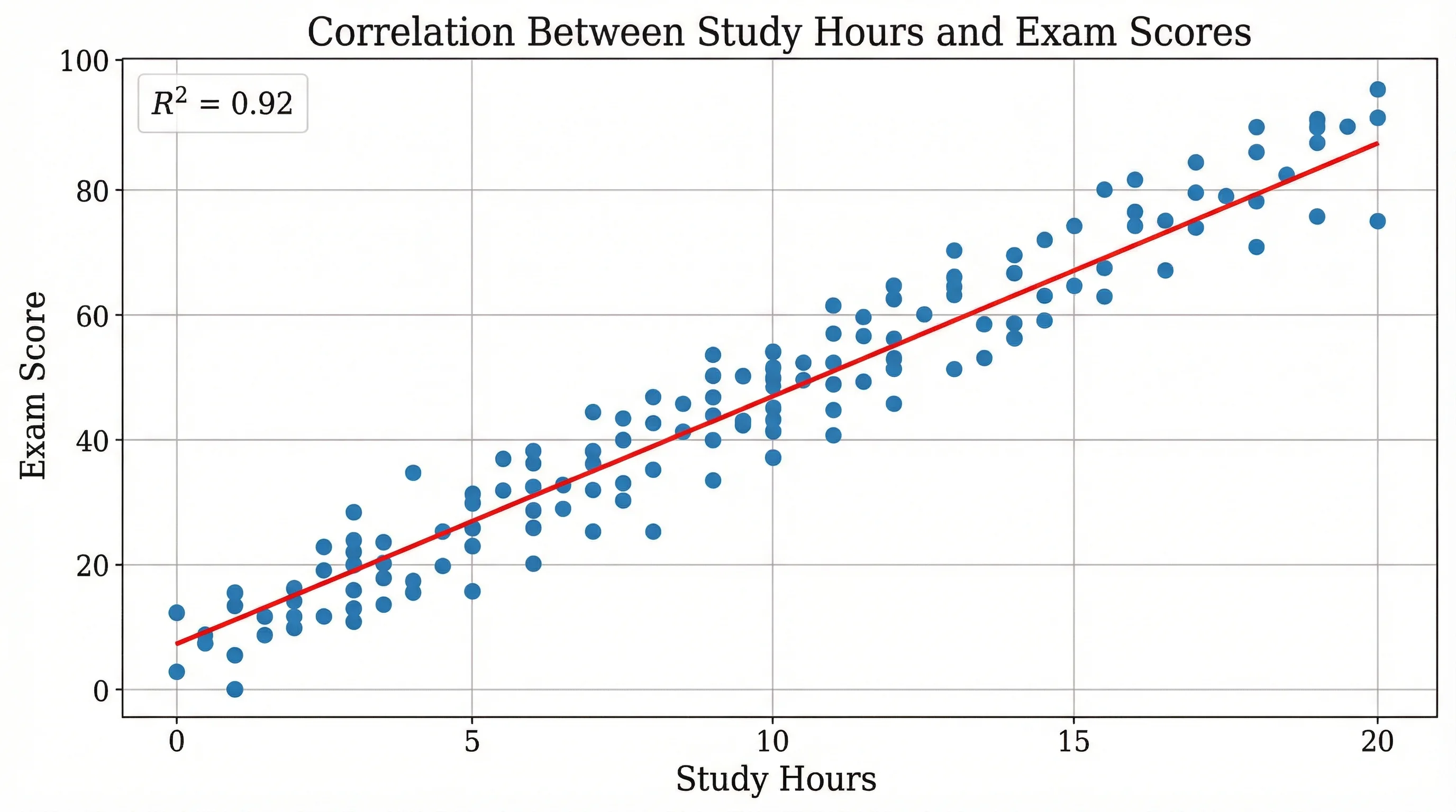
Créez des nuages de points professionnels avec des courbes de tendance et une analyse de régression pour les données de recherche.
 Visualisation
Générateur d'Infographies IA
Créez des infographies professionnelles pour les présentations, les rapports et la narration de données.