Dot Plot Generator for Statistics & Line Plots
Make a dot plot or line plot from your own data in seconds. Type or paste numbers, stack frequencies on a number line, show mean and median, switch between dots and X marks, and export a clean PNG or SVG — free.
n = 15 · mean 1.53 · median 1 · mode 1
min 0 · max 4 · range 4
Dot Plot Examples
Frequency dot plots and line plots rendered by the exact engine
Pets per Household
A classic frequency dot plot — each dot is one household, stacked above the number of pets.
Line Plot with X Marks
The same chart drawn with X marks — what elementary math calls a line plot.
Binned Test Scores
Continuous data is auto-binned (or set your own bin width) so it stays a dot plot, not a strip.
Mean & Median Markers
Turn on mean and median markers to compare center and read skew at a glance.
Goals Scored per Game
Tall stacks make the mode and the shape of a small dataset obvious.
Seedling Heights (cm)
Decimal measurements work too — they are binned automatically with the mean shown.
What is a dot plot?
A dot plot is a simple statistical graph that shows the distribution of a small dataset by stacking one dot for each data value above its position on a number line. The height of each stack is the frequency — how many times that value occurs. Dot plots make the center, spread, clusters, gaps, and outliers of a dataset easy to see at a glance, which is why they are taught from elementary school through introductory statistics.
How to make a dot plot from your data
- Type or paste your numbers in the data box — one value per line, or separated by commas or spaces. You can also upload a CSV or use the sample data.
- The generator counts how many times each value appears and stacks that many dots above it on the number line. Whole-number data is plotted on each exact value; decimal or wide-range data is grouped into bins automatically (you can set your own bin width).
- Switch between round dots and X marks, turn on mean and median markers, add an axis label and title, then export a clean PNG or SVG. The whole thing runs in your browser and is free — no image credits used.
Dot plot vs line plot — are they the same?
Yes. In elementary and middle-school math (Common Core), this chart is usually called a line plot and drawn with X marks above a number line; in statistics it is called a dot plot and drawn with dots. They are the same graph showing frequency over a number line. This tool makes both: just switch the marker between dots and X marks.
Dot plot vs histogram
A dot plot shows every individual data point as its own dot, so it keeps the exact values and works best for small datasets. A histogram groups data into bins and draws bars for the count in each bin, which suits larger datasets where individual points would be too many to show. Use a dot plot when you want to see each observation; use a histogram when you only need the shape of a large distribution.
Reading a dot plot: mean, median, mode, and shape
- Mode: the value with the tallest stack of dots is the most common value.
- Median: count to the middle dot when all dots are read left to right; the tool can mark it for you.
- Mean: the balance point of the dots; turn on the mean marker to compare it with the median and judge skew.
- Spread and shape: gaps (empty values), clusters, and far-out dots (outliers) are all visible directly, making dot plots a great way to describe a distribution.
When to use the AI illustration mode
Use the exact "Dot plot from data" mode for precise, free frequency dot plots and line plots from your own numbers. Switch to AI illustration for flexible, polished layouts the exact engine does not cover — side-by-side comparison dot plots, categorical Cleveland dot plots, or infographic-style designs for a poster or slide.
Questions Fréquentes
Related Statistics Tools
 Statistics
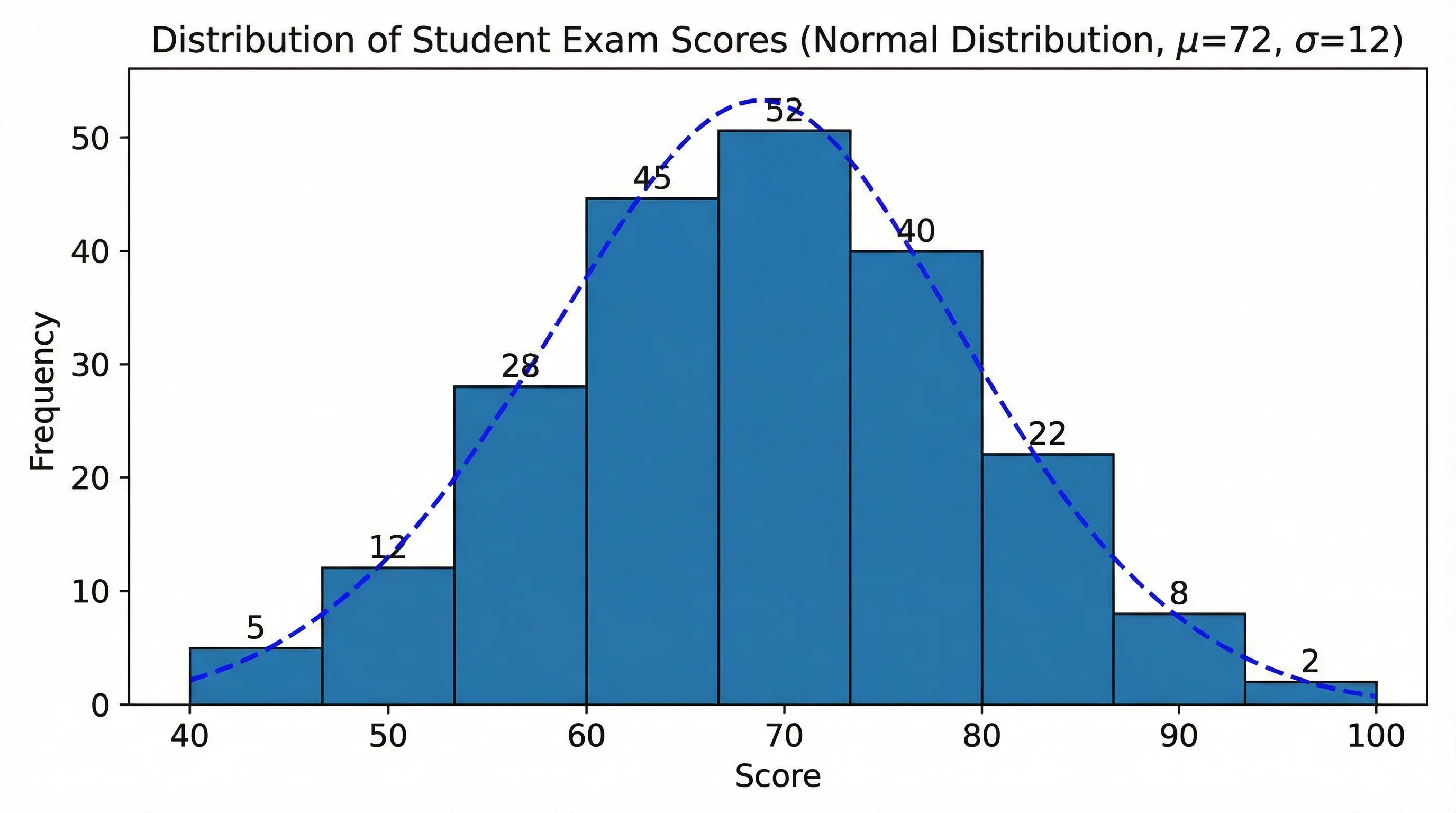
Histogram Maker
Turn raw data into a histogram with automatic binning, frequency bars, and a clean labeled axis.
 Statistics
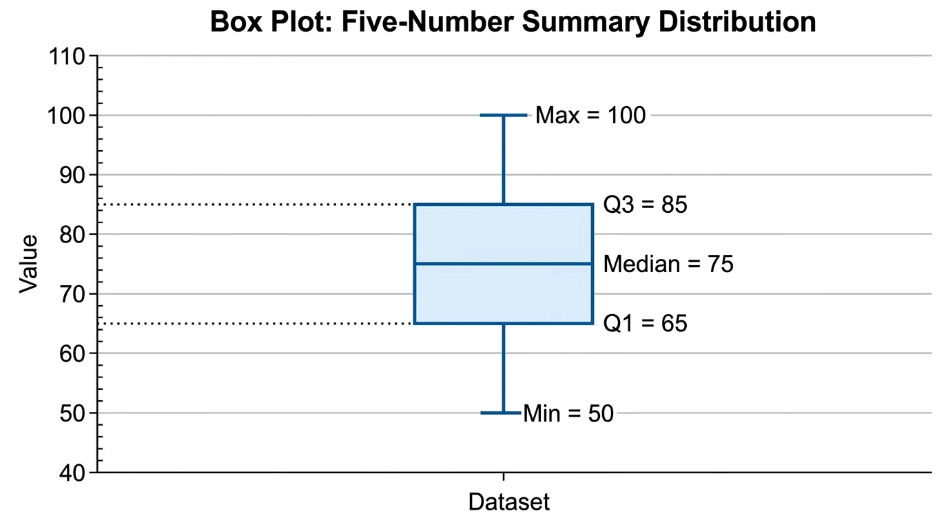
Box Plot Generator
Create box-and-whisker plots from your data with quartiles, median, and outliers marked.
 Statistics
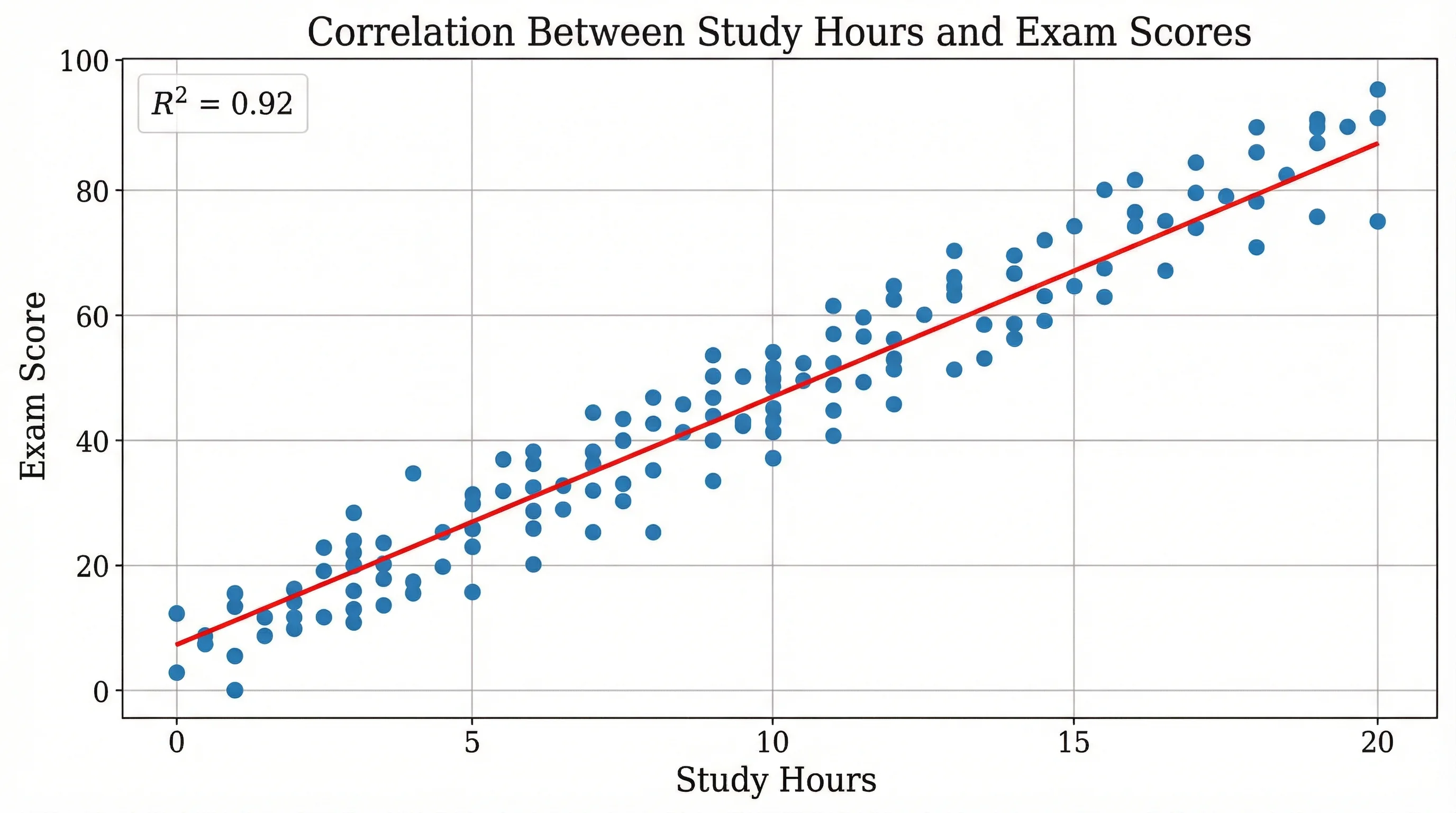
Scatter Plot Maker
Plot paired data to reveal correlation and trends, with axes, labels, and a trend line.