Créateur de Graphique à Barres Graphiques à Barres
Créez des graphiques à barres professionnels instantanément. Décrivez vos données ou téléchargez un CSV — obtenez des graphiques à barres nets et triés, prêts pour tout public.
Upload your CSV/Excel data — generates precise bar charts with real values
Bar Chart Maker
By using ConceptViz, you agree not to generate or edit adult, sexual, explicit, unsafe, or policy-violating content. See Content Policy.
Gratuit à essayer ·
Your bar chart will appear here
Describe the bar chart you want
Bar Chart Maker
Paste data, upload a file, or use sample data to continue.
By using ConceptViz, you agree not to generate or edit adult, sexual, explicit, unsafe, or policy-violating content. See Content Policy.
Gratuit à essayer ·
Your bar chart will appear here
Upload data to generate a precise bar chart
Exemples de Graphiques à Barres
Parcourez des exemples de graphiques à barres ou générez le vôtre ci-dessus
Comparaison des Résultats d'Expérience
Graphique à barres de résultats d'expérience avec des catégories groupées et des étiquettes de valeur.
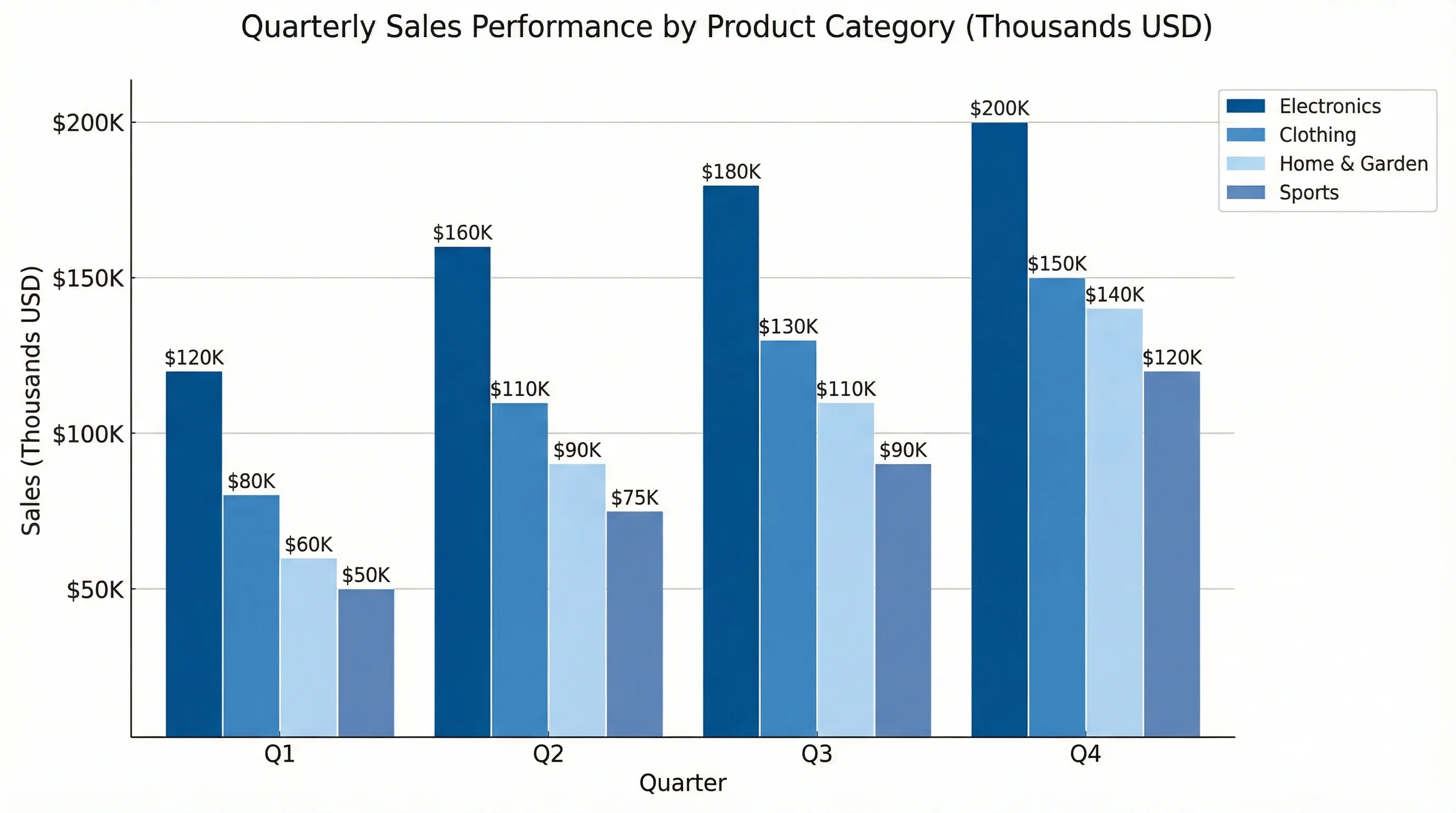
Graphique de Performance des Ventes
Graphique à barres de ventes commerciales avec des catégories triées et des étiquettes de données.
Analyse de Séries Temporelles
Graphique à barres de séries temporelles adapté aux rapports trimestriels ou annuels.
Graphique de Comparaison de Données
Graphique à barres de comparaison multi-métriques pour présentations et tableaux de bord.
Distribution des Réponses à l'Enquête
Graphique à barres de résultats d'enquête avec mise en page horizontale pour les longues étiquettes.
Analyse des Tendances de Revenus
Graphique à barres de revenus avec ligne de tendance pour les présentations aux dirigeants.
Qu'est-ce qu'un Graphique à Barres ?
Un graphique à barres utilise des barres rectangulaires pour comparer des valeurs entre différentes catégories. Chaque barre représente une catégorie, et sa longueur ou hauteur correspond à la valeur. Les graphiques à barres sont l'une des visualisations de données les plus polyvalentes et les plus compréhensibles, ce qui en fait le choix par défaut pour comparer des groupes discrets dans les rapports d'entreprise, la recherche académique et la communication quotidienne.
Types de Graphiques à Barres
- Graphique à barres vertical (histogramme en colonnes) — idéal pour les étiquettes courtes et les comparaisons standard
- Graphique à barres horizontal — idéal pour les longues étiquettes de catégories et les listes classées
- Graphique à barres groupé — compare plusieurs séries côte à côte au sein de chaque catégorie
- Graphique à barres empilé — montre simultanément la composition et le total
- Graphique à barres empilé à 100% — compare les proportions quand les totaux diffèrent entre catégories
- Graphique à barres divergent — montre les valeurs positives et négatives à partir d'une ligne de base
Bonnes Pratiques pour les Graphiques à Barres
Commencez l'axe des valeurs à zéro pour éviter d'exagérer les différences. Triez les barres par valeur quand le classement est le message principal. Utilisez une couleur principale avec un seul accent pour mettre en évidence. Gardez les étiquettes lisibles et évitez les abréviations quand c'est possible. Pour les barres horizontales, alignez les étiquettes de catégorie à gauche. Éliminez le "bruit visuel" — pas d'effets 3D, de dégradés ou de lignes de grille inutiles.
Graphique à Barres vs Histogramme
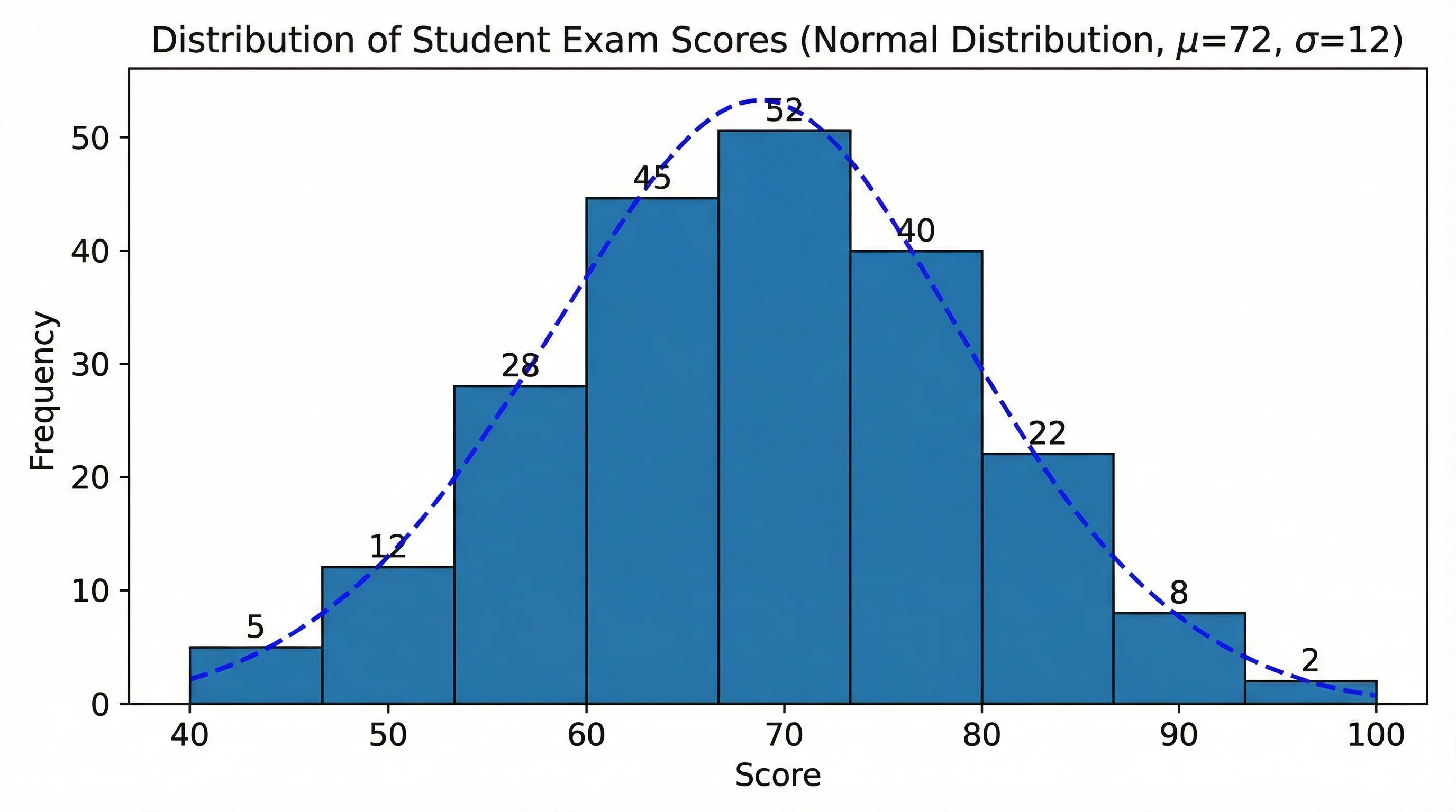
Les graphiques à barres comparent des catégories discrètes avec des espaces entre les barres. Les histogrammes montrent la distribution de données numériques continues avec des barres adjacentes. Si votre axe X comporte des noms de catégories (services, produits, pays), utilisez un graphique à barres. Si votre axe X comporte des plages numériques (tranches d'âge, intervalles de scores, intervalles de temps), utilisez un histogramme.
Questions Fréquentes
Plus d'Outils Graphiques
 Visualisation
Créateur d'Histogramme
Créez des histogrammes de distribution de fréquence pour l'analyse statistique.
 Visualisation
Générateur de Graphiques IA
Créez n'importe quel type de graphique à partir d'une description textuelle — camembert, courbe, nuage de points et plus encore.
 Visualisation
Créateur de Graphique Circulaire
Créez des graphiques circulaires et des graphiques en anneau pour les comparaisons parties-tout.