Spider Chart Maker for Spider Web & Radar Charts
Make a spider chart (also called a spider web, cobweb, or radar chart) online. Type your values per axis for a precise, auto-labeled chart, or describe one for an AI illustration — then export SVG or PNG, free.
Type categories and values — renders an exact spider chart as SVG, free
Chart settings
Exact spider chart, rendered as SVG.
Format: Label, value or Label, value1, value2 to compare two options. Uses 3–8 categories.
Compares two options across 6 criteria. Download an editable SVG for slides, reports, and worksheets.
Spider Chart Maker
免費試用 ·
Your spider chart will appear here
Describe the spider chart you want
Spider Chart Examples
Single-profile webs and multi-series comparisons for skills, options, and data
Performance Spider Chart
A single-series spider web: each axis is one skill, and the shaded area shows the overall profile.
Compare Options
Score options across the same criteria and overlay them to see which choice wins where.
Skills Assessment
Eight axes map a full skills profile — strengths reach out, gaps pull the web inward.
Multi-Series Comparison
Three overlapping series share one set of axes — a clean way to compare profiles at a glance.
Two-Series Web
Two teams on one cobweb chart — overlap shows where they match and where they differ.
Decision Matrix Web
Rate each option against your criteria and let the largest, most balanced web make the call.
What is a spider chart?
A spider chart plots several values around a central point, with one axis (spoke) per category. Joining the points wraps a shaded web around the center — which is why it is also called a spider web chart, cobweb chart, or web chart. It is the fastest way to show a profile or a balance of strengths and weaknesses across many dimensions at once. The same chart type is also known as a radar chart or star chart; if you specifically searched for that name, our radar chart generator is the same tool with a radar-focused walkthrough.
Two ways to make a spider chart here
- Data mode: type or paste a value for each axis and the tool builds a precise, correctly scaled spider chart with labeled spokes — accurate every time, no dragging or aligning.
- AI illustration mode: describe the spider diagram you want in plain English and the tool generates a polished, presentation-ready graphic with themed colors and styling.
- Use data mode when the numbers must be right (assessments, reports, comparisons); use AI mode when you want an on-brand visual for slides or social.
Spider charts for comparing options across criteria
A spider chart shines as a decision tool. List your criteria as the axes — price, quality, speed, support, and so on — then score each option you are weighing on those same axes. Overlay the options as separate colored webs and the trade-offs jump out: one choice may stretch far on price but cave in on support, while another stays balanced all the way around. This is the spider-diagram-for-comparing-options pattern people reach for when a plain table of numbers does not make the winner obvious. Because every option is rated against the same spokes, the largest and most even web is usually the strongest all-rounder.
How to make a spider chart from your data
- Name the axes — list the categories or criteria you want to measure, one per spoke.
- Enter or paste a value for each axis; add a second or third series if you are comparing options or people.
- The tool scales every series to the same axes and draws the labeled web automatically.
- Adjust labels and colors, then export a clean SVG or PNG to drop into a doc, slide, or report.
Multiple series and how many axes to use
You can plot one series for a single profile, or several series on the same chart to compare options, people, or time periods — each becomes its own colored web behind a legend. For the axes, three is the minimum that makes a web, and most readable charts use between five and eight. Past about ten spokes the labels crowd and the shapes get hard to tell apart, so it is better to drop low-signal categories or split the data into two charts. Keep every series on the same scale (for example 0–10) so the areas are honestly comparable.
When to use the AI illustration mode
Reach for AI illustration mode when you want a styled, eye-catching spider graphic rather than a strict data plot — a themed comparison for a presentation, a blog image, or a social post. For anything where the values must be exactly right, such as a graded assessment, a product comparison, or a report, use data mode so the spokes are scaled and plotted from your numbers instead of drawn by hand.
常見問題
Related Chart Tools
 Visualization
Radar Chart Generator
The same chart type framed around the radar name — plot values on spokes and overlay series.
 Visualization
AI Chart Generator
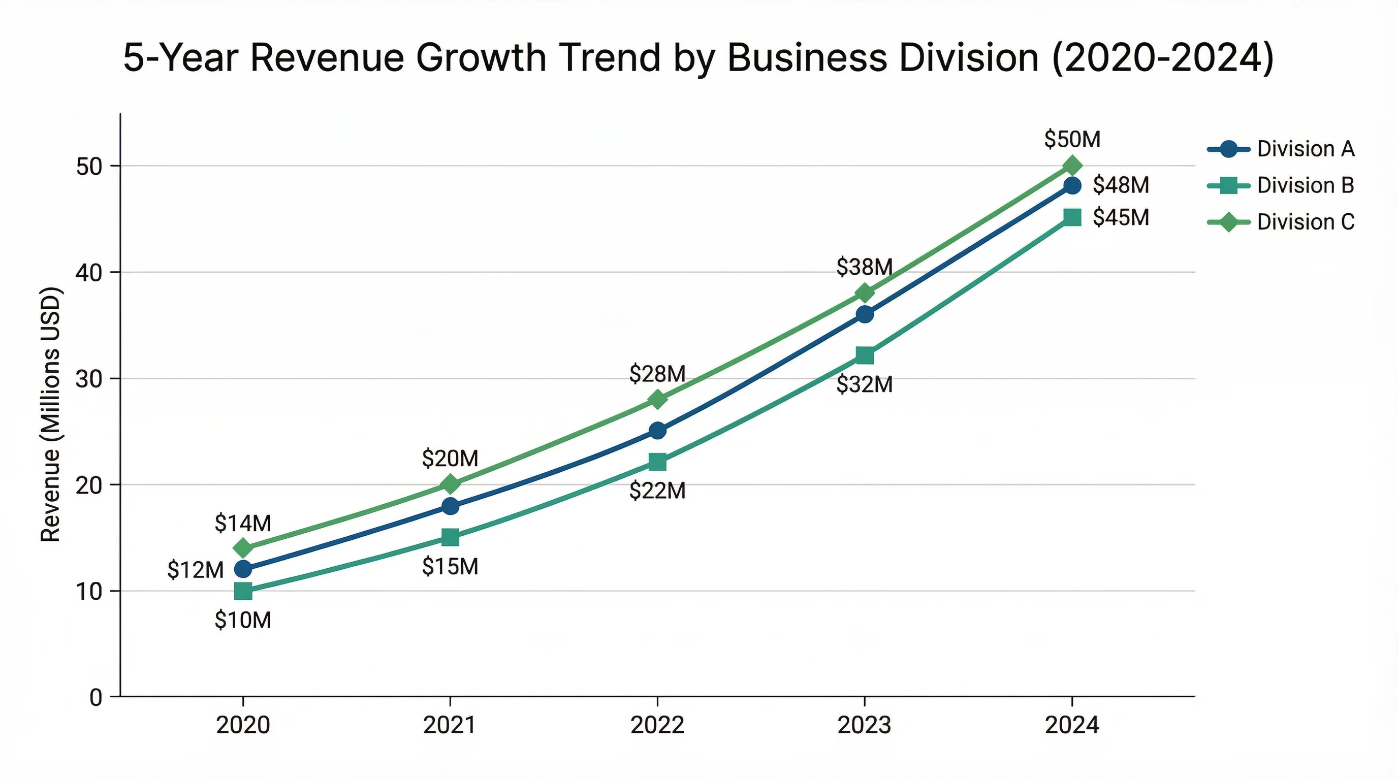
Turn data into bar, line, and pie charts with clean labels and styling.
 Research
Scatter Plot Maker
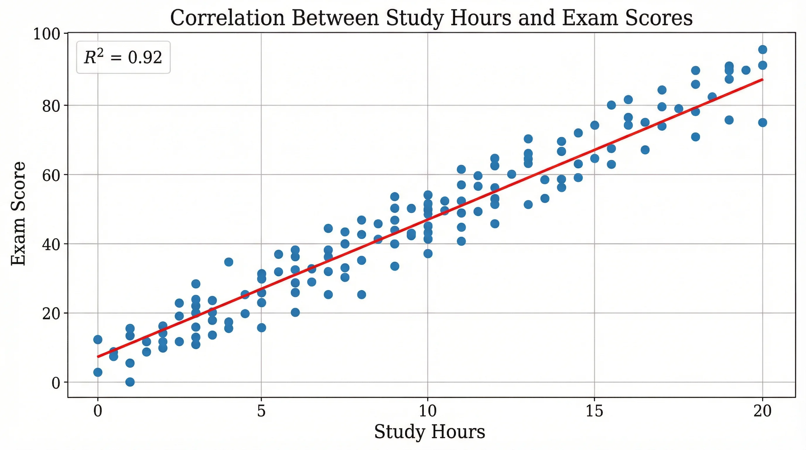
Plot two variables to reveal correlation, clusters, and outliers in your data.