圓餅圖製作器 圓餅圖
即時製作專業的圓餅圖。描述您的資料或上傳CSV — 即可獲得整潔、有標籤的圓餅圖,隨時用於簡報和報告。
Upload your CSV/Excel data — generates precise pie charts with real proportions
Pie Chart Maker
By using ConceptViz, you agree not to generate or edit adult, sexual, explicit, unsafe, or policy-violating content. See Content Policy.
免費試用 ·
Your pie chart will appear here
Describe the pie chart you want
Pie Chart Maker
Paste data, upload a file, or use sample data to continue.
By using ConceptViz, you agree not to generate or edit adult, sexual, explicit, unsafe, or policy-violating content. See Content Policy.
免費試用 ·
Your pie chart will appear here
Upload data to generate a precise pie chart
圓餅圖範例
瀏覽圓餅圖範例,或在上方生成您自己的圖表
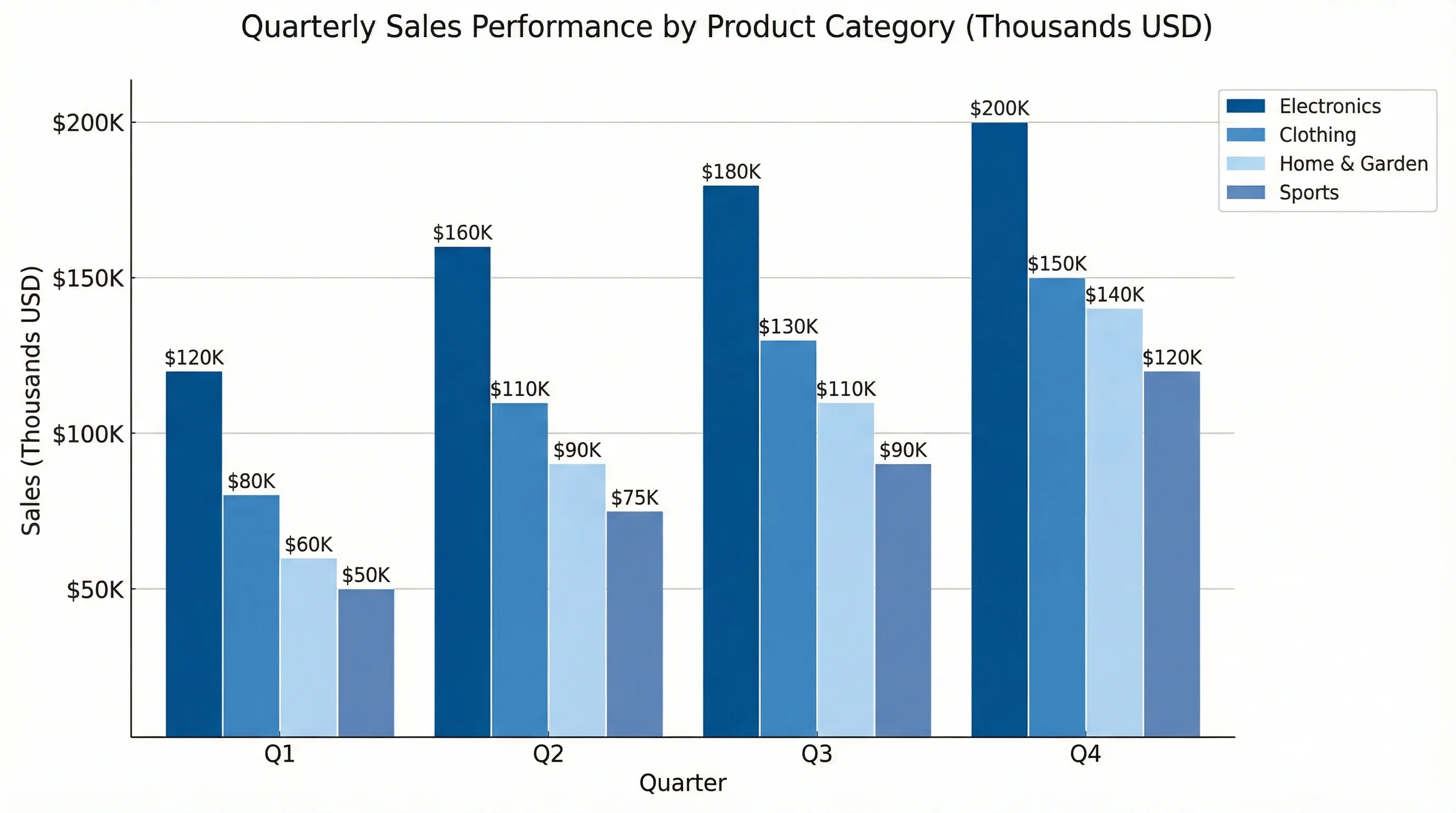
市場佔有率圓餅圖
整潔的市場佔有率圓餅圖,使用鮮明色彩並在外側顯示百分比標籤。
預算分配圖
適合財務報告和簡報的預算分配圓餅圖。
能源來源分佈
適用於環境和科學簡報的能源組合圓餅圖。
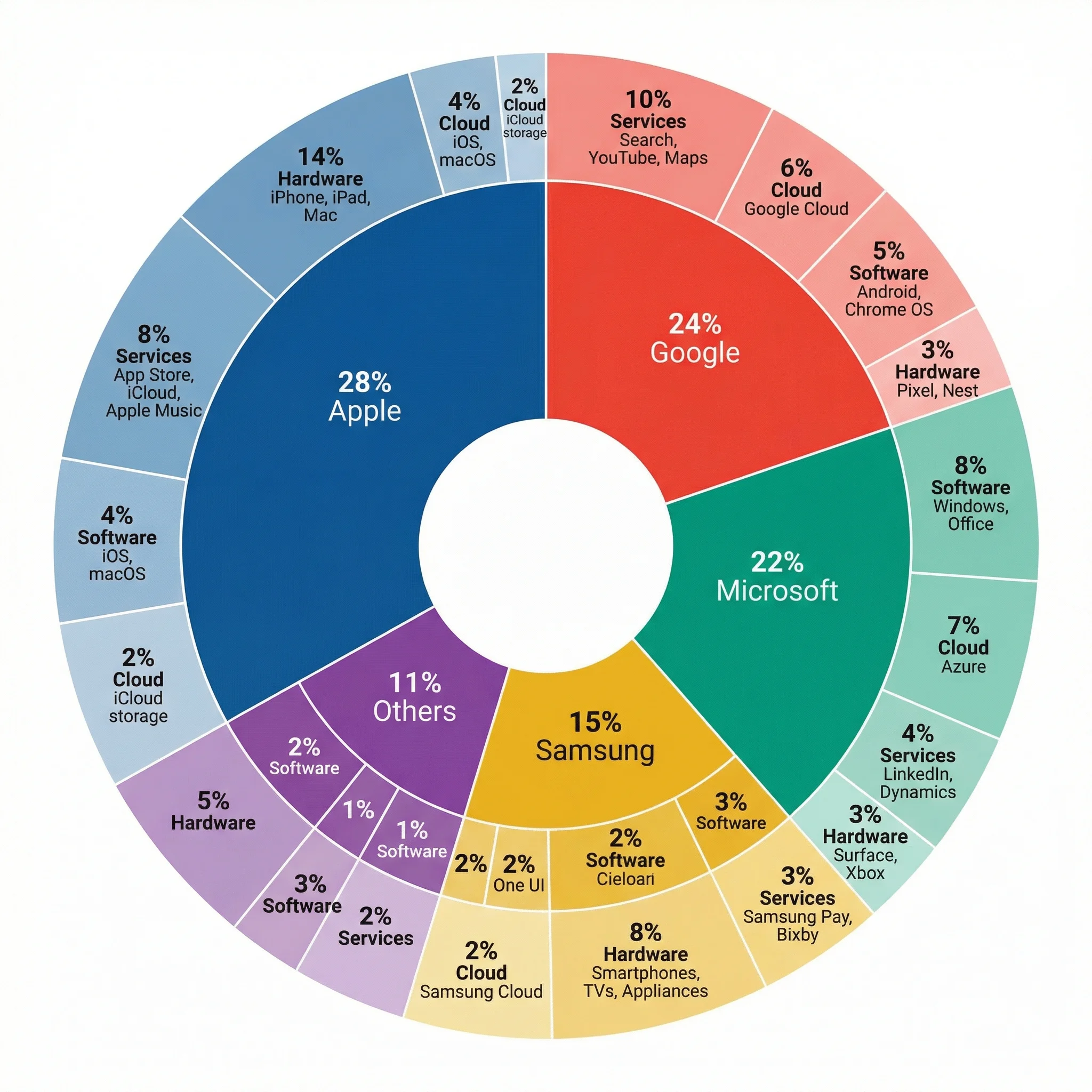
巢狀市場分析
多層圓餅圖,同時顯示類別和子類別的比例。
人口統計分佈
適用於社會科學研究的人口分佈圓餅圖。
研究方法組合
適用於學術文獻回顧的研究方法圓餅圖。
什麼是圓餅圖?
圓餅圖是一種圓形圖表,以整體的比例切片顯示資料。每個切片代表一個類別,其大小對應該類別對總量的百分比或比例。圓餅圖是最廣為人知的資料視覺化形式之一,能有效地向任何受眾傳達部分與整體的關係。
何時使用圓餅圖
- 顯示總量如何分為比例性部分(預算、市場佔有率、調查結果)
- 傳達具有5個或更少類別的簡單組成
- 呈現總量有意義時的部分與整體關係
- 為非技術受眾快速建立視覺摘要
- 在儀表板和高層報告中比較比例
- 顯示精確比較不如整體組成重要時的類別細分
圓餅圖設計最佳實踐
為確保可讀性,切片數量應控制在六個以下。使用鮮明但和諧的色彩,避免扭曲比例的3D效果。當切片較小時,將標籤置於圖表外側。按大小排序切片以便快速瀏覽。考慮使用環形圖以在儀表板上呈現更輕盈的視覺效果。若讀者需要精確比較類別,長條圖通常比圓餅圖更有效。
圓餅圖與其他圖表類型比較
圓餅圖擅長顯示部分與整體的關係,但在類別較多或數值接近時效果欠佳。長條圖更適合排名和精確比較。環形圖提供現代化的替代方案,中央有空間放置標籤。樹狀圖適合具有多個類別的階層式比例。堆疊長條圖可實現跨時期的比例比較,這是多個圓餅圖難以處理的。