Генератор водопадных диаграмм Водопадные диаграммы
Опишите свои данные, и наш ИИ мгновенно создаст профессиональную водопадную диаграмму. Идеально для финансового анализа, отчётов по отклонениям бюджета и презентаций для руководства.
Upload your CSV/Excel data — generates precise waterfall charts with real cumulative calculations
Waterfall Chart Generator
By using ConceptViz, you agree not to generate or edit adult, sexual, explicit, unsafe, or policy-violating content. See Content Policy.
Попробовать бесплатно ·
Your waterfall chart will appear here
Describe the waterfall chart you want
Waterfall Chart Generator
Paste data, upload a file, or use sample data to continue.
By using ConceptViz, you agree not to generate or edit adult, sexual, explicit, unsafe, or policy-violating content. See Content Policy.
Попробовать бесплатно ·
Your waterfall chart will appear here
Upload data to generate a precise waterfall chart
Примеры водопадных диаграмм
Просмотрите примеры водопадных диаграмм или создайте свою выше
Мостовая диаграмма выручки
Мостовая водопадная диаграмма выручки с разбивкой изменений год к году по продуктовым линейкам, ценообразованию и объёму.
Водопад прибылей и убытков
Каскадная диаграмма прибылей и убытков, показывающая путь от валовой выручки до чистой прибыли через различные статьи расходов.
Анализ отклонений бюджета
Каскадная диаграмма отклонений бюджета, сравнивающая плановые и фактические расходы по подразделениям с выделением благоприятных и неблагоприятных отклонений.
Сравнение квартальных результатов
Мостовая диаграмма квартального EBITDA, иллюстрирующая изменение показателей с Q3 по Q4 с ключевыми факторами влияния.
Структура затрат проекта
Каскадная диаграмма затрат по проекту, показывающая накопление общих расходов на различных этапах от планирования до внедрения.
Горизонтальная водопадная диаграмма
Горизонтальная водопадная диаграмма для анализа денежных потоков, показывающая изменение остатка денежных средств при различных притоках и оттоках.
Что такое водопадная диаграмма?
Водопадная диаграмма, известная также как каскадная или мостовая диаграмма, — это метод визуализации данных, показывающий, как на начальное значение влияет ряд промежуточных положительных и отрицательных значений, ведущих к итоговому результату. Плавающие столбцы наглядно перекрывают разрыв между последовательными точками данных, что упрощает отслеживание изменений. Водопадные диаграммы широко используются в финансовом анализе, бизнес-аналитике и корпоративных презентациях для объяснения изменений таких показателей, как выручка, прибыль или бюджет во времени или по категориям.
Применение в финансовом анализе
- Мостовой анализ выручки — отображение изменения выручки от одного периода к другому с разбивкой по факторам
- Разбор P&L (прибылей и убытков) — визуализация пути от валовой выручки до чистой прибыли через статьи расходов
- Отчётность по отклонениям бюджета — сравнение плановых и фактических расходов с благоприятными и неблагоприятными отклонениями
- Анализ денежных потоков — отслеживание изменения остатка денежных средств с учётом притоков и оттоков за период
- Мосты EBITDA — объяснение квартальных или годовых изменений EBITDA для инвесторов и стейкхолдеров
- Анализ накопления затрат — отображение накопления общих затрат по этапам проекта или подразделениям
Как читать водопадную диаграмму
Читать водопадную диаграмму несложно, если понять её условные обозначения. Первый и последний столбцы, как правило, представляют итоговые значения, привязанные к базовой линии. Промежуточные столбцы парят между этими итогами, отображая нарастающие изменения. Зелёные столбцы обозначают положительные изменения, увеличивающие итог, красные — отрицательные, уменьшающие его. Линии-соединители помогают отследить нарастающий итог. Совокупный эффект всех промежуточных столбцов объясняет разницу между начальным и конечным значениями.
Водопадная диаграмма vs столбчатая диаграмма
Хотя и водопадные, и столбчатые диаграммы используют прямоугольные столбцы, они служат принципиально разным целям. Стандартная столбчатая диаграмма сравнивает дискретные категории, все столбцы которых начинаются от одной базовой линии. Водопадная диаграмма показывает, как значения последовательно накапливаются: каждый столбец начинается там, где закончился предыдущий. Это делает водопадные диаграммы идеальными для отображения состава и изменений, тогда как столбчатые лучше подходят для простых сравнений. Если нужно ответить на вопрос «как мы перешли от A к B», выбирайте водопадную диаграмму.
Соглашения по цветовому кодированию
- Зелёные столбцы обозначают положительные изменения (увеличения, доходы, благоприятные отклонения)
- Красные столбцы обозначают отрицательные изменения (уменьшения, убытки, неблагоприятные отклонения)
- Синие или серые столбцы обозначают итоговые значения (начальное значение, конечное значение, промежуточные итоги)
- Янтарные или жёлтые столбцы иногда используются для нейтральных статей или резервов на непредвиденные расходы
- Единое цветовое кодирование делает водопадные диаграммы интуитивно понятными для читателей
- Некоторые организации используют фирменные цвета, сохраняя разграничение положительных и отрицательных значений
Применение в бизнес-презентациях
Водопадные диаграммы — обязательный элемент презентаций в управленческом консалтинге и корпоративных советах директоров. McKinsey, BCG и другие ведущие консалтинговые фирмы активно используют водопадные диаграммы для формирования историй о бизнес-результатах на основе данных. Они особенно эффективны в работе с инвесторами при объяснении изменений прибыли, в FP&A для обзоров бюджета и в стратегическом планировании для сценарного анализа. Последовательный характер водопадных диаграмм создаёт естественный нарратив, помогающий аудитории разобраться в сложных финансовых данных.
Часто задаваемые вопросы
Другие инструменты визуализации данных
 Визуализация
Генератор диаграмм ИИ
Создавайте столбчатые, линейные, круговые диаграммы и другие виды для визуализации данных.
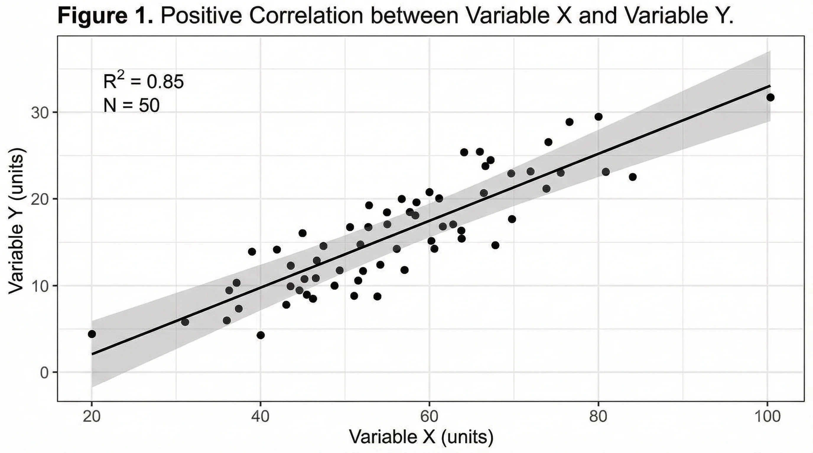
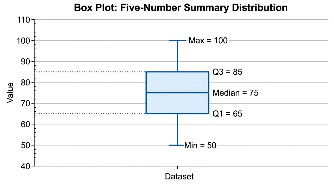 Статистика
Генератор ящичных диаграмм
Создавайте диаграммы ящик-с-усами для статистического анализа данных и сравнения распределений.
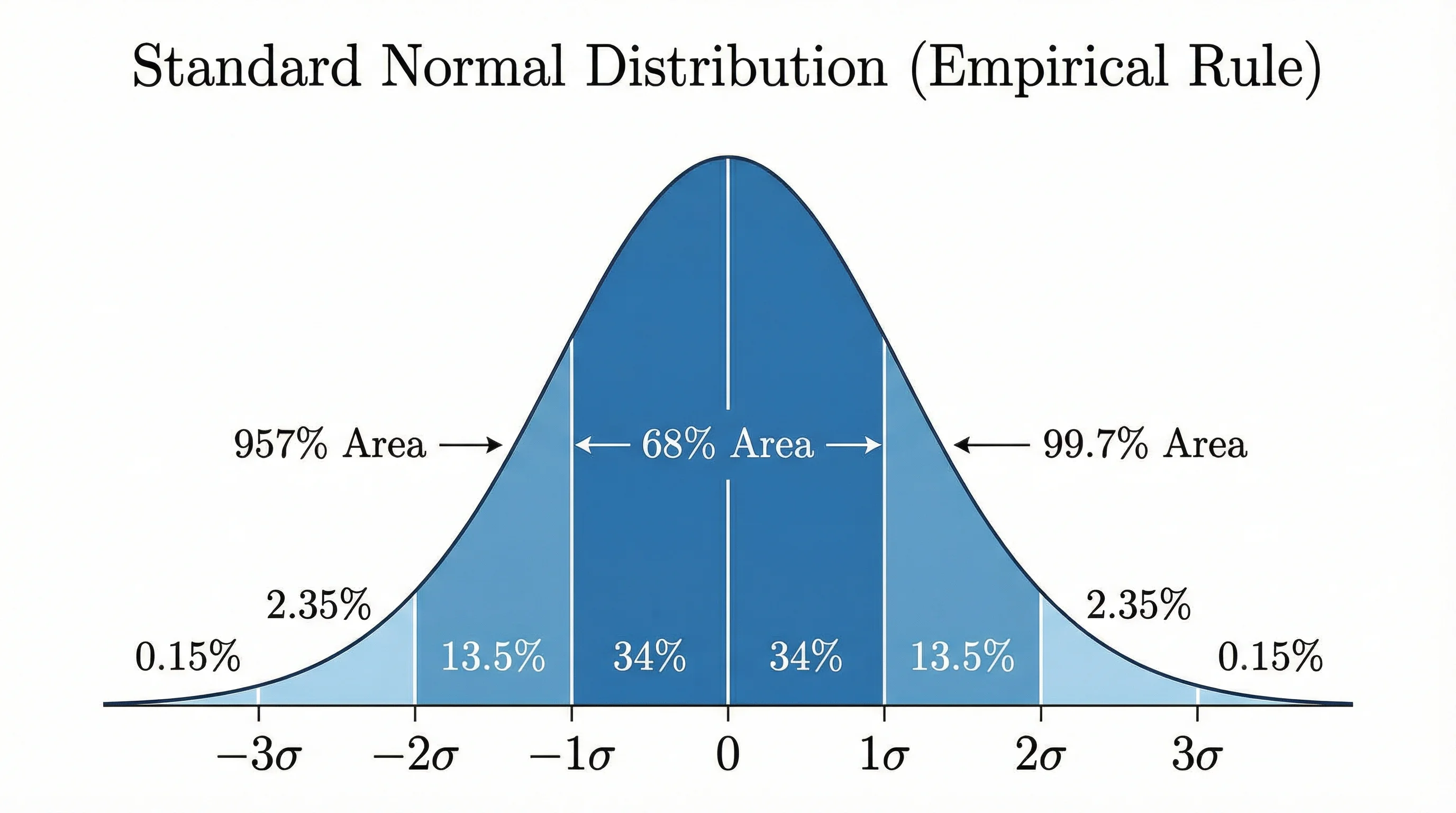 Статистика
Генератор кривой нормального распределения
Создавайте профессиональные кривые нормального распределения и графики для статистики и анализа.