Supply and Demand Graph Maker with Equilibrium & Shifts
Make a supply and demand graph in seconds. Plot the demand and supply curves, find the market equilibrium (P* and Q*), shift either curve to show changes, add a price ceiling or floor with the resulting shortage or surplus, and export SVG or PNG — free.
Supply & Demand Examples
Equilibrium, shifts, and price controls rendered by the exact engine
Market Equilibrium
Demand and supply cross at the equilibrium price (P*) and quantity (Q*).
Increase in Demand
A rightward demand shift raises both the equilibrium price and quantity.
Decrease in Demand
A leftward demand shift lowers both the equilibrium price and quantity.
Increase in Supply
A rightward supply shift lowers the equilibrium price and raises quantity.
Price Ceiling → Shortage
A binding price ceiling sits below equilibrium and creates a shortage.
Price Floor → Surplus
A binding price floor sits above equilibrium and creates a surplus.
What is a supply and demand graph?
A supply and demand graph plots price on the vertical axis and quantity on the horizontal axis. The demand curve slopes downward (people buy more when prices are lower) and the supply curve slopes upward (producers supply more when prices are higher). Where the two curves cross is the market equilibrium — the price (P*) and quantity (Q*) at which the amount buyers want equals the amount sellers offer.
How to draw a supply and demand graph
- Label the axes: price (P) on the y-axis, quantity (Q) on the x-axis.
- Draw the demand curve sloping down and the supply curve sloping up.
- Mark the equilibrium where they intersect, and drop dashed lines to read off P* and Q*.
- To show a change, shift the relevant curve left or right and mark the new equilibrium — this generator does the intersection math for you.
Shifts in demand and supply
A shift moves an entire curve. An increase in demand shifts the demand curve right (raising P* and Q*); a decrease shifts it left (lowering both). An increase in supply shifts the supply curve right (lowering P* but raising Q*); a decrease shifts it left. Use the shift buttons to move either curve — the original curve stays dashed and the new equilibrium is recalculated automatically, so you can illustrate events like higher income, new technology, or a supply shock.
Price ceilings, price floors, shortages, and surpluses
A price ceiling is a legal maximum price; when it is set below equilibrium it is binding and causes a shortage (quantity demanded exceeds quantity supplied). A price floor is a legal minimum price; when set above equilibrium it causes a surplus (quantity supplied exceeds quantity demanded). Turn on the price ceiling or floor to draw the control line and shade the resulting shortage or surplus.
The law of supply and demand
The law of supply and demand says that in a competitive market, price adjusts until the quantity demanded equals the quantity supplied. If the price is above equilibrium there is a surplus that pushes prices down; if below, a shortage pushes prices up. The market clears at the equilibrium, which the graph shows as the crossing point of the two curves.
When to use the AI illustration mode
Use the exact Supply & demand mode for microeconomic graphs with precise equilibria and shifts. Switch to AI illustration for related graphs the template does not cover: aggregate demand and aggregate supply (AD–AS), the money market, labor markets, or annotated diagrams showing taxes, deadweight loss, or consumer and producer surplus.
Часто задаваемые вопросы
Related Visualization Tools
 Visualization
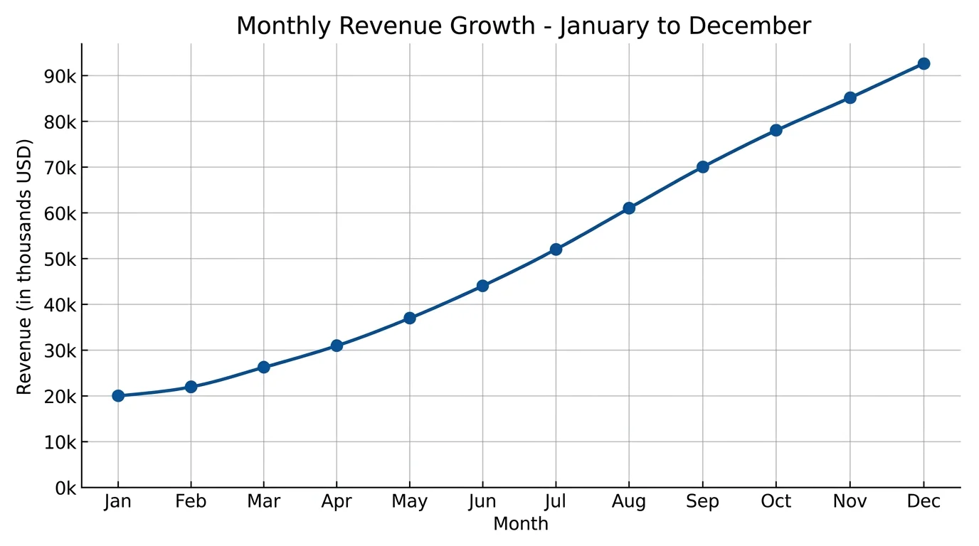
Line Chart Maker
Plot trends over time with clean axes, multiple series, and labeled data points.
 Visualization
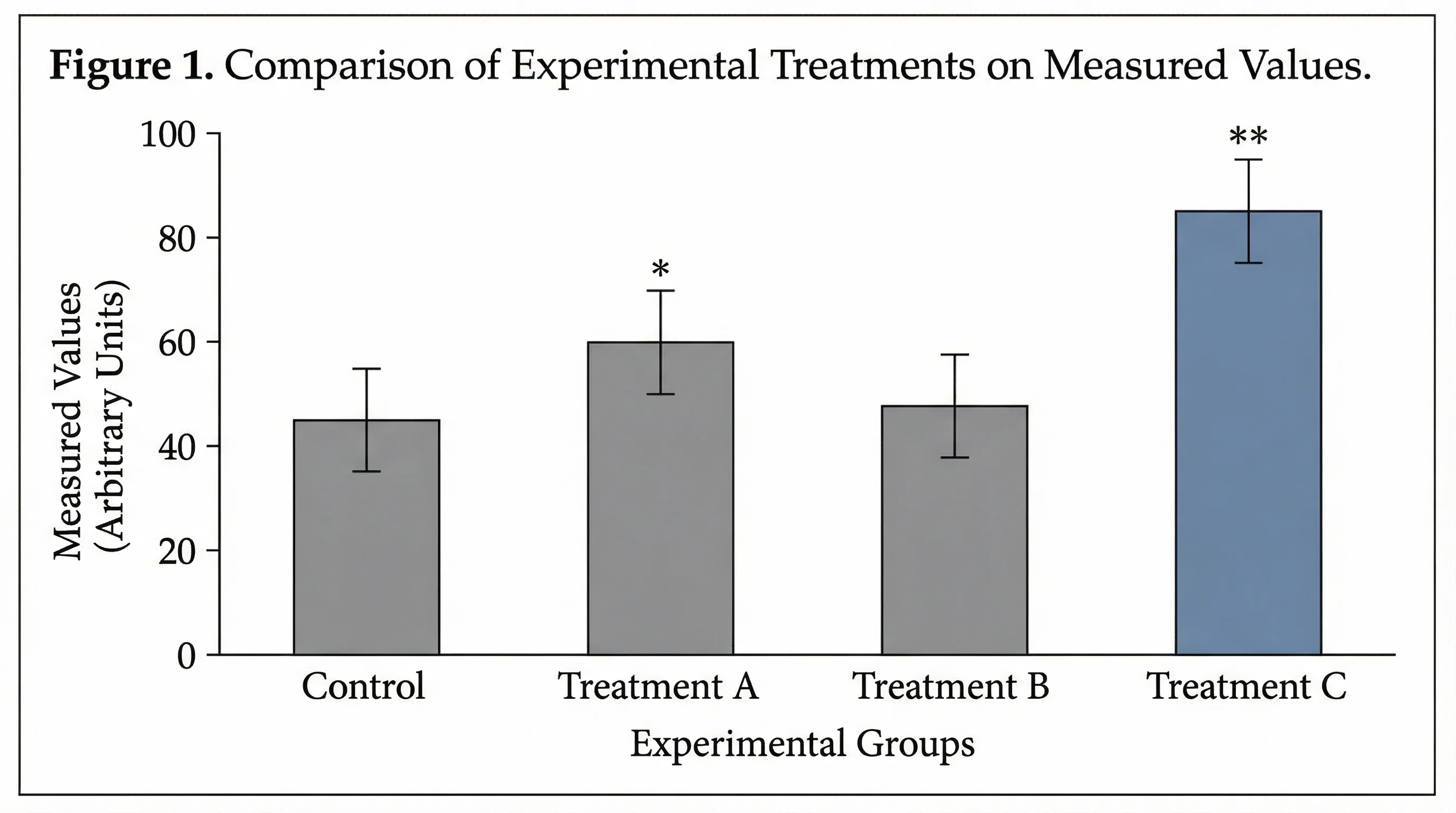
Bar Chart Maker
Compare categories with a clean, labeled bar chart you can export.
 Visualization
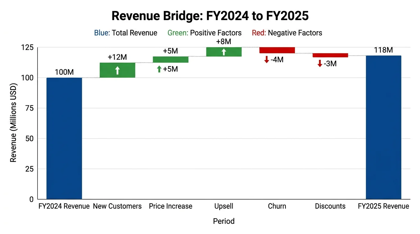
Waterfall Chart Generator
Show how a starting value rises and falls to a final total, step by step.