Column Chart Maker from CSV Data
Create accurate vertical column charts from CSV or spreadsheet data. Build grouped, stacked, and 100% stacked column charts, then export SVG, PNG, or CSV.
Column Chart Data
First column is labels; remaining columns are numeric series.
This generator runs in your browser and renders exact SVG charts from your table values. No image-generation credits are used.
Chart Preview
6 categories, 3 series
Column Chart Examples
Explore common vertical chart layouts for business reports, classrooms, and dashboards
Quarterly Sales Column Chart
A clean single-series column chart for comparing values across quarters.
Grouped Revenue and Expense Chart
Grouped columns make side-by-side comparison easy across the same categories.
Stacked Traffic Channels
Stacked columns show total volume plus channel composition over time.
100% Stacked Survey Share
A 100% stacked column chart focuses on proportion instead of total volume.
Classroom Science Results
A classroom-ready science comparison chart with a zero baseline.
Marketing Channel Comparison
A business report chart for comparing short category labels and values.
What is a column chart maker?
A column chart maker turns a table into a vertical bar chart. Categories appear on the horizontal axis and numeric values appear on the vertical axis, making the format useful for comparing products, months, quarters, departments, survey responses, and classroom measurements.
Why this tool uses precise chart rendering
- Column charts usually represent real values, so the bar heights must match the data exactly.
- The chart is rendered as SVG in the browser, not as an AI image, so labels, series, totals, and exports stay deterministic.
- You can use grouped, stacked, or 100% stacked layouts without spending image-generation credits.
- SVG, PNG, and CSV export make the result usable in reports, slides, worksheets, and dashboards.
How to prepare your data
- Put category labels in the first column, such as Month, Quarter, Product, or Department.
- Put numeric values in the remaining columns. Each numeric column becomes a chart series.
- Use grouped columns for side-by-side comparisons, stacked columns for total plus composition, and 100% stacked columns for proportions.
- Keep labels short. If labels are long or you have many categories, a horizontal bar chart may be easier to read.
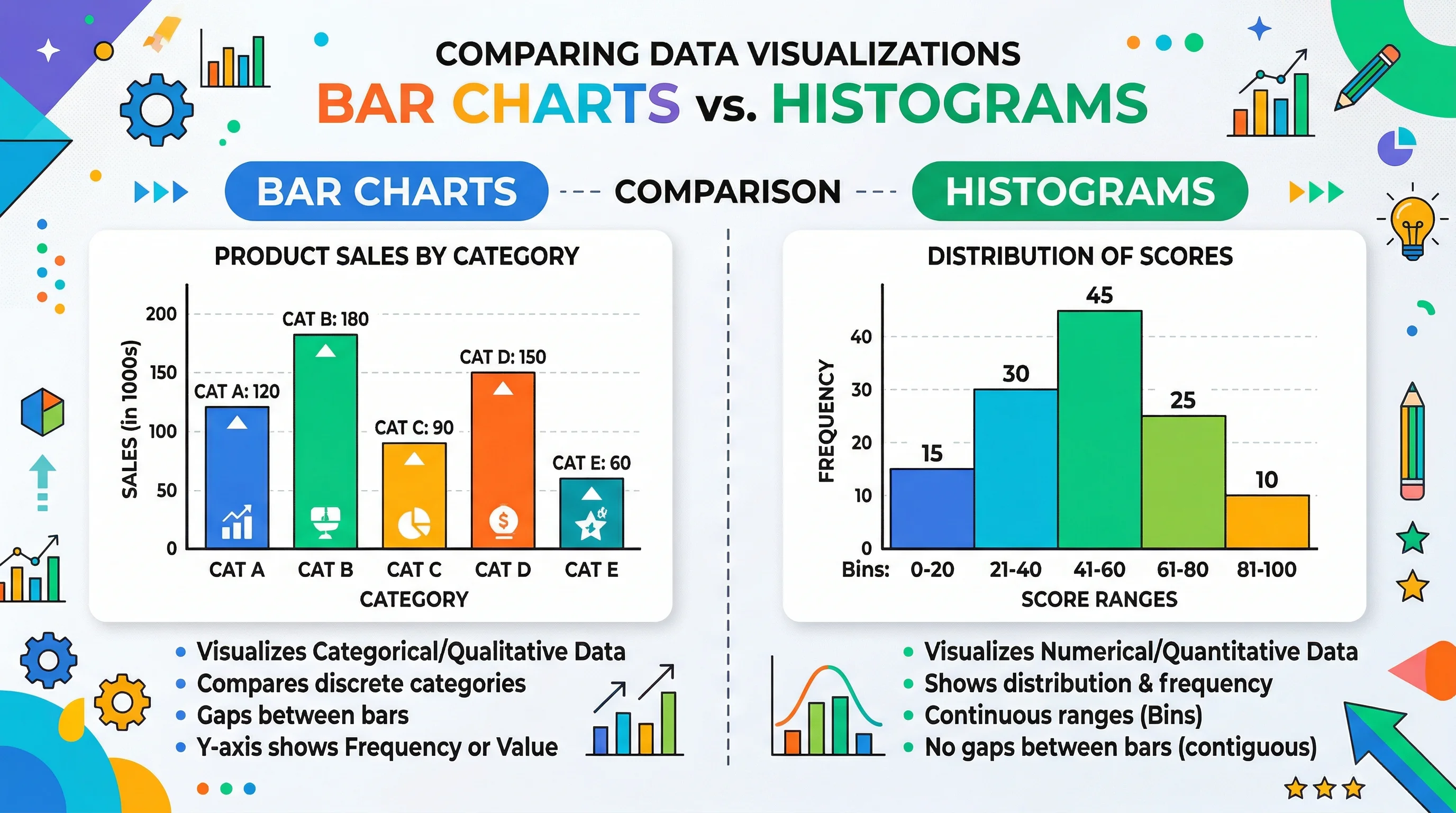
Column chart vs bar chart
Column charts and bar charts both compare categories, but the orientation changes readability. Use a column chart for short labels, months, quarters, and compact dashboard comparisons. Use a horizontal bar chart for long labels, rankings, and many categories.
When to use a column chart
- Monthly or quarterly business metrics.
- Short survey answer labels.
- Classroom experiment groups.
- Grouped comparisons such as revenue vs expenses.
- Stacked totals such as traffic by channel across quarters.
Часто задаваемые вопросы
Related Chart Tools
 Research
Bar Chart Maker
Create horizontal bar charts for rankings, long labels, and category comparisons.
 Research
AI Chart Generator
Generate chart illustrations and data visuals from plain-language descriptions.
 Research
Line Chart Maker
Create line charts for trends, time series, and multi-series changes over time.