")
How to Create Scatter Plots in Excel: Step-by-Step Guide (2026)
Learn how to make scatter plots in Excel with trend lines, labels, and formatting. Complete guide with screenshots and tips for research data visualization.
How to Create Scatter Plots in Excel: The Complete Guide
Excel remains one of the most accessible tools for creating scatter plots, especially for researchers, students, and analysts who need quick visualizations without writing code. Whether you are working on a thesis, analyzing survey data, or preparing a report, mastering scatter plots in Excel is an essential skill.
This step-by-step guide covers everything from inserting your first scatter chart to adding trend lines, customizing axes, handling multiple data series, and formatting for publication-quality output. By the end, you will know exactly how to draw a scatter diagram in Excel for any dataset.
Scatter Plot Maker
Create publication-ready scatter plots instantly with AI. No Excel skills needed — just paste your data and export high-resolution charts.
Try scatter plot maker free →Why Use Excel for Scatter Plots?
Before diving into the steps, it helps to understand why Excel is still a popular choice for scatter plot creation:
| Advantage | Description |
|---|---|
| Accessibility | Installed on most work and university computers |
| No coding | Fully GUI-based chart creation |
| Quick iteration | Charts update instantly when data changes |
| Familiar interface | Most researchers already know Excel basics |
| Export options | Copy to Word, PowerPoint, or save as image |
That said, Excel has limitations for advanced visualizations. For complex multi-panel figures or journal-specific formatting, tools like ConceptViz's scatter plot maker or dedicated software may be more efficient. We will discuss these alternatives later in the guide.
Step 1: Prepare Your Data
Proper data preparation is the foundation of a good scatter plot. Excel expects your data in a specific layout.
Data Layout Rules
- Column A (X-axis): Place the independent variable in the left column
- Column B (Y-axis): Place the dependent variable in the right column
- Headers: Include column headers in Row 1 (Excel uses these as axis labels)
- No blank rows: Remove any empty rows within your data range
- Numeric values only: Both columns must contain numbers, not text
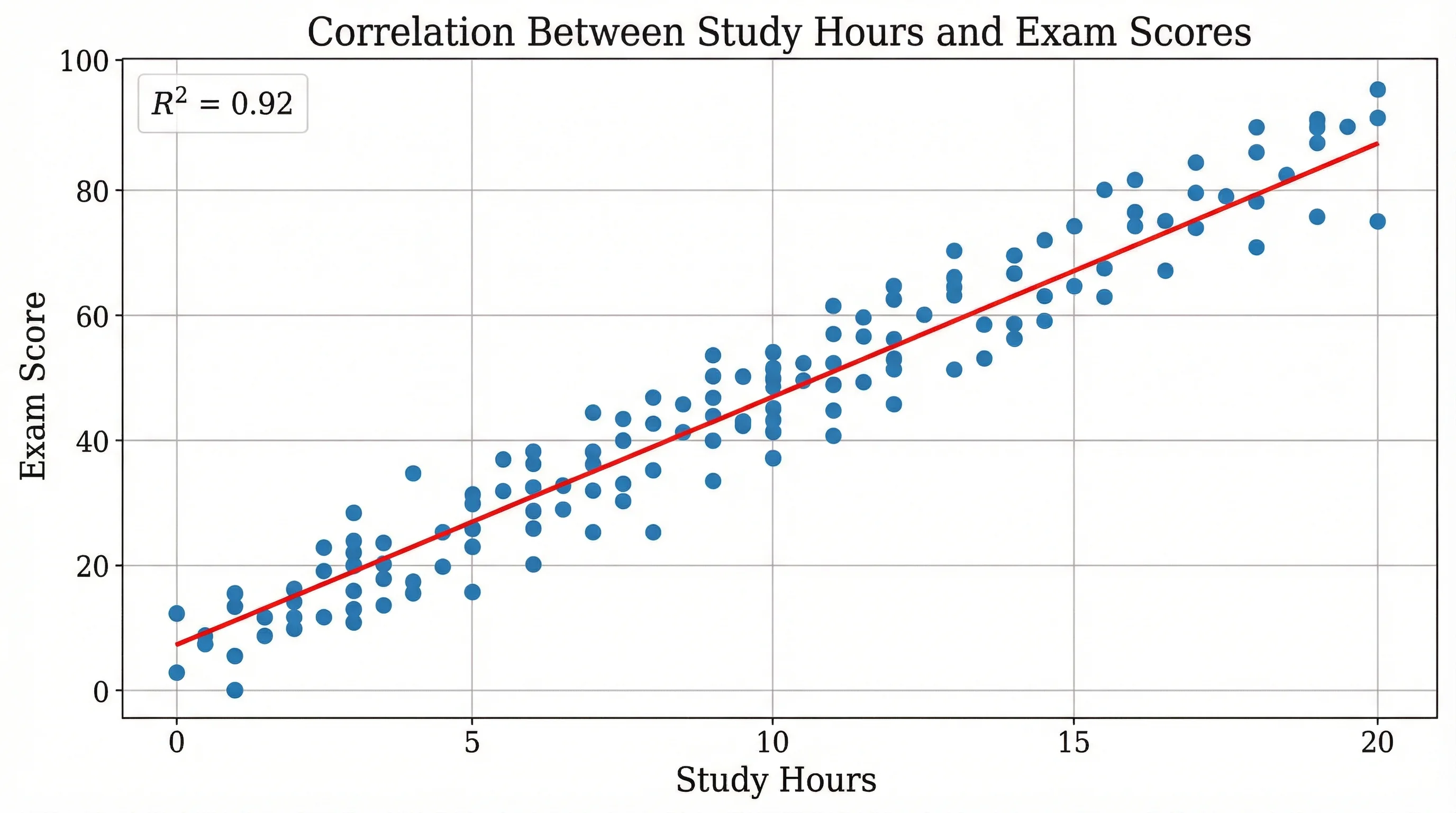
Example Dataset
Here is a sample dataset showing the relationship between study hours and exam scores:
| Study Hours (X) | Exam Score (Y) |
|---|---|
| 2 | 55 |
| 3 | 62 |
| 4 | 68 |
| 5 | 73 |
| 6 | 78 |
| 7 | 82 |
| 8 | 88 |
| 9 | 91 |
| 10 | 95 |
| 12 | 97 |
Tip: If your independent and dependent variables are not in adjacent columns, you can hold Ctrl (Windows) or Cmd (Mac) to select non-contiguous columns before inserting the chart.
Step 2: Select Your Data
- Click on the first cell of your data range (including the header), for example cell A1
- Drag to select all data through the last row and both columns
- Make sure you include the header row — Excel uses it for chart labels
If your data has multiple series (e.g., Treatment A and Treatment B), select all columns together. We will cover multiple series in detail later.
Step 3: Insert the Scatter Chart
With your data selected:
- Go to the Insert tab in the Excel ribbon
- In the Charts group, click the Scatter (X, Y) chart icon
- Select Scatter with only Markers (the first option) for a basic scatter plot
Excel will instantly generate a scatter chart embedded in your worksheet. The X-axis will display values from your left column, and the Y-axis will show values from your right column.
Scatter Chart Subtypes in Excel
Excel offers several scatter chart variations:
| Subtype | Best For |
|---|---|
| Scatter with only Markers | Standard scatter plot showing individual data points |
| Scatter with Smooth Lines and Markers | Showing trends when data follows a curve |
| Scatter with Smooth Lines | Emphasizing the trend over individual points |
| Scatter with Straight Lines and Markers | Connecting sequential data points |
| Scatter with Straight Lines | Time-ordered data with connections |
For most research and analysis purposes, Scatter with only Markers is the correct choice. The other options can visually imply connections between data points that may not exist.
A scatter plot showing positive correlation — the pattern you will see when both variables increase together
Step 4: Add a Chart Title
Excel may insert a generic title like "Chart Title" or use your column header. To customize it:
- Click on the chart title text
- Delete the default text
- Type a descriptive title, such as "Study Hours vs. Exam Score"
Chart Title Best Practices
- Be specific: "Effect of Study Hours on Exam Performance" is better than "Scatter Plot"
- Include variables: Mention both the X and Y variables
- Add units if relevant: "Temperature (°C) vs. Reaction Rate (mol/s)"
- Keep it concise: One line is ideal; two lines maximum
For academic papers, follow the convention of your target journal. Many journals require figure captions below the chart rather than a title above it, as explained in our guide on how to make figures for Nature and Science journals.
Step 5: Add and Format Axis Titles
Axis titles are critical for scatter plots. Without them, readers cannot interpret your chart.
Adding Axis Titles
- Click on the chart to select it
- Click the + (Chart Elements) button that appears at the top-right corner of the chart
- Check the Axis Titles box
- Click on each axis title to edit the text
Formatting Tips
- X-axis title: Name the independent variable with units — e.g., "Temperature (°C)"
- Y-axis title: Name the dependent variable with units — e.g., "Growth Rate (cm/day)"
- Font size: Use 10--12 pt for axis titles, matching your document font
- Rotate Y-axis title: Excel automatically rotates it; ensure it is readable
Step 6: Add a Trend Line
A trend line (or line of best fit) reveals the overall direction of your data. This is one of the most valuable features of Excel scatter plots.
How to Add a Trend Line
- Click on any data point in your scatter plot (this selects the entire series)
- Right-click and choose Add Trendline, or click the + button and check Trendline
- In the Trendline Options pane, select the regression type
Trend Line Types
| Type | When to Use | Equation Form |
|---|---|---|
| Linear | Data follows a straight line | y = mx + b |
| Exponential | Data increases/decreases by a constant multiplier | y = ae^(bx) |
| Logarithmic | Rapid initial change that levels off | y = a ln(x) + b |
| Polynomial | Data has curves; specify the order (2--6) | y = ax^n + ... |
| Power | Data follows a power law | y = ax^b |
| Moving Average | Smoothing noisy time-series data | Rolling average |
Display the Equation and R-squared Value
To show the regression equation and goodness-of-fit:
- Double-click the trend line to open the Format Trendline pane
- Scroll to the bottom of the Trendline Options
- Check Display Equation on chart
- Check Display R-squared value on chart
The R-squared value (R^2) indicates how well the trend line fits your data:
- R^2 > 0.9: Strong fit — the trend line explains most of the variation
- R^2 = 0.5 to 0.9: Moderate fit — some relationship exists
- R^2 < 0.5: Weak fit — the variables may not be linearly related
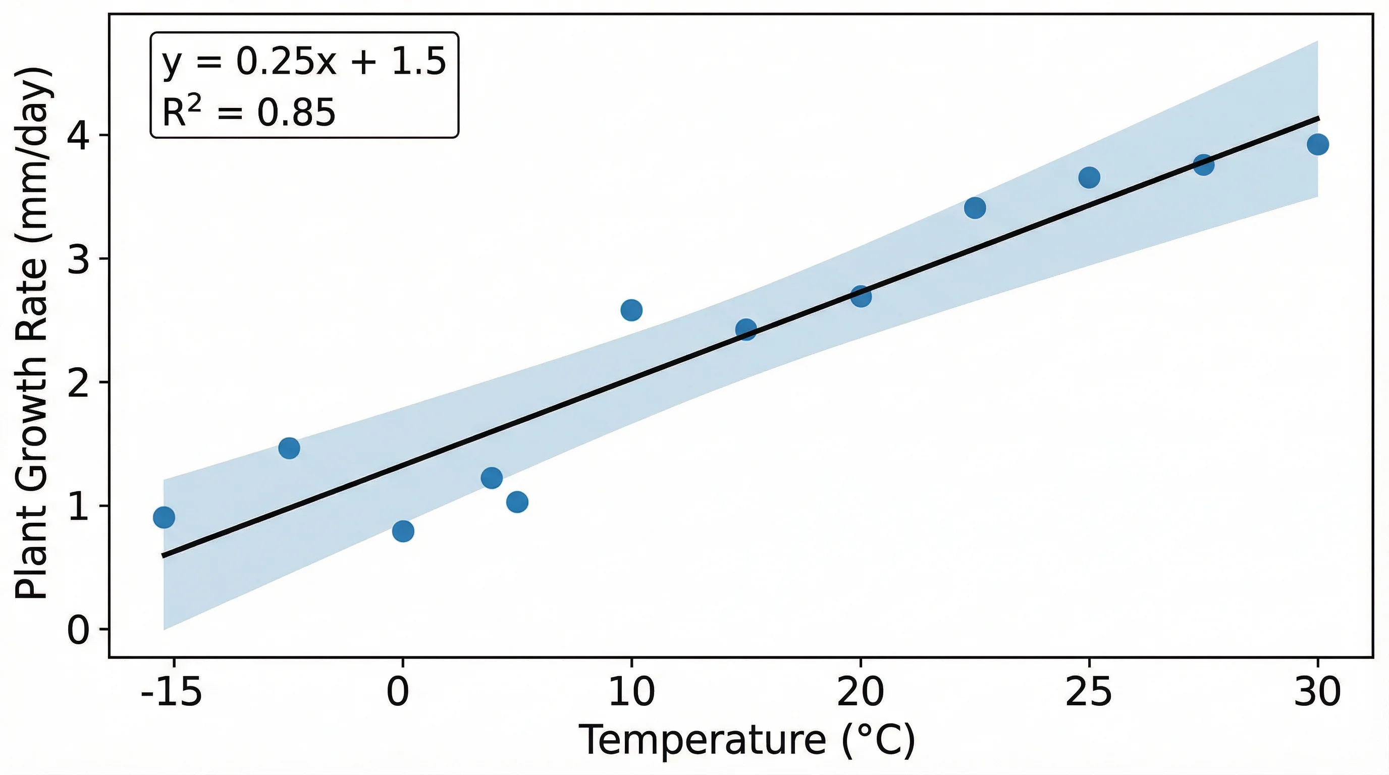
A scatter plot with regression trend line — adding R-squared values helps quantify the strength of the relationship
Step 7: Format the Axes
Default axis formatting in Excel is often not ideal. Here is how to improve it.
Adjust Axis Scale
- Double-click on an axis to open the Format Axis pane
- Under Axis Options, set custom minimum and maximum values
- Adjust the major and minor tick mark intervals
Why adjust the scale? By default, Excel may add excessive white space around your data. Tightening the axis bounds to match your data range makes patterns easier to see.
Format Axis Numbers
- Right-click the axis labels and select Format Axis
- Under Number, choose the appropriate format (e.g., number with 1 decimal place)
- For large values, consider scientific notation
Add Gridlines (Optional)
Gridlines help readers estimate values but can clutter a chart. To toggle them:
- Click the + button on the chart
- Check or uncheck Gridlines
- Choose Major, Minor, or both
For clean, professional charts, use light gray major gridlines only or remove gridlines entirely.
Step 8: Customize Data Point Appearance
Formatting your data markers improves readability, especially when presenting to audiences.
Change Marker Style
- Click on a data point to select the series
- Right-click and select Format Data Series
- Under Marker Options, choose the marker type, size, and color
Recommended Settings for Research
| Setting | Recommendation |
|---|---|
| Marker type | Circle (standard) or triangle for group differentiation |
| Marker size | 6--8 pt for most charts; smaller for dense datasets |
| Fill color | Use a scientific color palette for accessibility |
| Border | Same color as fill, or slightly darker |
| Transparency | 20--40% for overlapping data points |
Adding transparency is especially useful when many points overlap. This technique reveals data density without needing to change to a different chart type.
Working with Multiple Data Series
Research often requires comparing two or more groups on the same scatter plot — for example, treatment vs. control, or male vs. female participants.
Method 1: Data in Adjacent Columns
If your data is organized with a shared X column and multiple Y columns:
| Temperature (°C) | Growth Rate A (cm/day) | Growth Rate B (cm/day) |
|---|---|---|
| 10 | 0.5 | 0.3 |
| 15 | 1.2 | 0.8 |
| 20 | 2.1 | 1.5 |
| 25 | 3.0 | 2.4 |
| 30 | 3.8 | 3.1 |
- Select all three columns (including headers)
- Insert a Scatter chart
- Excel automatically creates two series with different colors
Method 2: Add Series Manually
If your groups have different X values:
- Create the scatter plot with the first group
- Right-click the chart and select Select Data
- Click Add under Legend Entries (Series)
- Set the Series X values and Series Y values to your second group's data
- Click OK
Differentiating Multiple Series
Use distinct visual attributes for each series:
- Different colors: Blue for Group A, red for Group B
- Different marker shapes: Circles vs. triangles vs. squares
- Add a legend: Click + > Legend to show which series is which
- Separate trend lines: Right-click each series individually to add its own trend line
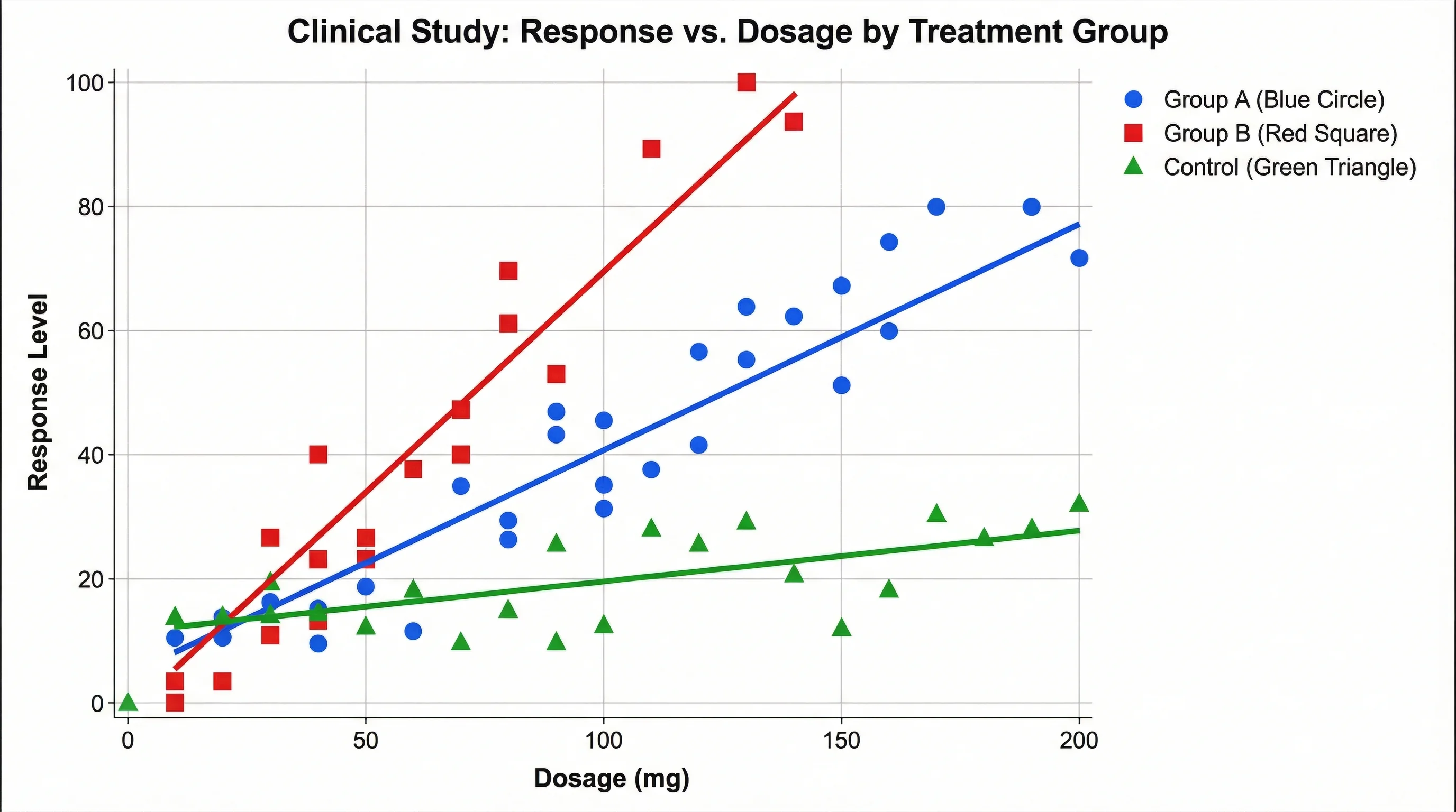
A multi-group scatter plot — using different colors and markers makes it easy to compare groups
Adding Data Labels to Scatter Points
Data labels identify individual points, which is useful when you have a small number of observations or need to highlight specific values.
Basic Data Labels
- Click on the data series in the chart
- Click the + button and check Data Labels
- Choose a position: Above, Below, Left, Right, or Center
Custom Labels from Cell Values
By default, Excel labels points with Y values. To use custom text (e.g., sample names):
- Click on the data labels to select them
- Right-click and choose Format Data Labels
- Under Label Contains, check Value From Cells
- Select the cell range containing your label text
- Uncheck Y Value to show only your custom labels
Pro tip: For scatter plots with many points, label only outliers or key observations to avoid clutter. You can delete individual labels by clicking once on all labels (to select the series) and then clicking again on the specific label you want to remove.
Common Scatter Plot Mistakes in Excel
Avoid these frequent errors when creating scatter plots:
1. Using a Line Chart Instead of a Scatter Chart
Line charts and scatter charts look similar but behave differently. Line charts space categories evenly on the X-axis regardless of their actual values. Scatter charts plot points at their true X-Y coordinates.
Always use Insert > Scatter for two continuous numerical variables.
2. Swapped Axes
If your chart looks wrong, you may have the X and Y variables reversed. To fix this:
- Right-click the chart and select Select Data
- Click Edit on the series
- Swap the Series X values and Series Y values
3. Including Non-Numeric Data
Scatter charts require both axes to be numerical. If you have text or dates mixed with numbers, Excel may plot them incorrectly or produce an error.
4. Overcrowded Charts
If you have hundreds or thousands of points, individual markers will overlap heavily. Solutions include:
- Reduce marker size
- Add transparency
- Use a 2D density plot instead (not available natively in Excel)
- Consider a dedicated tool like ConceptViz scatter plot maker which handles large datasets with automatic density visualization
5. Missing Axis Labels
A scatter plot without axis labels is meaningless. Always label both axes with variable names and units.
6. Inappropriate Trend Line
Do not add a linear trend line to clearly non-linear data. Always visually inspect the scatter plot first, then choose the regression type that best fits the pattern.
Excel Scatter Plot Shortcuts and Time-Savers
These tips will speed up your scatter plot workflow:
| Shortcut / Tip | What It Does |
|---|---|
| Alt + F1 (Windows) | Instantly creates a chart from selected data |
| F11 | Creates a chart on a new sheet |
| Ctrl + C on chart | Copies the chart for pasting into Word/PowerPoint |
| Chart Templates | Save a formatted chart as a template for consistent styling across figures |
| Double-click | Double-click any chart element to open its formatting pane |
| Ctrl + Z | Undo the last chart modification |
Saving a Chart Template
If you create scatter plots frequently (e.g., for a thesis with 20+ figures), saving a template ensures consistency:
- Format one chart exactly how you want it
- Right-click the chart and select Save as Template
- Name the template (e.g., "thesis-scatter")
- For future charts, go to Insert > Charts > All Charts > Templates
Scatter Plots for Academic and Research Use
If you are preparing scatter plots for a research paper, thesis, or conference poster, extra formatting steps are necessary.
Journal Requirements Checklist
- Resolution: 300 DPI minimum (use "Save as Picture" with high-quality settings)
- Font: Match the journal's required typeface (often Arial or Helvetica)
- Font size: Axis labels 8--10 pt, titles 10--12 pt when printed at final size
- Colors: Use colorblind-friendly palettes (avoid red-green combinations)
- File format: TIFF or EPS for most journals; PNG for online submissions
- Figure caption: Add a descriptive caption below the chart (not in the chart title)
For detailed guidance, see our comprehensive guide on creating figures for Nature and Science journals.
Exporting from Excel
To save a high-quality scatter plot image from Excel:
- Click on the chart to select it
- Right-click and choose Save as Picture
- Select PNG or TIFF format
- For higher resolution, copy the chart and paste it into PowerPoint, then export at 300 DPI
Important limitation: Excel's default image export resolution is 96 DPI, which is too low for journal publication. The PowerPoint method or using a vector format (EMF) produces better results.
Experimental data plotted as a scatter chart — this format is standard in scientific papers across disciplines
Excel vs. Dedicated Scatter Plot Tools
While Excel is convenient, it is worth considering when a dedicated tool might serve you better.
| Feature | Excel | Python / R | ConceptViz Scatter Plot Maker |
|---|---|---|---|
| Learning curve | Low | High | Very low |
| Customization | Moderate | Unlimited | AI-assisted |
| Multiple panels | Manual | Easy with code | Supported |
| Trend line options | 6 types | Unlimited | Auto-detected |
| Export quality | 96 DPI default | Vector/any DPI | High-res PNG/SVG |
| Reproducibility | Manual steps | Script-based | Template-based |
| Large datasets | Slows down > 10K points | Handles millions | Optimized for research |
| Color palettes | Limited built-in | Extensive libraries | Scientific presets |
When to Stay with Excel
- Quick exploratory analysis during data collection
- Simple scatter plots with fewer than 500 data points
- Charts for internal reports or presentations
- When your team only uses Microsoft Office
When to Switch Tools
- Publication-quality figures with strict formatting requirements
- Datasets with thousands of data points
- Multi-panel figures combining several scatter plots
- Reproducible workflows where you need to regenerate charts from updated data
For a broader overview of scatter plots across different tools, see our complete scatter plot diagram guide which covers Excel, Python, R, and AI-powered alternatives.
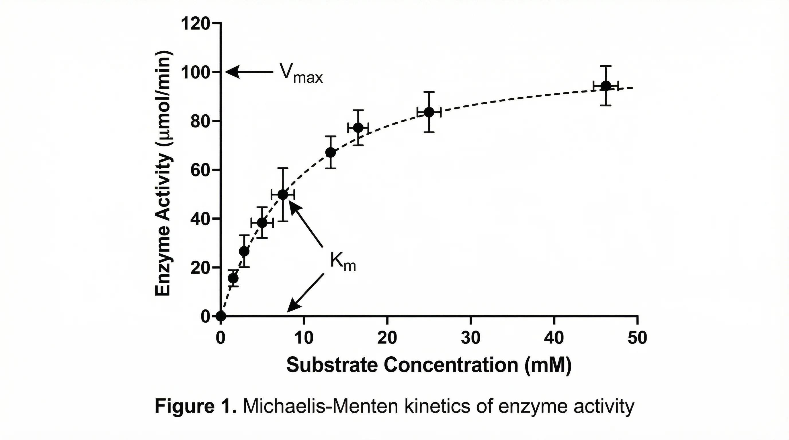
Advanced: Scatter Plot with Error Bars
Error bars communicate uncertainty in your data, which is essential for scientific scatter plots.
Adding Error Bars
- Click on the data series in the chart
- Click the + button and check Error Bars
- Click the arrow next to Error Bars and select More Options
- Choose the error amount: Fixed value, Percentage, Standard deviation, or Custom
Custom Error Bars from Data
For research, you typically calculate error values separately (e.g., standard error of the mean):
- In the Format Error Bars pane, select Custom
- Click Specify Value
- Set the Positive Error Value to your upper error range cells
- Set the Negative Error Value to your lower error range cells
Error bars can be added independently to both X and Y directions, which is common in physics and engineering scatter plots.
Advanced: Creating Quadrant Charts
A quadrant chart divides a scatter plot into four regions, useful for portfolio analysis, performance reviews, or risk assessment.
How to Create Quadrants
- Create a standard scatter plot
- Add vertical and horizontal reference lines at your threshold values
- To add reference lines, use the Error Bars trick:
- Add a single data point at the intersection of your threshold values
- Add error bars extending to the axis limits
- Format the error bars as dashed lines
Alternatively, add two separate data series: one horizontal line and one vertical line, each with two points defining the line endpoints.
Frequently Asked Questions
How do I create a scatter plot in Excel with two sets of data?
Select both data columns (including headers) and go to Insert > Scatter > Scatter with only Markers. If your two groups have different X values, create the chart with the first group, then right-click the chart, select 'Select Data', click 'Add', and specify the X and Y cell ranges for the second group. Excel will plot both series on the same chart with different colors.
Why does my Excel scatter plot look like a straight line?
This usually happens when you accidentally chose a Line chart instead of a Scatter chart. Line charts connect points in the order they appear and space categories evenly, which can make data look linear. Delete the chart and re-insert it using Insert > Scatter (X, Y) instead of Insert > Line. Also check that both columns contain numeric values, not text.
How do I add a trend line to a scatter plot in Excel?
Click on any data point in your scatter plot to select the series, then right-click and choose 'Add Trendline'. In the Format Trendline pane, select the regression type (Linear, Exponential, Polynomial, etc.). Check 'Display Equation on chart' and 'Display R-squared value on chart' to show the fit statistics. The R-squared value tells you how well the trend line fits your data.
Can I make a scatter plot with more than two variables in Excel?
Excel scatter plots show two variables (X and Y). To represent a third variable, you can use bubble charts (where bubble size represents the third variable) available under Insert > Charts. For a fourth variable, use color coding by creating separate data series for each category. However, for true multivariate scatter plots, consider using Python, R, or ConceptViz's AI chart generator.
How do I switch the X and Y axes in an Excel scatter plot?
Right-click on the chart and select 'Select Data'. Click 'Edit' on the data series. Swap the cell ranges in the 'Series X values' and 'Series Y values' fields, then click OK. This reassigns which variable is plotted on each axis without rearranging your source data.
What is the maximum number of data points Excel can plot in a scatter chart?
Excel can technically handle up to 256,000 data points per series in a scatter chart. However, performance degrades significantly above 10,000 points, and the chart becomes difficult to read with heavy marker overlap. For large datasets, consider reducing marker size, adding transparency, sampling your data, or using a dedicated tool designed for large-scale visualization.
How do I make a scatter plot in Excel for Mac?
The process is nearly identical to Windows. Select your data, go to Insert > Chart > X Y (Scatter), and choose Scatter with only Markers. The main difference is that some formatting options are accessed through the Format pane on the right rather than right-click menus. The keyboard shortcut to create a quick chart is Fn + F11 on Mac.
How do I format a scatter plot in Excel for a research paper?
Use a clean, minimal design: remove chart borders and unnecessary gridlines, use a white background, set fonts to Arial or Helvetica at 8-10 pt, and choose colorblind-friendly colors. Add clear axis titles with units, include a trend line with R-squared if relevant, and export at 300+ DPI. Copy the chart to PowerPoint and export as TIFF or high-resolution PNG for publication quality.
Conclusion
Creating scatter plots in Excel is straightforward once you understand the data preparation, chart insertion, and formatting workflow. The key steps are:
- Organize your data with the independent variable in the left column
- Insert a Scatter chart using the correct chart type (not Line)
- Add trend lines with R-squared values to quantify relationships
- Format axes, titles, and markers for clear communication
- Export properly for your intended use (presentation vs. publication)
For quick exploratory analysis, Excel is an excellent choice. For publication-quality figures, reproducible workflows, or large datasets, consider upgrading to a dedicated visualization tool.
Ready to create scatter plots without the Excel formatting hassle? Try ConceptViz Scatter Plot Maker to generate publication-ready scatter plots from your data in seconds — no manual formatting required.
Looking for more data visualization guidance? Read our complete scatter plot diagram guide for a tool-agnostic overview, or explore our tips on scientific color palettes to make your charts both beautiful and accessible.
Категории
Ещё публикации
")
50+ Graphical Abstract Examples & Templates by Discipline (2026)
Explore inspiring graphical abstract examples from biology, chemistry, medicine, and more. Includes downloadable templates, design analysis, and field-specific tips for researchers.

How to Present References in a Scientific Poster: Complete Citation Guide
Learn the best practices for formatting and presenting references on scientific posters. Includes citation styles, font sizes, placement tips, and real examples.

How to Create Science Animations for PowerPoint: Complete Guide for Researchers
Learn to create engaging scientific animations in PowerPoint with zero budget. Includes step-by-step tutorials, free tools comparison, and best practices for molecular biology, chemistry, and physics presentations.