")
How to Make a Pie Chart in Excel: Step-by-Step Guide (2026)
Learn how to create a pie chart in Excel, format labels, choose better colors, and avoid misleading slices. Includes Excel 365, 2024, 2021, and 2019 workflows.
Pie charts are one of the fastest ways to show how a total breaks into parts. If your audience needs to understand market share, budget allocation, survey response balance, or category contribution at a glance, a pie chart can work well. But it only works when the data structure is right and the slice count stays under control.
That is why pie charts are also one of the easiest visuals to misuse. Excel makes them simple to create, but the software cannot decide whether your categories belong in a pie chart, whether your labels are readable, or whether a bar chart would actually communicate the story better.
This guide walks through how to make a pie chart in Excel, how to format it so it stays readable, and how to avoid the common design mistakes that make proportion charts harder to interpret than they should be.
AI Chart Generator
Create polished pie charts, bar charts, and dashboard-ready visuals without manual Excel formatting.
Create a chart free ->What a Pie Chart Is Good For
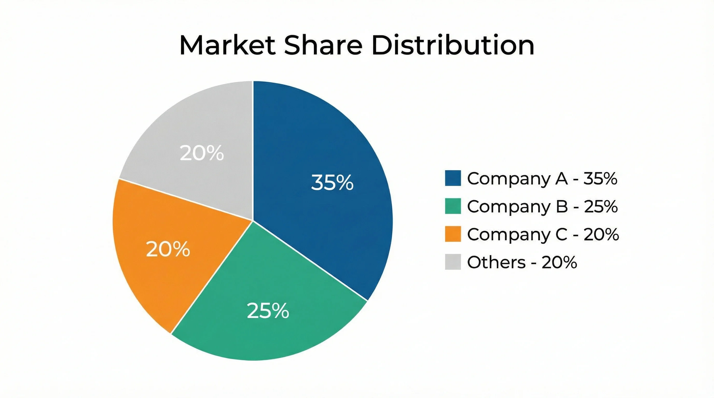
A pie chart shows part-to-whole relationships. Each slice represents one category's share of the full total.
Good pie chart use cases:
- revenue share by region
- marketing spend by channel
- survey response proportions
- budget allocation by department
- time allocation across project phases
A pie chart is most useful when:
- there is one meaningful total
- the slices sum to 100 percent
- the number of categories is small
- the audience cares about proportions more than exact ranking
If your readers need precise comparisons between categories, a bar chart is usually easier to scan. For that workflow, see how to make a bar chart in Excel.
When Not to Use a Pie Chart
Avoid pie charts when:
- you have many small categories
- you need to compare several different series
- the values are very close to one another
- your goal is to show change over time
- the total itself is not meaningful
As a practical rule, once you have more than five or six slices, the chart usually becomes harder to read than a simple sorted bar chart.
Which Excel Versions Support Pie Charts?
The built-in pie chart is standard across Excel 365, Excel 2024, Excel 2021, Excel 2019, and Excel for the web. Microsoft's official guide, Create a pie chart in Excel, documents the core ribbon workflow and the related doughnut chart options.
The standard path is:
Insert > Insert Pie or Doughnut Chart > Pie
Excel also lets you switch to exploded pie and doughnut variations from the same chart family.
Step 1: Prepare the Data Correctly
Excel pie charts work best when the source table is simple:
| Category | Share |
|---|---|
| Product A | 35 |
| Product B | 27 |
| Product C | 21 |
| Product D | 17 |
Data prep rules
- Put category labels in one column.
- Put the values in the adjacent column.
- Use one numeric series only.
- Remove empty rows and merged cells.
- Make sure the total is meaningful.
If one category contributes less than about 1 percent and there are several similar micro-categories, group them into Other before charting. Excel can technically plot them as separate slices, but the result is usually cluttered.
Step 2: Insert the Pie Chart
- Select the full two-column table, including headers.
- Go to
Insert > Insert Pie or Doughnut Chart. - Choose
2-D Piefor the clearest default starting point. - Let Excel generate the chart.
At that point, you have a valid pie chart, but not necessarily a useful one. The useful work starts in formatting.
If you want a fast visual walkthrough of the exact clicks, ExcelJet's article on how to make a pie chart in Excel is a good companion to the Microsoft guide because it shows the same workflow with a more practical emphasis on layout and labels.
Step 3: Decide Whether the Pie Chart Should Stay a Pie Chart
This sounds obvious, but it is one of the most important editorial checks you can make.
After Excel creates the chart, ask:
- Are there too many slices?
- Are the smallest slices impossible to label cleanly?
- Do readers need exact comparison more than part-to-whole context?
- Would a sorted bar chart communicate this faster?
If the answer to any of those questions is yes, the pie chart may not be the best final format.
This is especially true for operational dashboards, where readers often care less about the fact that values sum to a whole and more about which category is largest, smallest, or changing.
Step 3: Add Clear Labels
Pie charts become much easier to interpret when the labels do the heavy lifting.
In Excel:
- Click the chart
- Go to
Chart Design > Add Chart Element > Data Labels - Choose a placement such as
Outside EndorBest Fit
Best label setup
For most business and education use cases, include:
- category name
- percentage
Only add raw values as well if the chart is not crowded.
Good:
Marketing - 32%North America - 18%
Less good:
- just the value with no category
- value plus percentage plus category in a crowded chart
Step 4: Format the Chart So It Reads Fast
Use a readable color palette
Use distinct colors, but avoid neon or low-contrast combinations. A blue-teal-gray palette usually works better than a random rainbow.
Keep the first slice consistent
Excel lets you adjust the Angle of first slice in Format Data Series. If you produce recurring reports, keeping the first category in a predictable position makes charts easier to compare from month to month.
Explode only when needed
An exploded pie chart can be useful when you want to call out one key segment, but only do this for one slice. Exploding multiple slices usually makes the chart noisier without improving interpretation.
Prefer 2-D over 3-D
3-D pie charts make slices look larger or smaller depending on perspective. They add decoration, not clarity.
Consider a doughnut chart carefully
Doughnut charts are visually lighter and can work well on dashboards, but they are not automatically more readable. Use them when you want a cleaner modern look, not because they improve precision.
Handle small slices before they become a design problem
If several slices are tiny, you have three realistic options:
- group them into
Other - convert the chart to a bar chart
- switch to a more specialized layout if there is hierarchy in the data
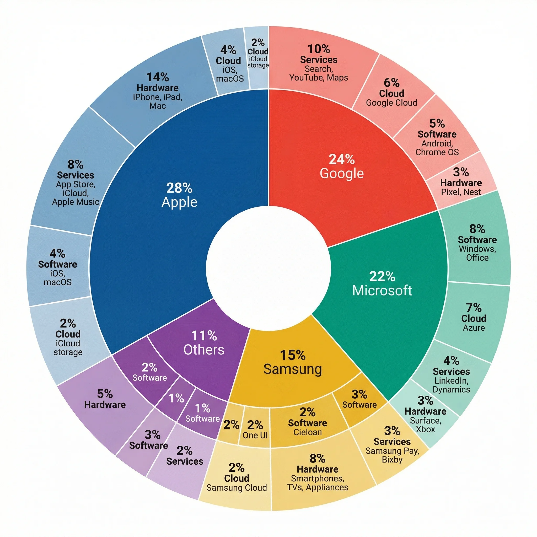
That third case matters more often than people expect. If you are trying to show two levels of composition, such as overall category plus subcategory, a basic Excel pie chart stops being the right tool. A nested chart structure or a purpose-built multi-level pie visual is usually clearer.
Example: Budget Allocation Pie Chart
Suppose you are presenting an annual operating budget:
| Category | Amount |
|---|---|
| Personnel | 420000 |
| Equipment | 115000 |
| Software | 65000 |
| Travel | 30000 |
| Training | 20000 |
If you insert this directly into Excel as a pie chart:
Personnelwill dominate the circle- the three smallest slices may become hard to label
- a sorted bar chart may actually communicate the ranking more clearly
This is a good reminder that the fact Excel can produce a pie chart does not mean it is always the best final chart type.
A better presentation version
For a leadership deck, you might:
- keep the four largest categories separate
- merge the smallest ones into
Other - place labels outside the slices
- add percentages but not raw values
- keep one restrained palette instead of assigning every slice a loud color
That version is usually easier to read in under five seconds, which is the real test for a business-facing chart.
Common Pie Chart Mistakes in Excel
Mistake 1: Too many slices
Once the chart turns into a wheel of tiny wedges, you have lost the benefit of the format.
Mistake 2: Using pie charts for close comparisons
If the categories are 22 percent, 21 percent, 20 percent, and 19 percent, readers will struggle to compare them accurately by angle alone.
Mistake 3: Using multiple pies to compare time periods
If you want to compare January vs February vs March, a grouped or stacked bar chart is usually easier to interpret.
Mistake 4: Mixing raw values and percentages carelessly
Your labels should help the reader, not overload the chart.
Mistake 5: Adding 3-D effects
This is one of the easiest ways to make a chart look more "designed" but less truthful.
Mistake 6: Treating a pie chart like a ranking chart
If the story is mainly "which category is biggest?" and "how much bigger is it than the next one?", bar charts are almost always more efficient. Pie charts are strongest when proportion is the first thing the audience should notice.
Pie Chart vs Doughnut Chart
Excel groups these together because they solve similar problems, but the choice still matters.
Use a pie chart when:
- you need the most familiar format
- you have just a few slices
- you want the clearest possible explanation of part-to-whole
Use a doughnut chart when:
- you want a more modern dashboard aesthetic
- the chart is part of a larger visual system
- you may place a KPI or summary value in the center
If your audience is broad and non-technical, a standard 2-D pie chart is still the safer choice.
Pie Chart vs Bar Chart in Practice
A useful shortcut is this:
- choose a pie chart when the whole matters most
- choose a bar chart when comparison matters most
For example:
budget allocation by departmentcan work well as a pie chartrevenue by product lineis usually clearer as a bar chartsurvey responses across 4 answer choicescould work as either, depending on whether ranking or share is more important
If you are unsure, build both. In many Excel workflows, that five-minute comparison will tell you immediately which visual is doing the better job.
When Excel Is Enough and When It Is Not
Excel is enough when:
- your data already lives in a workbook
- you need a quick chart for slides or reports
- your formatting needs are moderate
Excel becomes slower when:
- you need multiple polished variations
- you want stronger typography and spacing control
- you are preparing publication-ready visuals
- you need a fast workflow from text description to finished chart
That is where ConceptViz AI Chart Generator helps. Instead of manually fighting labels, slice colors, and layout tweaks, you can describe the chart you want and generate a cleaner version much faster.
Multi-Layer Pie Chart Maker
Create nested pie charts that show both category and subcategory breakdowns in one visual.
Frequently Asked Questions
How do I make a pie chart in Excel with percentages?
Insert the pie chart, then add Data Labels and enable Percentage in the label settings. If needed, also keep the category name so the labels are self-explanatory.
How many categories should a pie chart have?
As a practical rule, keep it to about five or six categories. Beyond that, a bar chart is often easier to read.
Should I sort the data before making a pie chart?
Yes, often. Sorting helps you group small categories more logically and makes the chart easier to explain, even though the pie itself is not read as a strict ranking chart.
What is the difference between a pie chart and a doughnut chart in Excel?
A doughnut chart has a hole in the middle and often looks cleaner on dashboards, but it communicates the same basic part-to-whole idea. Neither is ideal when you have many small slices.
Can I use a pie chart in academic or research presentations?
Yes, but carefully. In academic contexts, bar charts are often clearer unless the story is specifically about proportion and the slice count is small.
What should I do if Excel makes my pie chart look crowded?
Reduce the slice count, move labels outside the chart, remove unnecessary values, or switch to a bar chart. Usually the fix is not more formatting, but a simpler category structure.
Conclusion
Making a pie chart in Excel is easy. Making a good pie chart in Excel requires a little more judgment.
The winning workflow is:
- Start with one clean two-column table
- Make sure the categories truly represent parts of a whole
- Keep the slice count low
- Use readable labels and restrained colors
- Switch to a bar chart if the pie starts fighting the data
If you want the same part-to-whole story with less manual formatting, try ConceptViz AI Chart Generator. It is especially helpful when you need a cleaner, faster route from spreadsheet logic to presentation-ready output.
Additional Resources
分類
更多文章
")
8 Best Wiring Diagram Software in 2026 (Free & Paid)
Compare the best wiring diagram software for electrical, automotive, and industrial use. Reviews of 8 free and paid tools with features, pricing, and pros/cons.

Protein Structure: The 4 Levels Explained Simply
Protein structure made simple: the four levels (primary, secondary, tertiary, quaternary), the bonds that stabilize each, and why structure decides function.
: Tips, Slide Examples & Presentation Guide (2026)")
3 Minute Thesis (3MT): Tips, Slide Examples & Presentation Guide (2026)
3MT tips and winning slide examples. Learn how to design your 3 Minute Thesis slide, structure your presentation, and avoid common mistakes.