")
How to Make a Gantt Chart: Step-by-Step Guide for Projects and Research (2026)
Learn how to make a Gantt chart for project planning, research schedules, and launch timelines. Covers manual logic, Excel workflows, common mistakes, and when to use timeline tools instead.
Gantt charts are one of the clearest ways to show how work unfolds over time. They turn a project table into a visual schedule, making it easy to see when tasks begin, how long they last, where they overlap, and when major milestones happen.
That is why Gantt charts show up everywhere from software roadmaps to research plans, grant timelines, content launches, and operations work. A spreadsheet with start dates and durations can tell you the facts, but a Gantt chart shows the structure.
This guide explains how to make a Gantt chart from first principles, when to use one, how to build one in Excel, and when it makes more sense to move to a dedicated timeline tool instead.
Timeline Generator
Turn milestones, phases, and schedules into polished timeline visuals without manually formatting every task bar.
Create your timeline ->What a Gantt Chart Shows
A Gantt chart maps tasks against time.
At minimum, each task usually has:
- a name
- a start date
- a duration or end date
More advanced versions also include:
- owner
- percent complete
- milestone status
- dependency notes
- workstream or category
The visual payoff is that readers can answer questions like:
- What starts first?
- Which tasks overlap?
- Which tasks run the longest?
- Where are the key milestones?
- How far along is the plan?
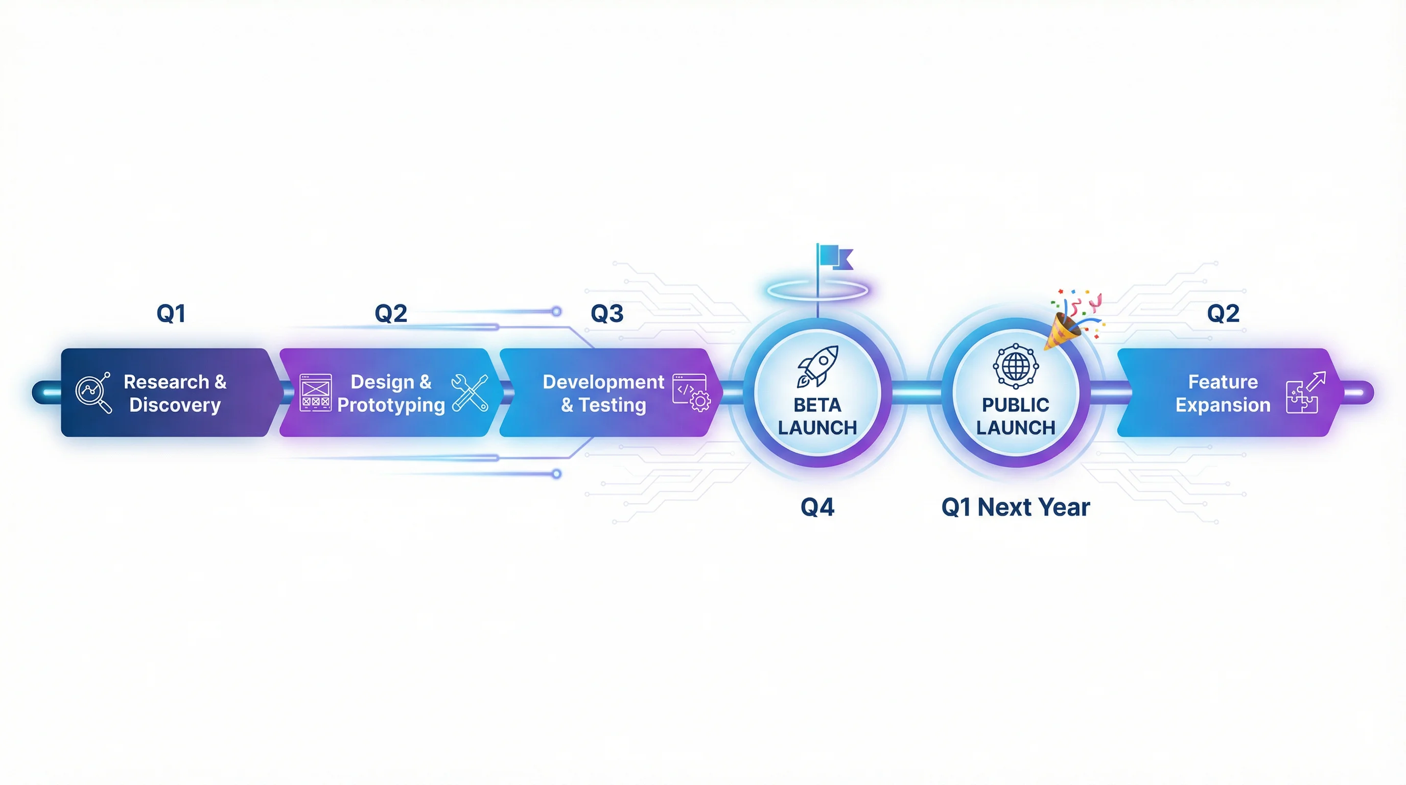
When a Gantt Chart Is the Right Choice
Gantt charts work well when the project has:
- a clear sequence of tasks
- meaningful durations
- milestone points
- a fixed time horizon
- an audience that needs to understand timing quickly
Typical use cases:
- project plans
- product launches
- research schedules
- content calendars
- implementation roadmaps
- grant or study timelines
Atlassian's guide to what a Gantt chart is is useful here because it frames Gantt charts as tools for visual planning, scheduling, and communication, not just decoration for a spreadsheet.
When Not to Use a Gantt Chart
Do not force a Gantt chart if:
- tasks are too fluid to estimate meaningfully
- the schedule changes hour by hour
- the work is purely backlog-based with no date commitments
- the audience only needs a few milestone points
In those situations, a checklist, Kanban board, milestone list, or simple roadmap may be a better fit.
How to Think About a Gantt Chart Before You Draw It
Before touching software, define four things:
- task name
- start date
- duration or end date
- milestone logic
If those are fuzzy, the visual will also be fuzzy.
That is why many "bad Gantt charts" are not design problems. They are planning problems wearing chart formatting.
How to Make a Gantt Chart by Hand
Even if you will ultimately use software, the manual logic is simple and worth understanding.
Step 1: List the tasks
Example:
- Literature review
- Data collection
- Data cleaning
- Analysis
- Draft writing
- Revision
Step 2: Assign dates or durations
For each task, define:
- when it starts
- how long it lasts
Step 3: Put tasks on a timeline
Create a horizontal date axis and draw one bar per task across the relevant date span.
Step 4: Mark milestones
Examples:
- proposal approved
- data collection complete
- manuscript submitted
- launch day
Step 5: Check overlaps and sequence
The real value of the Gantt chart is not the bars themselves. It is the visibility into overlap, sequencing, and bottlenecks.
A Simple Example
| Task | Start | Duration |
|---|---|---|
| Kickoff | May 1 | 1 day |
| Research | May 2 | 4 days |
| Draft | May 6 | 3 days |
| Review | May 9 | 2 days |
| Publish | May 12 | 1 day |
In chart form, this immediately shows:
- the project starts with one kickoff event
- research blocks drafting
- review comes after drafting
- publish is the terminal milestone
That is much easier to understand visually than reading a plain table.
How to Make a Gantt Chart in Excel
Excel is still one of the most common tools for Gantt charts because the data often already lives in a workbook.
Microsoft's guide, Present your data in a Gantt chart in Excel, explains the core idea: use a stacked bar chart, then hide the start-date series so only the duration bars remain visible.
The short version:
- create a table with task, start date, and duration
- insert a stacked bar chart
- hide the start-date series
- reverse the task order
- format the horizontal axis as dates
If you want the full Excel-specific walkthrough, see how to make a Gantt chart in Excel.
What Makes an Excel Gantt Chart Readable
Keep one main bar color
Use one primary color for standard tasks. Add accent colors only for milestones, progress, or major workstreams.
Reverse the vertical axis
Most readers expect the first task at the top, not the bottom.
Tighten the date range
If the timeline has too much empty space before the first task or after the last task, the chart feels less informative.
Avoid decorative clutter
Skip:
- 3-D effects
- heavy gradients
- unnecessary legends
- overly dense data labels
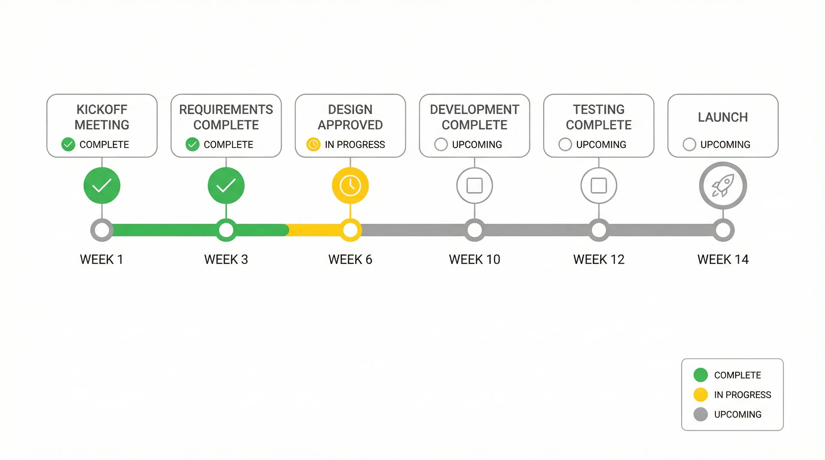
Progress, Milestones, and Dependencies
These are the three enhancements that usually make a Gantt chart actually useful.
Progress
Show completed work with a darker bar segment or a separate helper series.
Milestones
Mark important events such as:
- approval
- submission
- launch
- handoff
Dependencies
Even if your software does not render dependency arrows nicely, you can still communicate sequence by:
- grouping dependent tasks together
- ordering them tightly
- inserting milestone rows between phases
Formula-Based Gantt Layouts
ExcelJet's article on how to make a Gantt chart in Excel shows another useful pattern: instead of a chart object, you can create a timeline grid with formulas and conditional formatting.
That method is useful when:
- you want to see work by week or month
- you prefer a worksheet-first planning view
- you want tighter spreadsheet control
One common logic pattern is:
=AND($C2<=G$1,$C2+$D2>G$1)
This checks whether a given date column falls inside the task range so the corresponding timeline cell can be filled automatically.
Common Gantt Chart Mistakes
Mistake 1: Bad duration logic
If some tasks are inclusive and others are exclusive, the timeline becomes unreliable.
Mistake 2: Treating every task as equally important
If milestones and handoff points matter, mark them visually. Otherwise the reader only sees a wall of similar bars.
Mistake 3: Too many colors
Color should encode meaning, not variety.
Mistake 4: Using a Gantt chart for constantly shifting work
If the schedule changes too often, a static Gantt chart becomes maintenance overhead instead of insight.
Mistake 5: Trying to make Excel a full project-management system
Excel is strong for static planning and communication. It is not ideal for advanced dependency management, resource leveling, or complex multi-user schedule control.
When Excel Is Enough and When It Is Not
Excel is enough when:
- the timeline is relatively stable
- the task count is moderate
- the chart is mostly for communication
- the team already works in spreadsheets
Excel becomes limiting when:
- updates are constant
- dependencies are complex
- many people are editing simultaneously
- the project needs full scheduling governance
In those cases, Excel often becomes the staging area, while the final visual or planning logic moves elsewhere.
Timeline Generator
Turn project milestones and phases into polished timeline visuals instantly.
Frequently Asked Questions
Does Excel have a built-in Gantt chart?
No. Excel does not have a native Gantt chart type. It simulates one using a stacked bar chart.
What is the easiest way to make a Gantt chart?
The easiest way is to define tasks, start dates, and durations clearly, then build a timeline in Excel or a dedicated timeline tool.
What should I include in a Gantt chart?
At minimum: task name, start date, and duration. Often you also want milestones, completion status, or owner.
Are Gantt charts good for research projects?
Yes. They work especially well for thesis timelines, grant schedules, data collection phases, manuscript preparation, and multi-stage studies.
What is better than a Gantt chart for fast-moving work?
If the work is highly fluid, a Kanban board or simple milestone roadmap may be easier to maintain.
Can I make a Gantt chart without Excel?
Yes. You can use dedicated project tools, online timeline generators, or even draw one by hand. The core logic — tasks mapped against time — is the same regardless of the tool.
Conclusion
Making a Gantt chart is really about turning timing into structure.
If you know:
- what the tasks are
- when they start
- how long they last
- where the milestones sit
then you already have the core of the chart.
From there, the implementation choice is mostly about convenience. Excel works well for many straightforward schedules. Dedicated timeline tools work better when you want faster visuals with less manual formatting.
If you want that faster route, ConceptViz Timeline Generator is the natural next step for presentation-ready roadmap and schedule visuals.
Additional Resources
分類
更多文章
")
What Is a Manuscript in Research? Definition, Types & How to Write One (2026)
A manuscript in research is a formal document presenting original findings for journal publication. Learn the IMRAD structure, 5 manuscript types, manuscript vs paper differences, and a step-by-step writing guide with examples.
")
How to Design Scientific Infographics: 8-Step Guide for Researchers (2026)
Create credible, publication-ready infographics that scientists trust. Step-by-step process covering data accuracy, visual hierarchy, and source citations - with free templates.

What Is a Dot Plot? Statistics Examples and How to Make One
A dot plot shows the frequency of data with stacked dots over a number line. Learn how to make and read dot plots, find mean, median, mode, and range, with examples.