")
How to Make a Pie Chart in Google Sheets: Step-by-Step Guide (2026)
Learn how to create a pie chart in Google Sheets, summarize messy data, format labels, customize slices, and avoid misleading charts. Includes official Google Docs Editors Help references.
Google Sheets is one of the easiest places to build quick charts because the data, the sharing workflow, and the chart editor all live in the same browser tab. If you need to show how a total breaks into parts, a pie chart can be a good fit for stakeholder summaries, lightweight dashboards, and classroom work.
But pie charts in Google Sheets only work well when the source data is clean and the category count stays under control. If you try to build a pie chart directly from raw transactional rows, duplicate labels, or a table with too many tiny categories, the result will often be harder to interpret than the data itself.
This guide explains how to make a pie chart in Google Sheets, how to summarize the data correctly before charting, and how to use the Chart editor so the final visual is readable rather than decorative.
AI Chart Generator
Create polished pie charts, comparison charts, and presentation-ready visuals without spending time in the chart editor.
Create a chart free ->When a Pie Chart Works Well in Google Sheets
A pie chart is best when you want to show part-to-whole relationships.
Good use cases:
- budget allocation by department
- survey result balance across a few options
- traffic share by channel
- time allocation across a small number of project phases
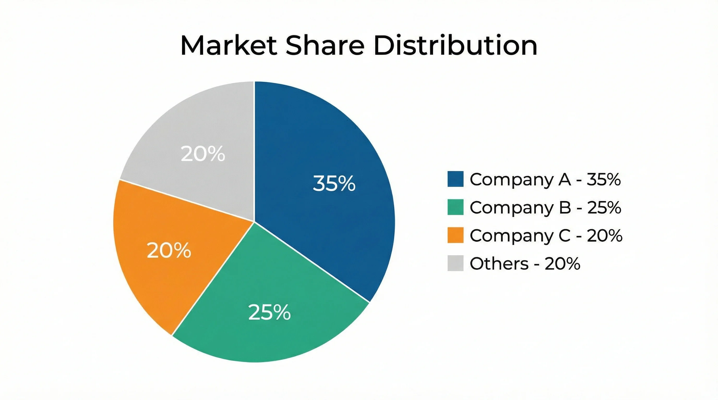
- market share across a few competitors
Google's Types of charts & graphs in Google Sheets page describes a pie chart as a way to show data as slices of a whole. That is the key test: if the total is meaningful and the categories represent portions of that total, a pie chart may be appropriate.
If readers need exact comparisons, ranking, or long labels, a bar chart is often clearer. If the values are continuous and grouped into intervals, you want a histogram instead.
When You Should Not Use a Pie Chart
Avoid pie charts when:
- you have too many categories
- the values are very close to one another
- you need to compare several time periods
- the underlying data is raw transaction-level data instead of a summarized table
- the total itself is not analytically meaningful
As a practical rule, once you move beyond about five or six slices, a bar chart often becomes easier to read.
Step 1: Prepare a Summary Table First
This is the step that matters most in Google Sheets.
If your data already looks like this:
| Category | Share |
|---|---|
| Paid Search | 34 |
| Organic Search | 29 |
| Social | 17 |
| 12 | |
| Direct | 8 |
you are ready to chart.
But many real Google Sheets datasets do not start in summary form. They look more like this:
| Transaction | Channel | Spend |
|---|---|---|
| 1 | Paid Search | 1200 |
| 2 | Paid Search | 900 |
| 3 | Social | 600 |
| 4 | 300 |
In that case, do not insert the pie chart immediately. First build a summary table by:
- using a pivot table
- using
SUMIF - using
QUERY
Why this matters
Google Sheets pie charts work best when each slice represents one final category and one final value. If you feed the chart raw rows, you often get repeated categories, strange aggregation behavior, or unreadable legends.
Step 2: Aggregate Raw Data if Needed
If you have row-level data, a pivot table is usually the fastest path.
Pivot table approach
- Select the raw data
- Go to
Insert > Pivot table - Put the category field in
Rows - Put the numeric field in
Values - Use the summarized output table as the chart source
This creates the clean two-column structure that pie charts need.
If you prefer formulas, a simple summary can also be built with SUMIF against a list of category names.
Example
If column B contains categories and column C contains values, a summary cell might use:
=SUMIF($B:$B,E2,$C:$C)
where E2 contains a category name.
This is usually enough for marketing budgets, response tallies, or cost breakdowns.
Step 3: Insert the Chart
Google's Add & edit a chart or graph help page documents the core workflow:
- select the cells you want to chart
- click
Insert > Chart - open the Chart editor on the right
- choose the desired chart type under
Setup
In practice:
- Select your summarized category/value table
- Click
Insert > Chart - In the Chart editor, go to
Setup - Change
Chart typetoPie chart
Google Sheets may guess the right chart automatically, but you should still verify the chart type manually.
Step 4: Check the Setup Tab Carefully
Before you start styling, confirm that Google Sheets is reading the data correctly.
On the Setup tab, look at:
- chart type
- data range
- labels
- values
- aggregate behavior
If the chart looks wrong, the problem is often in this layer, not in styling.
Common Setup problems
- category labels and values are reversed
- the wrong range is selected
- duplicate rows have not been aggregated first
- the chart is using raw rows instead of a clean summary table
Fix those before you touch colors or labels.
Step 5: Add Labels That Actually Help
Pie charts become much easier to read when the labels do the work.
In the Chart editor:
- Open
Customize - Open
Pie chart - Adjust labels to show what matters most
For most use cases, the best options are:
- percentage
- label
- sometimes value
Do not automatically show all three if the chart is crowded.
Google's chart help also notes an important limitation: you cannot freely drag pie labels around like independent objects. The support page explicitly says you cannot move labels on a pie chart the way you might want to. That is another reason to keep the slice count low and the summary table clean from the start.
Step 6: Customize Colors Without Making the Chart Worse
Google Sheets makes it easy to recolor slices, but easy is not the same as good.
Better default choices
- use a restrained palette
- highlight only one slice if emphasis is needed
- avoid random rainbow coloring
- keep background and border treatment simple
If you want one category to stand out, accent that slice and keep the rest neutral.
Keep small slices under control
If several slices are tiny:
- group them into
Other - simplify the categories
- or switch to a bar chart
Otherwise the chart becomes a wheel of tiny labels with very little interpretive value.

Step 7: Decide Whether a Doughnut Chart Is Better
Google Sheets also supports doughnut-style circular charts. A doughnut chart can look cleaner in dashboards, especially when you want to place a KPI in the center or reduce the visual heaviness of a full pie.
But do not switch just because it looks more modern. The same logic still applies:
- few categories
- meaningful total
- readable labels
If the underlying data is not a good fit for a pie chart, a doughnut chart will not fix it.
Example: Survey Results in Google Sheets
Suppose a class survey asks students which study resource they use most:
| Resource | Students |
|---|---|
| Lecture Slides | 42 |
| Practice Problems | 31 |
| Video Lessons | 18 |
| Peer Study | 9 |
This is a good pie chart candidate because:
- there is one meaningful total
- there are only four categories
- the audience mainly cares about proportional balance
A polished version would:
- show category name plus percentage
- use a restrained palette
- avoid 3D effects
- keep the legend secondary if labels are already visible
Common Pie Chart Mistakes in Google Sheets
Mistake 1: Charting raw rows directly
This is the most common problem. Aggregate first, chart second.
Mistake 2: Too many slices
If there are too many categories, the labels compete with each other and the chart loses readability.
Mistake 3: Using pie charts for ranking
If your real question is "which category is biggest and by how much?", a bar chart is usually better.
Mistake 4: Using overly decorative colors
The chart should communicate the data, not look like a theme picker demo.
Mistake 5: Comparing multiple pie charts side by side
Readers are not good at comparing angles across several separate pies. If you need period-to-period comparison, consider bars instead.
When Google Sheets Is Enough and When It Is Not
Google Sheets is enough when:
- the team already collaborates in Sheets
- the chart is quick reporting rather than publication graphics
- the data is already in a clean summary table
- the audience needs a browser-native chart fast
Google Sheets becomes limiting when:
- you need tight label control
- you want stronger visual refinement
- you need many polished variations
- you want to go from rough description to chart draft quickly
That is where ConceptViz AI Chart Generator becomes much faster than hand-tuning slice colors and chart editor settings.
AI Chart Generator
Generate polished pie charts and comparison visuals from a text description — no chart editor needed.
Frequently Asked Questions
How do I make a pie chart in Google Sheets from raw data?
Usually you should not chart raw rows directly. First summarize the data with a pivot table, SUMIF, or QUERY, then build the pie chart from the summary table.
Why does my Google Sheets pie chart look wrong?
The most common reasons are an incorrect data range, wrong label/value assignment, or unaggregated duplicate categories. Check the Setup tab before changing formatting.
How many categories should a Google Sheets pie chart have?
As a rule of thumb, keep it to about five or six categories. Beyond that, a bar chart is often easier to interpret.
Can I move pie chart labels manually in Google Sheets?
Not freely. Google's chart help notes that labels on pie charts cannot be moved around like independent objects, so clean setup and limited slice counts matter even more.
Is a pie chart or bar chart better in Google Sheets?
Use a pie chart when the main message is part-to-whole. Use a bar chart when exact comparison and ranking matter more than proportional composition.
Can I make a doughnut chart in Google Sheets?
Yes. Google Sheets supports doughnut-style circular charts. They look cleaner on dashboards but follow the same data rules as pie charts — keep categories few and the total meaningful.
Conclusion
Making a pie chart in Google Sheets is straightforward once the data is in the right shape:
- build a clean summary table
- insert the chart
- confirm the setup
- simplify labels
- keep slice count low
- switch to bars if the chart starts fighting the data
That sequence matters more than any one color or styling choice. In most cases, the best pie chart is the one that was simplified before it was decorated.
If you want a faster route to a cleaner result, try ConceptViz AI Chart Generator for pie charts and other comparison visuals that need less manual tweaking.
Additional Resources
Категории
Ещё публикации
")
8 Best Free Visme Alternatives in 2026 (No Watermark)
Best free Visme alternatives: Canva, ConceptViz, Piktochart, Google Slides, Design.com & more. Create infographics and presentations without watermarks or subscriptions.
")
15 Illustration and Infographic Design Styles Explained (2026)
Explore 15 illustration and infographic design styles with examples: flat, isometric, 3D, hand-drawn, minimalist, vector, cartoon, line art and more.
")
How to Create a Data Flow Diagram: DFD Levels, Symbols & Examples (2026)
Step-by-step guide to creating data flow diagrams (DFDs). Learn Level 0, 1 & 2 DFDs with real examples, standard symbols, and common mistakes to avoid.