")
How to Make a Histogram in Excel: Step-by-Step Guide (2026)
Learn how to create a histogram in Excel with the built-in Histogram chart, bin controls, and formatting tips. Includes Excel 365, 2024, 2021, 2019, and 2016 guidance.
If you need to understand the shape of a dataset instead of just its average, a histogram is one of the most useful charts you can build in Excel. It helps you see whether values cluster around the center, spread evenly, or skew toward one side. For students, researchers, analysts, and teachers, that makes it a practical chart for everything from exam scores to laboratory measurements and customer response times.
The good news is that modern Excel versions can create a histogram directly from your data. You no longer need to fake one with a regular column chart unless you are working around a very specific reporting requirement. In this guide, you will learn the fastest way to build a histogram in Excel, how to adjust bins properly, what mistakes to avoid, and when it is smarter to use a dedicated tool instead.
Histogram Maker
Create publication-ready histograms instantly with AI. Great for teaching, statistics assignments, and research visuals.
Try histogram maker free ->What a Histogram Actually Shows
A histogram is a chart for continuous numerical data. Instead of showing one bar for each category, it groups values into ranges, often called bins, and then counts how many observations fall into each range.
That sounds simple, but it changes what the chart tells you:
- A bar chart compares separate categories such as departments, product names, or survey answers.
- A histogram shows the distribution of one variable such as score, age, height, weight, runtime, or rainfall.
If your question is "Which group is bigger?", you probably want a bar chart. If your question is "How are these values spread out?", you probably want a histogram.
For a deeper side-by-side comparison, see our guide on bar chart vs histogram.
Which Excel Versions Support Histograms?
According to Microsoft Support, the built-in Histogram chart is available across current desktop Excel releases including Microsoft 365, Excel 2024, Excel 2021, Excel 2019, and Excel 2016, with similar support on Mac and newer mobile/web surfaces. In modern Excel, the standard path is:
Insert > Insert Statistic Chart > Histogram
That is the method this guide focuses on because it is the fastest and most maintainable approach for most users.
There is also a separate histogram workflow in Excel based on input data plus explicit bin numbers, which produces a frequency table and chart output. That method is still useful when you want stricter control over the exact bin table you report, but for everyday chart creation, the built-in Histogram chart is usually the better starting point.
Before You Start: Set Up Your Data Correctly
Excel works best when your raw values are in a single numeric column.
Recommended layout
| Exam Score |
|---|
| 52 |
| 61 |
| 68 |
| 71 |
| 74 |
| 76 |
| 81 |
| 88 |
| 91 |
| 95 |
Data prep rules
- Put the values in one column or one row.
- Use a clear header such as
Exam Score,Reaction Time, orDelivery Time (min). - Remove blank rows inside the dataset.
- Make sure the values are truly numeric, not text that only looks numeric.
- Avoid mixing units in the same column.
If your source data is dirty, clean it first. Histograms are only as useful as the values feeding them.
Method 1: Create a Histogram with Excel's Built-In Chart
This is the best method for most users.
Step 1: Select your data
Highlight the full numeric range, including the header if you have one.
Step 2: Insert the histogram
Go to:
Insert > Insert Statistic Chart > Histogram
Excel will immediately create a histogram based on your selected values.
Microsoft also notes that you can reach it through the All Charts tab under Recommended Charts, which can help if you are browsing several chart types before choosing one.
Step 3: Check whether the default bins make sense
This is where many beginners stop too early. Excel will generate a histogram, but the default binning is not always the best for your audience.
Ask yourself:
- Are there too few bars, making the chart oversimplified?
- Are there too many bars, making the chart noisy?
- Do the bins align with how people think about the data?
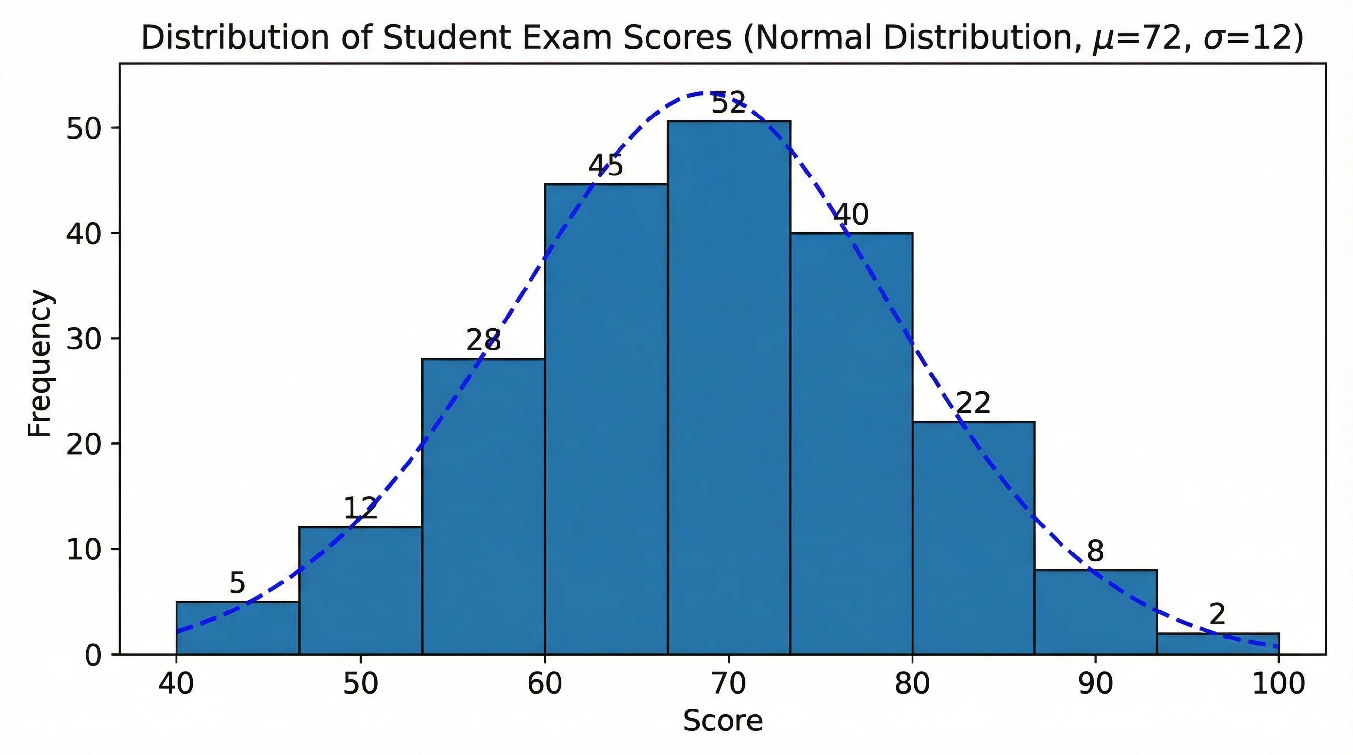
For example, a teacher reviewing test scores may prefer bins like 50-59, 60-69, and 70-79, while a lab analyst may want smaller intervals to reveal subtle shifts in a measurement distribution.
How to Change Histogram Bins in Excel
Microsoft's recommended workflow is:
- Right-click the horizontal axis
- Select Format Axis
- Open Axis Options
From there, you can control how Excel groups your data.
Automatic
Excel's default automatic binning uses Scott's normal reference rule, according to Microsoft. This is often a reasonable starting point for large, roughly continuous datasets, but it is not automatically the best choice for teaching, reporting, or publication.
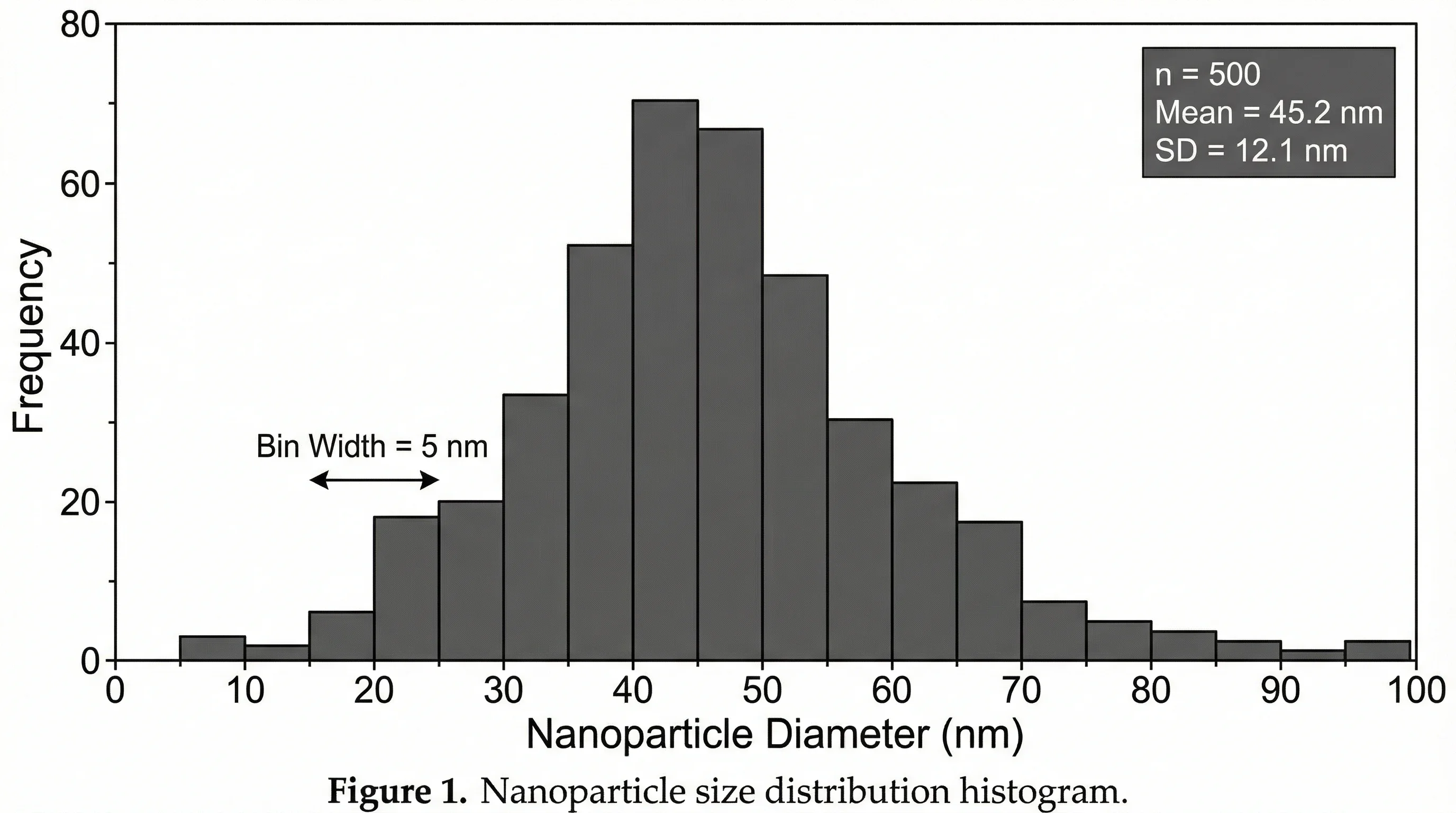
Bin width
Use this when you know the interval size you want.
Examples:
- Score bins of
5points - Income bins of
$10,000 - Time bins of
2minutes
If your audience already thinks in a specific interval size, Bin width is usually the clearest setting.
Number of bins
Use this when you care more about overall visual balance than exact interval size.
For example, if your chart looks too crowded, reducing the number of bins can make the shape easier to interpret.
Overflow bin
Use this when you want all unusually large values grouped together above a threshold.
Example:
Overflow bin = 100for scores above 100Overflow bin = 60for wait times longer than 60 minutes
Underflow bin
Use this when you want all unusually small values grouped together below a threshold.
Example:
Underflow bin = 40for very low scoresUnderflow bin = 0if negative values should be separated conceptually
Microsoft also notes that the histogram tool can work with explicit bin numbers in a second column. In that workflow, Excel counts each value into the appropriate interval, using values greater than the lower bound and less than or equal to the upper bound.
If you prefer a concise visual walkthrough of how Excel exposes these settings in practice, Exceljet's short tutorial on how to make a histogram chart is useful for seeing where bin width, bin count, and overflow settings live in the formatting pane.
How to Choose Good Bin Settings
There is no single perfect answer, but there are reliable heuristics.
Use wider bins when:
- You have a small dataset
- You need a high-level summary
- The audience is not statistically advanced
- The chart looks too jagged
Use narrower bins when:
- You have many observations
- You suspect multiple peaks or clusters
- You need to inspect skewness or outliers more closely
- The report is analytical rather than presentation-oriented
Practical rule of thumb
Start with Excel's automatic setting, then compare it with:
- one version using fewer bins
- one version using more bins
Pick the version that reveals the distribution without adding fake drama or hiding important structure.
Formatting Tips That Make the Chart Easier to Read
Once the bins are right, clean up the chart so readers can understand it quickly.
Use a descriptive title
Bad:
HistogramChart 1
Better:
Distribution of Student Exam ScoresReaction Time Distribution for Control GroupMonthly Delivery Time Distribution
Label the horizontal axis clearly
The x-axis should tell readers what variable is being grouped and, if relevant, which unit is being used.
Examples:
ScoreReaction Time (ms)Household Income ($)
Label the vertical axis clearly
Most histograms use:
FrequencyCountNumber of Observations
Avoid chart junk
Keep or remove visual elements based on whether they help interpretation:
- Keep light gridlines if they help people estimate counts
- Remove heavy borders
- Avoid excessive gradients or 3D effects
- Use one main color unless comparing groups
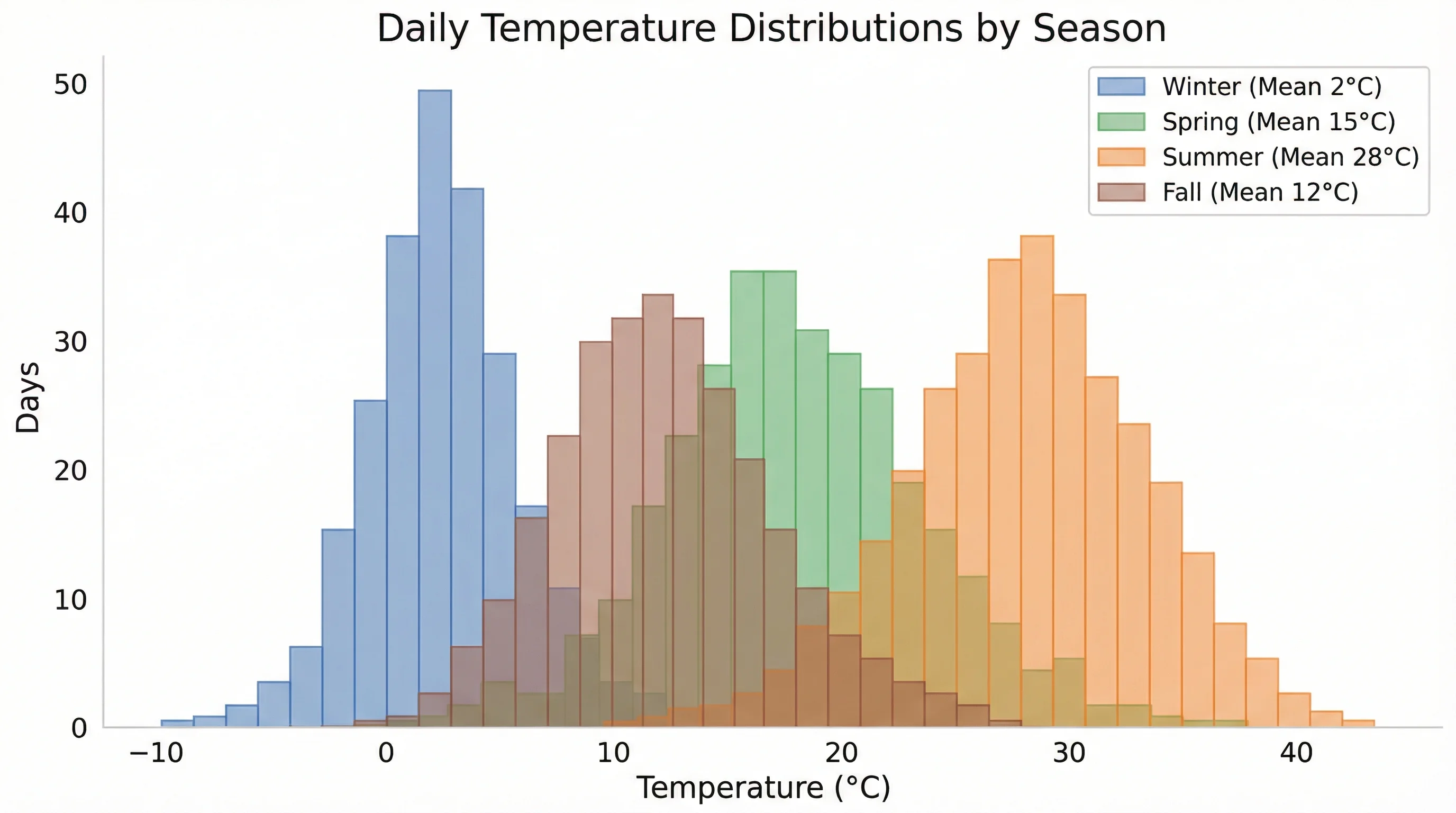
Use consistent scale across related charts
If you are comparing two histograms side by side, mismatched axes can make one distribution look more dramatic than it really is.
Common Mistakes When Making a Histogram in Excel
Mistake 1: Using categorical data
A histogram is not the right chart for categories like majors, departments, or favorite fruits. Use a bar chart instead.
Mistake 2: Leaving the default bins unreviewed
Excel's first result is only a draft. You still need to decide whether the bins support the story you want to tell.
Mistake 3: Making bins too narrow
This often produces a spiky chart that looks more precise than the data deserves.
Mistake 4: Making bins too wide
This can hide meaningful clusters, skewness, or tails.
Mistake 5: Treating a histogram like a bar chart
Histogram bars represent ranges along a continuous scale. The point is the shape of the distribution, not ranking separate categories.
Mistake 6: Ignoring outliers
If a few extreme values are stretching the chart, consider whether an overflow bin or a second explanatory note would make interpretation clearer.
When to Use the Frequency-Table Method Instead
Excel's chart method is convenient, but there are cases where the explicit bin-table workflow is better:
- You need the frequency table itself for a report appendix
- Your teacher or reviewer wants exact bin cutoffs shown in cells
- You want to audit every interval manually
- You are building a reproducible worksheet with visible intermediate calculations
In that setup, Excel expects:
- one column with the raw input data
- one column with bin numbers
It then counts how many observations fall into each interval and returns a histogram table plus a column chart.
This method is slower, but it gives you more transparency over how the distribution was grouped.
If the older worksheet-based workflow is missing from your Excel installation, Microsoft documents how to load the Analysis ToolPak in Excel. That matters because some users still expect histogram analysis to appear under the Data Analysis menu instead of the newer built-in chart path.
Excel vs Dedicated Histogram Tools
Excel is still a solid option when:
- your data is already in a spreadsheet
- you need a quick chart for a class, report, or meeting
- your formatting needs are moderate
But a dedicated tool is usually better when:
- you want cleaner visuals with less manual adjustment
- you need multiple design variants quickly
- you are preparing publication-quality figures
- you want to generate charts from plain-language prompts instead of worksheet cleanup
If you regularly move from raw data to visual explanation, using ConceptViz Histogram Maker can be much faster than formatting each Excel chart manually.
Best Practices for Research and Teaching
If you are making a histogram for a paper, poster, or class handout, these habits help:
- Keep your axis labels explicit
- Mention the sample size if it matters
- Explain unusual bin choices in the caption
- Use the same bin logic across related charts
- Pair the histogram with a box plot if you also need median and outlier detail
For broader figure design guidance, see our posts on research data visualization best practices, how to draw a box and whisker plot, and how to create scatter plots in Excel.
Histogram Maker
Skip the Excel formatting — generate publication-ready histograms from a text description.
Frequently Asked Questions
How do I make a histogram in Excel 365?
Select your numeric data, then go to Insert > Insert Statistic Chart > Histogram. After the chart appears, right-click the horizontal axis and use Format Axis to change bin width, number of bins, and underflow or overflow settings.
Why is Excel not giving me a histogram option?
The most common reasons are that your data is not truly numeric, you selected multiple incompatible columns, or you are using a workflow or version where the statistic chart button is hidden. Try placing the raw values in a single column, selecting only that range, and then using Insert > Insert Statistic Chart > Histogram.
How do I change the bin size in an Excel histogram?
Right-click the horizontal axis, choose Format Axis, and then open Axis Options. From there you can set Bin width, Number of bins, Underflow bin, or Overflow bin.
What is the best number of bins for a histogram in Excel?
There is no universal best number. Excel's automatic option is a useful starting point, but you should still compare a few alternatives. Use fewer bins for a cleaner overview and more bins when you need to reveal finer structure in a larger dataset.
What is the difference between a histogram and a bar chart in Excel?
A histogram groups continuous numerical values into ranges and shows frequency, while a bar chart compares separate categories. In a histogram, the emphasis is on the distribution of one variable. In a bar chart, the emphasis is on comparing categories or groups.
Can I use an Excel histogram in an academic paper?
Yes. Use clear axis labels, sensible bin settings, a descriptive title or caption, and consistent scale choices. For more polished visuals, many researchers move from Excel to a dedicated charting tool before final submission.
Conclusion
Making a histogram in Excel is straightforward once you separate the process into two decisions:
- Insert the chart correctly
- Tune the bins intentionally
If you remember nothing else from this guide, remember this: the quality of a histogram is not determined by the click path alone. It depends on whether the bins help readers understand the real shape of the data.
For most users, the best workflow is:
- Put one clean numeric variable into a single column
- Insert the built-in Histogram chart
- Adjust bin settings in
Format Axis - Clean up the title, labels, and styling
- Review whether the final shape matches the story your data is actually telling
If you want the same analytical clarity without the Excel formatting overhead, try ConceptViz Histogram Maker. It is especially useful when you need a faster path from raw values to a presentation-ready visual.
Additional Resources
Категории
Ещё публикации
")
8 Best Wiring Diagram Software in 2026 (Free & Paid)
Compare the best wiring diagram software for electrical, automotive, and industrial use. Reviews of 8 free and paid tools with features, pricing, and pros/cons.

Protein Structure: The 4 Levels Explained Simply
Protein structure made simple: the four levels (primary, secondary, tertiary, quaternary), the bonds that stabilize each, and why structure decides function.
")
7 Best Free Prezi Alternatives in 2026 (Ranked)
Looking for a free Prezi alternative? Compare 7 best options with zoom effects & animations—Google Slides, Canva, Genially & more. No $59/month needed.