")
How to Create a Sankey Diagram in Excel: Step-by-Step Guide (2026)
Learn how to make Sankey diagrams in Excel using add-ins, manual workarounds, and dedicated tools. Complete step-by-step guide with templates, examples, and best alternatives.
How to Create a Sankey Diagram in Excel: The Complete Guide
Sankey diagrams are one of the most effective ways to visualize flows, transfers, and relationships between categories. Whether you are tracking energy consumption, budget allocation, website traffic, or material flows in a supply chain, a Sankey diagram makes proportional relationships immediately visible through varying-width bands.
The challenge? Excel does not include a built-in Sankey chart type. But that does not mean it is impossible. This guide walks you through every method available — from Excel add-ins and manual stacked chart workarounds to dedicated Sankey diagram tools that handle the complexity for you.

Sankey Diagram Generator
Create professional Sankey diagrams instantly with AI. Just describe your data flows and get a publication-ready diagram in seconds — no Excel formulas needed.
Try Sankey diagram maker free →Why Excel Does Not Have Native Sankey Charts
Before exploring the workarounds, it helps to understand the gap. Excel supports over 20 chart types — bar, line, scatter, pie, waterfall, treemap, sunburst, and more. However, Sankey diagrams require a fundamentally different rendering engine that handles:
- Variable-width curved bands connecting source and target nodes
- Multi-level flows where a single source splits into multiple destinations
- Proportional scaling so band widths match actual data values
- Node positioning that minimizes visual overlap
These requirements go beyond what Excel's charting engine was designed to handle. Microsoft has not added Sankey support to Excel, even though Power BI (a separate Microsoft product) does include a Sankey visual.
This means you have three options:
- Use an Excel add-in that adds Sankey capability
- Build a manual approximation using stacked charts (complex but possible)
- Use a dedicated Sankey diagram tool outside of Excel
Let us explore each approach in detail.
Method 1: Create a Sankey Diagram in Excel Using Add-Ins
The most practical way to create a Sankey diagram directly within Excel is through a third-party add-in. Several add-ins add Sankey chart functionality to Excel's charting menu.
Popular Excel Add-Ins for Sankey Diagrams
| Add-In | Platform | Price | Key Feature |
|---|---|---|---|
| ChartExpo | Excel, Google Sheets | Free tier + paid plans | One-click Sankey from data |
| Power-user | Excel, PowerPoint | Paid subscription | Professional styling options |
| ChartEngine | Excel | Free + premium | Multi-level Sankey support |
Step-by-Step: Creating a Sankey Diagram with an Add-In
Here is the general workflow that applies to most Excel Sankey add-ins:
Step 1: Prepare your data
Organize your data in three columns:
| Source | Target | Value |
|---|---|---|
| Solar | Residential | 120 |
| Solar | Commercial | 80 |
| Wind | Residential | 90 |
| Wind | Industrial | 150 |
| Natural Gas | Residential | 200 |
| Natural Gas | Commercial | 180 |
| Natural Gas | Industrial | 300 |
| Coal | Industrial | 250 |
Each row represents a flow from one category (Source) to another (Target) with a proportional value.
Step 2: Install the add-in
- Open Excel and go to the Insert tab
- Click Get Add-ins (or My Add-ins > Store)
- Search for the Sankey add-in of your choice (e.g., ChartExpo)
- Click Add and follow the installation prompts
- Restart Excel if prompted
Step 3: Select your data
- Highlight all three columns (Source, Target, Value), including headers
- Make sure there are no blank rows in your selection
Step 4: Insert the Sankey chart
- Go to the Insert tab
- Click on the add-in button (e.g., ChartExpo in the ribbon)
- Select Sankey Chart or Sankey Diagram from the chart type list
- Click Create Chart or Insert
Step 5: Customize the diagram
Most add-ins allow you to:
- Change band colors to match your brand or data categories
- Edit node labels and positions
- Adjust chart title and subtitle
- Toggle data value labels on or off
- Resize the diagram
Limitations of the Add-In Approach
While add-ins are the easiest path, they come with trade-offs:
- IT restrictions: Corporate environments may block third-party add-ins
- Compatibility: Add-in charts may not render correctly when shared with users who do not have the add-in installed
- Limited customization: Most add-ins offer fewer styling options than dedicated tools
- Performance: Complex multi-level Sankey diagrams can slow down Excel
- Cost: Premium features typically require a subscription
Method 2: Build a Sankey Diagram Manually in Excel (Stacked Bar Chart Approach)
For users who cannot install add-ins or prefer a native Excel approach, it is possible to approximate a Sankey diagram using stacked area and column charts. This method, originally documented by Excel specialists, is technically impressive but extremely time-consuming.
How the Manual Method Works
The core idea is to:
- Create 100% stacked area charts to represent the curved flow bands
- Create 100% stacked column charts to represent the source and target pillars
- Use invisible spacer series to position each band correctly
- Overlay all charts on top of each other with precise alignment
Step-by-Step Overview
Step 1: Structure your source data
Start with the same three-column format (Source, Target, Value):
| Source | Target | Value |
|---|---|---|
| Dept A | Project X | 40 |
| Dept A | Project Y | 30 |
| Dept A | Project Z | 10 |
| Dept B | Project X | 25 |
| Dept B | Project Y | 35 |
| Dept C | Project Y | 20 |
| Dept C | Project Z | 45 |
Step 2: Build helper calculation tables
This is where it gets complex. You need to calculate:
- Source pillar values: Sum of all flows from each source
- Target pillar values: Sum of all flows to each target
- Space above each band: Cumulative sum of bands above the current one
- Band width: The actual flow value
- Space below each band: Remaining space below the current band
These calculations use formulas like SUMIF, XLOOKUP, IF, and ISNUMBER to determine the vertical position and width of every band in the diagram.
Step 3: Create individual area charts
For each source category, create a 100% stacked area chart with three series:
- Space above (formatted as invisible — 100% transparency)
- Flow band (formatted with 50% transparency in your desired color)
- Space below (formatted as invisible — 100% transparency)
Step 4: Format each chart
- Remove all chart elements (axes, gridlines, legends, titles)
- Reverse the vertical axis
- Set the plot area background to transparent
- Adjust the area fill colors and transparency
Step 5: Create pillar charts
Create 100% stacked column charts for source and destination pillars:
- Each segment represents one category
- Use solid colors matching the flow bands
Step 6: Assemble the final diagram
- Select all individual area charts while holding Ctrl
- Go to Shape Format > Align Center and Align Middle
- Position the pillar charts at the left and right edges
- Adjust sizing until everything lines up
Should You Use the Manual Method?
Honestly, this method is a learning exercise, not a practical workflow. Here is why:
| Consideration | Reality |
|---|---|
| Time required | 2-4 hours for a simple diagram |
| Complexity | Requires 50+ formulas and multiple charts |
| Maintenance | Adding a single data point means rebuilding calculations |
| Error-prone | One wrong formula breaks the entire visual |
| Appearance | Still looks approximate compared to dedicated tools |
If you are building Sankey diagrams regularly, the manual Excel method is not sustainable. It is better suited as a one-time academic exercise to understand how Sankey charts work visually.
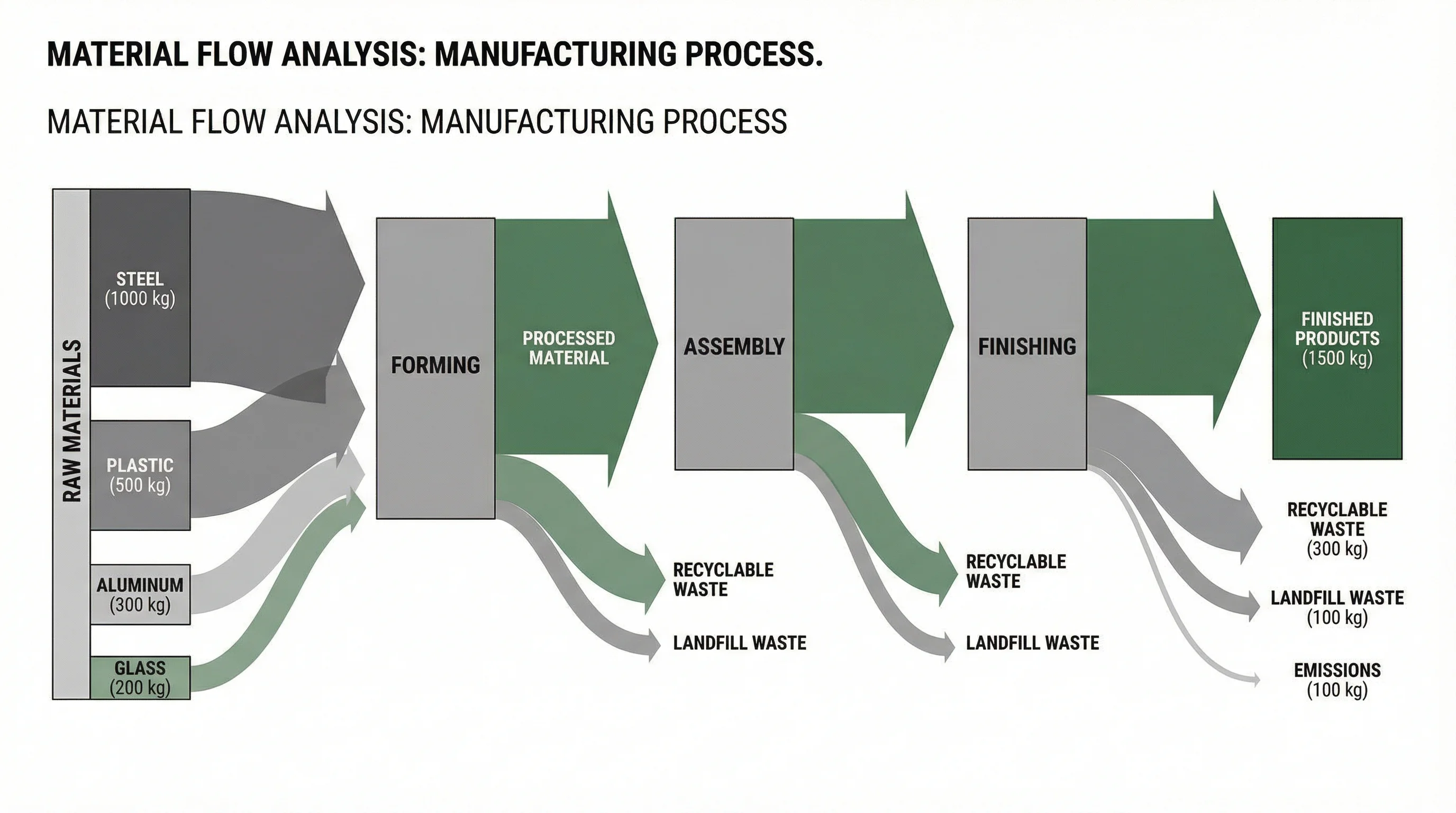
A professional Sankey diagram showing material flow analysis — this level of polish is difficult to achieve with Excel alone
Method 3: Use Power BI with Excel Data
If you are in the Microsoft ecosystem, Power BI offers a native Sankey visual that can connect directly to your Excel data.
Steps to Create a Sankey Diagram in Power BI from Excel
- Open Power BI Desktop (free download from Microsoft)
- Click Get Data > Excel Workbook
- Select your Excel file and import the three-column data table
- Go to Visualizations > Get more visuals > search for Sankey
- Install the Sankey visual by Microsoft or a third-party provider
- Drag your fields: Source to Source, Target to Destination, Value to Weight
- Customize colors, labels, and formatting
Pros and Cons of the Power BI Approach
Advantages:
- Native Microsoft product with reliable rendering
- Interactive — users can hover and filter
- Connects live to your Excel data source
- Free desktop version available
Disadvantages:
- Requires learning a separate application
- The Sankey visual is a custom visual, not built into the default set
- Sharing requires Power BI service (paid for collaboration)
- Less suitable for static report or publication use
Method 4: Use a Dedicated Sankey Diagram Tool
For most users, the fastest and most reliable way to create Sankey diagrams from Excel data is to use a dedicated diagramming tool. These tools are purpose-built for flow visualization and handle all the complexity that Excel struggles with.
Top Dedicated Sankey Diagram Tools
| Tool | Best For | Excel Import | Price |
|---|---|---|---|
| ConceptViz | AI-powered diagram generation | Paste data directly | Free tier available |
| SankeyMATIC | Quick simple diagrams | Manual text input | Free |
| Flourish | Interactive web embeds | CSV upload | Free + paid |
| RAWGraphs | Open-source data viz | CSV/TSV paste | Free |
| Google Charts | Developer integration | API-based | Free |
Workflow: Excel to Dedicated Tool
The typical process takes less than 5 minutes:
- Prepare your data in Excel using the three-column format (Source, Target, Value)
- Copy the data from Excel (Ctrl+C)
- Open the Sankey tool in your browser
- Paste or upload your data
- Customize colors, labels, fonts, and layout
- Export as PNG, SVG, or PDF
This workflow preserves your Excel data as the source of truth while using a specialized tool for the visualization layer.
AI Chart Generator
Generate any chart type from your data with AI — including Sankey diagrams, flow charts, and more.
Practical Sankey Diagram Examples and Use Cases
Understanding when to use a Sankey diagram helps you decide whether it is worth the effort in Excel or if a dedicated tool makes more sense.
1. Energy Flow Analysis
Sankey diagrams were originally invented by Captain Matthew Sankey in 1898 to visualize the energy efficiency of steam engines. Today, energy flow Sankey diagrams are used to show how energy is generated, distributed, and consumed across sectors.
Example data:
| Source | Target | Value (TWh) |
|---|---|---|
| Coal | Electricity | 350 |
| Natural Gas | Electricity | 280 |
| Natural Gas | Heating | 150 |
| Nuclear | Electricity | 200 |
| Renewables | Electricity | 180 |
| Electricity | Residential | 310 |
| Electricity | Commercial | 250 |
| Electricity | Industrial | 450 |
| Heating | Residential | 100 |
| Heating | Commercial | 50 |
2. Website Traffic and User Journey
Digital marketers use Sankey diagrams to visualize how users flow through a website — from traffic sources to landing pages to conversion actions.
3. Budget and Financial Allocation
Finance teams use Sankey diagrams to show how revenue flows from income sources through departments to specific expenditure categories.
4. Supply Chain and Logistics
Manufacturing companies visualize material flows from raw material suppliers through production stages to final customers.
5. Survey and Research Data
Researchers use Sankey diagrams (also called alluvial plots in academic contexts) to show how respondent characteristics flow across multiple categorical variables.
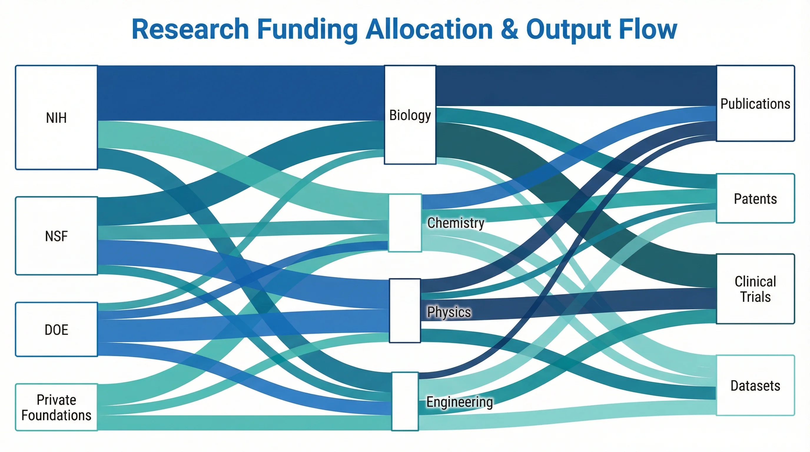
Sankey diagrams are widely used in academic research to visualize funding allocation and resource distribution
Best Practices for Sankey Diagrams
Regardless of which tool you use, follow these design principles to create effective Sankey diagrams:
Data Preparation
- Limit categories to 5-8 per level — too many nodes create visual clutter
- Use consistent naming — "Dept A" and "Department A" will be treated as separate nodes
- Verify data sums — values should balance between source and target levels
- Order categories logically — by size (largest at top) or by natural grouping
Visual Design
- Use distinct colors for each source category to trace flows across levels
- Keep transparency at 40-60% for flow bands so overlapping flows remain visible
- Add data labels selectively — label only the largest flows to avoid clutter
- Left-to-right orientation is standard for Western audiences
Common Mistakes to Avoid
| Mistake | Impact | Solution |
|---|---|---|
| Too many nodes | Diagram becomes unreadable | Group small categories into "Other" |
| Inconsistent naming | Creates duplicate nodes | Standardize category names before charting |
| Missing flows | Diagram does not sum correctly | Verify all source-target pairs are included |
| Poor color choices | Flows are hard to distinguish | Use a professional color palette with sufficient contrast |
| No title or labels | Readers cannot interpret the diagram | Always include a descriptive title and node labels |
Sankey Diagram Data Format for Excel
To make your Excel data compatible with any Sankey diagram tool, follow this universal format:
Three-Column Format (Standard)
| Column A: Source | Column B: Target | Column C: Value |
|---|---|---|
| Category 1 | Subcategory A | 100 |
| Category 1 | Subcategory B | 75 |
| Category 2 | Subcategory A | 50 |
| Category 2 | Subcategory C | 120 |
Multi-Level Format (Advanced)
For Sankey diagrams with three or more levels, add additional rows for each stage of the flow:
| Source | Target | Value |
|---|---|---|
| Revenue | Product Sales | 500 |
| Revenue | Services | 300 |
| Product Sales | North America | 200 |
| Product Sales | Europe | 180 |
| Product Sales | Asia | 120 |
| Services | Consulting | 200 |
| Services | Support | 100 |
This format creates a two-level Sankey diagram: Revenue splits into Product Sales and Services, which then split into geographic or functional subcategories.
Tips for Data Preparation in Excel
- Remove blank rows — Sankey tools will error on empty data
- Use text for categories, numbers for values — do not mix data types in a column
- Avoid circular flows — Source A to Target B and Target B back to Source A will cause rendering issues in most tools
- Handle zero values — remove rows with zero values rather than including them
Excel Sankey Diagram Templates
While Excel does not ship with Sankey templates, you can find downloadable templates from various sources:
What Templates Typically Include
- Pre-built helper calculation tables with formulas
- Formatted stacked area charts for flow bands
- Stacked column charts for source and target pillars
- Instructions for customizing the data
Where to Find Templates
- Excel community forums — Microsoft Tech Community often has shared templates
- GitHub — Search for "excel sankey template" to find open-source spreadsheets
- Add-in galleries — ChartExpo and similar tools offer template presets
- Tutorial blogs — Sites like ExcelOffTheGrid and Spreadsheeto offer downloadable workbooks
Template Limitations
Templates can save initial setup time, but they are rigid. If your data has a different number of categories or levels than the template was designed for, you will need to modify the formulas and add or remove chart series — which often takes as long as building from scratch.
Comparing Methods: Which Approach Should You Choose?
Here is a side-by-side comparison to help you decide:
| Factor | Excel Add-In | Manual Method | Power BI | Dedicated Tool |
|---|---|---|---|---|
| Setup time | 5-10 minutes | 2-4 hours | 15-30 minutes | 2-5 minutes |
| Learning curve | Low | Very high | Medium | Very low |
| Visual quality | Good | Moderate | Good | Excellent |
| Customization | Limited | Moderate | Good | High |
| Multi-level support | Varies | Very difficult | Yes | Yes |
| Data update ease | Easy | Very hard | Easy | Easy |
| Sharing | Requires add-in | Self-contained | Requires Power BI | Export as image/PDF |
| Cost | Free-$20/mo | Free | Free-$10/mo | Free-$15/mo |
Recommendation by Use Case
- Quick one-time diagram: Use a dedicated Sankey diagram tool — fastest from start to finish
- Regular business reports: Use Power BI with Excel data connection for repeatable, interactive reports
- Corporate Excel environment: Use an add-in if IT allows, otherwise export data to an external tool
- Academic or learning purpose: Try the manual method once to understand the mechanics, then switch to a dedicated tool
Frequently Asked Questions
Can you make a Sankey diagram in Excel without add-ins?
Technically yes, but it is extremely complex. You need to build multiple stacked area charts with invisible spacer series, create helper tables with dozens of formulas, and manually align all charts. The process takes 2-4 hours for a simple diagram and is very difficult to update when data changes. For practical use, an add-in or dedicated tool is strongly recommended.
What is the best free tool to create Sankey diagrams from Excel data?
SankeyMATIC is a popular free option for simple Sankey diagrams — you paste your data in a text format and it generates the diagram instantly. For AI-powered generation with more customization, ConceptViz offers a free tier that creates professional Sankey diagrams from your data. RAWGraphs is another excellent free, open-source option that accepts CSV data exported from Excel.
Does Microsoft Excel support Sankey diagrams natively?
No, as of 2026 Excel does not include a built-in Sankey chart type. However, Microsoft Power BI does support Sankey diagrams through a custom visual available in the AppSource marketplace. If you are in the Microsoft ecosystem, Power BI can connect directly to your Excel workbook as a data source.
How should I format my Excel data for a Sankey diagram?
Use a three-column format: Source (text), Target (text), and Value (number). Each row represents one flow. For example: 'Solar, Residential, 120' means 120 units flow from Solar to Residential. For multi-level diagrams, add additional rows for each stage. Remove blank rows and ensure consistent category naming.
What is the difference between a Sankey diagram and a flow chart?
A Sankey diagram shows proportional flows between categories using variable-width bands — the wider the band, the larger the value. A flow chart shows process steps and decision points using shapes and arrows with uniform line widths. Sankey diagrams are data-driven visualizations; flow charts are process documentation tools.
Can I create a multi-level Sankey diagram in Excel?
With add-ins like ChartExpo, you can create multi-level Sankey diagrams by adding more source-target pairs in your data. The manual stacked chart method becomes exponentially more complex with each additional level and is not practical beyond two levels. Dedicated Sankey tools handle multi-level diagrams with ease.
How do I export a Sankey diagram from Excel?
If you used an add-in, right-click the chart and select 'Save as Picture' to export as PNG or JPEG. For higher quality, copy the chart to PowerPoint and export from there at 300 DPI. If you used a dedicated tool, most offer direct SVG and PNG export at publication quality.
What data types work best with Sankey diagrams?
Sankey diagrams excel at showing categorical-to-categorical flows with quantitative values: energy flows, budget allocations, website traffic paths, supply chain logistics, survey response patterns, and any data where items move from one category to another with measurable quantities. They are not suitable for time-series data or continuous variables.
Conclusion
Creating a Sankey diagram in Excel is possible, but it requires workarounds. The native charting engine does not support the variable-width flow bands that define Sankey diagrams. Your three practical options are:
- Install an add-in like ChartExpo or ChartEngine for the simplest in-Excel experience
- Export your data to Power BI for interactive Sankey diagrams within the Microsoft ecosystem
- Use a dedicated tool like ConceptViz Sankey Diagram Generator for the fastest, highest-quality results
The manual stacked-chart method, while technically fascinating, is too time-consuming and fragile for regular use.
For most users, the best workflow is to keep your data in Excel (where it is easy to manage and update) and use a specialized tool for the visualization (where it is easy to create and export professional diagrams).
Ready to create a Sankey diagram from your Excel data? Try ConceptViz Sankey Diagram Generator — paste your data and get a publication-ready Sankey diagram in seconds, no formulas or add-ins required.
Want to explore more data visualization techniques? Read our research data visualization best practices guide for comprehensive tips, or learn how to create circuit diagrams online for technical documentation.
Категории
Ещё публикации

Best Free Adobe Illustrator Alternatives 2026
Compare the best free Adobe Illustrator alternatives in 2026: Inkscape, Affinity by Canva, Canva, Vectr, Gravit and ConceptViz for vector graphics and diagrams.
")
Canva Venn Diagram Maker: Complete Guide + Free Alternatives (2026)
Learn how to make a Venn diagram in Canva step by step, discover its limitations, and explore the best free alternatives including AI-powered tools for faster diagram creation.
")
How to Make a Graphical Abstract: Free Maker & 7-Step Guide (2026)
Free graphical abstract maker + step-by-step guide. Create Elsevier & Cell journal-ready abstracts in minutes. Includes size specs (1328x531px, 1200x1200px), templates, and AI tools.