
Academic Poster Design: Complete Guide for Researchers and Students
Learn how to create effective academic posters with proper layout, sections, and formatting. Includes size guidelines, templates, and discipline-specific tips.
Academic posters are a cornerstone of scholarly communication. Whether you're presenting at your first undergraduate symposium or your tenth international conference, understanding the conventions and best practices of academic poster design is essential for effectively sharing your research.
This comprehensive guide covers everything from standard sizes and layouts to discipline-specific conventions and modern design trends.
What Is an Academic Poster?
An academic poster is a visual summary of research designed for presentation at conferences, symposiums, and academic events. According to NYU's research guide, posters "summarize information or research concisely and attractively to help publicize it and generate discussion."
Unlike journal articles, academic posters are:
- Visual-first: Figures and graphics take priority over text
- Interactive: Designed to facilitate conversation with viewers
- Concise: Distill complex research into digestible chunks
- Standalone: Should be understandable without the presenter

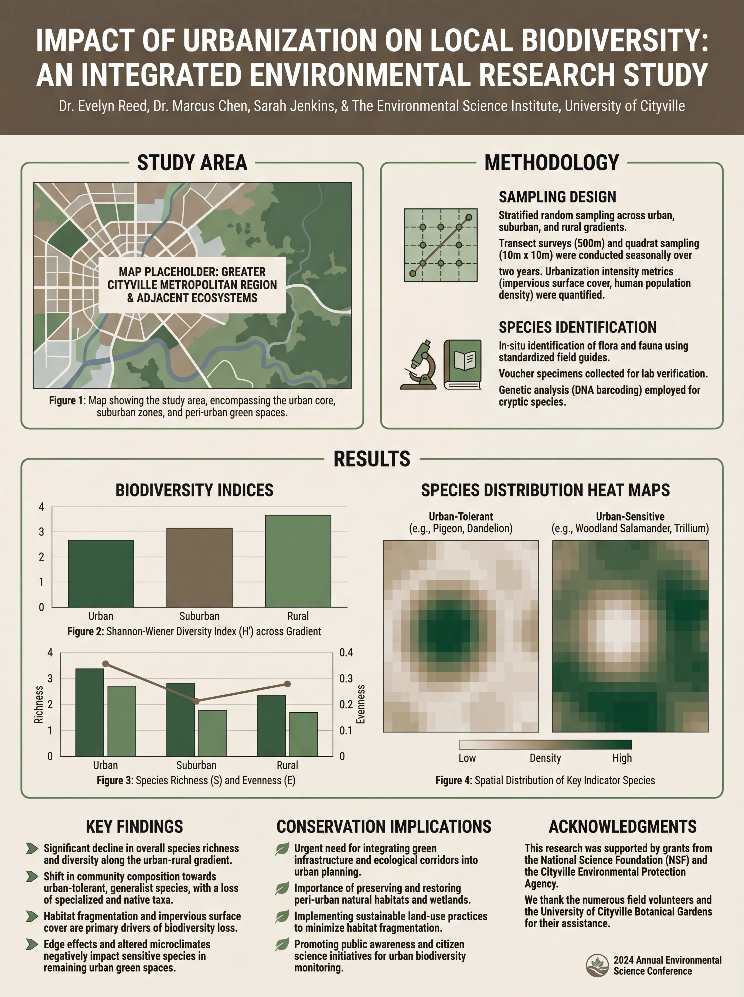
A biomedical research poster demonstrating standard academic poster structure
Standard Academic Poster Sizes
Poster dimensions vary by conference and region. Always check your specific conference requirements before designing.
Common Sizes
| Size | Dimensions | Common Usage |
|---|---|---|
| 48" × 36" | 122 × 91 cm | US standard (landscape) |
| 36" × 48" | 91 × 122 cm | US standard (portrait) |
| A0 | 841 × 1189 mm | International standard |
| A1 | 594 × 841 mm | Smaller conferences |
| 42" × 36" | 107 × 91 cm | Common US alternative |
According to Thompson Rivers University Library, landscape format (wider than tall) is most common, but portrait format is also used depending on conference requirements.
Orientation Considerations
Landscape (Horizontal):
- Most common format
- Natural left-to-right reading flow
- Better for wide tables and graphs
- Standard at most US conferences
Portrait (Vertical):
- Common in some disciplines
- Better for tall figures or flowcharts
- Often required at European conferences
- Works well for timeline-based research
Essential Sections of an Academic Poster
According to Ohio State's poster guide, academic posters typically contain these sections:
1. Title Block
The title block spans the top of your poster and includes:
- Title: Clear, specific, and engaging (readable from 15+ feet)
- Authors: Full names with affiliations
- Institution: University/organization logos
- Contact: Email or QR code for follow-up
Title Tips:
- Keep under 15 words
- State your main finding, not just the topic
- Use title case capitalization
2. Abstract (Optional)
Some conferences require an abstract on the poster; others don't. If included:
- Keep under 150 words
- Summarize the entire study
- Position prominently (usually top-left)
3. Introduction/Background
Set the context for your research:
- What problem are you addressing?
- Why does it matter?
- What's the current state of knowledge?
- What's your research question or hypothesis?
Length: 100-200 words maximum
4. Methods/Materials
Explain how you conducted your research:
- Study design
- Participants/samples
- Procedures
- Analysis methods
Best Practice: Use flowcharts or diagrams instead of lengthy text descriptions.
5. Results
The heart of your poster—present your findings:
- Lead with your main finding
- Use figures, graphs, and tables
- Include statistical information
- Highlight significant results
Best Practice: Results should occupy 40-50% of your poster space.
6. Discussion/Conclusions
Interpret your findings:
- What do the results mean?
- How do they relate to existing research?
- What are the implications?
- What are the limitations?
- What's next?
7. References
Cite your sources:
- Use abbreviated format
- Include 5-10 key references
- Position at bottom of poster
For detailed guidance on poster references, see our complete guide to presenting references on scientific posters.
8. Acknowledgments
Thank those who contributed:
- Funding sources (required by many grants)
- Lab members and collaborators
- Technical support
Environmental science poster showing clear section organization
Layout Options for Academic Posters
Traditional Column Layout
The most common academic poster layout uses 3-4 columns:
┌─────────────────────────────────────────────────────┐
│                    TITLE & AUTHORS                   │
├─────────────┬─────────────┬─────────────┬───────────┤
│  Abstract   │   Methods   │  Results    │ Discussion│
│             │             │  (cont.)    │           │
│ Introduction│  Results    │             │Conclusions│
│             │             │             │           │
│             │             │             │References │
└─────────────┴─────────────┴─────────────┴───────────┘
Reading Flow: Left to right, top to bottom within each column.
Two-Column Layout
Simpler design for less complex research:
┌─────────────────────────────────────────────────────┐
│                    TITLE & AUTHORS                   │
├─────────────────────────┬───────────────────────────┤
│      Introduction       │         Results           │
│                         │                           │
│        Methods          │       Discussion          │
│                         │                           │
│                         │    Conclusions/Refs       │
└─────────────────────────┴───────────────────────────┘
The #BetterPoster Format
A modern alternative gaining popularity, mentioned by ASCO's guidelines:
┌─────────────────────────────────────────────────────┐
│  Methods  │                                │ Results │
│           │      MAIN FINDING              │         │
│           │   (Large, central text)        │         │
│           │                                │         │
│  Sidebar  │      Key Figure                │ Sidebar │
│           │                                │         │
│           │      QR Code to Paper          │         │
└───────────┴────────────────────────────────┴─────────┘
Key Features:
- Main finding prominently displayed in center
- Minimal text
- QR code links to full paper
- Designed for quick scanning
Typography Guidelines
Font Size Recommendations
Based on UCLA Library's guidelines:
| Element | Font Size | Notes |
|---|---|---|
| Title | 72-120 pt | Readable from 15+ feet |
| Author names | 48-60 pt | Clearly visible |
| Section headers | 36-48 pt | Stand out from body |
| Body text | 24-32 pt | Readable from 4-6 feet |
| Captions | 18-24 pt | Smaller but legible |
| References | 16-20 pt | Smallest acceptable |
Font Selection
According to Springfield College Library, keep fonts simple:
Recommended Sans-Serif Fonts:
- Arial
- Helvetica
- Calibri
- Open Sans
Recommended Serif Fonts:
- Times New Roman
- Georgia
- Garamond
Best Practice: Use one font family throughout, or pair one sans-serif (headers) with one serif (body text).
For comprehensive typography guidance, see our best fonts for scientific posters guide.
Color and Visual Design
Background Colors
Springfield College Library recommends:
- White or light neutral backgrounds
- Subtle gradients (if any)
- Avoid busy patterns or photos as backgrounds
Color Schemes
Effective academic posters typically use:
- 2-3 main colors plus neutrals
- High contrast for readability
- Consistent color coding throughout
- Institution colors (optional)
For detailed color guidance, see our scientific color palette guide.
White Space
Don't underestimate empty space:
- Prevents visual clutter
- Guides the eye between sections
- Makes content more readable
- Signals professionalism
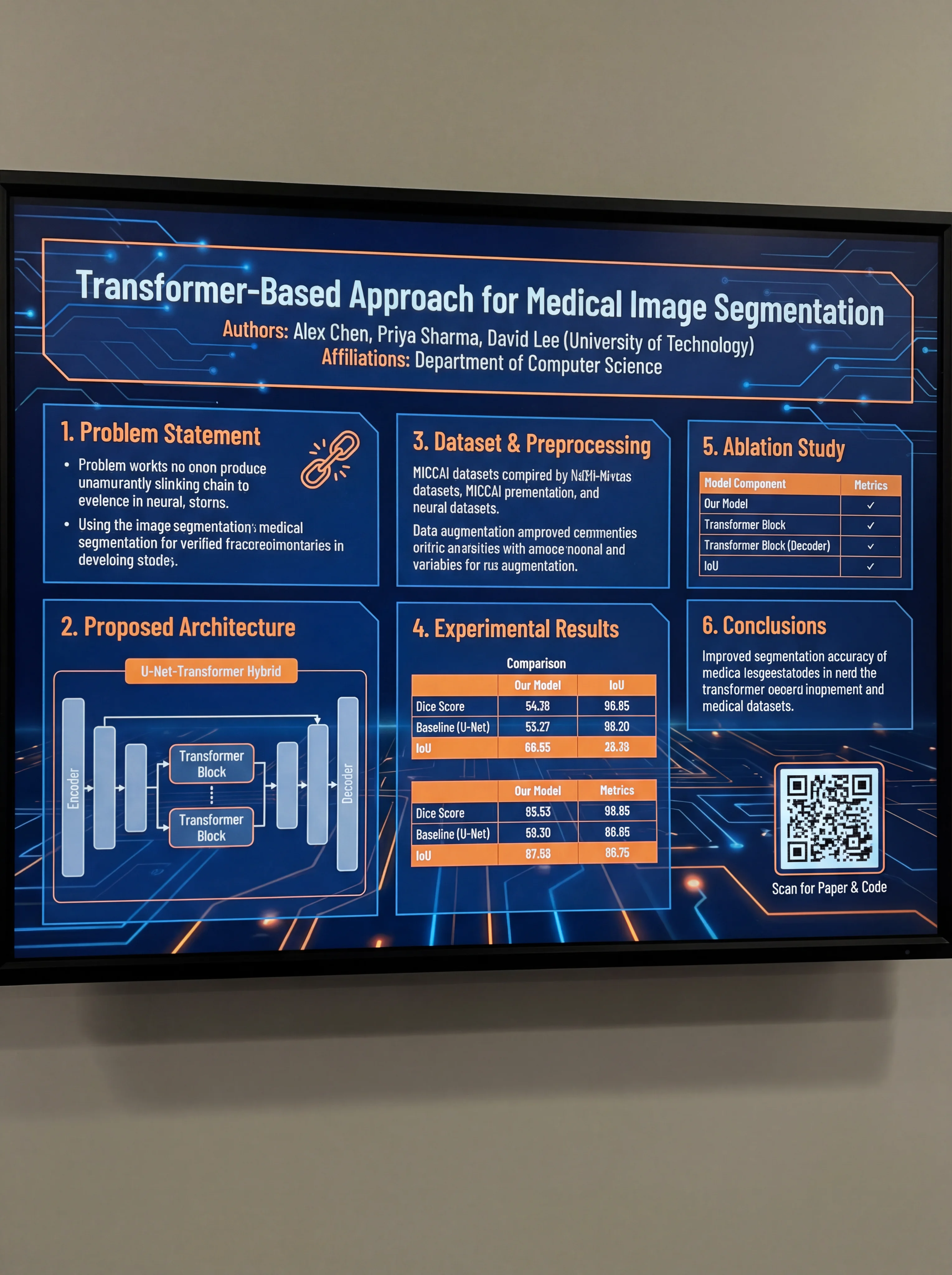
Computer science poster demonstrating effective use of white space
Discipline-Specific Conventions
Different academic fields have different poster norms:
STEM Fields
- Heavy emphasis on data visualization
- Statistical rigor expected
- Methods section is crucial
- Figures dominate the poster
Social Sciences
- More text-heavy than STEM
- Qualitative data presentation
- Theoretical frameworks important
- May include interview quotes
Humanities
- Even more text-oriented
- May include primary source images
- Argument structure is key
- Less standardized format
Health Sciences
- Patient privacy considerations
- Clinical significance emphasized
- IRB approval noted
- Often follows CONSORT/STROBE guidelines
Creating Your Academic Poster
Software Options
PowerPoint/Google Slides:
- Most accessible option
- Set custom slide dimensions
- Limited design flexibility
- Good for beginners
Adobe Illustrator/InDesign:
- Professional-grade results
- Steep learning curve
- Best for complex designs
- Expensive subscription
Canva:
- User-friendly interface
- Many templates available
- Limited customization
- Free tier available
AI-Powered Tools: ConceptViz offers AI-powered poster generation that helps researchers create professional academic posters quickly while maintaining proper academic formatting.
Step-by-Step Process
- Check requirements: Confirm size, format, and submission guidelines
- Outline content: Draft all text sections first
- Create figures: Design high-resolution graphics (300+ DPI)
- Choose layout: Select column structure based on content
- Design poster: Arrange elements with consistent styling
- Get feedback: Have colleagues review before printing
- Print and prepare: Allow time for printing and transport
Common Mistakes to Avoid
1. Too Much Text
The most common error. Academic posters should be visual summaries, not papers on a board.
Solution: Aim for under 800 words total. If you can't cut text, you're including too much detail.
2. Poor Figure Quality
Low-resolution images that pixelate when printed large.
Solution: Use 300 DPI minimum. Create figures specifically for the poster size.
3. Inconsistent Formatting
Mixing fonts, colors, and alignment throughout the poster.
Solution: Establish a style guide before designing. Use templates if needed.
4. Ignoring the Reading Flow
Content arranged illogically, forcing viewers to jump around.
Solution: Number sections or use visual cues to guide readers.
5. Missing Contact Information
No way for interested viewers to follow up.
Solution: Include email, QR code to paper, or social media handle.
Presenting Your Academic Poster
Design is only half the battle. Effective presentation matters too:
Before the Session
- Practice a 2-3 minute overview
- Prepare for common questions
- Bring business cards or handouts
- Know your data thoroughly
During the Session
- Stand beside (not in front of) your poster
- Greet passersby with eye contact
- Offer brief introductions
- Adapt explanations to audience expertise
- Be enthusiastic but not overwhelming
Engaging with Viewers
- Ask if they'd like an overview
- Point to relevant sections as you speak
- Invite questions
- Exchange contact information
- Thank them for their interest
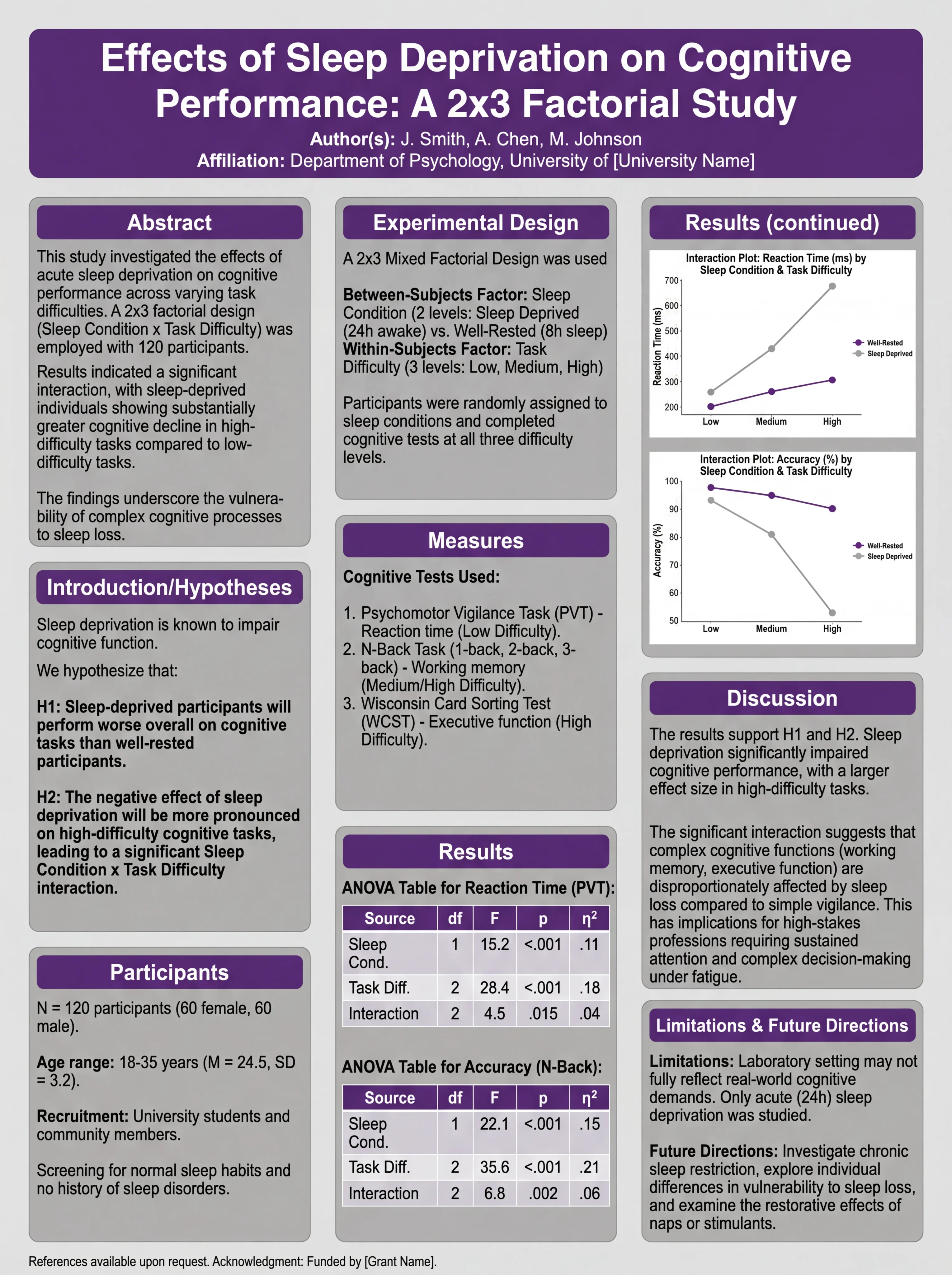
Psychology poster designed for effective conference presentation
Academic Poster Checklist
Before finalizing your poster:
Content:
- Title is specific and engaging
- All required sections are included
- Text is concise (under 800 words)
- Figures are high quality and relevant
- References are properly formatted
- Acknowledgments include funding sources
Design:
- Dimensions match conference requirements
- Font sizes are appropriate for viewing distance
- Colors are consistent and accessible
- White space is used effectively
- Reading flow is logical and clear
- Institution logos are included (if required)
Technical:
- File is saved in required format (PDF, PPT)
- Resolution is sufficient for printing (300+ DPI)
- Fonts are embedded or converted to outlines
- File size is manageable for submission
Conclusion
Creating an effective academic poster requires balancing scholarly rigor with visual communication principles. The key points to remember:
- Follow conference guidelines for size and format
- Prioritize visuals over text
- Maintain clear structure with standard sections
- Use consistent design throughout
- Practice your presentation before the event
Your poster is often the first impression colleagues have of your research. Invest the time to make it professional, clear, and engaging.
For more poster design guidance, explore our guides on award-winning scientific poster design and scientific poster examples.
Frequently Asked Questions
What is the standard size for an academic poster?
The most common size in the US is 48 inches × 36 inches (landscape orientation). International conferences often use A0 size (841 × 1189 mm). Always check your specific conference requirements, as sizes can vary significantly.
What sections should an academic poster include?
Standard sections include: Title and authors, Abstract (optional), Introduction/Background, Methods, Results, Discussion/Conclusions, References, and Acknowledgments. The exact sections may vary by discipline and conference requirements.
How much text should be on an academic poster?
Aim for under 800 words total. Academic posters should be visual summaries, not papers on a board. Figures and graphics should dominate, with text providing context and interpretation. If you can't cut text, you're including too much detail.
What font size should I use for an academic poster?
Title: 72-120pt (readable from 15+ feet), Section headers: 36-48pt, Body text: 24-32pt, Captions: 18-24pt, References: 16-20pt. These sizes ensure readability from appropriate viewing distances.
Should I use landscape or portrait orientation?
Landscape (horizontal) is most common, especially in the US. Portrait (vertical) is sometimes required at European conferences or for specific disciplines. Always check your conference guidelines before designing.
What is the #BetterPoster format?
The #BetterPoster format is a modern alternative that places the main finding prominently in the center with minimal text, sidebars for methods and results, and a QR code linking to the full paper. It's designed for quick scanning and conversation-starting.
What software should I use to create an academic poster?
Common options include PowerPoint (most accessible), Adobe Illustrator/InDesign (professional-grade), Canva (user-friendly), and AI-powered tools like ConceptViz. Choose based on your design skills and available resources.
How do I present my academic poster effectively?
Stand beside (not in front of) your poster, prepare a 2-3 minute overview, make eye contact with passersby, adapt your explanation to each viewer's expertise, and bring business cards or handouts for follow-up. Practice beforehand and know your data thoroughly.
Categorías
Más Publicaciones

AI Conceptual Framework for Thesis: Prompts, Examples, and Chapter 1 Workflow
Create an AI conceptual framework for thesis work with prompts, examples, variable tables, Chapter 1 writing tips, and validation checks.

How to Create a Vector Image: A Complete Guide for Beginners and Researchers
Learn how to create vector images using Inkscape, Adobe Illustrator, and AI tools. Complete guide covering SVG format, tracing raster images, scientific illustration, and best practices.
: Tips, Slide Examples & Presentation Guide (2026)")
3 Minute Thesis (3MT): Tips, Slide Examples & Presentation Guide (2026)
3MT tips and winning slide examples. Learn how to design your 3 Minute Thesis slide, structure your presentation, and avoid common mistakes.