")
How to Make a Histogram: Step-by-Step Guide for Students and Researchers (2026)
Learn how to make a histogram by hand, in Excel, in Google Sheets, and in Python. Includes binning tips, common mistakes, and examples for statistics and research.
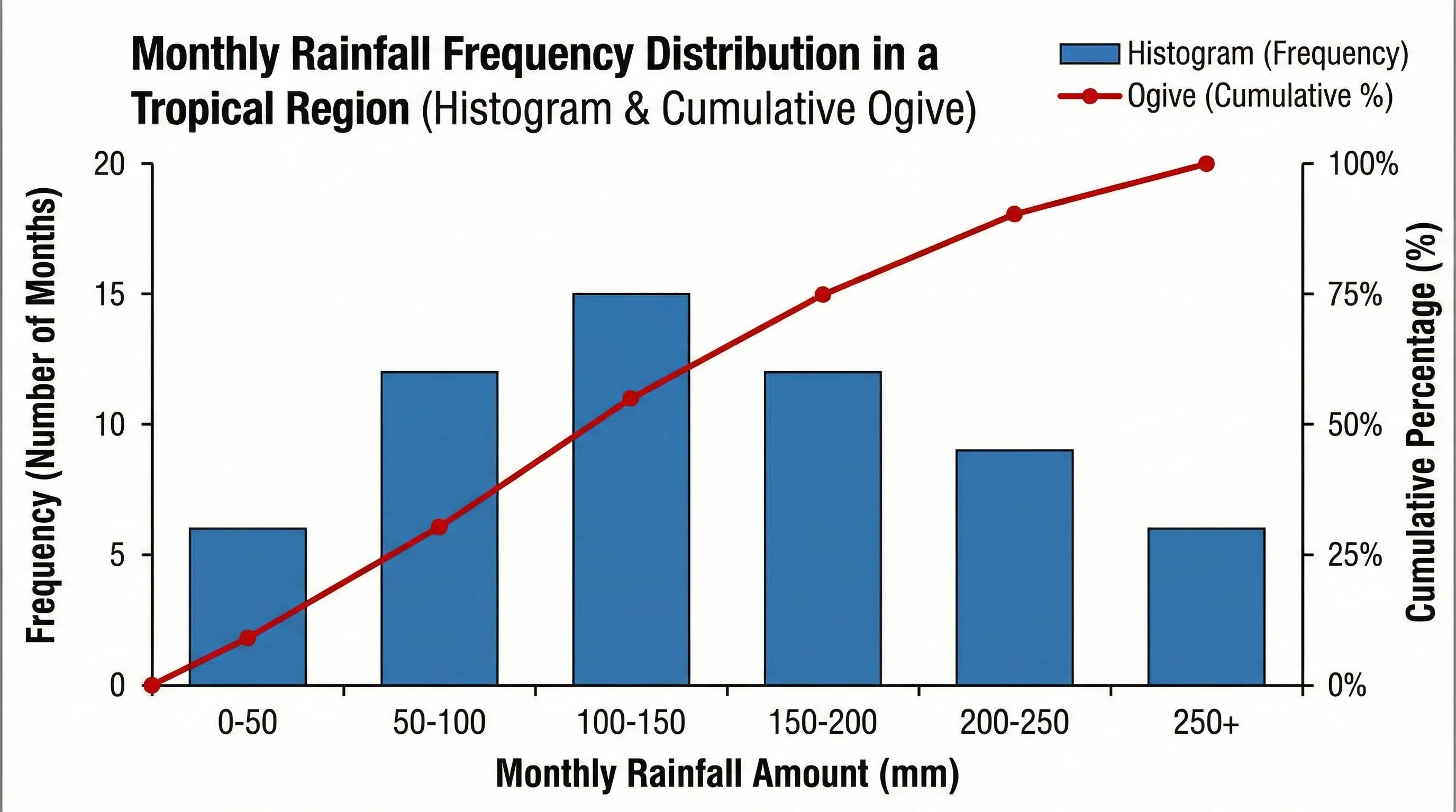
If you are working with test scores, reaction times, rainfall totals, lab measurements, or any other continuous numeric data, a histogram is one of the fastest ways to understand what your dataset is actually doing. It shows whether values cluster in the middle, spread evenly, skew in one direction, or split into multiple peaks.
That makes histograms useful far beyond the statistics classroom. Teachers use them to review student performance, researchers use them to inspect distributions before modeling, and analysts use them to spot outliers and binning patterns quickly. In many cases, a histogram tells you something that a table of averages never will.
This guide explains how to make a histogram from first principles, then walks through the most common workflows: by hand, in Excel, in Google Sheets, and in Python. It also covers how to choose bins, when to avoid histograms, and how to turn a rough first chart into something that is actually trustworthy.
Histogram Maker
Create clean, publication-ready histograms instantly from a plain-language prompt or data description.
Try histogram maker free ->What a Histogram Shows
A histogram groups numerical values into intervals called bins and shows how many observations fall into each interval.
That sounds simple, but it matters because a histogram is designed for continuous quantitative data, not categories.
Examples of good histogram data:
- exam scores
- patient ages
- household income
- runtime in seconds
- rainfall in millimeters
- sample weights in grams
Examples of poor histogram data:
- favorite color
- department name
- country
- survey response labels like "agree" or "disagree"
If the x-axis should represent categories, use a bar chart instead. If the x-axis should represent a number line broken into ranges, a histogram is the right direction.
Khan Academy's histograms review gives a clean beginner-level explanation of why bins matter and why histograms are fundamentally about grouped numeric ranges, not categories.
When Should You Use a Histogram?
Use a histogram when you want to answer questions like:
- Is the data roughly symmetric or skewed?
- Are most values concentrated in one range?
- Are there multiple peaks?
- Are there potential outliers or long tails?
- Does the dataset look approximately normal?
In practice, histograms are especially useful before:
- running parametric statistical tests
- choosing a transformation
- comparing groups visually
- explaining distributions in a report or presentation
What patterns histograms help you recognize
Histograms are especially good at revealing:
- roughly normal distributions where most values cluster near the center
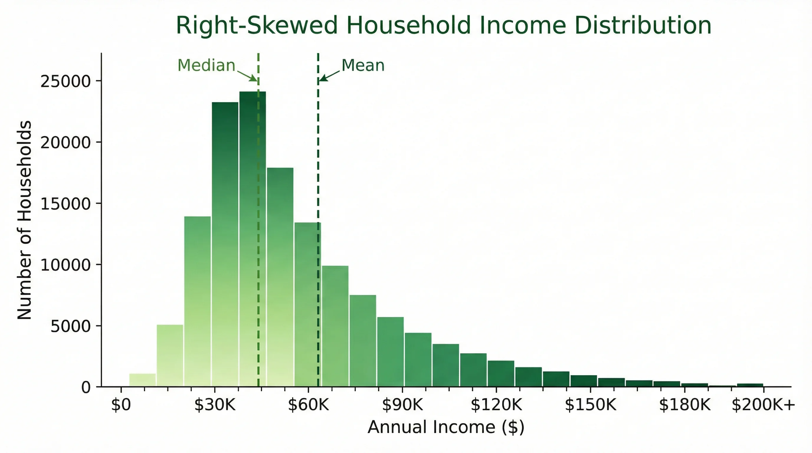
- right-skewed distributions where a few larger values stretch the tail
- left-skewed distributions where lower-end values stretch the tail
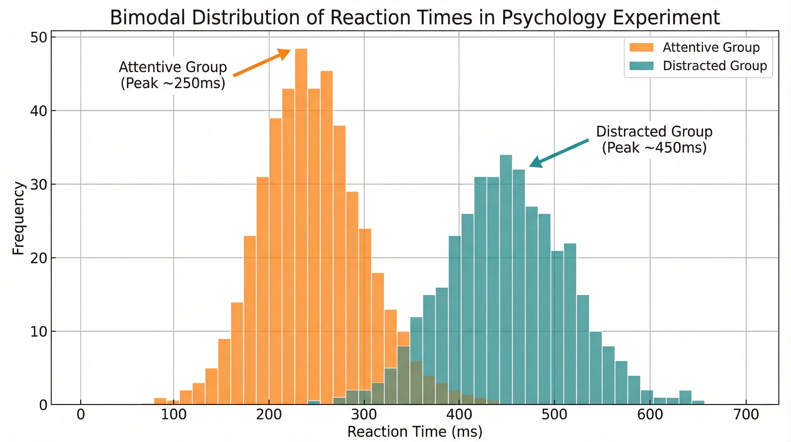
- bimodal distributions where two separate peaks suggest two subgroups
Those patterns matter because they often change what kind of summary statistics or models make sense next.
When Not to Use a Histogram
Do not use a histogram when:
- your data is categorical
- you need to compare a small number of discrete groups
- your audience cares more about exact individual values than shape
- you only have a tiny sample and each point matters individually
For very small samples, a dot plot or even a raw data table may be more honest.
How to Make a Histogram by Hand
Even if you mostly work in software, learning the manual process helps you understand what the charting tool is doing.
Step 1: Gather and sort the data
Suppose you have these quiz scores:
52, 57, 61, 63, 65, 68, 70, 71, 72, 74, 76, 78, 81, 83, 88, 91, 95
Sorting them makes it easier to see the range and choose bins.
Step 2: Find the range
- Minimum =
52 - Maximum =
95 - Range =
95 - 52 = 43
Step 3: Choose bin intervals
You might choose 10-point bins:
- 50-59
- 60-69
- 70-79
- 80-89
- 90-99
Step 4: Count observations in each bin
| Bin | Count |
|---|---|
| 50-59 | 2 |
| 60-69 | 4 |
| 70-79 | 6 |
| 80-89 | 3 |
| 90-99 | 2 |
Step 5: Draw the bars
Place the bins on the horizontal axis and the counts on the vertical axis. Because the bins represent adjacent numeric ranges, the bars should touch.
That touching-bar convention is one of the main visual differences between a histogram and a bar chart.
Histogram vs Bar Chart
This is one of the most common beginner mistakes.
Use a histogram when:
- the data is continuous
- the bars represent numeric intervals
- the chart is about distribution
Use a bar chart when:
- the data is categorical
- the bars represent separate groups
- the chart is about comparison
If you are comparing products, regions, or survey answers, that is bar-chart territory. If you are grouping scores, ages, or runtimes into bins, that is histogram territory.
How to Choose Good Bins
This is the step that most affects how your histogram looks.
If the bins are too wide, the chart hides detail. If the bins are too narrow, it becomes noisy and misleading.
Practical rules
- Start with bins that your audience will understand intuitively
- Keep bin widths consistent
- Compare at least two bin settings before finalizing
- Use domain knowledge when natural thresholds exist
Examples:
- exam scores: 5-point or 10-point bins
- ages: 5-year bins
- wait times: 1-minute or 5-minute bins
- income: $10,000 or $25,000 bins
A useful sanity check
If your interpretation changes drastically every time you change the bin width, you probably need to inspect the raw data more carefully before drawing conclusions.
Matplotlib's official guide on histograms is useful here because it shows how bins influence the shape of the final chart, especially when switching between different dataset sizes and distributions.
How to Make a Histogram in Excel
For many people, Excel is still the fastest option because the data is already in a spreadsheet.
Modern Excel versions include a built-in Histogram chart. Microsoft documents the current workflow in Create a histogram.
The short version is:
- Put the values in one numeric column
- Select the range
- Go to
Insert > Insert Statistic Chart > Histogram - Right-click the horizontal axis
- Use
Format Axisto change bin width, number of bins, and underflow/overflow bins
Excel is especially convenient when:
- your data already lives in a workbook
- you need a fast chart for class or reporting
- you want quick bin adjustments without coding
If you want the full Excel-specific walkthrough, see our dedicated post on how to make a histogram in Excel.
How to Make a Histogram in Google Sheets
Google Sheets is useful when you are collaborating with others or working in the browser.
The typical workflow is:
- Put your numeric data in one column
- Select the data
- Insert a chart
- Change the chart type to Histogram
- Adjust bucket size, labels, and axis formatting in the chart editor
Google Sheets is fine for lightweight classroom or team workflows, but formatting control is more limited than in Excel or Python. If you need publication-ready output, you will usually spend less time using a dedicated charting tool.
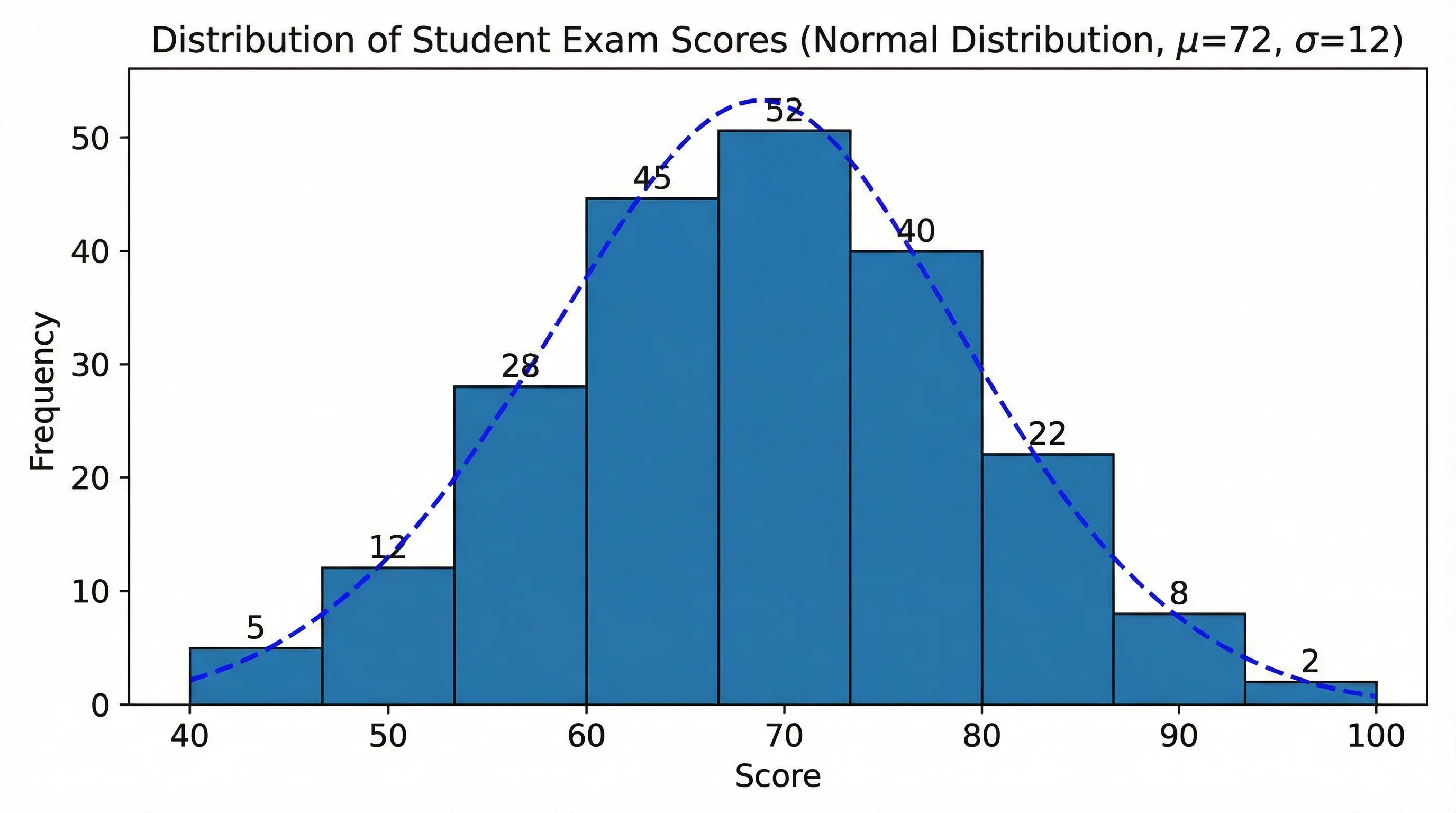
Example: Classroom Test Scores
Suppose a teacher has 80 quiz scores and wants to know whether the class is clustering near the middle or splitting into high- and low-performing groups.
A histogram helps answer that quickly:
- one peak near the middle suggests a relatively consistent cohort
- a long right tail suggests a handful of unusually strong scores
- two peaks may suggest two different preparation levels
That is exactly the kind of situation where a histogram is better than a table of averages, because shape matters more than one summary number.
How to Make a Histogram in Python
If you need reproducibility, scripting, or publication-grade control, Python is the better choice.
The most common starting point is Matplotlib's hist() function. The official matplotlib.pyplot.hist documentation and the gallery examples are the best primary sources here because they show exactly how bins, density, and styling behave.
A minimal example looks like this:
import matplotlib.pyplot as plt

data = [52, 57, 61, 63, 65, 68, 70, 71, 72, 74, 76, 78, 81, 83, 88, 91, 95]

plt.hist(data, bins=5)
plt.xlabel("Score")
plt.ylabel("Frequency")
plt.title("Quiz Score Distribution")
plt.show()
Python is the best option when:
- you need reproducible analysis
- you want the histogram generated as part of a workflow
- you need many chart variants
- you are writing for publication or automation
Common Histogram Mistakes
Mistake 1: Using category labels as bins
If the underlying variable is not numeric and continuous, you do not want a histogram.
Mistake 2: Making the bars look like a bar chart
Histogram bars should usually touch because the bins represent adjacent intervals on a number line.
Mistake 3: Choosing bins only because they look pretty
Binning should help interpretation, not manufacture a cleaner story than the data supports.
Mistake 4: Ignoring sample size
With a small dataset, histograms can easily overstate patterns. If you only have a handful of observations, consider showing the raw values directly.
Mistake 5: Forgetting that a histogram shows shape, not causation
A histogram can suggest skewness, clustering, or unusual spread. It does not explain why the pattern exists.
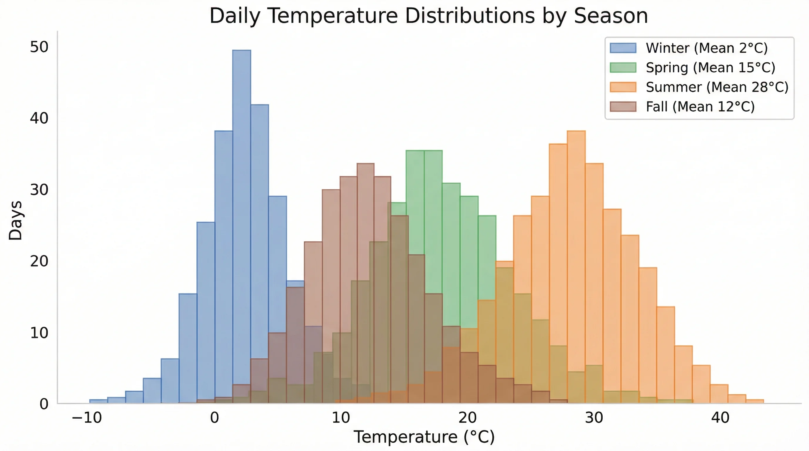
Mistake 6: Comparing histograms with inconsistent scales
If you place two histograms side by side but let the axes drift independently, the visual comparison becomes much less trustworthy. Keep scales aligned when comparison is part of the story.
How to Read a Histogram Well
When you look at a histogram, train yourself to ask:
- Where is the center?
- How wide is the spread?
- Is it symmetric or skewed?
- Is there one clear peak or several?
- Are there unusual gaps or tails?
These questions make histograms useful not just as visuals, but as analytical checkpoints before deeper work.
Histogram Maker
Generate publication-ready histograms instantly from a plain-language description of your data.
Frequently Asked Questions
What is the easiest way to make a histogram?
The easiest way is usually to use a spreadsheet tool such as Excel or Google Sheets if your data is already tabular. If you need a cleaner result quickly, a dedicated histogram generator is often faster than formatting the chart manually.
What is the difference between a histogram and a bar chart?
A histogram shows the distribution of continuous numeric data across bins. A bar chart compares separate categories or groups.
How many bins should a histogram have?
There is no single perfect answer. Start with a reasonable default, then compare a few alternatives and choose the one that reveals the distribution without hiding detail or adding noise.
Can I make a histogram without software?
Yes. You can choose bins, count how many values fall into each interval, and draw the bars by hand. Learning that process helps you understand what the software is doing.
Is Excel or Python better for histograms?
Excel is faster for ad hoc work when the data is already in a spreadsheet. Python is better for reproducibility, automation, and high-control output.
What kind of data should I use a histogram for?
Use histograms for continuous numerical data such as test scores, ages, weights, response times, temperatures, or income. Do not use them for categorical data like product names or survey labels.
Conclusion
Making a histogram is not complicated, but making a useful histogram takes a bit more care. The actual process is always the same:
- Start with continuous numeric data
- Choose sensible bins
- Count observations in each bin
- Plot touching bars across the intervals
- Review whether the final shape actually helps interpretation
If your goal is fast, clean output without spreadsheet cleanup, ConceptViz Histogram Maker is the quickest route. If your goal is analysis, the key is not the software you choose, but whether your bin choices and formatting help readers understand the real distribution.
Additional Resources
Categorías
Más Publicaciones

Eye Anatomy: The Parts of the Human Eye Explained
A clear guide to eye anatomy: the cornea, iris, pupil, lens, retina, and optic nerve, what each part does, how vision works, and how to read an eye diagram.
")
How to Create Circuit Diagrams Online: Free Tools & Step-by-Step Guide (2026)
Learn how to draw circuit diagrams online for free. Compare top circuit diagram makers and follow our step-by-step guide to create professional electrical diagrams.

How to Make a Schematic Diagram: Step-by-Step Guide for Scientists and Students
Learn how to make a schematic diagram for science, lab experiments, and research. Step-by-step guide covering rules, symbols, software tools, and examples for biology, chemistry, and physics.