
Supply and Demand Graph: Equilibrium & Shifts
Learn how to read the supply and demand graph: why demand slopes down and supply slopes up, where they meet at equilibrium, plus shifts, surplus, and shortage.
The supply and demand graph is the single most important picture in economics. It shows how the price and quantity of a good are set by two opposing forces — buyers who want more when prices fall, and sellers who want to sell more when prices rise.
This guide explains how to read the graph: what the demand and supply curves are, where they cross at equilibrium, the difference between shifting a curve and moving along it, and how surpluses and shortages push the market back to balance.
Quick Answer: What Is a Supply and Demand Graph?
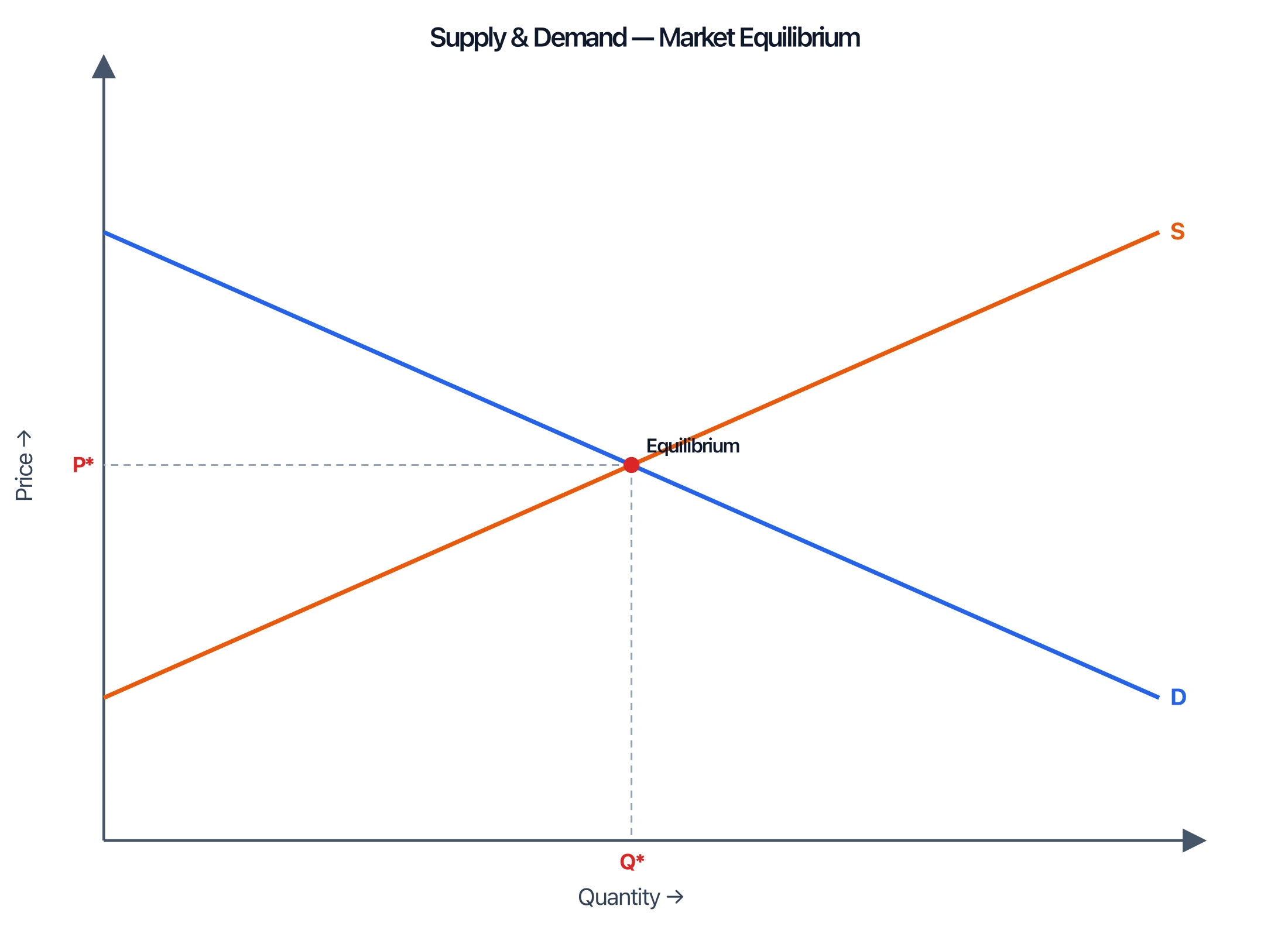
A supply and demand graph plots price on the vertical (y) axis and quantity on the horizontal (x) axis. The demand curve (D) slopes down and the supply curve (S) slopes up. Where the two curves cross is the equilibrium — the price and quantity at which the amount buyers want exactly equals the amount sellers offer.
The Demand Curve
The demand curve shows how much of a good buyers will purchase at each price. It slopes downward: as the price falls, the quantity demanded rises, and as the price rises, the quantity demanded falls. This inverse relationship is the law of demand.
Why does it slope down? Two reasons. First, when something gets cheaper, people who couldn't afford it can now buy it (more buyers enter). Second, existing buyers tend to buy more of a good when each unit costs less. Demand is conventionally drawn in blue and labeled D.
The Supply Curve
The supply curve shows how much sellers will produce at each price. It slopes upward: higher prices make production more profitable, so sellers offer more; lower prices mean fewer units are worth making. This is the law of supply.
The supply curve slopes up because producing extra units usually costs more (overtime, scarcer inputs), so sellers need a higher price to justify the extra output. Supply is typically drawn in a contrasting color and labeled S.
Equilibrium: Where the Curves Meet
The equilibrium is the point where the supply and demand curves intersect. At that single point, the quantity demanded equals the quantity supplied — there is no leftover stock and no unmet demand. The price there is the equilibrium price (P*) and the quantity is the equilibrium quantity (Q*).
Equilibrium is stable: if the market price drifts away from it, natural pressure pushes it back, as we'll see with surplus and shortage below.
Supply and Demand Graph Maker
Create clean, labeled supply and demand graphs with equilibrium points, shifts, surpluses, and shortages, then download them free as SVG or PNG.
Make a supply and demand graph ->Shifts vs. Movements Along the Curve
This is the distinction that trips up most students:
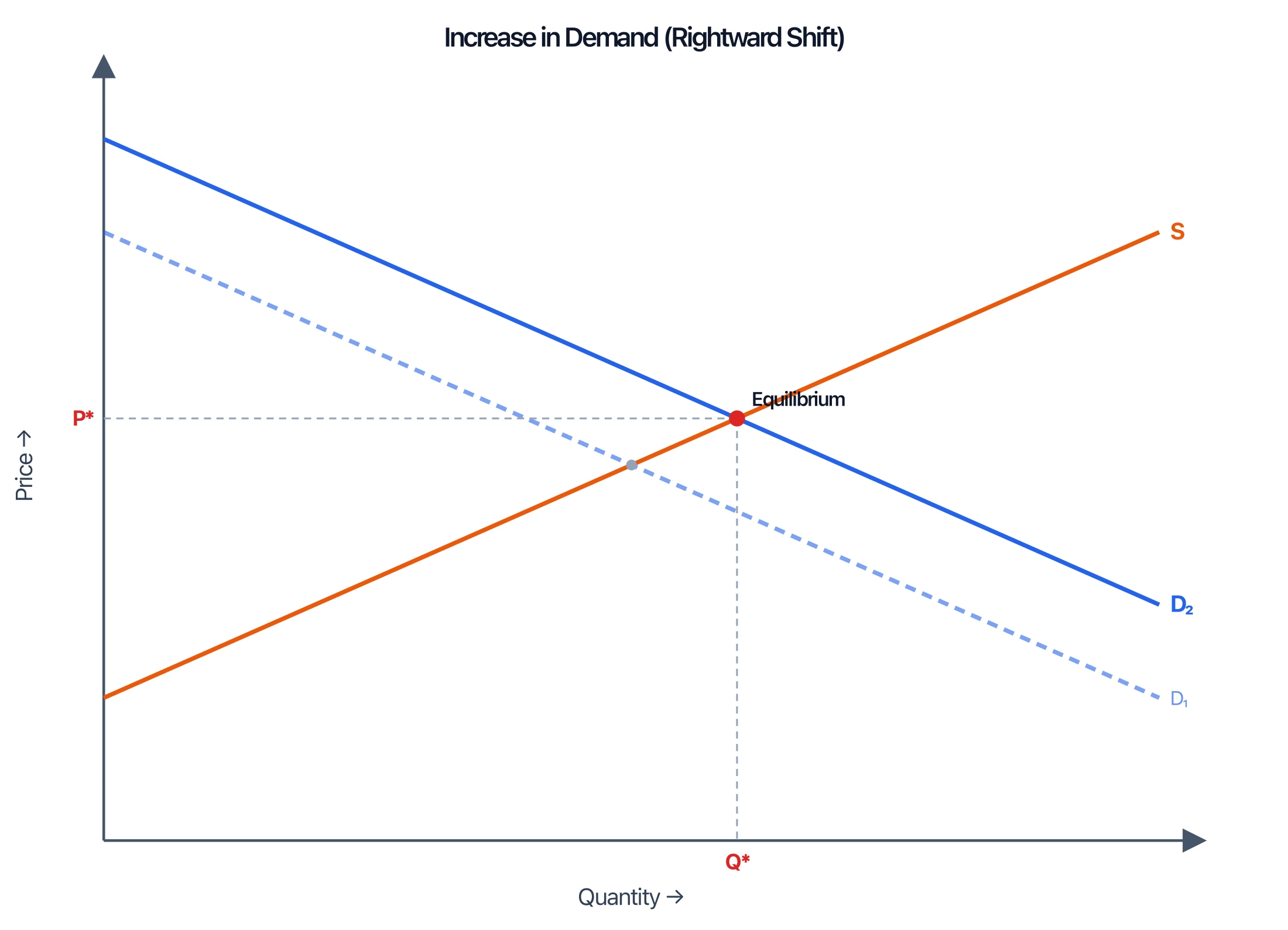
- A movement along a curve happens only when the good's own price changes. You slide up or down the same curve to a new quantity. Nothing about the curve itself moves.
- A shift of a curve happens when something other than the good's price changes. The entire curve moves left or right to a new position, creating a new equilibrium.
What shifts the demand curve? Income, the price of related goods (substitutes and complements), tastes, expectations, and the number of buyers. What shifts the supply curve? Input costs, technology, taxes and subsidies, expectations, and the number of sellers.
When the demand curve shifts right (demand increases), both the equilibrium price and quantity rise. When supply shifts right (supply increases), the equilibrium quantity rises but the price falls.
Surplus and Shortage
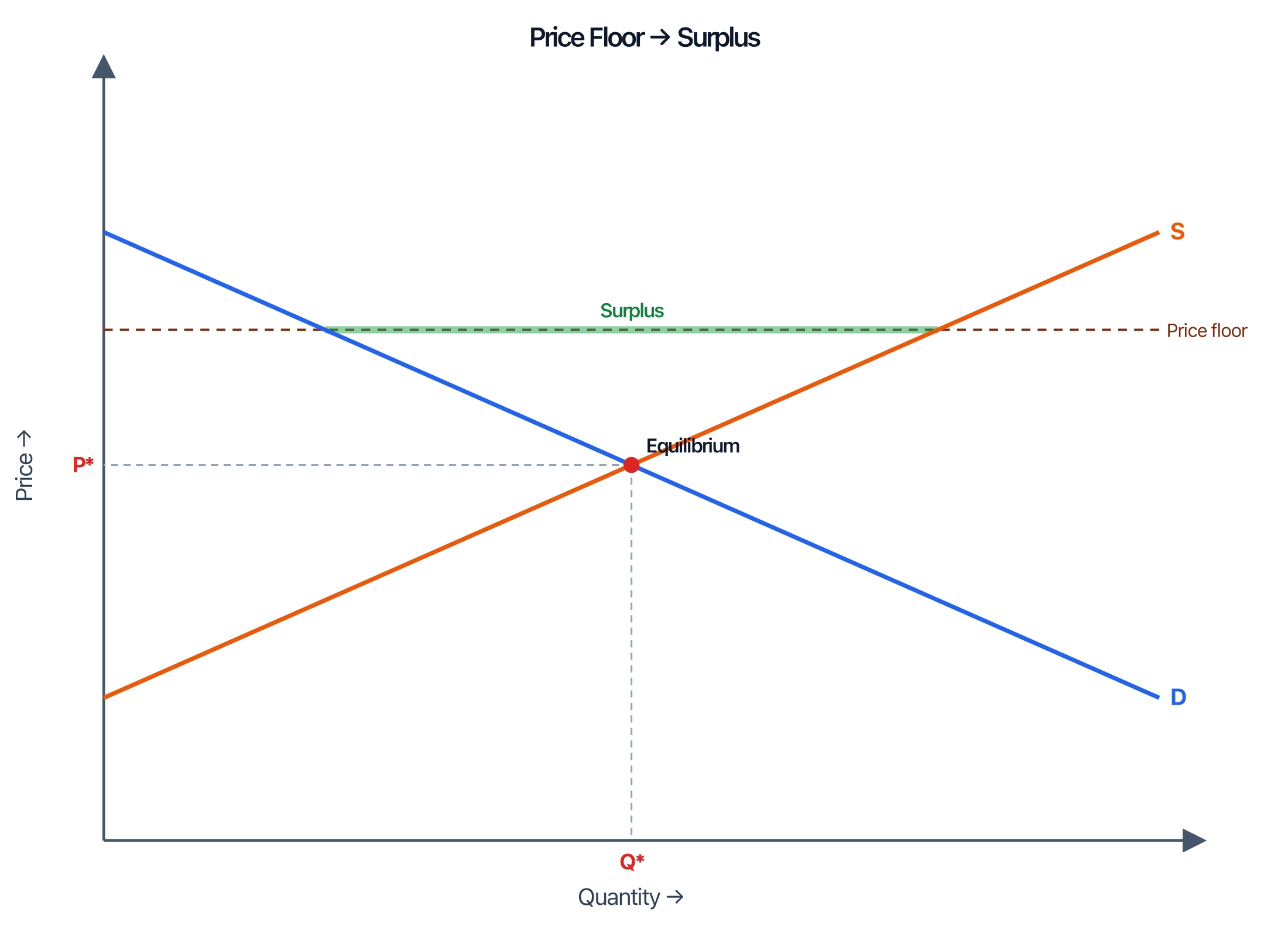
What happens when the price isn't at equilibrium?
- Surplus (excess supply): If the price is set above equilibrium, sellers offer more than buyers want. Unsold stock piles up, so sellers cut prices, and the market slides back down to equilibrium.
- Shortage (excess demand): If the price is set below equilibrium, buyers want more than sellers provide. Competition among buyers bids the price up until balance returns.
Price controls freeze these gaps in place. A price floor (a minimum price, like a wage floor) set above equilibrium creates a lasting surplus. A price ceiling (a maximum price, like rent control) set below equilibrium creates a lasting shortage.
How to Read and Draw the Graph
- Label the axes: price on the vertical axis, quantity on the horizontal.
- Draw demand (D) as a line sloping down to the right.
- Draw supply (S) as a line sloping up to the right.
- Mark the intersection — drop a dashed line to the x-axis for Q* and across to the y-axis for P*.
- To analyze a change, decide whether it affects price (move along) or another factor (shift the whole curve), then read off the new equilibrium.
Supply and Demand Graph Maker
Plot demand and supply curves, mark equilibrium, and show shifts, surpluses, or shortages in seconds.
Common Mistakes
- Swapping the axes. Price goes on the vertical axis, quantity on the horizontal — the reverse of most math graphs.
- Confusing a shift with a movement. Only a change in the good's own price moves you along a curve; everything else shifts the curve.
- Shifting the wrong curve. A change in income or tastes shifts demand; a change in input costs or technology shifts supply.
- Forgetting both effects. When a curve shifts, both the equilibrium price and quantity usually change — check each.
FAQ
What does a supply and demand graph show?
It shows the price and quantity of a good as set by buyers and sellers. The downward demand curve and upward supply curve cross at the equilibrium, where the quantity buyers want equals the quantity sellers offer.
Why does the demand curve slope down and the supply curve slope up?
Demand slopes down because people buy more when prices fall (the law of demand). Supply slopes up because higher prices make producing more units profitable (the law of supply).
What is equilibrium on a supply and demand graph?
Equilibrium is the point where the supply and demand curves intersect. At that price, quantity demanded equals quantity supplied, so there is no surplus or shortage and no pressure for the price to change.
What is the difference between a shift and a movement along the curve?
A movement along a curve is caused only by a change in the good's own price. A shift moves the entire curve left or right and is caused by other factors, such as income, input costs, tastes, or the number of buyers and sellers.
What causes a surplus or a shortage?
A surplus happens when the price is above equilibrium, so sellers offer more than buyers want. A shortage happens when the price is below equilibrium, so buyers want more than sellers provide. Both push the price back toward equilibrium.
Further Reading
分類
更多文章
: Tips, Slide Examples & Presentation Guide (2026)")
3 Minute Thesis (3MT): Tips, Slide Examples & Presentation Guide (2026)
3MT tips and winning slide examples. Learn how to design your 3 Minute Thesis slide, structure your presentation, and avoid common mistakes.

Best Open-Source Diagramming Tools: Draw.io & Mermaid
Compare open-source diagramming tools for flowcharts, UML, whiteboards and docs: Draw.io, Excalidraw, Mermaid, PlantUML, Graphviz and self-hosted options.

Best AI Scientific Illustration Tools in 2026: Complete Guide
Compare the best AI-powered scientific illustration tools for researchers in 2026. From BioRender to ConceptViz, find the right tool for publication-quality scientific figures.